| |
|
I've been doing art on HEE for quite a while but I feel like it's hitting a dead end for myself now. I need some constructive criticism and tips/ideas to change how my art looks a bit, but for the better. I need some tough constructive criticism, I won't be offended, just don't be snarky/rude though.
http://funkyimg.com/i/2ERmg.png http://funkyimg.com/i/2ERmF.jpg http://funkyimg.com/i/2ERmG.jpg http://funkyimg.com/i/2ERmH.png http://funkyimg.com/i/2ERmJ.jpg |
|
|
| |
 |
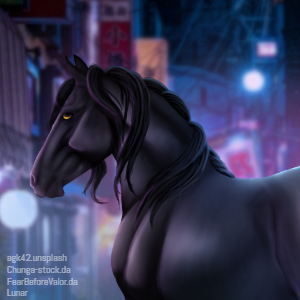
It seems to me you could do a bit better matching your horses and backgrounds, maybe reducing the noise in your horses, and really making sure the hooves make sense. The second one's feet immediately look off to me, I think it's mostly an issue of the background being at the wrong angle/taken further back than the horse's photo so the hooves would be either floating or hidden more than would seem right, I think it's the first. The third one looks like a giant horse standing in a large river, I don't think that background is ideal unless that's the effect you're going for. The light source also seems off. The issue I see with the other two, and the art in your gallery, is that the horses are too large compared to your background. I'm assuming it's to make sure you get the entire effect of the background, but it does make things look off. It's a trend on HEE though, so that doesn't necessarily mean anything. |
|
|
| |
|
1. I love this piece! The horse really goes well with the BG, and the colors just pop. I would not change a single thing.
2. I would paint the tail longer, as it looks out-of-proportion now. Like Wraith said, maybe adjust the angle of the horse so it looks like it's on the ground instead of floating. I really like how this horse goes so well with the BG, and how happy it is! Maybe experiment with smudging and highlighting on the coat, and see what happens.
3. The angles on this one feel a little off. With the way the horse is arranged on the BG, it really looks like it's floating off the ground, with the rest of the rocks in the distance. Maybe make the BG bigger, and then make the horse a bit smaller? Also, if it was me, I'd play around with the Brightness/Contrast settings to see where I got. Gorgeous work on the tail and mane, though!! And I love how you cut the horse out-it's a stellar job.
4. I loved this so much at first glance! The way the horse is standing, the way you blurred the BG, and how sharp the horse is really make this piece pop. However, when I took a second look, I noticed the lighting was a little off. If it was me, the last step in making the piece would be to add a lens flare in the top left corner or somewhere thereabouts, to kind of make the lighting on the horse make sense.
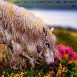
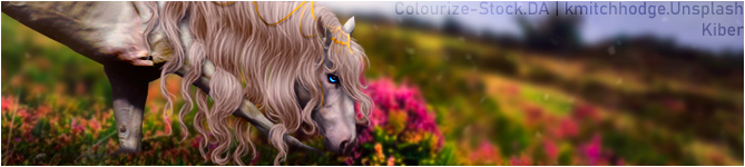
5. I LOVE THIS SO MUCH!!! This is literally one of my favorite pieces ever!! The way you manipulated the bits of grass and the flowers to be in front of the horse really make it seem real, and the expression on his face perfectly captures the feeling of the forest behind him- peace. The only thing I would suggest would be to make the boundary between the sharp forest floor and the blurred trees a little less prominent. Right beneath his throatlatch, it seems there's a pronounced line between the trees and the ground. Maybe merge those 2 layers, then smudge a little on that boundary?
Your art is so great! Hope this helps. <3
|
|  |
|
| |
|
|
 Snow and Sleet Mix, Clearing at Night

