| |
|
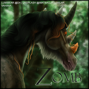
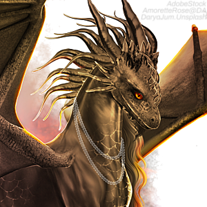
ISO some criticism on this piece. Be as picky, as mean as you need to get your point across XD I want to improve, if it's the hard way I need to, give it me 🤣  also searching for a SB, AB + MI for this piece :D |
|  |
|
| |

|
okay so first of all, im apsolutely in awe of this piece. like it's totally amazing. but. the first thing i noticed was that the horse+wings seem very contrasted, so maybe lower the contrast a tad, especially on the belly/right side. the second thing i see is that the sun rays in the BG don't seem to really reach the horse. so i would try to make the horses left side brighter with a warmish, yellowish glow from the strong sunlight. i *love* your tail, but i think the mane should be less poofy and spiky and more long and flowy to match the tail. also i'd love to see a bit of opaqeish cloud covering parts of the horse's feet. - but other than that i think its awesome! is have it like this- SB-20k MI-3k AB-150k |
|
|
| |
|
Wow - I love this <3 and I would also start bidding with 20k SB. Yes, the contrast could be a bit lower and the belly a bit brighter. For me the mane and tail are okay, because I would use the image for a sport pony. Here is the first offer SB |
|  |
|
| |
|
Aventurine Hills said:
Wow - I love this <3 and I would also start bidding with 20k SB. And here is the offer: SB. :)
It isn't up for auction yet :) got some stuff to complete on it first :D
Olive Tree Equine said:
okay so first of all, im apsolutely in awe of this piece. like it's totally amazing. but. the first thing i noticed was that the horse+wings seem very contrasted, so maybe lower the contrast a tad, especially on the belly/right side. the second thing i see is that the sun rays in the BG don't seem to really reach the horse. so i would try to make the horses left side brighter with a warmish, yellowish glow from the strong sunlight. i *love* your tail, but i think the mane should be less poofy and spiky and more long and flowy to match the tail. also i'd love to see a bit of opaqeish cloud covering parts of the horse's feet. - but other than that i think its awesome! is have it like this- SB-20k MI-3k AB-150k
Thank you! I am currently working on a new mane as I wasn't a fan of the other XD |
| |
|
| |
 |
Its amazing!! Like you don't understand that art you did a awesome job on! |
|
|
| |
|
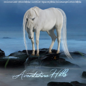
With my freshly woken up eyes I can see only a few things: 1. Always check the background and the horse against each other. The only way to fit the horse into the background is to adjust the contrast and colors until they match. What I can see here is that you used super strong shadows but I can't see their super strong light counterparts. If there is a strong shadow there must be a strong light on the opposite side otherwise it looks unnatural. Look atvthe clouds in the background! They have medium-strong, long shadows and heavy, soft lights. Try to match the ratio on the horse as well. 2. The wings don't feel like they are actually connecting to the horse, for now it looks a bit pasted. Especially because the wing on the left side (so the right wind of the horse) doesn't match the shadows of the horse's body. Where that wing connects the horse has a strong shadow and yet the wing has light on it. That wing shouldn't have light at all until it reaches over the head of the horse because the head looks to be casting a shadow on it. 3. The color of light on the wings doesn't look natural, it makes the wing look a bit dusty. I would change the style of the layer of the light and lower opacity until the light shines well but doesn't mush out the details of the wing. So far this is all I see, I hope it helps :D I'm horrible when it comes to prices but I can tell you that I would easily pay over 150k for this exact piece so don't sell yourself cheap! |
|  |
|
| |
|
HRS said:
With my freshly woken up eyes I can see only a few things: 1. Always check the background and the horse against each other. The only way to fit the horse into the background is to adjust the contrast and colors until they match. What I can see here is that you used super strong shadows but I can't see their super strong light counterparts. If there is a strong shadow there must be a strong light on the opposite side otherwise it looks unnatural. Look atvthe clouds in the background! They have medium-strong, long shadows and heavy, soft lights. Try to match the ratio on the horse as well. 2. The wings don't feel like they are actually connecting to the horse, for now it looks a bit pasted. Especially because the wing on the left side (so the right wind of the horse) doesn't match the shadows of the horse's body. Where that wing connects the horse has a strong shadow and yet the wing has light on it. That wing shouldn't have light at all until it reaches over the head of the horse because the head looks to be casting a shadow on it. 3. The color of light on the wings doesn't look natural, it makes the wing look a bit dusty. I would change the style of the layer of the light and lower opacity until the light shines well but doesn't mush out the details of the wing. So far this is all I see, I hope it helps :D I'm horrible when it comes to prices but I can tell you that I would easily pay over 150k for this exact piece so don't sell yourself cheap!
Thank you! I'm definitely still working on it as I'm not overly happy with a few things, but I'll definitely try work on those! |
| |
|
| |
|
Zomb said:
HRS said:
With my freshly woken up eyes I can see only a few things: ..
Thank you! I'm definitely still working on it as I'm not overly happy with a few things, but I'll definitely try work on those!
Oh now that I'm properly awake it came to my mind that regarding the shadows and lights you can also edit the background and not the horse. I quite like the strong shadows on the horse (because I'm in love with contrasty pieces xD) so if you tried to raise contrast in the background instead, it might give an overall better looking result than editing the horse too much. I'd definitely give it a try to edit the bg :D |
| |
|
| |
|
A little Update- need to add some lighter shades then it'll be completed! |
| |
|
| |
|
I've decided to leave it as this (for now XD) as I'm quite happy with how it looks  |
| |
|
 Clear with Temps dropping into the Teens


