| |
|
Okay so I recently got shutterstock and Adobe etc etc.
So I'm looking for some extremely in depth critiques. Be as picky, as blunt as you need. I asked for it XD I promise I can take it :D Make it about anything/everything!
Most Recent Examples: Pricing : Not absolutely needed, but is appreciated!
THANKS! |
|  |
|
| |
|
|
| |
|
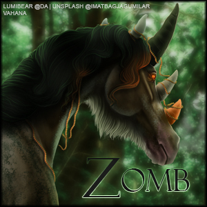
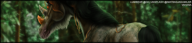
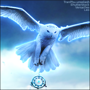
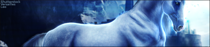
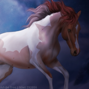
I'll be critiquing each piece. I'm also a huge fan of your art and I've love seeing your art improve. You've improved so much over the last couple months :) Pegasus Piece - I love this piece. I don't really have many critiques for this. The main one that sticks out is the main. On the top, it is very beautifully highlighted and looks like it has deapth while the bottom towards the mane looks kind of flat. I think that the lighting makes sense but maybe if you added a couple other colors it would continue the depth of the mane. This is stunning! Pink Flowers Piece - There are a couple of things that stick out to me. For one, you can see the original grass on the back right hoof and you can see some of the airbrush eraser strokes. The other thing that sticks out is the mane. It looks very spiky which stands out to me. It may have looked a bit more natural if you made longer strokes of the mane. Overall this is again a great piece. Autumn Forest Piece - This piece is amazing. The only thing I have for you is the lighting. The horse looks very highlighted while the light from the background is coming from the other direction. The horse would realistically be less highlighted but that's about it. Rock Piece - For this piece, the main critique fror me is the hair. The mane just looks a bit off for some reason. I'm not sure why but it just does. The tail is also pointing downward while the mane is flowing upwards. I bring this up for the consitancy. Realistically the tail would have a similar look to the mane and flick upward as the horse is jumping. The body prep is gorgeous and I especially love the eye for this. Crow Piece - I also really like this piece. The only thing for me is the tail. At the end, it doesn't look like hair because you can see where the stroke left off. It's very rounded so I would have added some fly aways and more strands at the very end. Overall I really like this piece and you nailed the lighting! Waterfall Piece - There are a couple things that stick out to me about this piece. For one, the mane does not look very realistic. I would add a couple flyaways just to make it look a bit more realistic. The tail should also have a couple more strands I think. It just kind of ends at a point. Finally the grounding also looks a bit off. I would add a couple ripples and/or a reflection. The water looks very low but you can't see the hooves at all, even though you can see the rocks at the bottom. All in all, I think your art is really good. I'd love to see you try to do some longer and flowy manes as well as do more movement pieces. I really hope this helps! Great work! |
|  |
|
| |
|
Red River Ranch said:
I'll be critiquing each piece. I'm also a huge fan of your art and I've love seeing your art improve. You've improved so much over the last couple months :) Pegasus Piece - I love this piece. I don't really have many critiques for this. The main one that sticks out is the main. On the top, it is very beautifully highlighted and looks like it has deapth while the bottom towards the mane looks kind of flat. I think that the lighting makes sense but maybe if you added a couple other colors it would continue the depth of the mane. This is stunning! Pink Flowers Piece - There are a couple of things that stick out to me. For one, you can see the original grass on the back right hoof and you can see some of the airbrush eraser strokes. The other thing that sticks out is the mane. It looks very spiky which stands out to me. It may have looked a bit more natural if you made longer strokes of the mane. Overall this is again a great piece. Autumn Forest Piece - This piece is amazing. The only thing I have for you is the lighting. The horse looks very highlighted while the light from the background is coming from the other direction. The horse would realistically be less highlighted but that's about it. Rock Piece - For this piece, the main critique fror me is the hair. The mane just looks a bit off for some reason. I'm not sure why but it just does. The tail is also pointing downward while the mane is flowing upwards. I bring this up for the consitancy. Realistically the tail would have a similar look to the mane and flick upward as the horse is jumping. The body prep is gorgeous and I especially love the eye for this. Crow Piece - I also really like this piece. The only thing for me is the tail. At the end, it doesn't look like hair because you can see where the stroke left off. It's very rounded so I would have added some fly aways and more strands at the very end. Overall I really like this piece and you nailed the lighting! Waterfall Piece - There are a couple things that stick out to me about this piece. For one, the mane does not look very realistic. I would add a couple flyaways just to make it look a bit more realistic. The tail should also have a couple more strands I think. It just kind of ends at a point. Finally the grounding also looks a bit off. I would add a couple ripples and/or a reflection. The water looks very low but you can't see the hooves at all, even though you can see the rocks at the bottom. All in all, I think your art is really good. I'd love to see you try to do some longer and flowy manes as well as do more movement pieces. I really hope this helps! Great work!
Thank you! The rock piece with the dodgy tail is not a new new piece, but I'll take all that into consideration! :D |
| |
|
| |
|
I have been working on tails mainly. This is where I'm at now :) ((AdobeStock for the horse backside XD) tail done by meee |
| |
|
| |
Game Moderator
|
I can say that the tail from that wip looks much more realistic. Definitely some improvement in the hair already |
|  |
|
| |
|
California Valley said:
I can say that the tail from that wip looks much more realistic. Definitely some improvement in the hair already
Thank you! I just need to get the highlights etc down now also :D |
| |
|

 Crisp, Clear, and Cool


