| |

|
Back with another piece :D Please tear me apart even though it's a WIP, i want to hear every single possible flaw lol, also my first-ish time trying silk :D |
|  |
|
| |

|
Edit: will post in critique forum on finished piece ;D |
|  |
|
| |
|
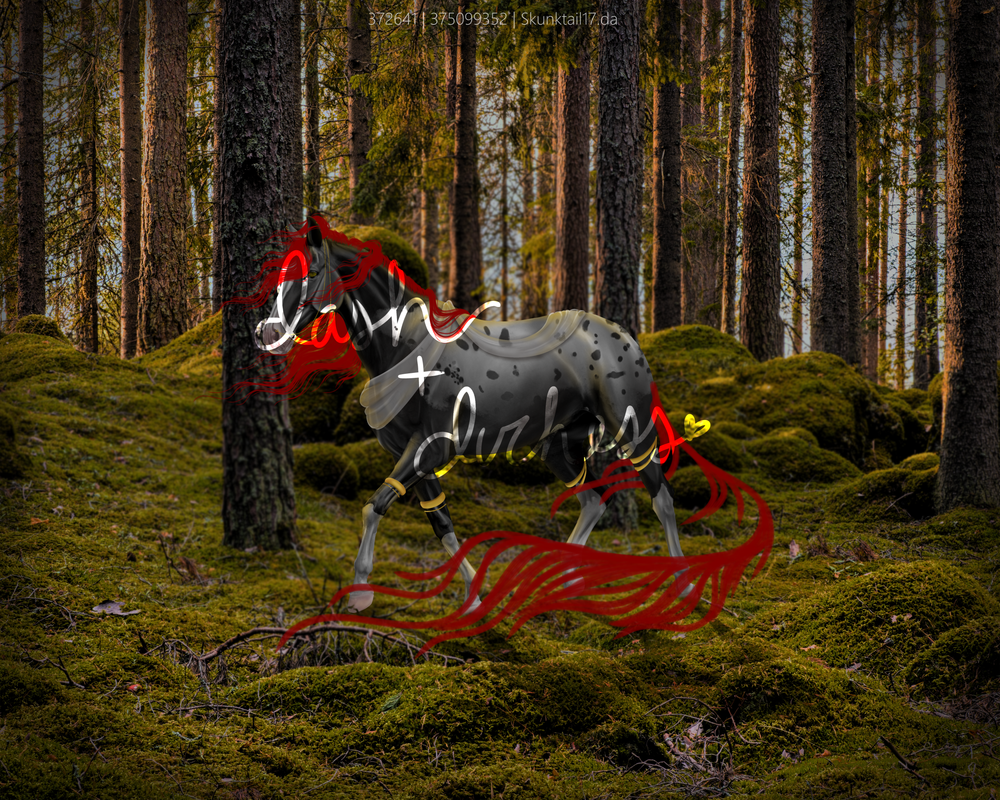
I forgot about this a bit XD but I figured I'd revive it!  this is my most recent piece, but as always I'd love some critique! |
| |
|
| |
|
Hi!! I really love the pose of this one and the composition is just perfect. Plus all of the little details are so cute!!!! My main issue with the piece is the colors. Looking at the background itself, it's super colorful and bright and saturated. However, the horse doesn't match this. I think the face works with the lighting but the abdomen and flank of the horse just seem so desaturated in comparison. I went and stalked through Nat's barns to find the girl and it looks like she's an Amber Champagne. In the piece, the colors look almost palomino-esque because you've emphasized the yellow tones rather than pinks or purples. If I was you, I would add a Soft Light layer above the horse and just add a whole bunch more color. Pull shades from the background and just airbrush over the horse with some super bright pinks and purples and blues. I would suggest sticking to cooler tones in the shadows then warmer tones in the highlights. Should give you something like this... Will come back and write a bit more later... . |
| |
|
| |
|
Gem said:
Hi!! I really love the pose of this one and the composition is just perfect. Plus all of the little details are so cute!!!! My main issue with the piece is the colors. Looking at the background itself, it's super colorful and bright and saturated. However, the horse doesn't match this. I think the face works with the lighting but the abdomen and flank of the horse just seem so desaturated in comparison. I went and stalked through Nat's barns to find the girl and it looks like she's an Amber Champagne. In the piece, the colors look almost palomino-esque because you've emphasized the yellow tones rather than pinks or purples. If I was you, I would add a Soft Light layer above the horse and just add a whole bunch more color. Pull shades from the background and just airbrush over the horse with some super bright pinks and purples and blues. I would suggest sticking to cooler tones in the shadows then warmer tones in the highlights. Should give you something like this... Will come back and write a bit more later... .
Thank you gem!! I really appreciate the critique, i was struggling to implement those purple/pink-y and blue hues, and just couldn't maintain the balance of color accuracy and environmental accuracy (if that makes sense? ToT) Thank you so much for the advice! I'll definitley be embracing those more saturated colors and cooler tones! <3 |
| |
|
 Sunny And Hot