| |

|
 be picky 😤 |
|  |
|
| |
 |
Okay so I absolutely love the detail you put into this hair. Drawing hair is hard as it is, and drawing it well takes a lot of talent. Amazing job. I think my big jab with this piece is that it's dark enough that my eyes are overly drawn to the mane, and I'd like to see a bit more of the face. There is a lot of expression in a horse's eye and I think keeping that part of the horse visible can add a lot to a piece. That is purely personal opinion though. I think if this was lightened a bit so the horse better matched the contrast of the mountains (see how the light hits the trees and mountains?) that it would 'pop' a ton more. Also, slight rippling in the water to create a more natural appearance, you can lightly smudge the reflection to give it less of a glassy look as well. Overall, this is really well done and I really like it
Zomb said:
be picky 😤
|
|
|
| |

|
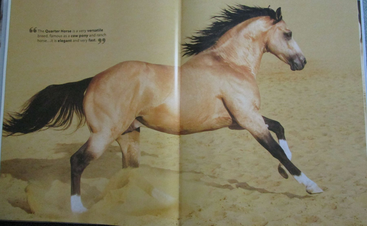
Here's my first golden buckskin. Its made with color pencils. The back ground is washed water colored pencils. I used a Quarter Horse photo in a book as reference. And the bottom photo is the image I used. :) I seam of the book makes it look a bit different. |
|  |
|
| |
|
Hm, the near side ear is covered with some mane. Something doesn't quite look right there. The offside ear might be too light colored? Does the hind legs need some light on them too? I see light on the forelegs and the belly. The tail is being swished to the side. Does it need some light on it? So it can balance the mane a bit. And I agree with Timber, the water could use a tad of smudging. :) Otherwise this is a very stunning piece! I love drafts, I'd love it printed and framed. Or put on a shirt.
Zomb said:
be picky 😤
|
| |
|
| |
|
|
| |

|
OverFieldStables said:
Critiques?
Okay so here's a few things I notice: -Both the horse and the background are really blurry. I'm not sure what your process looked like and why it's blurry, but you want a nice crisp image, that's SUPER super important in order to have all those details and make it look realistic, so if you can not make it blurry that would automatically improve it a ton. -The way you tried to do the grass overlapping in front of the horse doesn't really work. I can tell that you've taken an eraser and erased parts of the horse image to make it look like grass, but because you can't trace every blade of grass exactly, it doesn't look right. A better technique that I use is to paint the grass on top. You take a similar brush to what you've used for the eraser, one that's about the thickness of the grass and that tapers at the end, pick some colours from the grass in the background with an eyedropper tool, and literally just draw grass. It works best to start with the darker colours and then keep painting grass in lighter colours on top, so it looks like the blades of grass in shadow are behind the ones in the light (all of the shades should be eyedroppered from the background). -The shape of the mane and tail aren't very detailed. What I mean by this is that in the mane, I can still see bits of the background from the horse stock image, and the shape of the tail doesn't look very realistic to me. I'd recommend finding a tutorial on painting manes and tails and maybe trying that out, since then you'll be able to control the shape and the way it looks rather than having to cut out the mane and tail from the stock image. I think it's a good effort, and the composition is pretty good! I think with some practice you could really improve! Also don't be afraid to try out different techniques and styles at this point, for things like manes and tails especially, and find something that works for you. Oh, and in the credits, you'll need to specify which site the person you're crediting at on. For example, if you're crediting the account horse-stock on Deviant Art (I just made that up), it would be horse-stock.da |
|
|
| |
|
Edited at October 9, 2021 05:46 PM by Night Shadow Stables
|
|
|
| |
|
Oop. Thank you! I believe if you click on the image it isn't as blurry, but I'm not sure... I definitely had a hard time with the grass. Thank you for giving me tips on that :) Ive tryed doing name and tails but I can not do them 😭😭😭 Thank you so much for all your tips! I will also go fix the crediting!
Night Shadow Stables said:
OverFieldStables said:
Critiques?
Okay so here's a few things I notice: -Both the horse and the background are really blurry. I'm not sure what your process looked like and why it's blurry, but you want a nice crisp image, that's SUPER super important in order to have all those details and make it look realistic, so if you can not make it blurry that would automatically improve it a ton. -The way you tried to do the grass overlapping in front of the horse doesn't really work. I can tell that you've taken an eraser and erased parts of the horse image to make it look like grass, but because you can't trace every blade of grass exactly, it doesn't look right. A better technique that I use is to paint the grass on top. You take a similar brush to what you've used for the eraser, one that's about the thickness of the grass and that tapers at the end, pick some colours from the grass in the background with an eyedropper tool, and literally just draw grass. It works best to start with the darker colours and then keep painting grass in lighter colours on top, so it looks like the blades of grass in shadow are behind the ones in the light (all of the shades should be eyedroppered from the background). -The shape of the mane and tail aren't very detailed. What I mean by this is that in the mane, I can still see bits of the background from the horse stock image, and the shape of the tail doesn't look very realistic to me. I'd recommend finding a tutorial on painting manes and tails and maybe trying that out, since then you'll be able to control the shape and the way it looks rather than having to cut out the mane and tail from the stock image. I think it's a good effort, and the composition is pretty good! I think with some practice you could really improve! Also don't be afraid to try out different techniques and styles at this point, for things like manes and tails especially, and find something that works for you. Oh, and in the credits, you'll need to specify which site the person you're crediting at on. For example, if you're crediting the account horse-stock on Deviant Art (I just made that up), it would be horse-stock.da
|
|
|
| |
|
One more XD Thoughts? Negativity? Positivity? Throw it at me |
|
|
| |

|
I'm not the best at art myself, but I'll give a few really noticable problems. 1. The mane and tail don't match styles at all. The mane is very blended while the tail isn't, since you used a pre-cut It would have been much easier to just leave it unblended. 2. The blending is very pixelated, or in some pleaces its very obvious you used a diffrent opacity to blend compared to the rest of the background. Mostly talking about the top left and the strip on the right. 3. Some places are more blended than others, like the chest looks detailed while the rest of the horse looks incredibly blurry/ blended. Other than that I really like it, manips take ages to perfect. Even then almost no one's peice will be flawless. This is more of a side-note than anything, with the credits if both the horse and backgroud are from the same stock provider you don't need to put the name in twice :) |
|  |
|
 Partly Cloudy, Rain Possible