| |

|
Edited at December 4, 2024 06:20 PM by Circle F Stables
|
|  |
|
| |

|
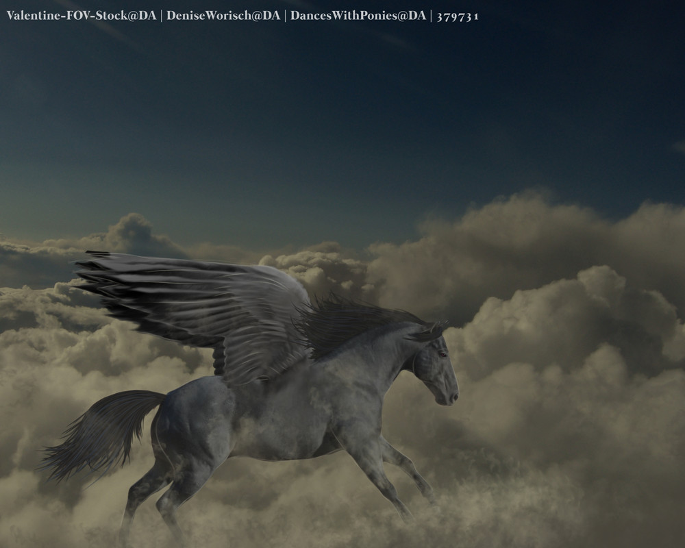
Circle F Stables said:
any tips? my first time adding wings to anything and not amazing with manes and tails but getting there!
I'd say make sure that the wings are rooted closer to/in the shoulder, for anatomy!! Looks gorgeous! |
|
|
| |

|
looking for some critique :D |
|  |
|
| |
|
Circle F Stables said:
any tips? my first time adding wings to anything and not amazing with manes and tails but getting there!
This is so cute!! I'd recommend erasing the part of the mane that goes over the wings, so that they look a bit more even <3 |
| |
|
| |

Art Team
|
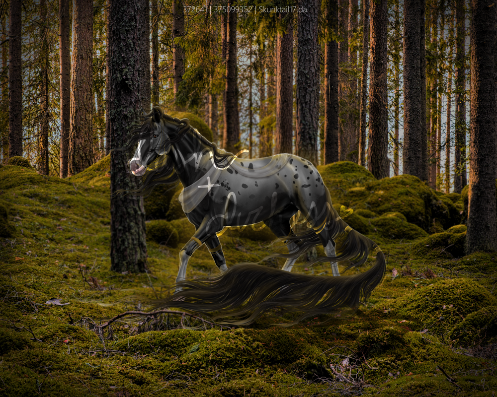
Dash and Duchess said:
looking for some critique :D
Just initial thoughts, the horse seems almost sort of dull. Technically yes the horse is in shadow but it's almost hard to see. I would recommend upping the contrast and brightness of the background and adjust the horse accordingly. You could also darken the foreground (Multiple layer, large dark green airbrush) to draw more attention to the horse. Part of the dullness I think is also the lack of color on the horse's body aside from the yellow highlights. Don't be afraid to add shadows using dark green/brown even though the horse's base coat is black/grey. Almost all black fur has either a dark blue or dark red (brown) undertone which would help make the horse look more natural. . I absolutely love the texture and transluscency of the fabric!! I would just say to be careful about stark white outlines, particularly around the underside of the horse. I understand that you're trying to make the horse stand out a bit more but it just feels unnatural. To achieve a similar effect, I would add a new layer behind the horse, set it to Hard Light, and use an airbursh to create a soft gold outline around the lit parts of the horse, adjust layer transparency and blurring as needed. . The hair is completely gorgeous. I just have a lil question about lighting. Looking at the section of hair in between the horse's back legs, it is highlighted once it emerges from behind the farther back leg. However, this highlight is not carried over to the horse's leg or underbelly. I think it's up to you if that area is highlighted or not but consistency is important ;D Last thing about lighting is that the horse's face has some very strong highlights despite being on the complete opposite side of the light source. Overall, I love the definition of the musculature and the piece as a whole is very very lovely <3 |
|  |
|
| |

|
Looking for an opinion on this art piece, please. **Mod edit** all stock used MUST be properly downloaded and credited |
|
|
| |
Art Team
|
Glacier Bay Cove said:
It doesn't look like you downloaded the Adobe Image which makes it stolen. I'd recommend taking the piece down immediately so you don't get in trouble |
| |
|
| |
|
Gem said:
Glacier Bay Cove said:
It doesn't look like you downloaded the Adobe Image which makes it stolen. I'd recommend taking the piece down immediately so you don't get in trouble
I picked a free adobe stock image for the background
|
|
|
| |
|
I will take it down, I don't want to get in trouble with anybody |
|
|
| |
Art Team
|
The image still needs to be properly downloaded so that the watermarks are removed. If you can do that and add credits for whatever horse you referenced, you'll be all good :) |
| |
|
 Afternoon Showers, Sleet Possible