| |

|
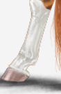
Horse images are pixelated on desktop, Mozilla Firefox, 1920*1080, and visual clarity is gone now. |
|
|
| |

|
Thanks Cadence, the surface pro 'remarks' wraping error is sorted. The remaks box is as before. |
|  |
|
| |

|
This is not so much a bug, but I'm generally confused about the updates. I thought the objective was to create a mobile-friendly layout that we could toggle off if we wanted to continue to use the desktop version, but the desktop version is changing as well. Is there not a way to just continue using the old version? |
|  |
|
| |

|
Ive been getting this popup page when refreshing/chatting and then swapping chats. Specifically on horse page but will update if I notice another "Warning: Cannot modify header information - headers already sent by (output started at /home/horseede/includes/horseachievements.php:3) in /home/horseede/includes/util/misc.php on line 1864
Warning: Cannot modify header information - headers already sent by (output started at /home/horseede/includes/horseachievements.php:3) in /home/horseede/includes/util/misc.php on line 1865" |
|  |
|
| |

Administrator
|
Scout Creek said:
This is not so much a bug, but I'm generally confused about the updates. I thought the objective was to create a mobile-friendly layout that we could toggle off if we wanted to continue to use the desktop version, but the desktop version is changing as well. Is there not a way to just continue using the old version?
The Desktop View toggle is for phones. So that you can see the desktop layout. We are not contining the old version because it's outdated and I'm not maintaining two separate code bases. |
|  |
|
| |
Administrator
|
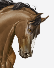
The horse images are back to their normal size now. |
| |
|
| |

|
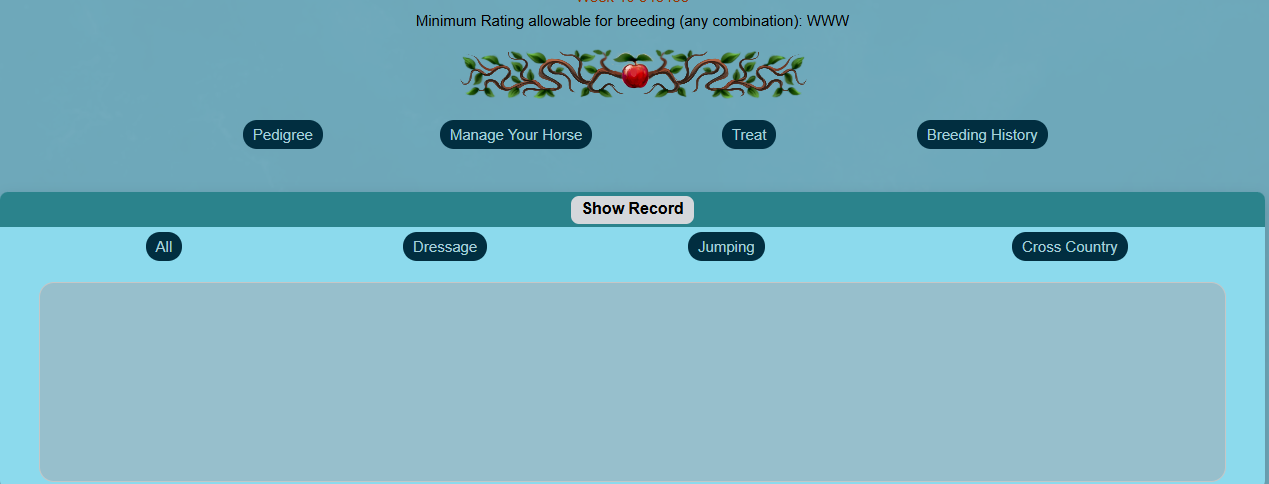
These buttons go really far away from each other when you have a big screen, like me. Their behaviour is one that allows them to wrap as you make the screen smaller. Wouldn't it be possible to establish a fixed width? Like the body container is trying to fill out a ton of space that I think is not necessary. We could have a fixed maximum width, and then it could shrink as you make it smaller. The background can pretty much grow and be white space. It would be a little bit just like how it was before. Pretty sure people would enjoy it more. |
|  |
|
| |

|
The straw page in the vet's office is wonky for me. I use Google Chrome on an HP Envy and Safari on an iPhone. It looks the same on both devices. For entries 14 and 16 the amount of straws spills doesn't extend and instead starts a new row. |
|  |
|
| |
Administrator
|
Shivering Sea said:
These buttons go really far away from each other when you have a big screen, like me. Their behaviour is one that allows them to wrap as you make the screen smaller. Wouldn't it be possible to establish a fixed width? Like the body container is trying to fill out a ton of space that I think is not necessary. We could have a fixed maximum width, and then it could shrink as you make it smaller. The background can pretty much grow and be white space. It would be a little bit just like how it was before. Pretty sure people would enjoy it more.
Show Record buttons are fixed. |
| |
|
| |
Administrator
|
Keeper of the Lost said:
The straw page in the vet's office is wonky for me. I use Google Chrome on an HP Envy and Safari on an iPhone. It looks the same on both devices. For entries 14 and 16 the amount of straws spills doesn't extend and instead starts a new row.
That's because there's not enough room for the whole row. |
| |
|
 Crisp, Clear, and Cool