| |

|
Eve I thought I would let you know what round pens look like on a Win7 Google Chrome Dell Inspiron 1366 x 768 max. It seems to be pretty huge on screen let me show you two things This is at 100% I can only reduce my screen size by 10% at a time, so the next option is 90% and I get this which is hard to see for me. I am hoping this is just a small blip that can be fixed. at 90% |
|  |
|
| |

Administrator
|
PK Rescue Stable said:
Eve I thought I would let you know what round pens look like on a Win7 Google Chrome Dell Inspiron 1366 x 768 max. It seems to be pretty huge on screen let me show you two things This is at 100% I can only reduce my screen size by 10% at a time, so the next option is 90% and I get this which is hard to see for me. I am hoping this is just a small blip that can be fixed. at 90%
I made the round pen table wider. |
|  |
|
| |
Administrator
|
Shivering Sea said:
Any thoughts on what I said earlier regarding setting a max width for the body and letting the background grow? I would love if the body size of the 1920 x 1080 resolution, could be kept on bigger screens like 2560 x 1440 and onwards. I think this measure could kind of return the old view that people desire, while keeping the game responsive for small screens. I have been testing that idea. Used this code in the body with the inspector: max-width: 1400px; margin-left: auto; margin-right: auto; This way the body keeps a maximum of 1400px, the background grows and the body is always centered. Examples Before 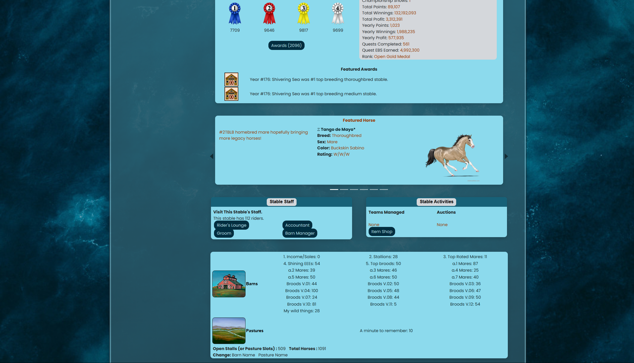
After 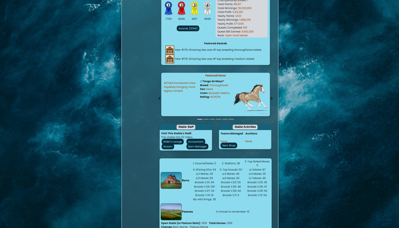
You are the expert coder here, eve. I don't know if any other components could get in trouble cause of this, but I think people would appreciate something like this.
I reduced it to max-width:1500px. I like the larger size, but I get that on large screens it was too wide. |
| |
|
| |
Administrator
|
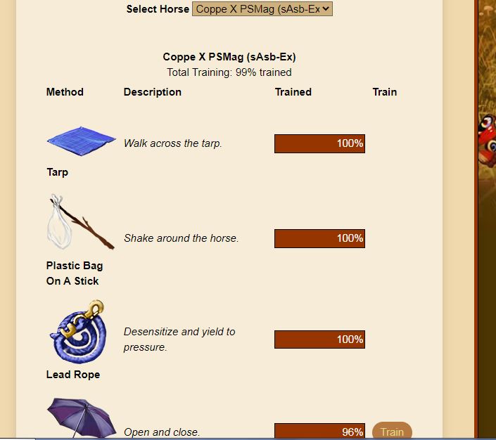
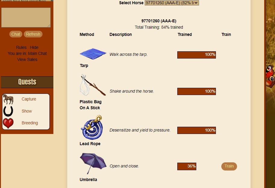
Asfamoth said:
Teeny tiny thing, but when barns and pastures are set to explore view, the submit button is on the right side of the yes/no dropdown column when in a barn, but when viewing a pasture the button is on the left side of the dropdown column. Edit: Also regarding the little apple-leaf decorations at the top of the auction house page, the left leaf is stuck all the way to the side and doesn't float out like the other one. The leaves on individual auction pages seem to be fine though. Edit 2: In the New Tack shop, the preview image for removing notifications for items does not show up.
#1 and #2 should be fixed. I don't think #3 was ever a feature. |
| |
|
| |

|
Cadence Farms said:
Shivering Sea said:
Any thoughts on what I said earlier regarding setting a max width for the body and letting the background grow? I would love if the body size of the 1920 x 1080 resolution, could be kept on bigger screens like 2560 x 1440 and onwards. I think this measure could kind of return the old view that people desire, while keeping the game responsive for small screens. I have been testing that idea. Used this code in the body with the inspector: max-width: 1400px; margin-left: auto; margin-right: auto; This way the body keeps a maximum of 1400px, the background grows and the body is always centered. Examples Before
After
You are the expert coder here, eve. I don't know if any other components could get in trouble cause of this, but I think people would appreciate something like this.
I reduced it to max-width:1500px. I like the larger size, but I get that on large screens it was too wide.
Awesome! Thank you eve 😀 Wider tends to be better to fit more things but it's not HEEs case. At some point it made things go far from each other and it was really confusing. |
|  |
|
| |

|
Thank You so much! :-)
Cadence Farms said:
PK Rescue Stable said:
Eve I thought I would let you know what round pens look like on a Win7 Google Chrome Dell Inspiron 1366 x 768 max. It seems to be pretty huge on screen let me show you two things This is at 100% I can only reduce my screen size by 10% at a time, so the next option is 90% and I get this which is hard to see for me. I am hoping this is just a small blip that can be fixed. at 90%
I made the round pen table wider.
|
|  |
|
| |
Administrator
|
Cloud Peak Stables said:
As I was entering Member Shows, I noticed that only the top dropdown (Level 1) has the searchable function. The subsequent dropdowns are still the old style. Can we have all of them in the new, searchable style? I'm on PC, using Chrome.
Fixed, thanks! |
| |
|
| |

|
Copying this over to keep requests for layout changes in one place :) I would be very appreciative if the tabs underneath carousels that let you skip to a specific section could be made taller and span the entire bottom of the carousel, or be made into tabs. Screenshot of how itty bitty they are on my laptop, haha. If they could be made, for example, 10 pixels tall, I'd have a much easier time clicking on them. Here is what they look like at 10 pixels tall. I use Vivaldi (which is chromium based) for my browser and my laptop is an HP Elitebook. |
|
|
| |

|
I understand that but I can't get the palette off because I can't access my account setting because the toggle is right under my profile picture. But it isn't there. Can you turn my palette off?
Cadence Farms said:
I can't debug your custom palette. They don't work with the new layout. So you'll either need to fix it, or use a different palette.
|
|  |
|
| |
|
I understand that but I can't get the palette off because I can't access my account setting because the toggle is right under my profile picture. But it isn't there. Can you turn my palette off?
Cadence Farms said:
I can't debug your custom palette. They don't work with the new layout. So you'll either need to fix it, or use a different palette.
|
| |
|
 Crisp, Clear, and Cool