Oooh I love critiquing!!!
.
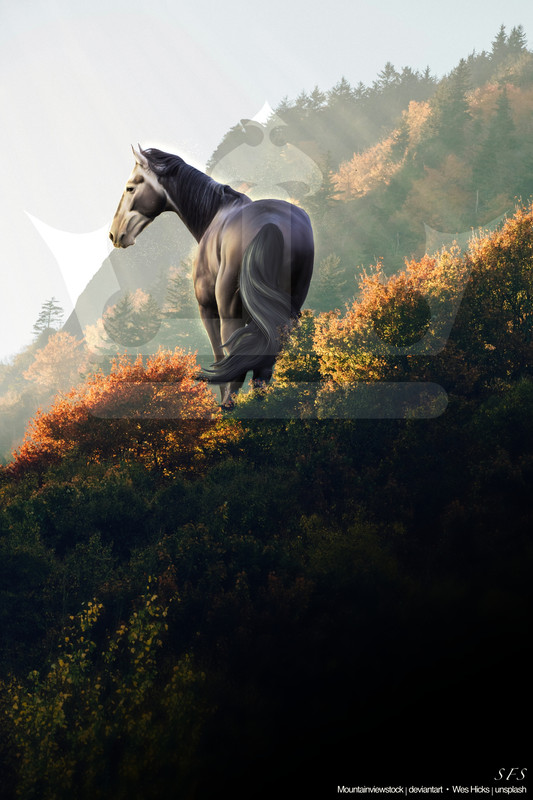
First off, overall I love the piece! The horse seems to fit in well with the scene and you did an incredible job on lighting.
.
First thoughts:
- horse is a little blurry.
Be sure to find quality/sharp stock images, and work on a large canvas size to try to keep things as crisp as possible. A piece can be the most amazing in every aspect but if it's blurry, unfortunately it can't be appreciated to the fullest.
- stock choice
It works quite well actually! You chose a good horse and background lighting combo, and you sized the horse correcty to fit the background. However, in my personal opinion (everyone's tastes are different!) I would like to have the horse a little larger in the frame.
- horse details
Like gem said, I would definitely bring out the eye! I personally repaint mine, so I add a brown oval and shade it, then a black oval iris, and then a dot for a white highlight. My eye technique is fairly simple lol.
- shadows
I personally like how dark your shadows are, I like to have mine pretty distinct as well, especially on the face. This type of grey is hard because the darker grey patches can be mistaken as shadows/mess up how you want the horse to look. If you look at how the bushes are, theyre more backlit than you made the horse, so I would personally darken the tail/bum a bit in the center to show that. (I only noticed this on the second glance).
- hair
I like how you've done the hair! It looks gorgeous and I love the strands and details. I think the tail looks a bit stiff, but that just comes with practice so I don't think it's much to worry about. I think you used the original stock hair for the mane? That or you did a super realistic job lol. I think adding a little bit of highlights to the ends could've helped, but if it's part of the OG stock then I don't know how you'd go about that.
.
Overall this piece is gorgeous and I'm so excited to see more of your art in the future! Welcome back to the art realm!
 Heavy Rain