| |

|
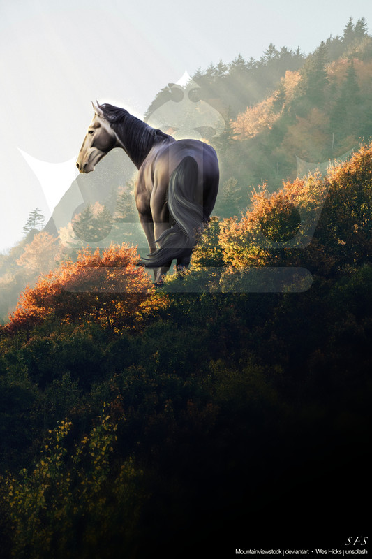 Click Clickwould appreciate any critique on my art! I'm a bit rusty as I haven't done Manips in MONTHS note: I do try to go for more of a realistic looking piece, which I know isn't generally the preference in HEE |
|
|
| |

Art Team
|
Hi!! So if you're aiming for realism, the biggest things to work on are lighting and texture. I love the yellow highlights you have on the left side of the horse, they're really beautiful ^^
However, there are some really dark shadows on the face that don't quite make sense. Especially looking at the bridge of his nose and his cheekbone below the eye. I definitely agree there should be shadows there but they're a bit too dark as is with the entire face in light. Same with the top of the mane and his back, although there is a light source from the left, the entire sky is still light so I'd definitely curve the highlights over the rest of him a bit more. . Regarding the texture, if you want a super realistic look, I don't this smudging is quite the way to go. I'm not the best artist to ask for techniques on this one because I repaint everything but I'm imagining something more like Charmed Acres Or my absolutely favorite artists for texture that aren't super active anymore are HRS and Breezie - both of which I have examples of in my bio . And I guess these might be personal touches but I would love to see more depth in the eye. Currently it looks very flat/black which takes away from the lifelike-ness. I would suggest at least adding a highlight if not an iris. (This could be the result of the image quality, in which case a larger canvas size may help too :D) Last thing, I personally would probably add a shadow that the horse is casting onto the plants on the right. Yes this could be argued that the plants are behind where the horse is standing but at least some of them would likely be less bright. . In general, great work with the colors and excellent start on the lighting. The tail looks wonderful!! I hope this helps and please feel free to let me know if you'd like clarification or more help with anything <3 |
|  |
|
| |
|
I didn't actually shade much of the face haha 😅 it was jsut the horses markings but I agree it does look a little odd in places
Gem said:
Hi!! So if you're aiming for realism, the biggest things to work on are lighting and texture. I love the yellow highlights you have on the left side of the horse, they're really beautiful ^^
However, there are some really dark shadows on the face that don't quite make sense. Especially looking at the bridge of his nose and his cheekbone below the eye. I definitely agree there should be shadows there but they're a bit too dark as is with the entire face in light. Same with the top of the mane and his back, although there is a light source from the left, the entire sky is still light so I'd definitely curve the highlights over the rest of him a bit more. . Regarding the texture, if you want a super realistic look, I don't this smudging is quite the way to go. I'm not the best artist to ask for techniques on this one because I repaint everything but I'm imagining something more like Charmed Acres Or my absolutely favorite artists for texture that aren't super active anymore are HRS and Breezie - both of which I have examples of in my bio . And I guess these might be personal touches but I would love to see more depth in the eye. Currently it looks very flat/black which takes away from the lifelike-ness. I would suggest at least adding a highlight if not an iris. (This could be the result of the image quality, in which case a larger canvas size may help too :D) Last thing, I personally would probably add a shadow that the horse is casting onto the plants on the right. Yes this could be argued that the plants are behind where the horse is standing but at least some of them would likely be less bright. . In general, great work with the colors and excellent start on the lighting. The tail looks wonderful!! I hope this helps and please feel free to let me know if you'd like clarification or more help with anything <3
|
|
|
| |

|
Oooh I love critiquing!!! . First off, overall I love the piece! The horse seems to fit in well with the scene and you did an incredible job on lighting. . First thoughts: - horse is a little blurry. Be sure to find quality/sharp stock images, and work on a large canvas size to try to keep things as crisp as possible. A piece can be the most amazing in every aspect but if it's blurry, unfortunately it can't be appreciated to the fullest. - stock choice It works quite well actually! You chose a good horse and background lighting combo, and you sized the horse correcty to fit the background. However, in my personal opinion (everyone's tastes are different!) I would like to have the horse a little larger in the frame. - horse details Like gem said, I would definitely bring out the eye! I personally repaint mine, so I add a brown oval and shade it, then a black oval iris, and then a dot for a white highlight. My eye technique is fairly simple lol. - shadows I personally like how dark your shadows are, I like to have mine pretty distinct as well, especially on the face. This type of grey is hard because the darker grey patches can be mistaken as shadows/mess up how you want the horse to look. If you look at how the bushes are, theyre more backlit than you made the horse, so I would personally darken the tail/bum a bit in the center to show that. (I only noticed this on the second glance). - hair I like how you've done the hair! It looks gorgeous and I love the strands and details. I think the tail looks a bit stiff, but that just comes with practice so I don't think it's much to worry about. I think you used the original stock hair for the mane? That or you did a super realistic job lol. I think adding a little bit of highlights to the ends could've helped, but if it's part of the OG stock then I don't know how you'd go about that. . Overall this piece is gorgeous and I'm so excited to see more of your art in the future! Welcome back to the art realm! |
|  |
|
| |
|
Yeah I tend to work on a REALLY big canvas ( 2600-4500) so unfortunately my pieces can end up looking a bit fuzzy due to HEEs compression. i appreciate the critique on this ! Thankyou very much to both of you |
|
|
| |
|
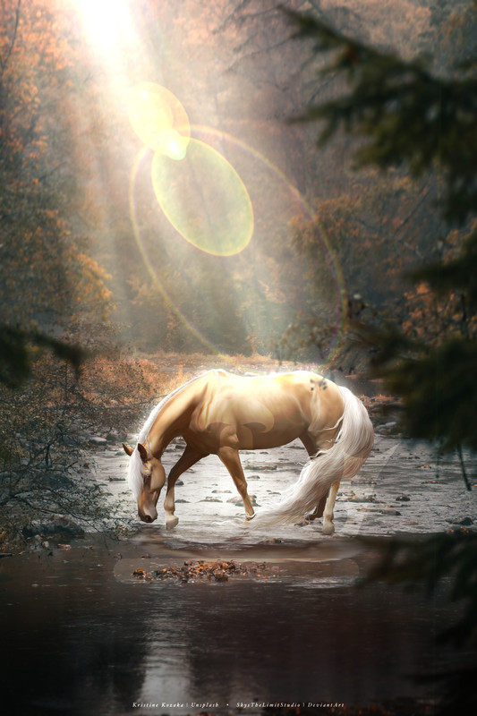 Please click Please click hi! I have another piece for yall to critique :)) PLEASE PLEASE click the link to view the higher quality version, the HEE compression hides a lot of details and/or flaws! Ps: you have to click the image in the link to access the uncompressed version |
|
|
 Sunny
Sunny


