| |
 |
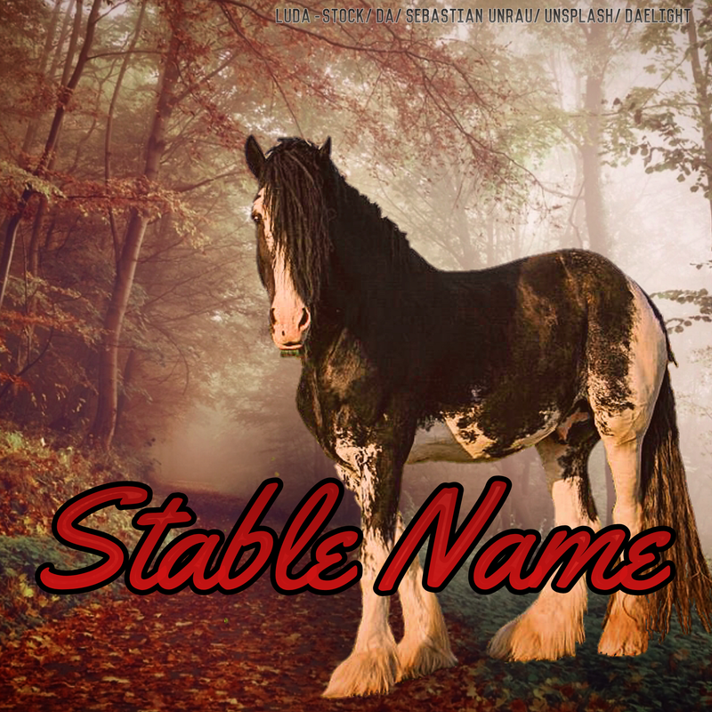
• • • • My most recent Manip. I have some of my very first ones In my bio if you want to see how much I've grown. I've been pricing 45 to 60k and it usually gets bought (AB) in a day or two. So I think I need to raise prices, but what do you guys think? I personally see a few issues but I'm pretty hard on myself. |
|
|
| |

Rumble Team |
I'm not at all good when it comes to pricing, but I do see many places where this image in particular can be improved. I personally wouldn't raise prices yet, but if you feel that your art is selling too well, you can always try to raise and see if you keep your customers. If interest drops, you can always just lower back the prices. |
|  |
|
| |
|
HRS said:
I'm not at all good when it comes to pricing, but I do see many places where this image in particular can be improved. I personally wouldn't raise prices yet, but if you feel that your art is selling too well, you can always try to raise and see if you keep your customers. If interest drops, you can always just lower back the prices.
The main thing in it that bothers me is the shadow is messed up and I MISSED a spot -_- under the chin. Which I'm super mad about but was an honest mistake. Also one back foot bothers me. |
|
|
| |
|
Daelight said:
HRS said:
I'm not at all good when it comes to pricing, but I do see many places where this image in particular can be improved. I personally wouldn't raise prices yet, but if you feel that your art is selling too well, you can always try to raise and see if you keep your customers. If interest drops, you can always just lower back the prices.
The main thing in it that bothers me is the shadow is messed up and I MISSED a spot -_- under the chin. Which I'm super mad about but was an honest mistake. Also one back foot bothers me.
I didnt even notice the spot under the chin until you said it. It's beautiful. I'm not an artist but as a buyer I think it would be worth 60 to 70k from what I've been looking at. I've seen worse go for more. |
|
|
| |
Rumble Team |
I wasn't sure if you're looking for only pricing help or detailed critique. If you'd like critique you can also post it in the art critique forum here :D People are really helpful. What I can see here just with a quick look are the following: 1) Grounding: The horse is missing its drop shadow and the hooves should be covered by leaves on the ground. 2) Shading: I feel that the lighting of the background doesn't match that of the horse. The background doesn't have very strong shadows and lights, it's a dim setting, but the horse has a bright yellow to orange shine as if it stood in a sunset setting. 3) Cutout: Not sure how was the horse on the original image, but here the left hind leg of the horse (the one which is closer to us onlookers) looks like it had parts cut off. But it may be because of how the long hairs stay on it :D 4) Colors: I briefly mentioned above at the shading that the horse has a much yellowish hue than the background. The color warmth and saturation of the background and horse should match as closely as possible, so either add some yellow to the background, or dim the light on the horse. I'm sure that the critique forum will give a much more detailed suggestion than my barely woken up mind thought up lol
Daelight said:
HRS said:
I'm not at all good when it comes to pricing, but I do see many places where this image in particular can be improved. I personally wouldn't raise prices yet, but if you feel that your art is selling too well, you can always try to raise and see if you keep your customers. If interest drops, you can always just lower back the prices.
The main thing in it that bothers me is the shadow is messed up and I MISSED a spot -_- under the chin. Which I'm super mad about but was an honest mistake. Also one back foot bothers me.
|
| |
|
| |
|
HRS said:
I wasn't sure if you're looking for only pricing help or detailed critique. If you'd like critique you can also post it in the art critique forum here :D People are really helpful. What I can see here just with a quick look are the following: 1) Grounding: The horse is missing its drop shadow and the hooves should be covered by leaves on the ground. 2) Shading: I feel that the lighting of the background doesn't match that of the horse. The background doesn't have very strong shadows and lights, it's a dim setting, but the horse has a bright yellow to orange shine as if it stood in a sunset setting. 3) Cutout: Not sure how was the horse on the original image, but here the left hind leg of the horse (the one which is closer to us onlookers) looks like it had parts cut off. But it may be because of how the long hairs stay on it :D 4) Colors: I briefly mentioned above at the shading that the horse has a much yellowish hue than the background. The color warmth and saturation of the background and horse should match as closely as possible, so either add some yellow to the background, or dim the light on the horse. I'm sure that the critique forum will give a much more detailed suggestion than my barely woken up mind thought up lol
Daelight said:
HRS said:
I'm not at all good when it comes to pricing, but I do see many places where this image in particular can be improved. I personally wouldn't raise prices yet, but if you feel that your art is selling too well, you can always try to raise and see if you keep your customers. If interest drops, you can always just lower back the prices.
The main thing in it that bothers me is the shadow is messed up and I MISSED a spot -_- under the chin. Which I'm super mad about but was an honest mistake. Also one back foot bothers me.
I do appreciate the critique. I didn't really notice yellow vs red difference. It's a bit harder for me as I'm partially colorblind(I have issues seeing the difference in yellow/red/oranges). I usually have a friend look over it for me first but the friend was asleep when I made this one. I do love it still though! Do you think you could tier me please? I honestly don't know which tier I should be in. I have some skills of a level 2 but there are times I utterly fail at tier 1 skills too haha! |
|
|
| |
Rumble Team |
Oh you did a really neat job then :) I would put you in high tier 3 or mid-low tier 2 based on your confidence for custom orders and complex patterns/markings. Some customers can be really exact with their wishes lol
Daelight said:
HRS said:
I wasn't sure if you're looking for only pricing help or detailed critique. If you'd like critique you can also post it in the art critique forum here :D People are really helpful...
I do appreciate the critique. I didn't really notice yellow vs red difference. It's a bit harder for me as I'm partially colorblind(I have issues seeing the difference in yellow/red/oranges). I usually have a friend look over it for me first but the friend was asleep when I made this one. I do love it still though! Do you think you could tier me please? I honestly don't know which tier I should be in. I have some skills of a level 2 but there are times I utterly fail at tier 1 skills too haha!
|
| |
|
| |

|
I say High Tier 3. Get some customers, see how many people are interested, and see how you handle all the orders. Then I would say move up to low Tier Two :) |
|  |
|
| |

|
Yep, tier 3. A lot of people price art auctions higher than they'd do in their regular shop. Personally I'd say 20-30k is a good price, especially if this is your first art shop. Start small and work your way up ;) |
|  |
|
| |
|
I agree with Emerald and a lot of the other things people have said. Your art looks mostly like cutting out the horse is the extent of the manipulation to the horse stock, I haven't seen any body prep, repainting to fit lighting, fixing blemishes, or repainting manes and tails so I would start in tier 3 and maybe experiment with those types of things. |
|
|

 Steady Rain all Day