| |

|
So classic me and I have hurt myself quite badly. Stuck at home for the next couple of days and can only sit down for 15 minutes at a time so art is off the cards for the next week at least. So to curb my insanity a bit I am creating this thread.
If you would like a critique please post the following: - 2 artworks (the more recent the better) - What tier you are in - what you struggled with in the piece or in general - what program you used I will try to give general feedback on your whole technique and overall feel of the image, criqitues on specific parts of the piece, general areas of improvement for the future, any advice or tips for where you are struggling and what you nailed.
While I will not be a Gordon Ramsay with "you are an idiot sandwich" this will be honest feedback and I can and have picked apart pieces very thoroughly before (Breezie can attest to that).
If you are after glowing praise of your latest artwork please do not comment as you will be disappointed. If you are after an honest review of your works feel free to comment |
|
|
| |

|
im in tier 2 and would like some critique on my art. I struggled with body prep and with lighting and shading i use ibis paint as my program |
|
|
| |

|
im a tier 3 artist wanting to move into tier 2 soon. I struggle with painting hair and I use pixlr E and photoshop on an ipad.
Edited at November 4, 2020 02:12 AM by Madsie Manor |
|  |
|
| |
|
Wings Of Glory said:
im in tier 2 and would like some critique on my art. I struggled with body prep and with lighting and shading i use ibis paint as my program
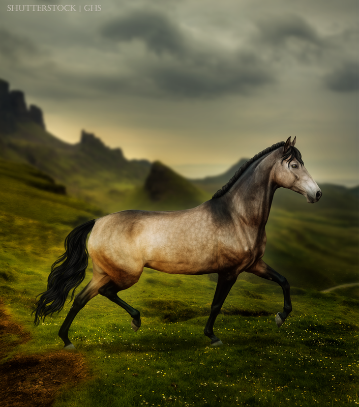
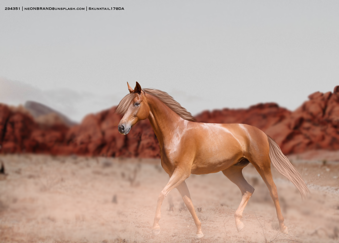
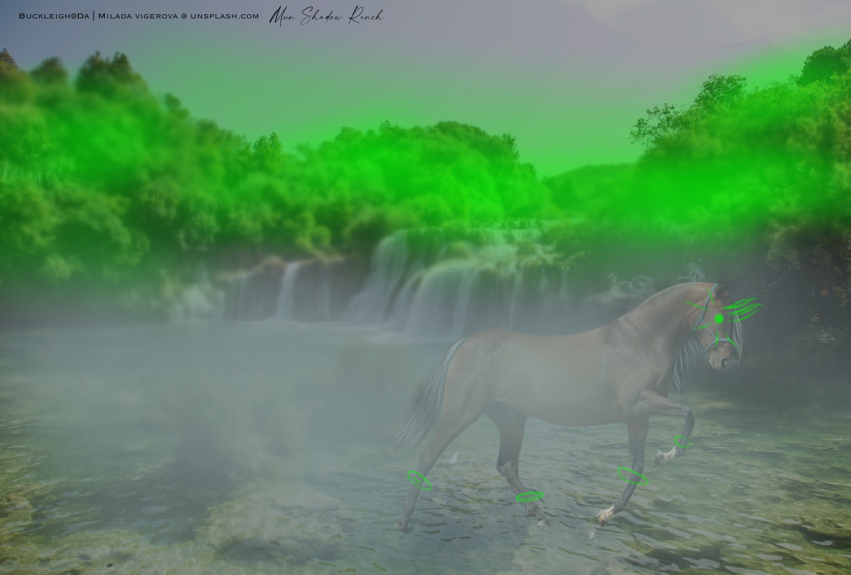
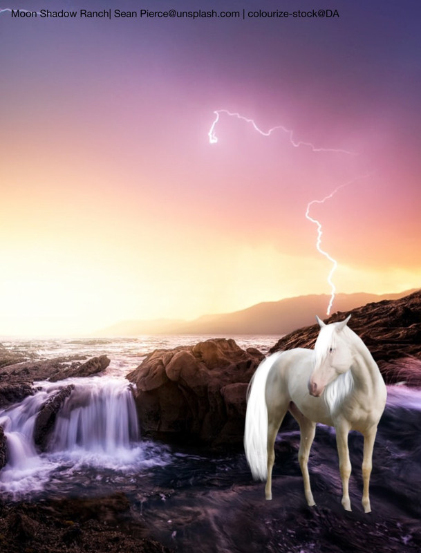
Hey Wings, first off I just want to say I’ve been watching the stuff you’ve been pumping out recently and some of them have been beautiful. I really loved the dapple grey in the field. Both horses have been beautifully colour matched into the background and really ties the image together. The body prep between both images is very consistent as well and quite smooth. If you are after a smoother effect consider duplicating the horse layer and smudging it on a higher level than you would usually do (for me I smudge on 15% and when I use this technique I smudge on 30%). Create a duplicate layer and then repaint over this. When you repaint colour pick from the smudged horse when and repaint on a soft brush with various opacities when needed. Your manes need a bit of work and I feel they are the main part letting the image down. Part of this does tie into lighting as well. They are currently being painted in quite fat and even clumps. Have a look at this gallery: https://www.deviantart.com/danceswithponies/gallery/67494764/andalusian-stock Have a study on how the hair falls and part and then how light bounces off it. Work on unevenness and more natural movement. Push your shadows and highlights more extreme to get a more realistic effect. Your Friesian is good just lacks definition in the fall of the mane making it look messy. For the IT pony the main thing throwing this off is the scale of the horse. You have a very powerful image with a strong confronting horse. Yet it only fills less than half the background. Make the horse a lot bigger and push the shadows and you would have a very strong horror theme going. Don’t be afraid to research and actually study scenes from movies if you are doing something themed. Otherwise there is very little I would change about this image :) For your Friesian there’s a couple of awkward things that throw this piece off. The background has lighting which should make the horse backlit yet the main shadow stretches out an awkward angle to the horizon. The shadow realistically needs to stretch towards the viewer in the opposite line of the sun. So pretty much flip it vertically if that makes sense. If you ever struggle to pick where the shadows lie try and find one cast in the background and match to that. With the highlights, I really like the ones you did. Tweaking them to a slight warm bright yellow and defining the belly and right foreleg will help define the image further. Currently it’s hard to define the pace as the front and black leg blend together a bit. Personally I’m not a fan of the no tail, I think it could have really added balance and juxtaposition to the image by having a long busy tail dragging in the water catching the sun. This would have helped ground the horse further. Also adding water spray and flying sand would have been a nice finisher. I do like the overall piece though and it’s a very fresh and fun themed piece. If you have any further questions feel free to ask. I hope this helps Wings :D |
|
|
| |

|
Hi Bell! This is very kind of you :) I would love you to pick apart these two. Your wisdom is so helpful I am in Teir 1 and I use Gimp. As far as the 1st piece goes, I primarily struggled in getting the "stiffness" out of the piece. I don't think I was successful in that endeavor, and having to make it a cropped mane definetly didn't help. I tried to put a little bit of motion in the clouds to help. I think the horse looks "brickish". I also felt like the background was a little busy, and I struggled to incorporate the ruins and the ligtning while still making it look "united". In the 2nd piece, I struggled with the horns on the body for such a long time, but I don't think they turned out too terribly. A part that I also struggled with is how the sky merges with the rock; I think the lighting is pretty iffy there. Thank you so much- do your worst! ;) I think me writing this out atually helped me pinpoint what was bothering me. I hope you get better soon!! |
|
|
| |

|
I am in Tier 1 and I use Photoshop. I feel like I am not really consistent accross pieces especially with the manes and tails. I have been trying to improve on my lighting and making the piece feel realistic. The arab piece, I'm not too satisfied with I don't know what is off about it and hopefully you can pinpoint what that was. Thank you so much for doing this! |
|  |
|
| |
|
Madsie Manor said:
im a tier 3 artist wanting to move into tier 2 soon. I struggle with painting hair and I use pixlr E and photoshop on an ipad.
Hey Madsie, What a great start to your journey you are showing me here. I quite like your artistic vision and am interested to see how you develop it further. There are two main things I would work on before you make the jump up to tier 2; grounding and hair. Your second image is grounded a lot better than the first but still lack shadows. Keeping shadows in mind and your directional light when grounding your horse is important. A horse’s shadow will always be cast in the opposite direction of the main light source. When I do shadows I roughly draw in black where the shadow will lie in the shape of the horse and then blur it moderately and then put the layer on multiply. For lighting on the horse pick highlights and shadows from the background and create a clipping mask and draw on where general highlights and shadows should be. Once these are done guassian blur them so they are soft and set the layer to soft light. For manes work on creating flowing manes and tails. Break it down from tertiary shapes (the whole tail or mane), secondary shapes (clumps) and primary shapes (individual strands or smaller locks of hair. This walkthrough here is a great way to study building up shadows and highlights in manes and tails. https://www.deviantart.com/yewrezz/art/Mane-walkthrough-492961005 In your first image there are a couple of things to watch out for. When cutting out your horse make sure you have no left overs from the background and it is nice and smooth (Like the bay pony). When doing a glowing orb or object with a horse make sure there is bounce light on the horse. That might mean you use a fine hard round light to highlight areas where the light would catch eg. Jawline, chest, top of the legs When grounding your horse make sure the legs are blended in smoothly to the grass or foliage if that’s where the horse is standing. If it’s rock of hard ground you need to always see the leg. On your second image I really like the overall appeal of the image it’s super cute. I feel the lighting works very well. However on further inspection your pony is actually a giant horse as it seems to be standing in a valley of trees. It kinda works but it is quite off putting as there are no other aspects suggesting that this horse is meant to be big though. So keep that in mind for future when picking backgrounds. I do love how you have grounded in the pony though!! I hope this helps Madsie |
|
|
| |
|
Polaresta Elites said:
Hi Bell! This is very kind of you :) I would love you to pick apart these two. Your wisdom is so helpful I am in Teir 1 and I use Gimp. As far as the 1st piece goes, I primarily struggled in getting the "stiffness" out of the piece. I don't think I was successful in that endeavor, and having to make it a cropped mane definetly didn't help. I tried to put a little bit of motion in the clouds to help. I think the horse looks "brickish". I also felt like the background was a little busy, and I struggled to incorporate the ruins and the ligtning while still making it look "united". In the 2nd piece, I struggled with the horns on the body for such a long time, but I don't think they turned out too terribly. A part that I also struggled with is how the sky merges with the rock; I think the lighting is pretty iffy there. Thank you so much- do your worst! ;) I think me writing this out atually helped me pinpoint what was bothering me. I hope you get better soon!!
Alright Moony here we go. I’m going to do this a bit differently and go through image by image and then general areas. So I’m just going to jump right into it but I feel like the stiffness you are talking about could be fixed with warping the background to look like a fish eye lens. As you said everything is rigid and stiff and kind of clashes with each other. The pose is very powerful and unique but is very angular with no juxtaposing secondary lines of motion. Warping the horizon to mimic a fish eye lens will create a level of movement and momentum that will counter balance the horse. If you were to curve the horizon on a diagonal so it gently sweeps around the horse and furthers the hierarchy that you see the horse first I believe you could relieve the stiffness feeling. Also adding in loose strands I’m the tail could help soften the rigidness of the horse. I’m always down for a dramatic cloudy sky and I don’t think it’s it busy. However I would position the clouds so there is a larger lighter sky area around the horse’s top half creating the silhouette effect. Overall I think the lighting needs a bit of polishing it’s quite inconsistent overall. The beautiful halo lighting doesn’t follow though up the neck of the horse and the head just appears that touch to dark in lighting compared the rest of the horse. Furthermore with the positioning of the horse the gradual light on the tummy comes to far in and I think this adds to the rigidness of the horse. I thinking tweaking with the lighting will help bring the elements of this image together in more harmony. Overall I still this is a beautiful image and I would be so happy to add this to my art hoard. Moving onto the second image I feel like the positioning of the horse and background is more complementary than the first image. Once again however the overall lighting of the piece is off and just sits a bit awkwardly. The belly and tail are too illuminated and seem to be creating their own light which doesn’t tie in with the mane. I would personally tone down the underside lighting a lot. The mane seems very flat lit and and just doesn’t have the highlights that you would expect with the rest of the body so illuminated. I would get a hard brush and paint in illuminated gold fly away strands to match the level of lighting in the back. I like the effect of the horns coming out of the horse and they are painted superbly. The one think I would tweak is the actual muscle definition of the horse underneath. You don’t get huge heavy horns like that erupting from the skin without having an underlying muscle mass to support it. Look at elephants and rhinos and you can see how the skeleton and muscle supports the tusks or horns. By adding muscle definition underneath where the horns are you will add a another level of realism to this piece. Horses with horns on their neck I will always paint a thicker neck to help support the horns. Another small tweak to this piece would be the positioning of the tail. Anatomically and ergonomically for a horse to be in motion with such a long tail (with bone) it doesn’t quite work for it to be physically in between its legs. The horse could very likely step on it and rip it off. If you are ever wondering how to position a long tail look at snow leopards or cheetahs those cats are like 80% tail and you can see how they counter balance themselves with it in a variety of poses and movements. Furthermore by positioning the tail up it would have been a chance to add secondary lines of movement and hierarchy into the image. The cliff face I think would have blended in better without the golden light. Simply blurring it into the background with the light blue might have balanced it a bit better as the current lighting draws the eye away from the horse slightly having that brightly lit negative space so high up. The colour change on this horse I just have to say is stunning and the physical technique of your hair style is fabulous. Overall moving forward I would consider more time and effort into developing multiple lines of actions that add subtle depth and further movement to your pieces. Having a Google search and read through of that is a good start to learn more about it. Keeping an eye on your lighting overall with the horse as well is something to work on going forward. Generally your bellies on the horses are a bit too well lit considered with other areas and aspects. Practise doing a head shot with different lighting styles like this (links below) to help give you a style guide moving forward. This will also help give you a self made guideline for consistency. https://www.deviantart.com/aycasnis/art/How-Light-affects-the-face-196115836 https://www.deviantart.com/crystalrain272/art/Lighting-Reference-for-Face-780213510 You are a wonderful artist Moony and in my top 10 to stalk on HEE and DA. Very honoured you came to me for some feedback and I really hope this helps you. I’m happy to answer further questions you may have from my feedback. |
|
|
| |
|
Oh thank you so so much, that helped a lot! I will definetely be keeping in mind all of that for my future work :) Bless you for your time and effort you put into that thorough critique! |
|
|
| |

|
I use Ibis Paint as my program and I am in Tier 3! I struggle a lot with body prep as I often don't know what to do to properly do body prep. |
|
|

 Light Rain then Clearing Overnight