| |

|
Basically what the title says. What's wrong with my art? How can I improve? 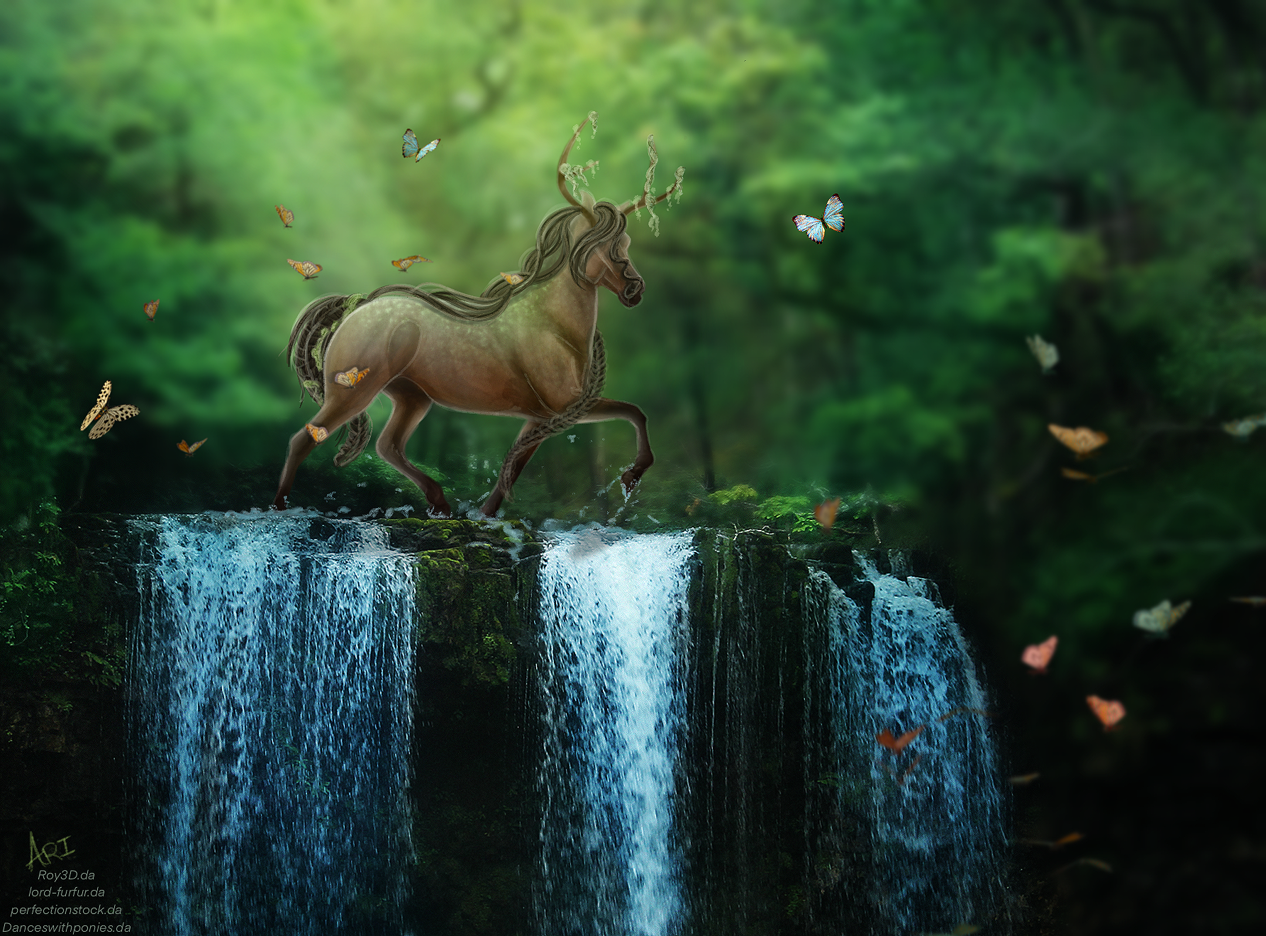
|
|
|
| |
|
|
| |
|
Quizzical Quarters said:
Stilling looking.
|
|
|
| |

Rumble Team |
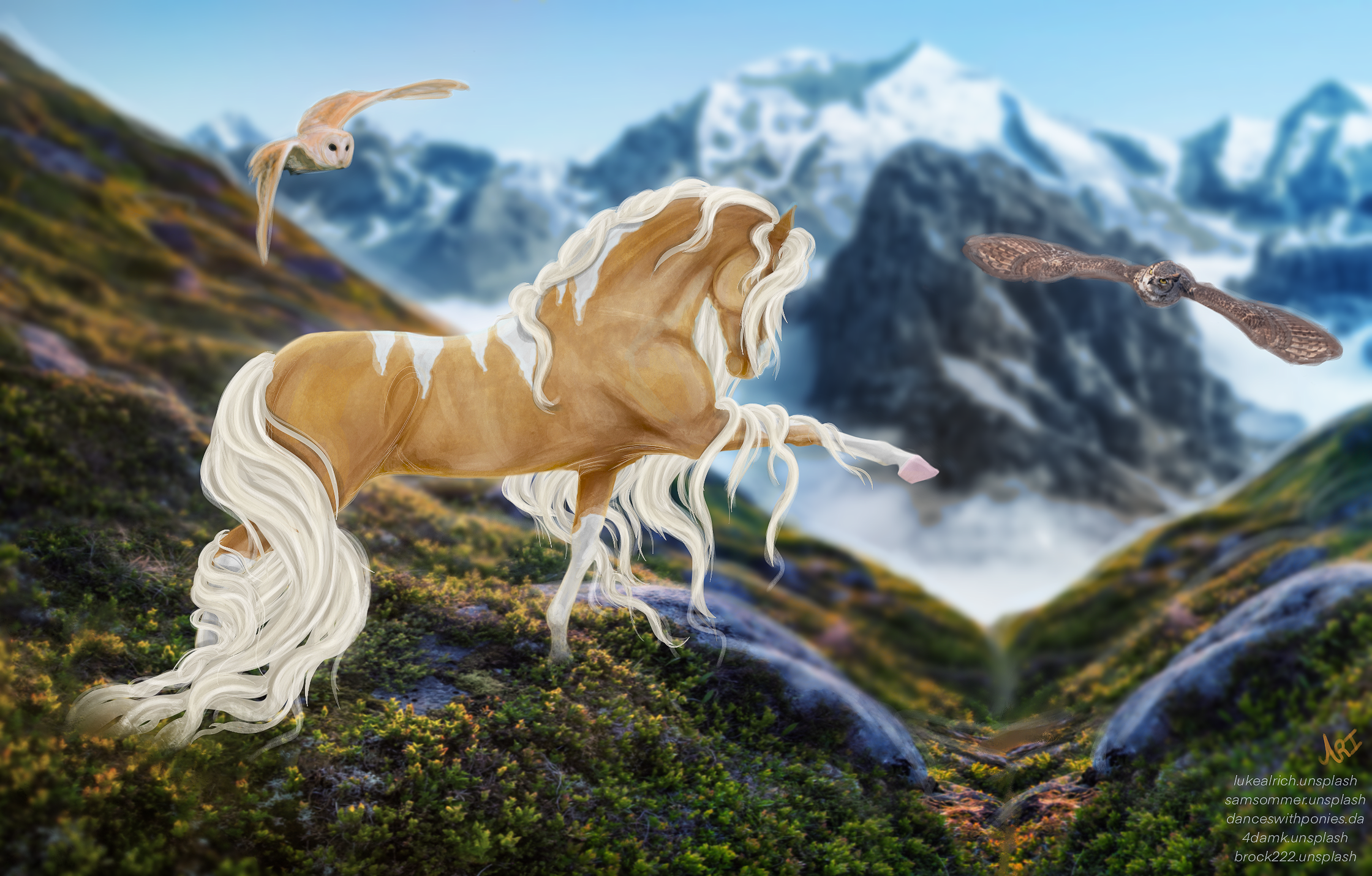
I'm half asleep so can't really go very in depth now, but there is one thing I can point out immediately: Your horses look as if they were hand drawn with colored pencils - absolutely beautiful by the way - but the background doesn't match this so they feel a bit like stickers on the image. I also miss shadows from the horse's body, mainly on the second example, but in my opinion the first one could use some more dramatic lighting since the background is also quite contrasty. |
|  |
|
| |
|
Thank you so much for the feedback!
HRS said:
I'm half asleep so can't really go very in depth now, but there is one thing I can point out immediately: Your horses look as if they were hand drawn with colored pencils - absolutely beautiful by the way - but the background doesn't match this so they feel a bit like stickers on the image. I also miss shadows from the horse's body, mainly on the second example, but in my opinion the first one could use some more dramatic lighting since the background is also quite contrasty.
|
|
|
| |
|
|
| |

|
Gosh I love your art Ari 🥺 |
|  |
|
| |

|
Your style is not something I feel I could really give a good critique on. The only few things I could offer: - work on matching contrast to the BG better. - stop putting hair over the eyes in all your pieces. The eye is such an IMPORTANT part of overall emotion and expression. Without emotion/expression pieces are very much flat. |
|  |
|

 Light Rain then Clearing Overnight

