| |

|
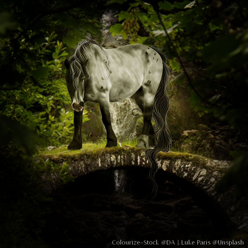
Okay so here we go! --- I am needing some help on a few things. More specifically - Critique - Shop prices/ Tier level (Currently a Tier 2, with most prices betwewn 50-55k) - Which body prep looks better or more appealing? (First 2 or last 2) - Hoof help please! *I ask that you give a critique, and then a way to improve it if possible* Thanks in advance! Now the art: 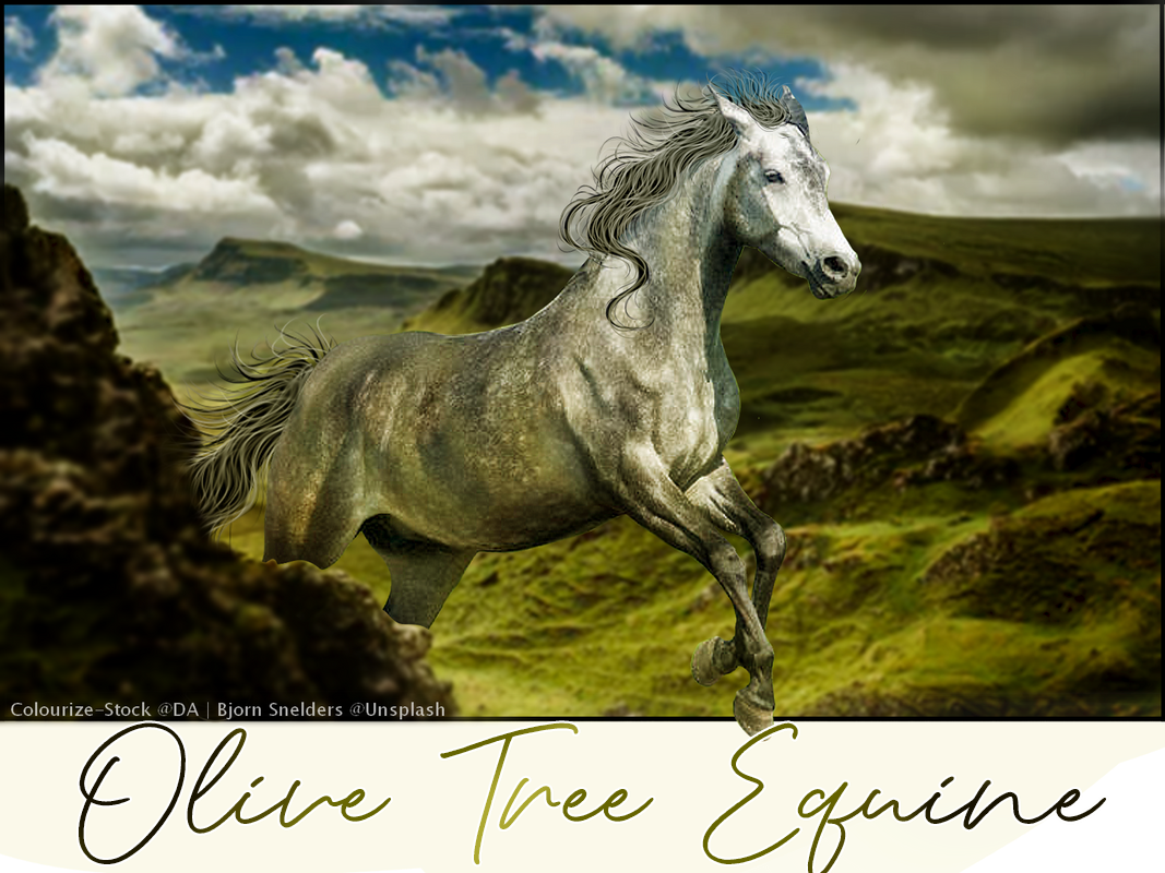
|
|  |
|
| |

|
I love the second piece all your work is beautiful <3 |
|
|
| |

|
I know nothing about art but I'd probably pay 75-100k for yours. |
|
|
| |
 |
Psst, Caal did this for me Also, I second this:)
Mediterranean said:
I know nothing about art but I'd probably pay 75-100k for yours.
|
|
|
| |

Moderator |
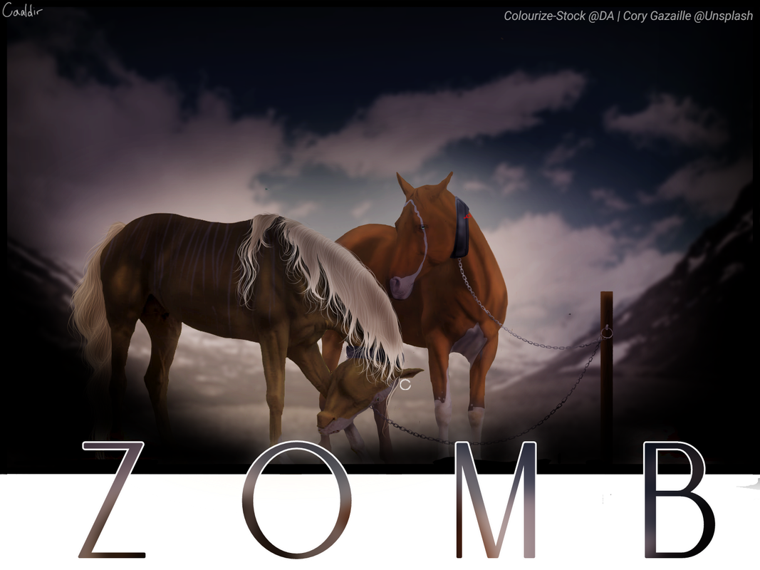
Well at first glance I'm questioning where the ears in the last piece disappeared to xD BUT ANYWAYS, in the piece for Zomb, the first thing that I notice is the mane of the front horse. In some places you have nice strands that are wavy and look really good. Then between these pieces, it goes straight and it appears you just made individual strands over that, yet they don't hide the harsh straight line (if that makes any sense). I also feel like the hair could be a bit less messy if you know what I mean? Especially the tail in that last piece. From a distance it doesn't look bad, but when you zoom in you can see just a bunch of strands overlapping each other every which way. Otherwise, I find that your body prep is very nice and you seem to have a good idea of highlights and lowlights on the body and hair. Personally, I think you are in high tier 2 range overall. 75-100k would be a good range |
|  |
|
| |

|
I'd say upper Tier 2, bordering on Tier 1. You're in that same awkward place as me where you aren't really either of them xD |
|
|
| |
|
California Valley said:
Well at first glance I'm questioning where the ears in the last piece disappeared to xD BUT ANYWAYS, in the piece for Zomb, the first thing that I notice is the mane of the front horse. In some places you have nice strands that are wavy and look really good. Then between these pieces, it goes straight and it appears you just made individual strands over that, yet they don't hide the harsh straight line (if that makes any sense). I also feel like the hair could be a bit less messy if you know what I mean? Especially the tail in that last piece. From a distance it doesn't look bad, but when you zoom in you can see just a bunch of strands overlapping each other every which way. Otherwise, I find that your body prep is very nice and you seem to have a good idea of highlights and lowlights on the body and hair. Personally, I think you are in high tier 2 range overall. 75-100k would be a good range
I forgot it in that original, but I did fix it for the person who bought it lol. I'm experimenting with different brushes to find the right one to make the tail smooth while still having some detail? |
| |
|
| |

|
I agree with everyone else on your prices. Highest of T2, bordering a move up.
Personally I think the body styling of the first two is "better". The other two just don't look as natural. BUT, finding a healthy balance between the two styles is what I think will really pull you through to something greater. I like the softness and attention to places that bulge out in the first style, the second piece especially. Keeps the horse from looking like a flatass cardboard cutout. Pair that with the better attention to muscle placement in the second style and youre golden. Maybe laying a low opacity layer of the second style over top the first may work? Idunno, just experiment.
Hooves are a bit of a tough thing to explain. A basic rundown of what I do to mine is a very light smudge, put a low opacity layer of the most "in the middle" tone of the original hoof over that, then darken the outsides and lighten the inside. Slip a few faint horizontal lines in there and it should look pretty alright.
As for random critiques, the only thing I really see as a problem here is the hair. It seems almost like a bunch of string/yarn glued together by the base color. I'd say change the size of your brush more often when you're painting it. I paint my darkest shades the largest and lighter shades / mini whites in the smallest. You also need to work on really deciding which way the hair is moving. Having a million strands going every which way in a single spot isn't pretty. If you ever want to chat through some deeper hair tips n shit, feel free to message me. My shapes need some work but apparently people enjoy how I paint lol. Would be happy to help. |
|
|
| |

Rumble Team |
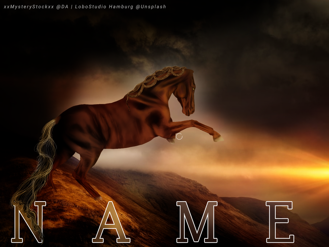
- Critique Piece 1: First glance, I notice the incredibly bright white face and the marker darker, much GREENER body. Evening that out and losing a bit if the green would make the horses appendages work better together and stand out a bit more from the background. Your lighting looks good as well as the rest of the body prep, the hair could use a bit of work, it's very clumpy with to many flyaways. You have a leaping horse with a flagging tail and a lifted mane , except for that one curl. Work in picking a direction for the hair, using varied brush sizes, and less flyaways. Piece 2: I really love this piece overall, body prep is very pleasing and works well together, except for the left hind leg, the black cuts of to the (not sure what's going on there)... I love the color and the lighting, especially the texture on the belly, I wish you would have carried that around. The hair looks quite pretty and flowing, but you have a lot of flyaways standing straight up in the main and no other stand of hair is signaling a breeze, your hair direct is much better hear, but if your going to out an element in one part you have to out it on the others. I would have loved a repainted eye here, something bright that stood out, blue, a pale purple, green. Piece 3: This piece is pretty dark and I can really only see one horse. Starting at the face the lighting and prep is quite good, but the further back you go the work it gets the brindle (?) is pretty non-existent. One this piece your mane lacks texture and has a bit of a "spidery" look, you again have a lot of hair everywhere, (I would have left of the loopy flyaways at the crest), the horse number 2 looks fine, but he lacks hair in general, the marking of his chest makes his look like he's leaning. But amazing job on the collars. Piece 4: First off, this horse is sick, please return her ears and hind hooves. Second the lighting is very, very harsh lacking smudge and blend. The flyaways her ears much better and I love the tail if the N, but it looks very rough, and is lacking the artsy smoothness. I also notice, that this horse is not grounded, he has no shadow (an alien!) and know looking back, it appears nine if your horses have shadows in the ground (they need them :). Piece 5: This piece has a very smooth appearance and is lacking shadows and muscling, no grounding kn this bad boy either. Your bridle could use some cleaning up so it matches, and the hair has returned to the clumpy uneven stage again, lol. Work on an even mane with stands that go the same direction. - Shop prices/ Tier level (Currently a Tier 2, with most prices betwewn 50-55k) I think your shop prices are pretty good, although raising to 70-80k could be beneficial. Stay Tier 2 for a little while longer. - Which body prep looks better or more appealing? (First 2 or last 2) The only one that REALLY appeals to me is #2, #1 is very green, #3 is fine, #4 is much to harsh, #5 is quite pretty, just soft. - Hoof help please! Pick a middle color from the original hoof, and then paint over the entire hoof, add 1 or 2 lighter vertical stripes. |
|  |
|
| |
|
Does this tail look better? I tried to follow the advice you guys gave me and found a softer brush as well. I feel it could use a bit more detail in the center, where a majority of the shadow is. Thoughts? |
| |
|

 Light Rain then Clearing Overnight


