| |

|
So its been a whilr since Ive done any art! But looking to get back into it to make some money. I was originally selling these for around 4k, but I did find that I wasn't making much for the time. I mean, these are in no way shape or form good, so am hoping to improve. Any critisism would be greatly appreciated! The more help the better lol. 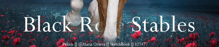 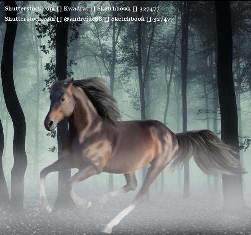 |
|
|
| |

|
hey belle! ill give a little critique on the second peice, seeing as i cant gather much from the first. The first thing i notice about the horse, is that he looks very blended/smudged. Its good to do this a little less to keep some of the horse's detail and make it look less blurry. Im pretty sure you drew a little of the body prep on (though correct me if im wrong) it looks good! i would just blend it out (smudge very lightly) and lower the opacity of the layer a little bit. Hair looks good, and i like the fog! if you are looking for a realistic peice look, id use the sharpen tool *very lightly* if you have that on your program. A good thing to do if your wanting to get into art is use a program like GIMP (free) or my personal favourite and the one i use, AffinityPhoto, but you do have to pay about 50 pounds, which is a lot, but its a one-time purchase and totally worth it. Easy to use too. as far as pricing goes, i think if you keep making peices the same quality of the last one, 5-15k, but if you improve just a bit and try out some of the above tips, easily 15-30k! |
|
|
| |

Trivia Team |
I 100% agree with Olive! Another thing is lighting the light is coming from the back. So add shadows towards the front of then highlights around the edges where the light would hit. Always do this on separate layers one for shadows one for highlights. That way you can lower the opacity and smudge them out without effecting the horse layer. You will want to color pick several highlight and shadow colors from the bg to best blend the horse in. If you can play around with the color temperature of the horse image. That bg has cooler tones so you would move the slider to get more blue undertones. If you told me what program you use I think I could explain better. There's also so hard drak bits in the mane and tail. Try to soften those up with a smudge tool on low settings and small soft brush. Overall its good work (: I really recommend Wild Willows art tutorial, it's in art help. |
|  |
|
| |

|
coming from T1, i agree with them both! :) lighting is super duper important and can really make or break the piece. you're gonna wanna make sure the horse fades in, and isn't just right there and in your face:) your body prep is nice, just make sure you dont overblend it and take out muscle details lovely work! keep it up ^^ |
|  |
|

 High Heat Advisory: Extreme Heat Index

