| |

|
Hey everyone! I am wanting to improve on my art so thoguht I would reach out to the community for some advice. I am looking for some in depth critique on anything and everything. Some things I am currently trying to improve:
Lighting & hair ~ I also use Ibis Paint x Feel free to pick the art apart :3 and thank you in advance <3 Here are some recent examples:  


|
|  |
|
| |

|
Another recent example :) 
|
|  |
|
| |

|
I have no criticism, just came here to say these are AMAZING |
|  |
|
| |

|
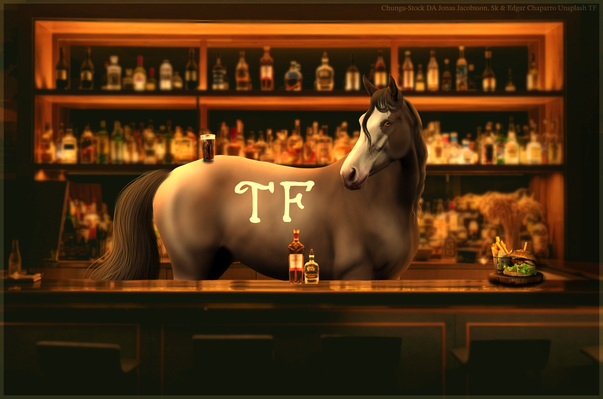
First of all, I gotta say these are absolutely incredible!!! Your composition is on point and I love the horse in a bar! As for advice, something that stood out to me were the horse's shadows. That sharp kind of shadow is what might happen if the horse were standing on a hard, reflective surface, not in a more nature-y landscape. To determine where the shadows should lie, look at the surrounding bg and light sources for clues. For example, a horse standing in clear, still water would likely have a more defined shadow, possibly with part of its reflection, but the water would give it a kind of ripple affect. At other times, the shadow might not be more than a smudge, especially if there's very little light. If there is a very strong light source in the piece, the shadows would be longer and more defined, but would still have softer edges. I'd say for most of your examples, the shadow would mainly be a darkened smudge underneath the horse. Something that might help is to see what your own shadow looks like at various times of the day and in various settings, and then apply it to your art. Whoo! That was long, but I hope it's helpful!! Your lighting is overall very strong (especially in pieces 3 & 4 which I ADORE!!) Do tell me if you've got other questions! You're doing awesome <333 |
|
|
| |

|
First, I wanna say that I LOVE your body prep and the way you do hair! I think the most important thing is the darker shadows under the belly. With some of these pieces, the lighting is more(for want of a better word) distilled, so the shadows should be softer. In the first piece(blue one), there's light in the water, which would be illuminating the belly slightly. Try lowering the opacity of your deeper shadow layer a bit and let the horse's detail show through ;) The next piece(forest one) same thing- there isn't super strong lighting coming from anywhere in prticular, so the shadows will be much softer. Again, play with the opacity of your layers. I really like the lighting in the blue/green piece(4th one), it matches the background very well<3 The next one, in water, same thing- light reflects off of water and back onto the horse, so not only would the shadows be lighter, there would be some subtle lighting over top of them. Next one, the bartender, the lighting is spot on! Only thing I could think of is adding a shadow under the cup on his hindquarters, and possibly a reflection on the shiny countertop. |
|  |
|