| |

|
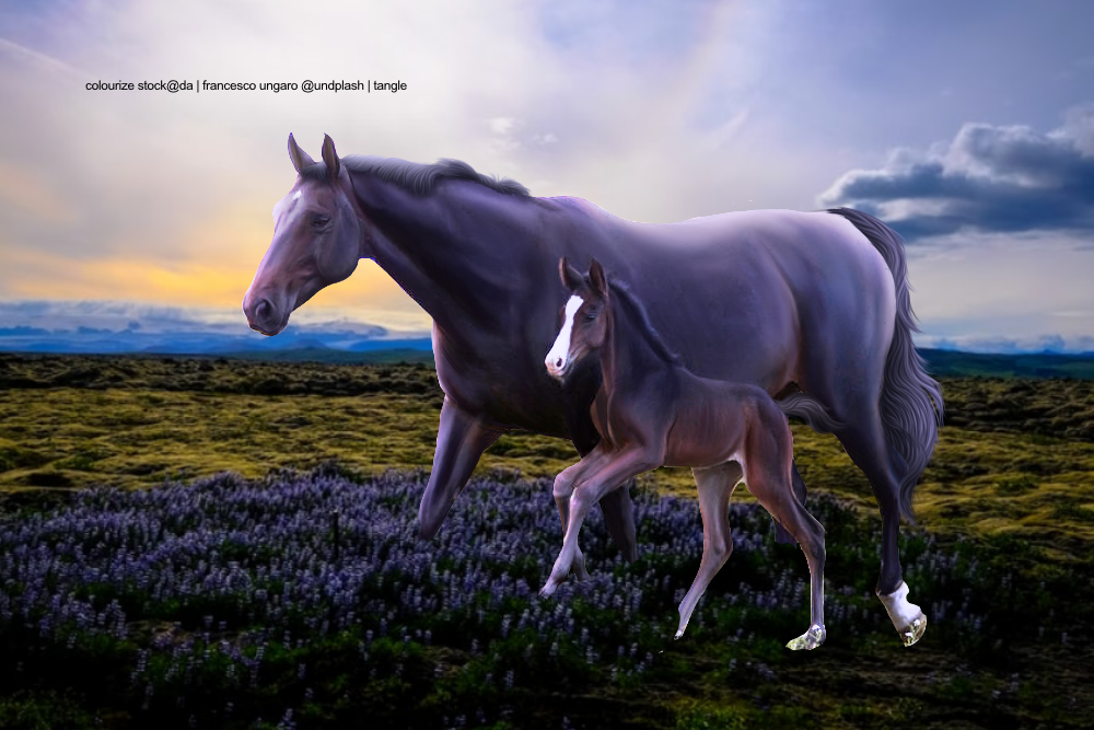
i think a big thing here is that the BG is waaay too contrasted. the horses are soft, and the BG is harsh (sorry this is short but ill edit it later maybe)
Tanglewood said:
Thank you CC! Just realized I forgot to make the lighting layers visible again, I get what you're saying about the foal's legs.
|
|
|
| |

Art Team
|
|
| |
|
Edited at March 3, 2021 07:48 PM by Moonglade Manor
|
|
|
| |

|
Zomb said:
Bloop
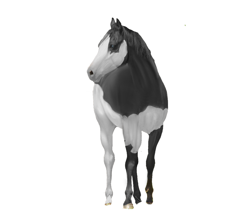
Hey! I just want to say this is a very nice piece of art, but there are some things you could add to make this even better :D the first thing I notice is the mane is very spiky and at the very top of the neck near the ear, the hair is moving in a different direction to the rest of the mane. Also I can't see any strands in the hair, but there might be some, I just can't see them so make lighter/darker depending on the colour. The tail is very nice, and I don't see a problem with that. Maybe work on the grounding of the closest hind leg as it just sort of is just a straight line. The body prep is drool worthy and very nice! I hope this helps you! edit: fixed some typos :D |
|  |
|
| |

|
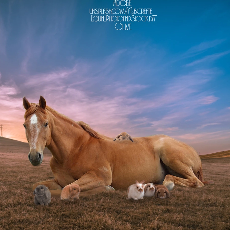
Olive Tree Equine said:
rip this to shreds.
Going to go through this as systematically as possible. This is a really sweet piece, but there are a few technical ehs about it. Main ciritque is the horse - no edits seem to have been done to it other than cutting it out. Obviously everyone has their own body prep/hair style, but here is seems like you did nothing (Sincere apologies if I got this wrong and you did in fact do something). You also retained the original lighting, meaning that it doesn't quite fit with the background as well as it could have. The light is coming from the viewer's left side of the image, so I'd like to see the horse's face/neck having much stronger highlights. Your grounding seems to be fairly solid, other than a few airbrush-appearing erases on some of the rabbits. The bunny on the horse's back also appears not entirely natural - can't offer tips over here though, since objects on a horse are my nightmare xD Like I mentioned earlier, the lighting is a bit all over the place. Each object retained its original lighting, so when you put it together it's hard to tell where the light source is coming from. I often find it helpful to doodle lighting arrows on a sepearate layer before I load on the horse - so after I open the bg image, I draw little colourful arrows pointing where the strongest highlights/shadows should be. This definitely helps a lot when you start fixing the lighting, since you already have a rough idea of it. But this is an adorable image! Love love the idea, good job on using non-equine animals! |
|  |
|
| |
Art Team
|
Enoki Valley said:
Zomb said:
Bloop
Hey! I just want to say this is a very nice piece of art, but there are some things you could add to make this even better :D the first thing I notice is the mane is very spiky and at the very top of the neck near the ear, the hair is moving in a different direction to the rest of the mane. Also I can't see any strands in the hair, but there might be some, I just can't see them so make lighter/darker depending on the colour. The tail is very nice, and I don't see a problem with that. Maybe work on the grounding of the closest hind leg as it just sort of is just a straight line. The body prep is drool worthy and very nice! I hope this helps you! edit: fixed some typos :D
Thank you! I'll definitely try when I do my next piece :D |
|  |
|
| |
|
I'm so, so excited with how this came out! Would love thoughts on it! It's my first time doing an actual fire piece. ^^ 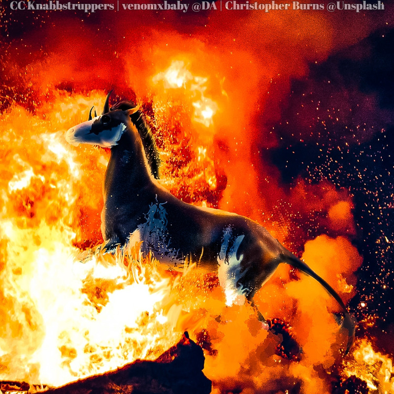
EDIT: Also did this! If you could rip it apart too, that would be much appreciated! ^^ 
|
|
|
| |
Art Team
|
|
| |

Art Team
|
Would love any tips on this, pretty happy with color change. Not finished with grounding so I don't really need any critique on that <3  |
|  |
|
| |
|
Moonglade I'd be more heavy with your shadows. Take a Multiply layer (or two or three or four ^^') and start blending darker spots into your light areas. I don't like repainting entire horses because #1 I'm not entirely confident with it and #2 it's a pain to do the shadows and varying colors XD. So instead, I take a dark color from the horse itself, select a Multiply layer and paint in some darker shadows, sometimes extending them or adding my own where necessary. Then, I take a lighter color on a Screen layer and add the general highlights of the horse, where the shadow transitions to the light, really emphasizing on the shiny parts. Then, on a third Screen layer, I'll take a pure white and a small, low opacity airbrush and reinforce the highlights. This is just what I've found helpful to get the "shiny" look without losing color and/or detail in the horse. Also, make sure that backleg is contrasted to the front leg. It looks like they're melted together. Other than the shadows, you've done a brilliant job! ^^ Zomb This is straight up stunning! My only critique is maybe adding harsher/yellow highlights around the edges because of how strongly backlit it is. ^^ Gem I love this!! So, so much! I'd maybe say harsher, more abrupt highlights especially around the edges and definitely highlights in the hair! ^^ Remember on the shadow too, it will be more defined where it's closest to the horse and become less opaque as you go away. Other than that, this is a fantastic piece! I might need to steal it! X3 |
|
|
 Steady Rain all Day