| |
|
Still looking for some help with this!! :)
Trillium Acres said:
 Any critiques on this are appreciated! Its obviously not finished, and I need to fix the hooves, but other than that I'm curious as to what I can do to make this better:) This is my first time doing art in about a year and a half lol
|
|
|
| |
|
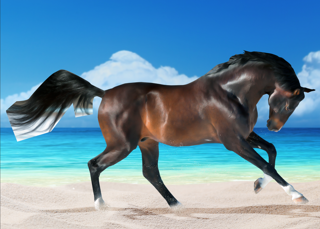
Not sure if your planning on painting in a new mane of tail, so I'll leave that until you respond back on if you need help with that Trillium!
I like how you added the sand spotting to make it blend into the BG more, perhaps increase the amount of sand kicked up, at the bottom, near the hooves.
The horse legs disappear almost into the sand, but in the way that it's transparent, not covered by sand. If you can, try to get some of that area back and just cover it partially with sand instead of half opacity erasing it. I can help you figure this out if you need. I see this particularly in the back left leg, the one protruding to the front. And a bit in the very back leg/ hoof.
Now the very front hoof doesn't look quite "there". Perhaps paint in the edges of the hooves a bit more, so it doesn't look so much as the hoof blends into the BG.
- Your body prep looks good, each person's body prep is different so I try to just look for inconsistencies within the body prep. It looks pretty good, except the head has a different amount of smudge than the rest of the body, it's much heavier there and looks almost too- blurred. If there was something on the face that you were trying to smudge out, perhaps I could help suggest a different method if I saw the original stock. If it just happened to get smudged more and you weren't trying to cover something up, perhaps see if you can go back in and undo some of the smudges. Or cut out the head and put it on top of the existing one and rework from there. Also, the eye almost looks too cloudy and it's seems that the brow ridge is smudged into the eye, which is a bit trippy. I have a few eye painting tutorials from DA that I can scrounge up for you if you'd like!
-
I'm not sure if you are planning on/ have added shadows and highlights. It depends on how you personally as an artist do it, but some pieces may need it to fix any errors in the lighting between the piece and the horse. The only thing you might want to change is the big glare/ reflection mark on the horse's neck. It could be toned down a bit as the BG doesn't have a big, specific light source or lighter section in it, the lighting is more consistent throughout.
Personaly, I think the piece would benefit with you painting in a new mane and tail, but you can do without too, it's up to you.
-
There's also a white mark on the belly, I think it just bothers me a bit because of the smudge on it. But it's honestly fine, I'm just being ultra-picky right now. You could leave it, cover it up, or make it look more natural if you wanted.
- You may want to tone down the brightness? I guess on the horse a bit, maybe play around with saturation and brightness/ contrast levels to make it blend in more/ fit in with the BG.
- the shadow seems a bit too skinny for the piece, it could be the positioning, though. I think maybe just making it wider and making the edges less crisp would make it seem more like uts casting onto the ground and less like it's floating. It's definitely a good start on that shadow.
-- I currently can't think of anything else to fix right now, but I'm a bit tired. I'll let you know if I think of anything else. I think I gave you a good start on things that you could look at to change. I hope this was helpful, feel free to pm me if you need help or have any questions! You're off to a good start!! |
|
|
| |
|
Ocean View QH said:
Critique on this, please! I painted the pattern myself :)
I'm currently getting tired and a bit out of it, so I may start a critique and then finish it later lol. We'll see.
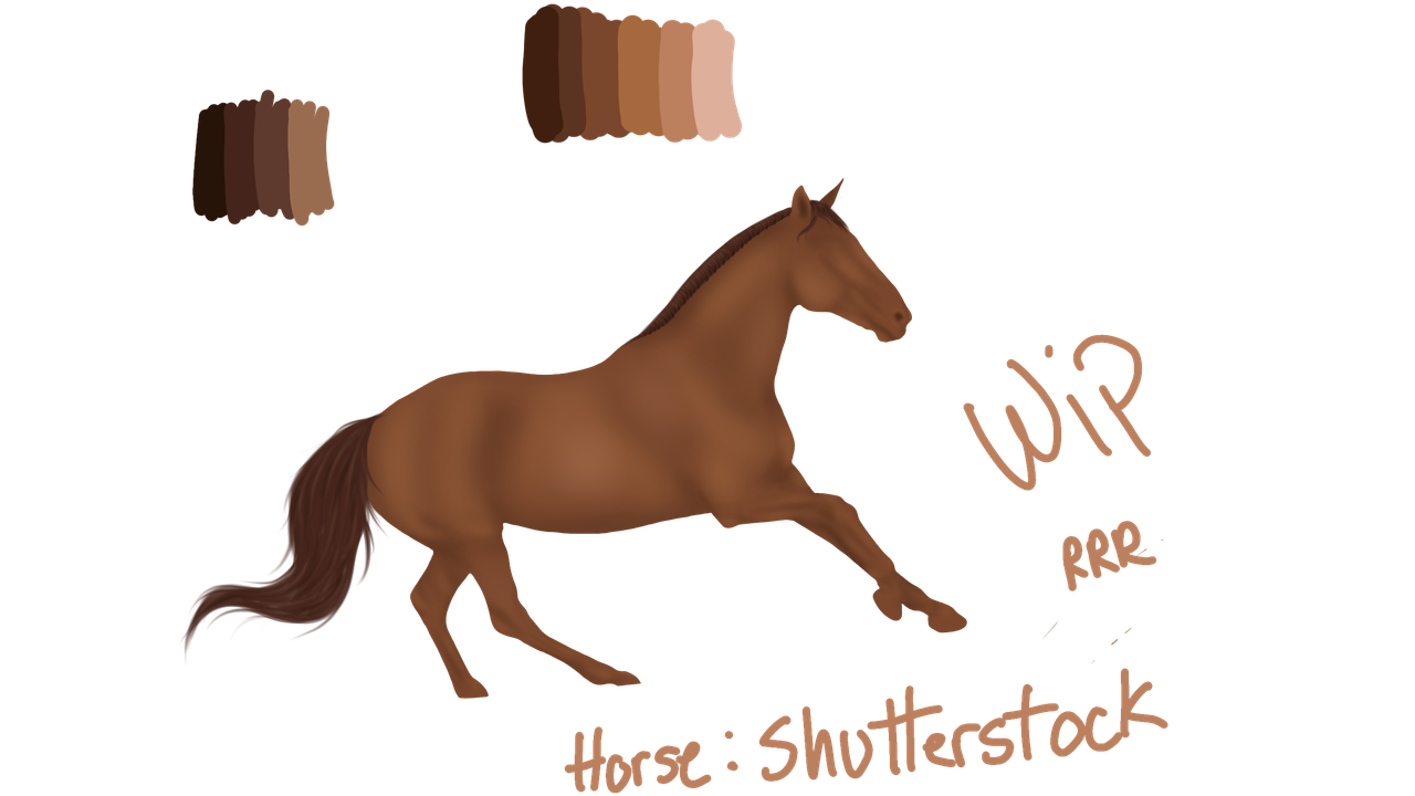
- First off did you paint that horse yourself? It looks good, a great start. Here's my first intital notices on things that could be fixed.
1. These 3 things look out of proportion with the rest of the body/ too small: the head, the neck, and the front legs. The neck could be extended a bit too. It might not need that depending on what it looks like if/when you resize it. Alternatively you could make the rest of the body smaller instead of enkarging those 3.
2. I'm loving the main an tail, great structure. Personally, I would pull out the mane spikes a bit more to balance it out and make it more noticeable. You might also want to pull and extend the tail, but it could work as is.
3. You've got a good base of heavy shadows and highlights. Next, I'd make another layer and start making softer shadows and highlights (can always change later opacity after to make this easier) to make the horse more defined and filled out in some areas.
4. Perhaps lighten or change the shade of the hooves, the blend in a bit too much with the background.
5. Now that you've got the base layer and the general shadows and highlights, perhaps go back in with some other colors to help shade color it in some area to define it, make it pop a bit more and a a bit more realism. Often when you're making using a color, it takes more than one color to subtly make up the end result. (Does that make sense?) 6. the head work seems pretty good so far, the side of the cheek bone where it goes over the neck could use more defining and perhaps rework the eye.
ok I need to stop here for now. Let me know if you need any help or have any questions, hope this was helpful! |
|
|
| |
|
If anyone else's hasn't been answered yet, let me know, I can try to etch out some time tomorrow and look them over :) |
|
|
| |

|
Tanglewood said:
Aight, looking for critique on the piece in general, but specifically on the mane/tail (I tried a new technique for those.) I'm aware the background wasn't blurred out smoothly, that's just laziness on my part xD But otherwise, rip it to shreads! (Would love a good reflection/shadow tutorial if anyone has one.)
I'd love critique for this piece, Shadow <3 |
|  |
|
| |
|
Yes! I am planning on adding a new mane and tail :) If you have any tips for adding hair that would be appreciated though. I did art very consistently for a while but then life got a little too busy and I am 99% sure I have forgotten everything about adding hair lol. - Thank you for your advice on the hooves and face blurring, I was thinking the same thing. I don't think I can undo the smudge strokes as I beleive its a bit too far gone for my computer to handle it >.< However, I did get quite good at shadowing and highlighting so perhaps thats how I'll fix it!! - I hadn't noticed the white mark on the belly but thank you for pointing that out. Its bothering me too now lol! - I agree with the big highlight on the neck bwing too bright. I'll tone that down. Also, I'll try making the shadow wider. Lighting is my biggest issue with my art. Its so difficult to match the horse and BG seamlessly >_< - Thank you so much for your help!! I'll probably PM you with an updated version ;)
Shadow Woods said:
Not sure if your planning on painting in a new mane of tail, so I'll leave that until you respond back on if you need help with that Trillium!
I like how you added the sand spotting to make it blend into the BG more, perhaps increase the amount of sand kicked up, at the bottom, near the hooves.
The horse legs disappear almost into the sand, but in the way that it's transparent, not covered by sand. If you can, try to get some of that area back and just cover it partially with sand instead of half opacity erasing it. I can help you figure this out if you need. I see this particularly in the back left leg, the one protruding to the front. And a bit in the very back leg/ hoof.
Now the very front hoof doesn't look quite "there". Perhaps paint in the edges of the hooves a bit more, so it doesn't look so much as the hoof blends into the BG.
- Your body prep looks good, each person's body prep is different so I try to just look for inconsistencies within the body prep. It looks pretty good, except the head has a different amount of smudge than the rest of the body, it's much heavier there and looks almost too- blurred. If there was something on the face that you were trying to smudge out, perhaps I could help suggest a different method if I saw the original stock. If it just happened to get smudged more and you weren't trying to cover something up, perhaps see if you can go back in and undo some of the smudges. Or cut out the head and put it on top of the existing one and rework from there. Also, the eye almost looks too cloudy and it's seems that the brow ridge is smudged into the eye, which is a bit trippy. I have a few eye painting tutorials from DA that I can scrounge up for you if you'd like!
-
I'm not sure if you are planning on/ have added shadows and highlights. It depends on how you personally as an artist do it, but some pieces may need it to fix any errors in the lighting between the piece and the horse. The only thing you might want to change is the big glare/ reflection mark on the horse's neck. It could be toned down a bit as the BG doesn't have a big, specific light source or lighter section in it, the lighting is more consistent throughout.
Personaly, I think the piece would benefit with you painting in a new mane and tail, but you can do without too, it's up to you.
-
There's also a white mark on the belly, I think it just bothers me a bit because of the smudge on it. But it's honestly fine, I'm just being ultra-picky right now. You could leave it, cover it up, or make it look more natural if you wanted.
- You may want to tone down the brightness? I guess on the horse a bit, maybe play around with saturation and brightness/ contrast levels to make it blend in more/ fit in with the BG.
- the shadow seems a bit too skinny for the piece, it could be the positioning, though. I think maybe just making it wider and making the edges less crisp would make it seem more like uts casting onto the ground and less like it's floating. It's definitely a good start on that shadow.
-- I currently can't think of anything else to fix right now, but I'm a bit tired. I'll let you know if I think of anything else. I think I gave you a good start on things that you could look at to change. I hope this was helpful, feel free to pm me if you need help or have any questions! You're off to a good start!!
|
|
|
| |
|
Your Welcome Trillium, happy to help! I can help you with manes and tails. It's been awhile so when I'm off the road, I'll check my computer for my notes. Feel free to on me anytime! And I'd love to see an updated version if you want to send that. Also, if you need to redo the head and the highlighting and shadowing doesn't work enough for to the horse stock, cut out the horse head and paste and reposition upon the horse! And then work from there :) |
|
|
| |
|
Tanglewood said:
Tanglewood said:
Aight, looking for critique on the piece in general, but specifically on the mane/tail (I tried a new technique for those.) I'm aware the background wasn't blurred out smoothly, that's just laziness on my part xD But otherwise, rip it to shreads! (Would love a good reflection/shadow tutorial if anyone has one.)
I'd love critique for this piece, Shadow <3
Sure thing Tangle! It may take awhile since I keep losing service :/ I'll be off the road soon though, so it shouldn't take hours. Would've gotten to this earlier, but I got swept up in balloon battle- both making it personally to the top of the hit list (my personal goal lol, so yay)! And getting North to #1 Hitters/ Splashers (we're not #2, for the first time in awhile lol). |
|
|
| |
|
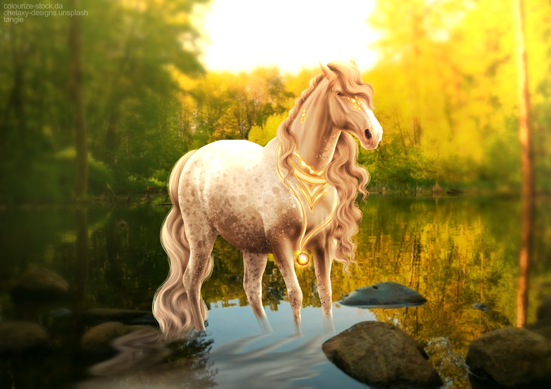
Ok Tangle, so sorry about the wait, I've finally had time to sit down and take a look over your work and analyze it! Right off the bat, I figured that I'd need to bust out my huge list of things to go over and look for in pieces. (lol yes, I've got a list, a giant list so that I don't forget what to spot check whenever I give in-depth critiques or analyze my own art). I then realized that I don't have the damn list with me lol, so I'll do my best here. [Btw, the big-ass list of things is not an insult at all or anything. It's actually a good thing, it means that off-hand, I don't see a ton of flaws, so I like to scan over a list so I don't forget anything. I definitely forgot to originally mention this and it might've given you the wrong idea :/ .]
I just want to start this out by saying that your piece is very beautiful, I love the colors and lighting! -------- -First off, I like the blur effect that you added to the piece, it makes the horse pop out more. Perhaps this is just me, or nit-picky, but personally I'd lessen the effects of the blur, just a smidge around/ directly behind the horse. That way the viewer can still see a bit of the backround and it seems more present. You did this well on the sides of the horse, but I think that you could lessen this above the back of the horse before the glare from the sun. -The reflecion into the water is looking good, the only thing is you may want to stretsh it out in certain places horizontally. Maybe add in some light waves from the water. If you look into other areas of the water, you'll notice that the water is being blown, leaving the wave lines in horizontal path. The waves are slight, so you wouldn't want to over do it, but one or both of the things above might make it fit in with the water better. - The ringlets around the feet are very well done, they fit in well! Personally I might add a bit more water disturbance around the horse's left, back leg (not the one sticking back). And possibly the front left, though this could be fine without further changes. - The mane and tail look soo nice! It all looks to be done correctly, so I don't think I have any suggestions here. - Same with the horse gear/ adornments. I don't see much to change there. Perhaps on the amulet, increase the amount of glare/ flare coming out in the bottom right, as the sun hits it. Though with bezeled edging the light would likely become a bit scattered too, though the big flat part of the amulet would likely do as I first mentioned. Since the light is being refracted from the amulet, you may want to add a corresponding shine/ small beam from the amulet into the water, making a light reflection. It might even cast a beam onto the rock in front of it, if you want to add one there. Oh, one more thing here, on the necklace, or whatever it's called, you may want to increase the cast shadows, unless it's something directly against the horse or whatnot. - The shadows and highlights are done very well, but there are two things that you might want to change. One, there's a glow between the chest and the hair and the front leg. This looks pretty natural because of high prominent the light source is, though right there it looks like it's a bit over-done, so it looks like there's a white spot there. Second, The light draping over the horse's back and upon it's belly is good, but you may want to increase how far up the shadow goes, just a bit, since the sun is behind and over it, it may not reach that far on the belly. You may also want to lower how bright the highlight is on the very back leg, as it likely wouldn't be that bright, so far down. I don't think it should be completely gotten rid of, just dimmed a tad. - The horse coloring and pattern look very good, the eye as well, one thing I noice is that the markings for the horse are carried over into the nose it looks like. And for the eye, you could increase the white around the top right, it's not a huge deal, it just might enhance the look of the eye. - You may want to expiriment with the way the environment might splay color onto the horse. Sometimes the green from the trees and the water can cast a bit of color. I just expiriment with taking color(s) from the background, making a new layer, conservatively painting the color in certain areas, and then messing with the opacity. Again, not all pieces might need this, but this one you might want to expiriment this with. ----------- Ok, I think that is all that I can think of at this moment, if I think of anything else, I'll let you know. Again, sorry for the delay! Lovely piece <3 --- Edit: made a spelling mistake and added something to the intro! |
|
|
| |
|
This is my first time repainting a horse and I'd love some critique/advise on my progress. I still have to add more detail throughout and do the eye/hooves. |
|  |
|
 Steady Rain all Day