| |
|
I'm sure there are some tiny things that a better and more experienced artist could pick up on, but to my eye that piece is gorgeous! The only thing I would maybe do is tint the horse a little more toward the colour of the background. |
|
|
| |
Rumble Team |
The Undercity said:
What could i do to improve this piece?
The hair could use a little more shading, and the horse needs to be overlayed with some colors from the background. I like the duplicate the background image and clip it to the horse, blur it to the maximum and then use the overlay filter then adjust the opacity until your happy. |
|  |
|
| |
|
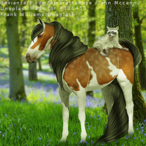
Thank you! I will try that:)
HMH Reality Check said:
The Undercity said:
What could i do to improve this piece?
The hair could use a little more shading, and the horse needs to be overlayed with some colors from the background. I like the duplicate the background image and clip it to the horse, blur it to the maximum and then use the overlay filter then adjust the opacity until your happy.
|
|
|
| |
|
The Undercity said:
What could i do to improve this piece?
This is really stunning! You have improved heaps. I would agree that the hair could use a tad more shading, I would have a hair colour palette of at least 3, sometimes more, and layer those colors on top of each other to create more depth, I usually go from darkest to light. Then I would recommend using the dodge/burn tool (usually at a slightly larger size) to create further depth with shadows, and then in separate areas use the dodge for heightening the highlights. In addition to that I personally would blur the background (ie not the planet but the sky behind it) slightly - I think it just make the image look less busy and brings the focus onto the horse. That is just a personal preference though - the piece is amazing overall. |
|
|
| |

|
I am back again XD finally got some motivation to squeeze out a peice how would i got about blending the horse shading wise and how does the general sketch look? |
|
|
| |
|
These are my first two pieces after a looooong hiatus. Rip them to shreds, please! - - |
|
|
| |

|
Please click the link and zoom! It's a pretty large piece and would hate for the details to be ignored. Is there anything I could do to this piece to make it better? ^^ |
|
|
| |
|
Hi! Firstly I wanna say that is an amazing art piece! What you could do is move the star at the nose of the horse away, since it kind of falls over the nose if that makes sense. (Unless if that was your intention, then I'd change it). Also maybe you could make the planets have sharper edges. Hope this helps :D
~Pegasus Lane~ said:
Please click the link and zoom! It's a pretty large piece and would hate for the details to be ignored. Is there anything I could do to this piece to make it better? ^^
|
|
|
| |

|
Any advice, tips, criticism for my profile icon? This is the second horse art I made so far so I'm not the best, sorry xD |
|
|
| |
|
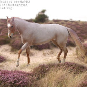
Hi :) This is my first time trying digital art, and would love to hear what you guys have to say! I'm really looking for help on making the horse fit better into the background, and what do you guys do for hair???? I'm thinking this is going to be a large learning curve for me, but I'm excited! :D I'm pretty sure I have the credits correct, but I'm going to try and make them easier to read and bigger. I was thinking near the bottom in white? maybe? I'll test it out. Thanks for looking :D https://www.deviantart.com/kakuokoalio/art/Untitled-952901250 |
|
|
