| |

|
Dash and Duchess said:
It was a bit slow at first but now I've had a few people pm me to see if I could squeeze another slot so I'm hoping to auction off a few more custom slits and see what happens xD
That's awesome! If you're happy with the amount of people then definitely leave it alone for now |
|  |
|
| |

|
Also, here's some general tips for art. - ALWAYS blur the background, even if it's just a tiny bit. Look at photography, especially comparing your phone and a digital camera. The bokeh effect in the digital camera makes the piece look better. - Add vignette to the corners of every piece. How much depends on the darkness of the scene. Never use plain black. This helps frame the subject and draw the viewers eye in to the horse. - Brighten a layer behind the horse. I take the silhouette of the horse and hair, put it behind the horse, turn it white/almost white, and then switch the layer to overlay, add, or soft light. Then I'll blur it and lower the opacity until it looks perfect. It really helps the horse pop. Sometimes I'll erase/fade this layer closer to the horses feet to keep the horse grounded. |
|  |
|
| |
|
Sagebrush said:
Also, here's some general tips for art. - ALWAYS blur the background, even if it's just a tiny bit. Look at photography, especially comparing your phone and a digital camera. The bokeh effect in the digital camera makes the piece look better. - Add vignette to the corners of every piece. How much depends on the darkness of the scene. Never use plain black. This helps frame the subject and draw the viewers eye in to the horse. - Brighten a layer behind the horse. I take the silhouette of the horse and hair, put it behind the horse, turn it white/almost white, and then switch the layer to overlay, add, or soft light. Then I'll blur it and lower the opacity until it looks perfect. It really helps the horse pop. Sometimes I'll erase/fade this layer closer to the horses feet to keep the horse grounded.
Thank you!! I've been trying to blur my backgrounds recently and I'm definitely taking all of these with my as I work on my next WIPs 😁 I really appreciate the tips!! |
|  |
|
| |

|
Dash and Duchess said:
Sagebrush said:
Also, here's some general tips for art. - ALWAYS blur the background, even if it's just a tiny bit. Look at photography, especially comparing your phone and a digital camera. The bokeh effect in the digital camera makes the piece look better. - Add vignette to the corners of every piece. How much depends on the darkness of the scene. Never use plain black. This helps frame the subject and draw the viewers eye in to the horse. - Brighten a layer behind the horse. I take the silhouette of the horse and hair, put it behind the horse, turn it white/almost white, and then switch the layer to overlay, add, or soft light. Then I'll blur it and lower the opacity until it looks perfect. It really helps the horse pop. Sometimes I'll erase/fade this layer closer to the horses feet to keep the horse grounded.
Thank you!! I've been trying to blur my backgrounds recently and I'm definitely taking all of these with my as I work on my next WIPs 😁 I really appreciate the tips!!
I'm glad you appreciate it! Those things are stuff I ALWAYS do to my pieces and it really makes it so much better. One day I'll do a side by side comparison! What I also like to do is copy the background image, paste it over the entire art piece, use overlay/soft light, blur it, and lower the opacity a lot. This helps with cohesiveness of the piece. |
|  |
|
| |

|
Sagebrush said:
Dash and Duchess said:
Sagebrush said:
Also, here's some general tips for art. - ALWAYS blur the background, even if it's just a tiny bit. Look at photography, especially comparing your phone and a digital camera. The bokeh effect in the digital camera makes the piece look better. - Add vignette to the corners of every piece. How much depends on the darkness of the scene. Never use plain black. This helps frame the subject and draw the viewers eye in to the horse. - Brighten a layer behind the horse. I take the silhouette of the horse and hair, put it behind the horse, turn it white/almost white, and then switch the layer to overlay, add, or soft light. Then I'll blur it and lower the opacity until it looks perfect. It really helps the horse pop. Sometimes I'll erase/fade this layer closer to the horses feet to keep the horse grounded.
Thank you!! I've been trying to blur my backgrounds recently and I'm definitely taking all of these with my as I work on my next WIPs 😁 I really appreciate the tips!!
I'm glad you appreciate it! Those things are stuff I ALWAYS do to my pieces and it really makes it so much better. One day I'll do a side by side comparison! What I also like to do is copy the background image, paste it over the entire art piece, use overlay/soft light, blur it, and lower the opacity a lot. This helps with cohesiveness of the piece.
I've never thought of that! That does make sense though to bring it together! I'll definitely be updating here soon using all of these tips and I'm excited to see what it looks like on my WIPs 😁😁 |
|  |
|
| |

|
I'm going art crazy with all of my Wips right now so here's another one aggressive toss . |
|  |
|
| |

|
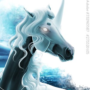
Updating with my newest WIP, any advice is really appreciated <3 (side note, I'm absolutley loving this so far and I'm quite happy with the current progress!) - mods - both adobe stocks are purchased and proof can be provided <3 ^Clicky^ |
|  |
|
| |

|
I am in love with the most recent WIP.😍 need to get arts from you soon 😍 |
|  |
|
| |

|
Amethyst Ranch said:
I am in love with the most recent WIP.😍 need to get arts from you soon 😍
Thank you!! I'm super happy with how it's coming along! (And I think I may throw some more slots out soon :D) <3 |
|  |
|
| |
|
Dash honey this is absolutely stunning 😍
Dash and Duchess said:
Updating with my newest WIP, any advice is really appreciated <3 (side note, I'm absolutley loving this so far and I'm quite happy with the current progress!) - mods - both adobe stocks are purchased and proof can be provided <3 ^Clicky^
|
|
|
