| |

|
I've been playing around a lot recently, with different things and I think I've finally set on something that I'm loving. But I'm wondering what I can do to make it better. (all clicky links) |
|  |
|
| |
|
well personally i like the style of that middle piece. it's amazing! |
|
|
| |
|
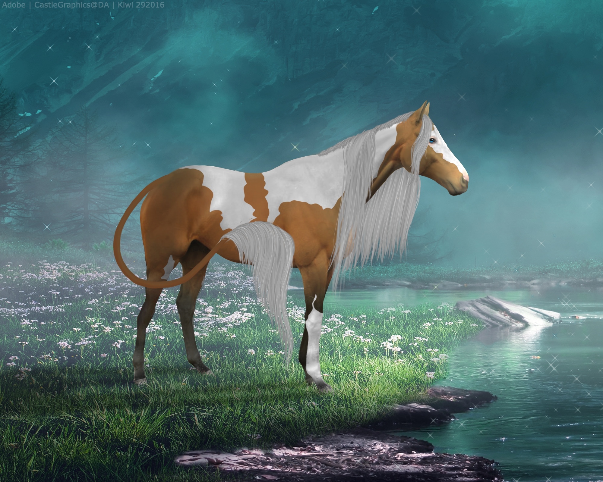
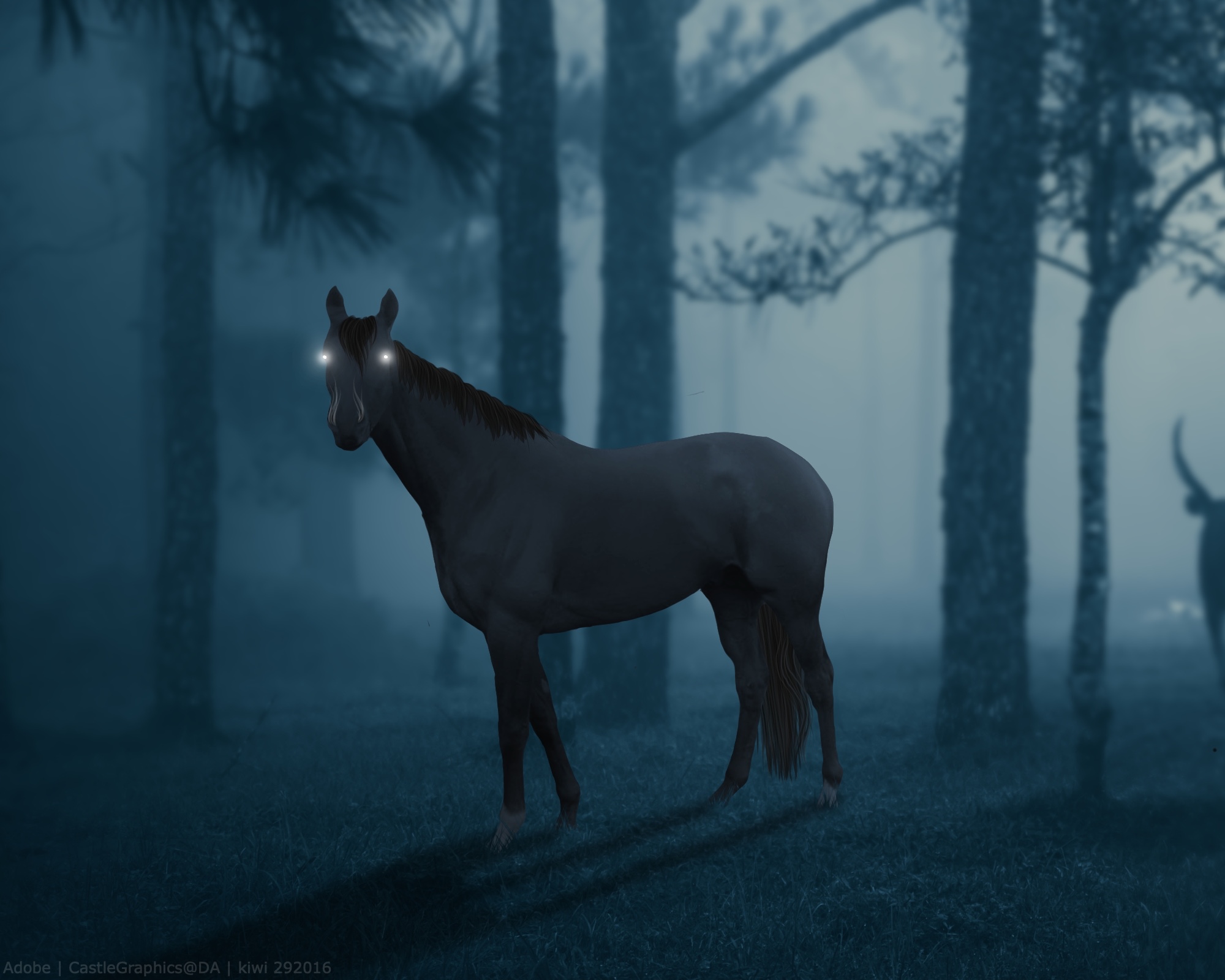
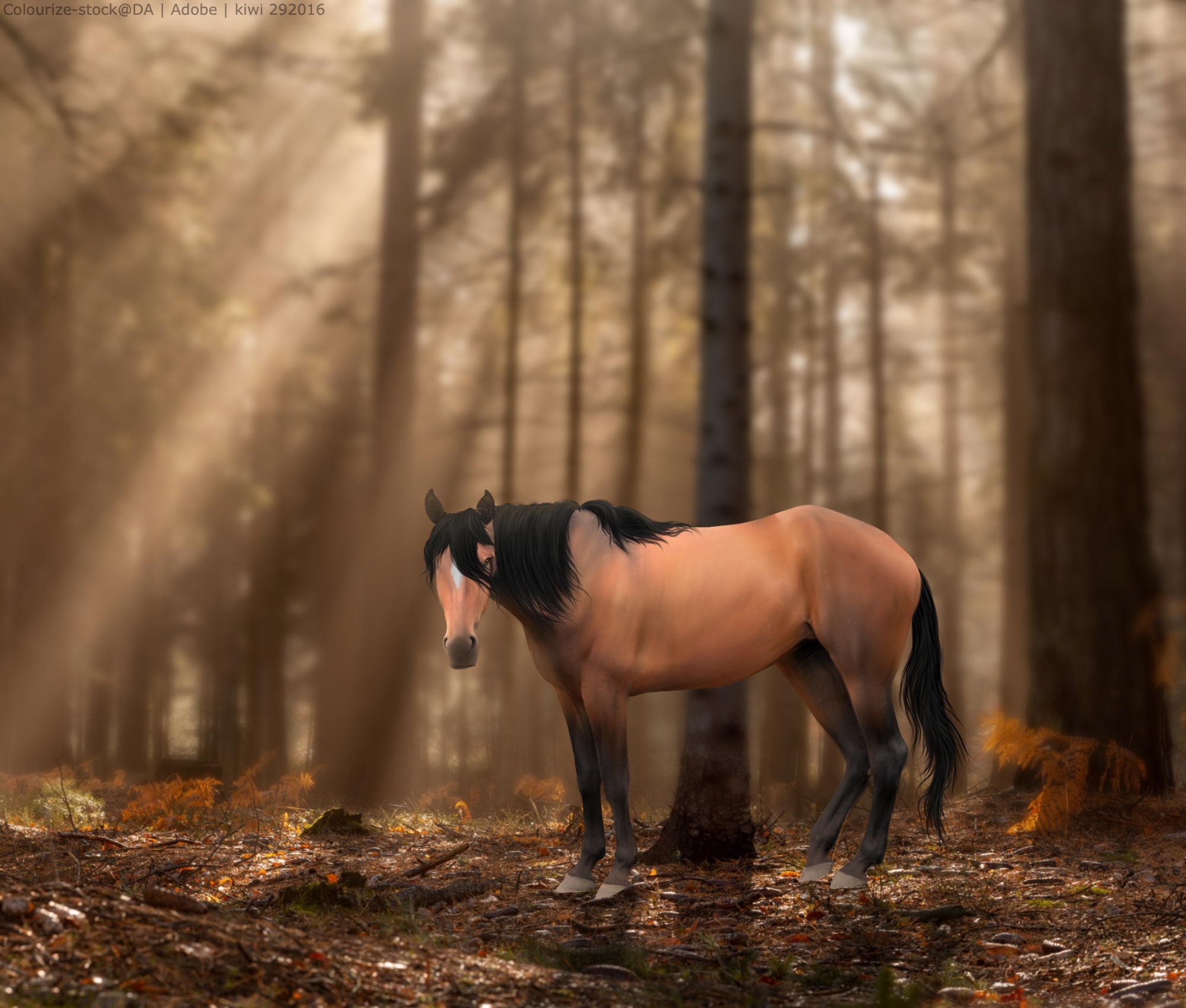
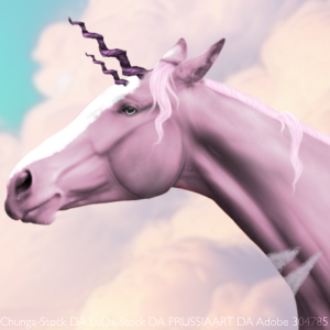
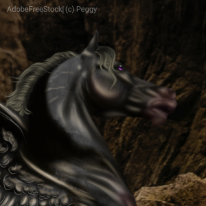
First of all, I love the style of your pieces, it's very soft and also dramatic and it's very unique and pretty! Your concepts are creative and work well together. For the first piece, I personally think the horse looks a bit dark. I know it's a dark piece but I find the eye isn't really drawn to the horse because it tends to blend in with the background at the bottom of the piece. Personally I'd add a bit more contrast probably to the whole bottom of the piece so it's less just black and the horse would stand out a bit more. The second piece is definitely my favourite of the three, I think you've done a really great job with the lighting and the work on the horse and the colours are pleasing together. My only concern is that to me, the horse appears too small for the background that it's in. In the third one, I think the lighting of the horse could use some work. The horse looks pretty flat as there is not a ton of definition and shape from shadows and highlights. I would go in and add a bunch more shadows and highlights on the horse's body to contribute to definition and lighting, especially with shadows - the horse seems to be slightly backlit from the lighting source, so it would make sense to have shadows. The horse also seems like it's much smaller than a full size horse should be, but I'm unsure if that's what you're going for in this piece. |
|
|
| |
|
I've got more I want opinions on. I quite like the top one especially haha |
| |
|
| |
|
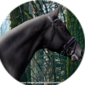
For the first three, I agree with Nightshade. The first and third don't really draw attention to the horse, with the first being too dark and the third having too much going on that kind of draws attention away from the horse. In the last two you posted, it looks like the actual cutting of the stock image of the horse could use some neatening. Not much, but I notice a few wonky edges here and there. Also, keep in mind that 90% of the time a horses markings will not be pure white. And this may just be a personal preference, but blending out the edges of markings ever so slightly may make them look a bit more natural. I see many different styles here, which I understand you're experimenting, so it'll be hard to give you a complete assessment until you find a style you like best. Overall, great work! |
|
|
| |
|
I agree with both Mystic and Nightshade, however, I do notice a few more things that I'd say could use cleaning up. 1. Hair tones, shading, and definition. The hair on almost all of the pieces don't match the horse they're meant for, in terms of shading, and color. Your overall hair technique is great, I like the flow of it. When looking through (almost) all of your pieces, the hair doesn't match any color on the body of the horse, or a shade of a color on the horse. Hence making it look peculiar, or unrealistic, even if you're doing a realistic piece. Matching hair is a key thing, especially when doing color changes. If you do it right, you can really make the horse and hair stand out on the background. 2. Adding fantasy parts to the horse. As much as I enjoy fantasy, I do believe your fantasy techniques could use some cleaning up. For starters, your hybrid tails. They do look very pretty at a glance, but looking closer you notice a few things: 1) there isn't definition to them; they look very flat and 2) they don't have much shading. I suggest looking and studying lion and tiger tails to understand how the light hits different angles on them, and understand how they connect to the body. Another thing that could use a *tiny* bit of cleaning up is your glowing eyes. When things glow, they have a gradient that forms around the objects around them, and causes a slight tint to the things around them. Your eyes are missing this effect, or it isn't given much definition. Another thing about this is you need to remember that glowing eyes doesn't mean the eyes disappear. It's always good to have the glow on top of the eyes, so you can still see the definition of the shape of the eye. 3. Cutting/grounding technique. Your grounding for the most part is really well done, but I do have some things to note about grounding when in water. When in water, objects typically have water splashing around them, or ripples. In the one example that the horse is in water, it simple looks cut out and placed there, with nothing but a line symbolizing this. It's easy to forget to do something like this in a dark piece, but whether it's dark or not, having ripples or splash marks helps the piece overall. Also, as Mystic said, your cutting is a bit unclean. In the first piece, third piece, fourth, and fifth piece, you can see it if you zoom in. You always want to have a clean cut, or those who are nitpicky about pieces will not be drawn into it. In the fourth piece there is a noticable white line near the bottom of the horse's right hind leg. In the fifth piece the cut gives a wonky shape if you zoom in. Cutting a horse properly is essential when trying to make a horse fit in the background provided. 4. Last but not least, additions to the background. On your third and fourth piece, you've added sparkles and moss to one, and sparkles to the other. Things to note when adding sparkles: Sparkles aren't everywhere. They have different sizes, opacities, and tints, and if you add to much, it takes away from the original background. You also only want them in the sky, or above the horse. If they're simply above and below the horse, it can make a piece look sloppy. If you still have the .psd of one or both of these images, try doing as I say. You may end up loving the piece even more! Lastly, the moss. When doing moss, you need to remember that moss connects to other moss around it, and doesn't fall in a straight angle. It's flowy, like hair, but not so much that it looks like it, if you get what I mean? Moss, like sparkles, should have different opacities, and shouldn't look flat. You can see through it in real life, so it should be slightly faded in a picture. Also, make sure it wraps around the origin at the top, instead of seeming to just connect at a tiny point, and continue growing on. |
|  |
|
| |
|
Ooo I loooove the first one, but it's a little too dark. |
|
|
| |
|
Alright, I've tried doing a different style this time I'm asking more so about the style and hair, rather than just the art in general. Or other things that range across all the peices. Each is clickable |
| |
|
 Morning Showers then Cooling