I am by no means a hoof master - but I think I may be able to provide some tips!
I certainly don't think you're hooves are too bad, but personally there are a few things I would do differently. Personally I like less smudged hooves, as I go for a less painted look with my horses. I generally try to preserve as much as the original hooves on the stock as possible, then I use the clone tool to fill them out and create the proper shape/cover up any grass etc. When I do it I always try and preserve the natural colour changes and even grain in the image, so I tend to use a size 7ish brush and clone from areas directly above/below etc but in separate 'dots' if that makes sense , ie I don't drag the brush. For me that stops the hooves from becoming overly muddy in colour and preserves their natural grain and colour. It's only after I get the shape right doing this method that I do any smudging - which for me is pretty minimal as I go for more realistic look and the details on the hoof are quite delicate. That is just my personal method though, and I tend to se stock that has at least one visible hoof so that I can reuse its texture if I need to repaint the others.
In terms of grounding, I think you've done quite well with the last two, especially the left side of the green image. I would suggest trying out putting a darker, more localized shadow directly beneath a hoof that's on the ground in addition to the rest of the shadows, as I find this helps especially when there isn't much grass etc covering the hoof (ie the first image). What I would also be inclined to do would be to lightly darken the bottom of the hooves themselves that are on the ground, especially if there is grass or sand as this can create a slight shadow.
Here is a quick breakdown of nit-picky things I would do differently on each of the pieces - but don't take these as gospel, but my preference!
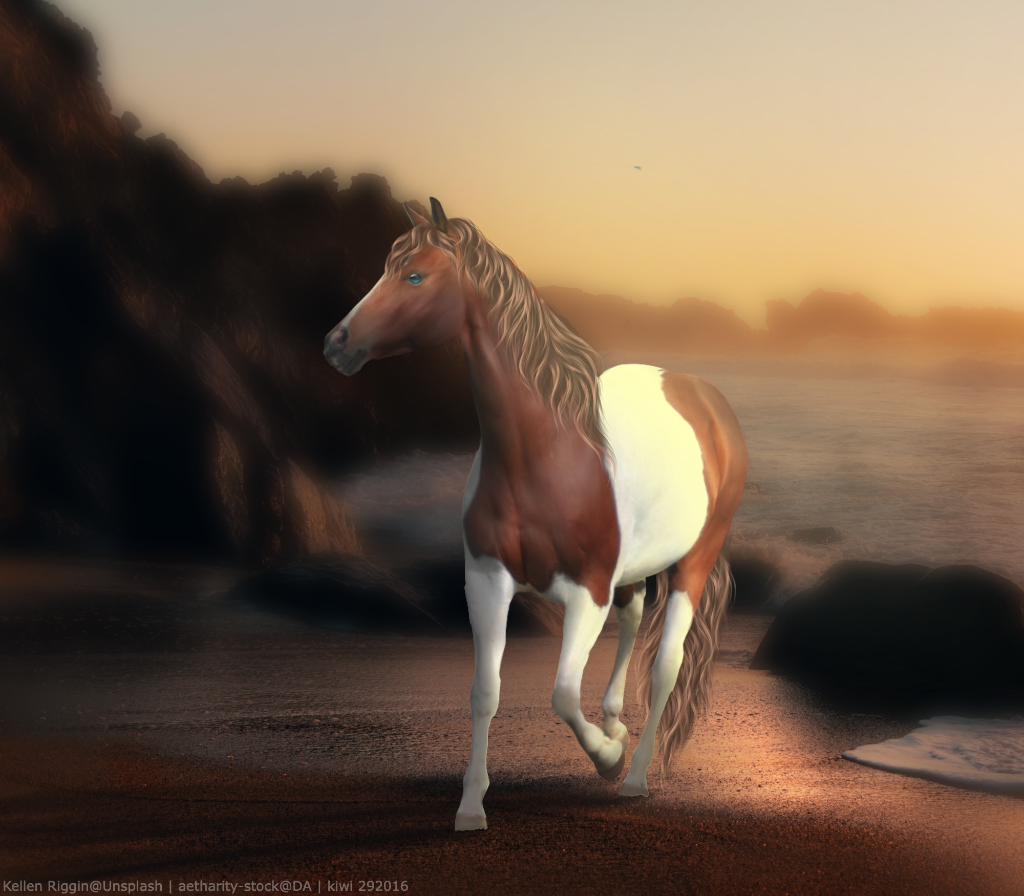
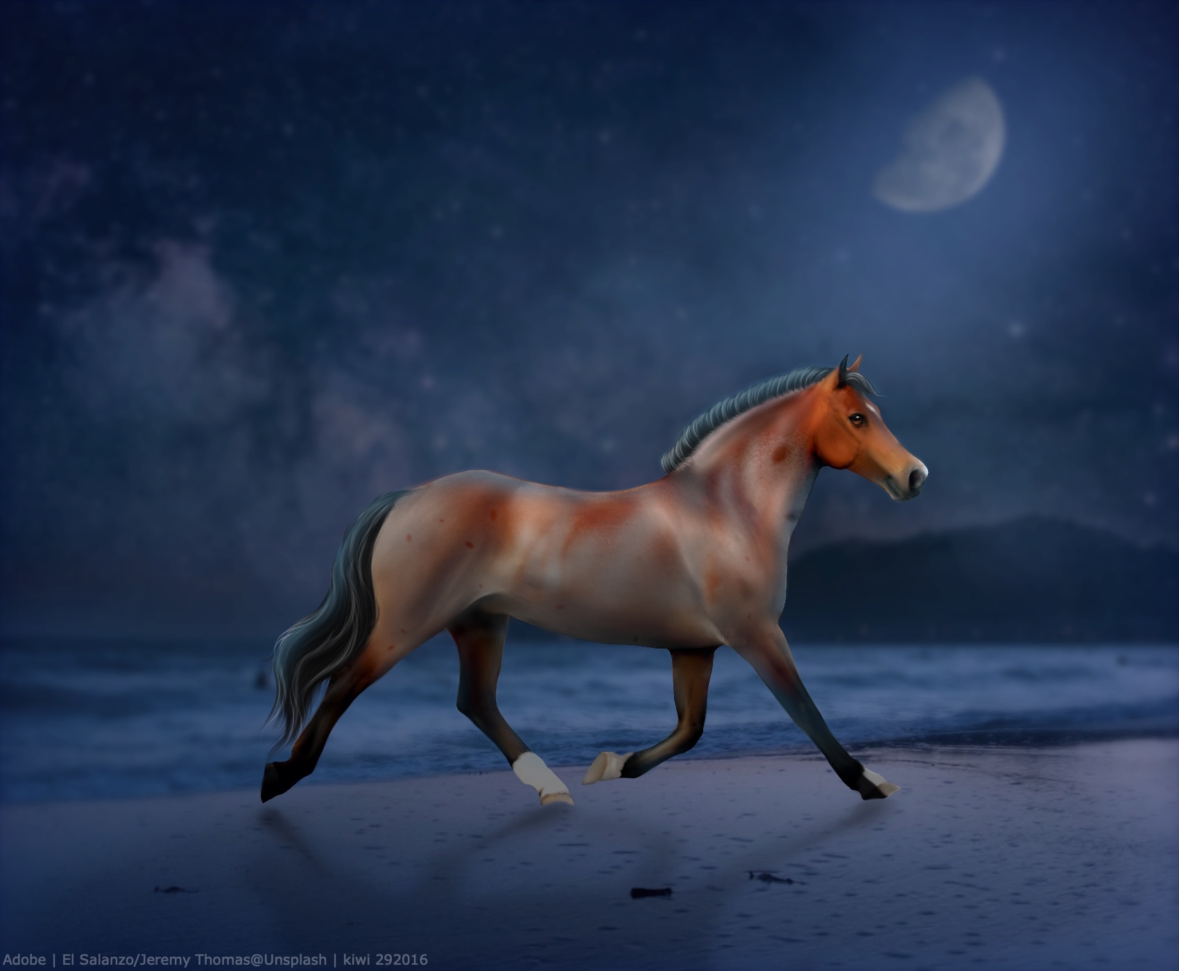
1. The main thing that sticks out is the colour, while you don't want super dark hooves with white socks, I'd stay away from going too pink - aim for a more grey/white/even yellowish colour such as with the last image. I'd have a go at adding an extra dark shadow right under the hoof as well, and darken the hoof bottom. I'd also say the closer front hoof is a tad too long but that's very pedantic lol
2. The colour works a lot better here, I would just try to darken the hooves around where the sand sits in fort to show some shadow/blend it better. Again this is pedantic, but I feel the front hoof on the ground should have a more angled left side so that it comes out a bit more to the side - try following the angle/line of the pastern downwards to the ground.
3. The grounding is really nice with the grass and I like the less smudged (lighter) front hoof. My only hang up would be the darker front hoof, it looks a bit blocky so I would erase more of it so it looks like more grass is covering it. I would also consider making it lighter so it better matches the other hooves.
4. I think this one fits really nicely with your art style - the hooves don't feel overly smudged or totally one colour, but are also in a similar painted style to the horses body. The only thing I'd try would be darkening the hoof on the ground just above were the sand covers it to add a bit of shadow.
Overall I think you are doing great! These are just my preferences and I find that no horse stock can be treated the same, you just have to play around and try different things - so don't get discouraged. I apologies for the essay lol, It may not even be the sort of feedback you wanted, but I clearly quite like my hooves! Hopefully this all makes sense, feel free to PM me if you ever need help!
 Morning Showers then Cooling