| Help? | May 24, 2024 11:59 PM |
|

|
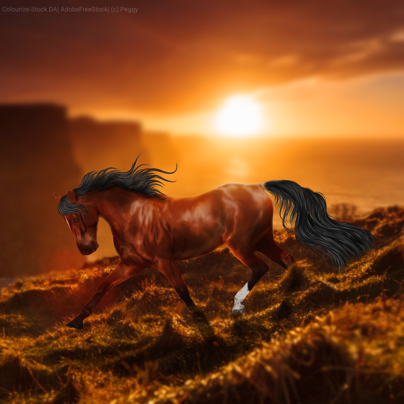
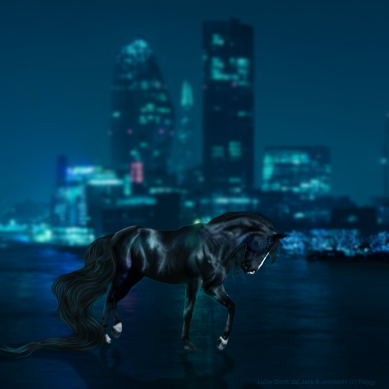
After almost 6 months of drowning under the load of school, work, and animals I finally have had some time to pick up the ole art pen. I'm SO rusty and I feel like these look odd or are missing something but I cannot put my finger on what I did wrong. I would love to get some tips or ideas about what looks funky. Thanks loads~ . This one was a rider removal.. it was not fun 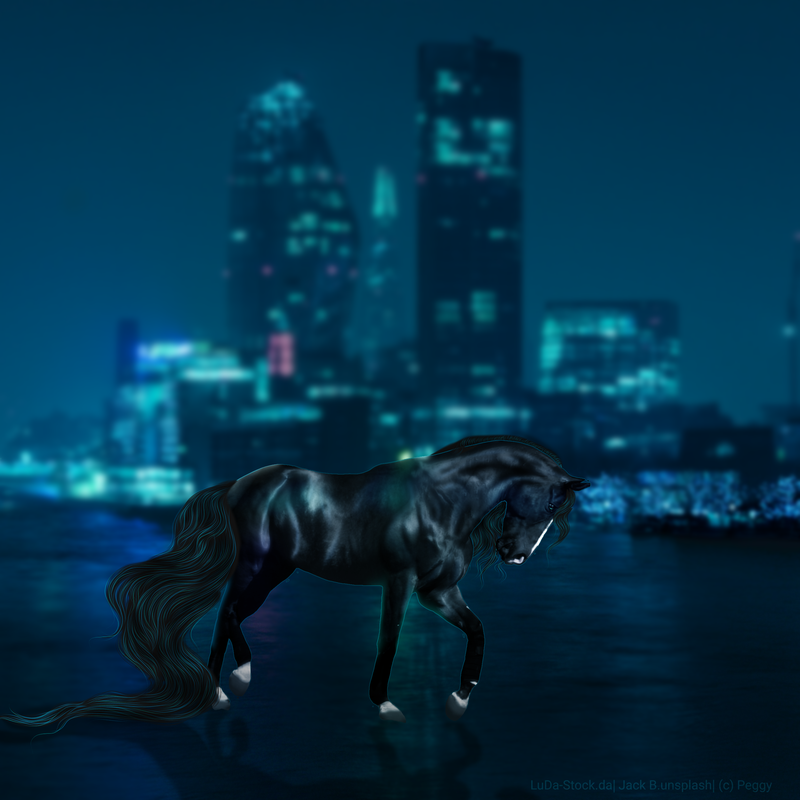 . |
|  |
|
| Help? | May 25, 2024 12:09 AM |
|

|
i think the lack of a solid outline in some areas of the horse for a highlight is what youre missing. especially the orange one. theres no reflected backlight from the bright sun. i like where you were going with the soft light around the silhouette of the horse but it seems to just cover it. what setting do you have that specific layer with the soft light? EDIT i also just noticed this; the bg upstages the horse because of how sharp the image is, try a light blur on them |
|  |
|
| Help? | May 25, 2024 08:43 AM |
|
|
Caprina Springs said:
i think the lack of a solid outline in some areas of the horse for a highlight is what youre missing. especially the orange one. theres no reflected backlight from the bright sun. i like where you were going with the soft light around the silhouette of the horse but it seems to just cover it. what setting do you have that specific layer with the soft light? EDIT i also just noticed this; the bg upstages the horse because of how sharp the image is, try a light blur on them
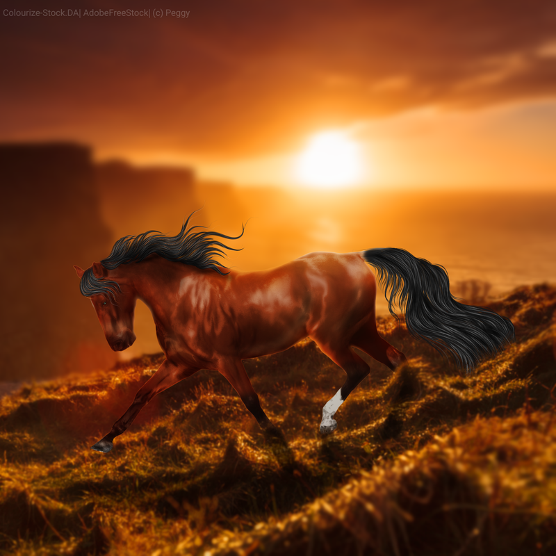
Omg thank you!! Images have been updated on the first post if anyone else has criticism :) Links are clicky so you can really see all the details ❤ |
| |
|
| Help? | May 25, 2024 08:00 PM |
|

|
The only issues I see are very small details. The legs on the black horse look a bit undefined and almost swollen, and its feet are a bit more blury than the rest of the horse. It also is missing some definition in some areas, such as the back legs kind of blend into a black mass. You could try using some very light white to define the shape a bit more. The orange one looks very good, except for the front leg and foot is a bit sharp and blocky. It also could use some of the highlights for definition as well. Also the face/muzzle looks a bit big for the horse's face, and the ears are a bit blury and could use some definition. I hope this isn't to harsh. Like I said just being very nit picky if thats what you are looking for! lol :) They look amazing though! |
|  |
|
| Help? | May 25, 2024 08:10 PM |
|
|
Angels angels said:
The only issues I see are very small details. The legs on the black horse look a bit undefined and almost swollen, and its feet are a bit more blury than the rest of the horse. It also is missing some definition in some areas, such as the back legs kind of blend into a black mass. You could try using some very light white to define the shape a bit more. The orange one looks very good, except for the front leg and foot is a bit sharp and blocky. It also could use some of the highlights for definition as well. Also the face/muzzle looks a bit big for the horse's face, and the ears are a bit blury and could use some definition. I hope this isn't to harsh. Like I said just being very nit picky if thats what you are looking for! lol :) They look amazing though!
That's exactly what I was looking for, thank you! <3 |
| |
|
| Help? | May 26, 2024 03:41 PM |
|
|
Alrighty, here are the current pieces. Thank you both for the advice! If there's any nit-picking to be done about anything else please don't be afraid to offend me :) It's quite hard to do lol . . |
| |
|
| Help? | May 30, 2024 08:09 PM |
|

|
Wow! they look awesome with those little edits! your art is stunning! |
|  |
|
| Help? | May 30, 2024 08:09 PM |
|
|
Edited at May 30, 2024 08:09 PM by Dash and Duchess
|
| |
|
 Morning Showers then Cooling