| |

|
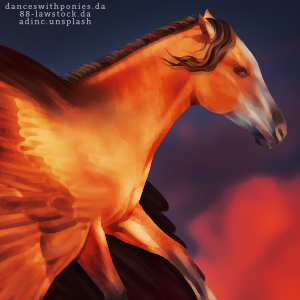
Hello everyone! I'm currently a Tier 2 artist but would very much like to move up to Tier 1 eventually. I'm looking for some suggestions of what to improve on in order to get there. I would love help on where to put facial highlights and shadows along with more realistic manes and tails. For anyone who's interested, I do use Inis Paint X to do art. Anything helps! Thank you very much!!! |
|  |
|
| |
|
this is probably a dumb question for me to ask... But I just started trying to use IbisPaintX and I'm failing. Badly lol. any tips? |
|
|
| |

|
Lol, it really just takes practice. If there's anything specific you need help with feel free to PM me :) |
|  |
|
| |
 |
I wish I had tips for you, but your art is fantastic and I think you should be at Tier 1 already. |
|
|
| |

|
Wow, thank you. That really means a lot <3 |
|  |
|
| |
|
I think you are rather close to moving up to tier 1 but there are a few pieces of yours that are tier 2 as well. Something that I do suggest is making sure to not 'over' smudge/blur your horses coat, as it's currently a little visible. Other than that your good! |
|  |
|
| |

|
Edited at May 5, 2020 09:11 PM by Snowmass Horses
|
|  |
|
| |
Moderator |
A bit more highlight/lowlight definition and smooth flow to the manes/tails. They look a bit stringy. But other than that, looks good! |
|  |
|
| |

|
Thanks Snow! Thank you so much Ven! |
|  |
|
| |
|
since you use ibis, I recommend (for hair) using a soft dip pen sized 1.7 on force fade stabilizer. It's a good size for most pieces. Use it to make the outline for your hair and to do the first layer of highlights. I use a new layer for each new set of highlights / shadows I do, so that I can toy with opacity before merging everything.
The brush sizes I use for doing hair are 1.7, 1.4, 1.1, and 0.8. You go down 0.3 for each new layer. The smaller the brush, the lighter the color used for highlighting. 0.8 is usually almost all white. It's also the size I use to add more shadows / definition to the hair, using the base color. This system is what works best for me, so I figured I'd share :) Oh, and when I'm outlining / filling the base of the hair, I use a bright red color so that it stands out from the rest of the piece. It's pretty helpful. Once you've got the shape down, use filters>mono color to change it all to the base color you want. My tips for highlighting the face-- study pictures of horses to see the muscles and natural highlights. It'll help when you go to do your art. Also, do your shadows first! Then you can add highlights (i use a a barely off-white, tinted to whatever sort of color the background is). A little Gaussian blur can help highlights match better, but don't go overboard. Once you have a good shadow / highlight base on the face, take your 1.7 soft dip pen with force fade and take the brightest color that the lighting in your piece has. On a new layer, trace over the highlights again. Then toy with opacity to make it look right. I usually switch this layer to Soft Light before working with opacity, but sometimes Normal works better. Just gotta find what looks best! Anyway, I'll shut up now. Good luck movin up! |
|
|