| |
|
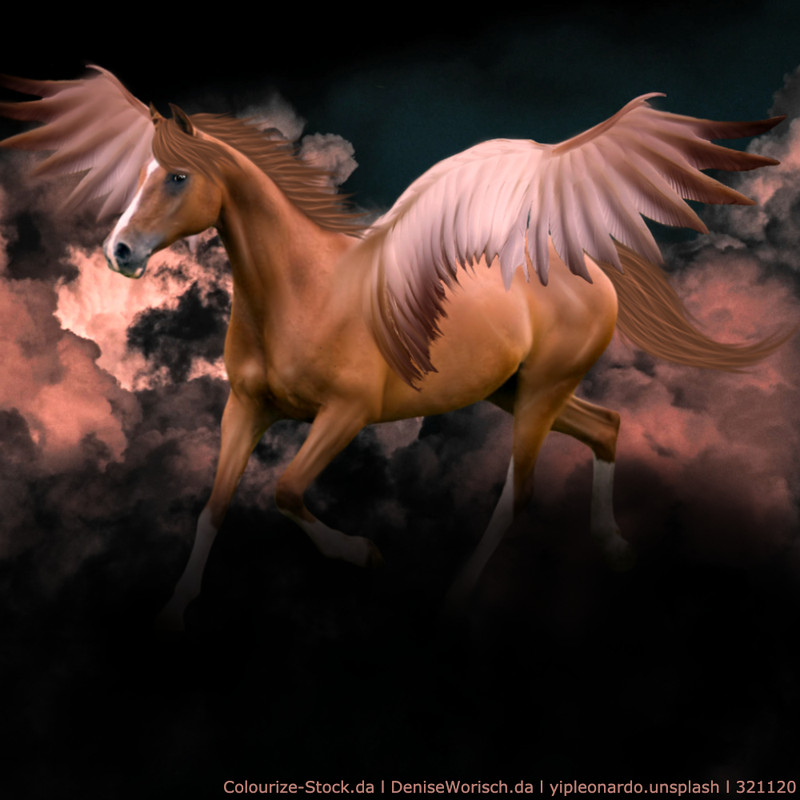
Just something I randomly had some motivation to do. Be as harsh as you want. |
|
|
| |

|
Be as harsh as you want (: Edited at February 14, 2021 11:45 AM by ~Pegasus Lane~ |
|  |
|
| |

|
Thoughts? Tips? I'm so proud of this! My first lineai, but please, I want your serious opinion. |
|
|
| |
|
Apex Equestrian said:
Just something I randomly had some motivation to do. Be as harsh as you want.
Looks awesome, coloring and cutout, grounding looks great, mane is awesome, tail could be thicker and looks a little to flyaway. |
|
|
| |
|
~Pegasus Lane~ said:
Be as harsh as you want (:
Your cutout needs to be way more precise, hooves are oddly shaped, mane is tail are not positioned correctly and horse is not grounded. Could use some smudging, but love the colors. |
|
|
| |
|
I'm so happy with how this turned out! Be as harsh as you'd like :) |
|  |
|
| |
|
|
| |
|
Hello, this isn't a photo manipulation so I dont know if I can post it here ( I think so but you never know). Is there any critique for the shading( on other parts of the drawing is fine too !)? I digitilized a old sketch of mine so some of the lines are in the wrong places. Also I can show proof I made that art piece tomorrow, but currently I am on my computer and don't have acces to my tablet. |
|
|
| |

Art Team
|
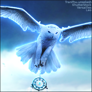
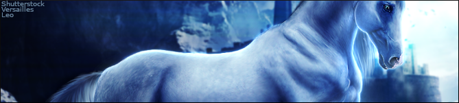
@CC Yay! Chonks are my favorite. Reflection and feathers are especially nicely done. My main critique on this one is lighting. The highlights are very very strong and there're not quite in the correct location to be natural. The main light source in my opinion is the sky so the strongest highlights should all fall on the top edges of the horse. There will some light reflecting back up onto the horse's stomach but they won't be nearly as strong. Some ripples around the horses feet would add another element of realism <3 . @Anonymitat Very very nice! I love the naturalness of this piece and also the expression of the horse. It just seems (to me) very pleased with itself and is taking a victory trot away from something. I like the smoothness of the horse along with grounding. I would definitely reccomend giving the horse at least somewhat of a tail. Aside from that, I don't think the lighting of the horse quite matches the background. You could make it match by adding shadows over the right half of the image and highlighting the left half or you could give the horse softer shadows and highlights and make sure the light source is above and behind the horse more. Wonderful job overall :) . @PRR To me, the hair placement really depends if you want movement or not. For instance the horse could be standing still and look like this or there could be wind/movement (which I personally prefer) and look like either of these . @Apex Wonderful composition on this one and big yay to the luck of white lines 😜 I love the wildness of the tail and mane. I think the thickness is a matter of preference and I don't mind the thinner tail at all. I feel like the body prep is somewhat inconsistent as it's smudged more in some places and less in others. I would recommend touching that up a little bit. Highlights seem overly strong to me while shadows on the horse are a little weak, specifically the underside of the stomach. My only other suggestion is to add a shadow on the mane on the horse. Beautiful natural piece overall <3 . @Pegasus Lane I did see your pm about this but it's easier for me to critique here when I'm already on a roll. I agree with HMH about being a little more careful when cutting out the horse. Some shadows and highlights would be a huge help, specifically looking at the original photo and defining the muscles and boundaries. Make sure your patterns stay in the horse as opposed to overlapping onto the tail. I really like the added touch of the steam from the horse's nostrils <3 . @HMH For your first lineart or any lineart really, it's very nicely done. The muscles are clearly defined with nice corresponding highlights. You're very generous with the highlights (which I like) but I think you could be a little more generous with the shadows too. From what I see, the light source appears to be beneath the horse, so l like that the lighting is consistent. Definitely strengthen the shadow where the horse's left/viewer's right back leg meets the stomach. My only other suggestion would be to make the eye more of a different color than the rest of the horse because it kind of gets lost the way it is. And maybe add a little highlight in the eye as well. Very nicely done <3 |
|  |
|
| |
|
The face muscling is off, as well as the eye placement. |
|
|
 Steady Rain all Day