| |
 |
CC- Like Cando said, the horse seems pretty far stretched out.But, that might just be the stock. The left hind leg looks really small compared to the others too. Cando- The face seems to be a little bit too smudged, and the blur coming from behind seems to blend in the tiniest bit too much. The thing that kind of throws me off is the front leg on my right. Otherwise, I don't see much of anything wrong with it! |
|
|
| |
|
Tear this apart guys! It's still a wip 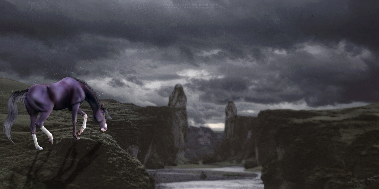 |
|
|
| |

|
Cando, the light source is coming for the left, so the shadow should be on the right side of the horse, insted of the left. The front leg is odd as well, but that could be because it looks as if it is going down a hill, or its gaited, so its not a big deal. |
|  |
|
| |
|
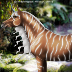
Thank you guys so much! Its really helpful. Yeah the stock though did come like that, the legs twisted a bit. But i found it quite difficult to work with. but thank you guys again, cant stress how much it means :) |
|
|
| |

Rumble Team |
I'm so proud of this piece! First one I've completed that aim actually happy with! Please some critique as well as what you think I should auction it at! |
|  |
|
| |

|
@HMH That's awesome!!! Really really love the idea. First off, I feel like you could add more of a blue tint to the horse to help it look just a touch more natural with the background. Aside from that, maybe add in/draw some splashes as a result of the front feet impacting the water. SB: 35-45k, AB: 125-150k <3 |
|  |
|
| |

Rumble Team |
Thank you, I totally forgot the blue tint, it was on my mental list, lol. Thanks for the reminder. I've never worked with water before. Any tips? |
|  |
|
| |

Rumble Team |
|
| |

|
Pick it apart pretty please? :3 I think this is one of my favorites I've done....and it's even roan! Roan! I hate doing roan XD 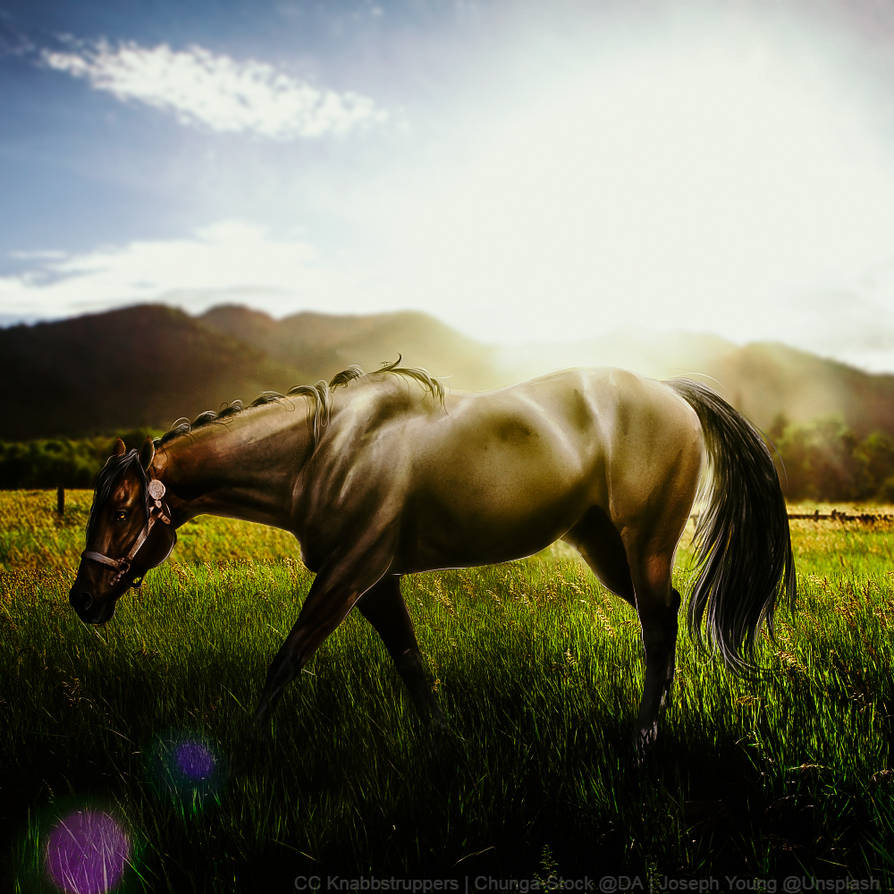
|
|
|
| |

|
@HMH That made a huge improvement! Water is tough. Especially when drawing it. My best reccomendation on that is to look at DA tutorials, try to find one that you like, and look at photographs of splashes and see if you notice any consistencies or patterns. . @CC That's awesome! The lighting especially is on par. I myself also HATE doing roans so you nailed that as well. Going to have to get nitpicky.... I like that you have a slight highlight on the farther back back leg (if that makes sense? It's the horse's right back leg) but I think I would like it a touch more if you continued that highlight onto the underside of the horse's barrel along with the horse's right front leg. Only other thing, more highlights on the right side of the tail and add a shadow in the mane on the horse. Seriously love the piece overall 🥰😍 |
|  |
|
