| |
 |
Thank you! I'm definitely not great at photo manipulations, but these tips help! I will work on my manes and tails,
Kiwi Mountains said:
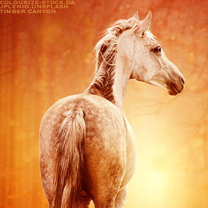
I'm not the best at art myself, but I'll give a few really noticable problems. 1. The mane and tail don't match styles at all. The mane is very blended while the tail isn't, since you used a pre-cut It would have been much easier to just leave it unblended. 2. The blending is very pixelated, or in some pleaces its very obvious you used a diffrent opacity to blend compared to the rest of the background. Mostly talking about the top left and the strip on the right. 3. Some places are more blended than others, like the chest looks detailed while the rest of the horse looks incredibly blurry/ blended. Other than that I really like it, manips take ages to perfect. Even then almost no one's peice will be flawless. This is more of a side-note than anything, with the credits if both the horse and backgroud are from the same stock provider you don't need to put the name in twice :)
|
|
|
| |

|
Edited at October 12, 2021 05:57 PM by Kiwi Mountains
|
|  |
|
| |
|
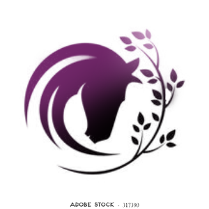
could somebody please give me some basic critique on my overall art style? please dont say anything about the hair, im working on getting an art tablet and starting to draw hair, its just not really possible at the moment. |
|
|
| |
|
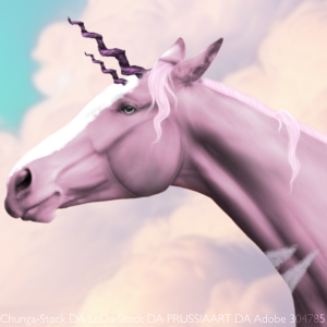
Critiques on this recent piece I finished? Be critical please |
|
|
| |
|
I thought I'd do a warm-up piece from the Spring 2021 Rumble to refresh my photo manip skills. This isn't finished yet (Horse needs a lot more work)... But I'd like some feedback so I can hone in on what I should be doing differently. |
|  |
|
| |
|
here is my first piece in a long time! i have no idea what tier i am supposed to be in, and as always any help is appreciated! created using apple sidecar/ipad/apple pencil on photoshop. |
|  |
|
| |
|
Legazy Stables said:
here is my first piece in a long time! i have no idea what tier i am supposed to be in, and as always any help is appreciated! created using apple sidecar/ipad/apple pencil on photoshop.
High Tier 3 maybe? The lighting is confusing at first glance, like the brightness doesn't fit any particular feature (the clouds, horse, landscape) and the vivdness of the white on the horse competes with the sun/moon in the sky in a way that doesn't feel good. |
|  |
|
| |

|
The lighting matches the background and horse, but i can see how the white on the horse is too bright. It was my first attempt at markings. Horse was originally bay so I did a complete rework of color and doge/burn/ shadow and highlight work.
Over the Garden Wall said:
Legazy Stables said:
here is my first piece in a long time! i have no idea what tier i am supposed to be in, and as always any help is appreciated! created using apple sidecar/ipad/apple pencil on photoshop.
High Tier 3 maybe? The lighting is confusing at first glance, like the brightness doesn't fit any particular feature (the clouds, horse, landscape) and the vivdness of the white on the horse competes with the sun/moon in the sky in a way that doesn't feel good.
|
|  |
|
| |

|
Legazy Stables said:
The lighting matches the background and horse, but i can see how the white on the horse is too bright. It was my first attempt at markings. Horse was originally bay so I did a complete rework of color and doge/burn/ shadow and highlight work.
The light direction might match the sky and the horse, but the landscape/trees don't match the suggested lighting. Here's a similarly bright landscape, you can still make out the rocky textures and the differences between rocks and trees. Also with light behind an object, the object has stronger shadows towards the viewer. So the horse should be much darker with maybe just the face/neck full highlights, and rimlighting for the rest of the body. Examples taken from Unsplash |
|  |
|
| |
|
Thoughts? I'm seeing I forgot to blend/blur some areas, but I'm feeling pretty chuffed about it otherwise. |
|  |
|
