| |

|
thankyou for the critique <3 and thankyou for the compliment |
|
|
| |

|
Shadows and highlights are very important in not making jewelry look flat!
Over the Garden Wall said:
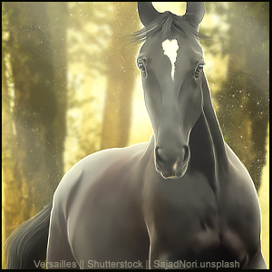
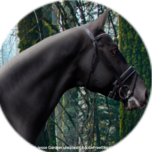
Is there a trick for turning grey noses pink? I'm using a grey horse stock, but my desired outcome has some pink. The trouble mainly is that the face is in front of the body so I'm worried about 'pinking' over areas I don't want too. Also any tips for drawing jewellery or should I try finding stock for that? Asking mainly because I don't know how detailed to make it and I don't want it looking flat.
|
|  |
|
| |
|
Edited at March 20, 2022 06:59 PM by Moon Estates
|
|
|
| |
|
Please do your worst xD. Thanks in advance! |
|
|
| |
|
|
| |
|
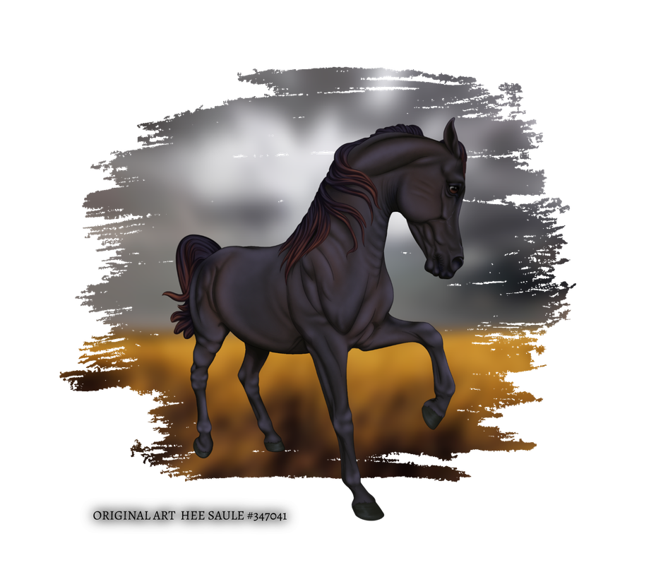
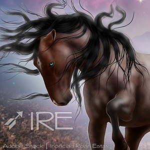
Beyond proud of this one. I really do feel like I've come into my own personal "style" and have improved greatly from when I first started a few months ago. Be as harsh as you want, the more constructive criticism the more I can focus on improving. |
|
|
| |
|
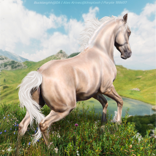
Hi everyone! I just recently picked up my iPad and Procreate again after a longer break. Trying to find "my style" and move away from super realistic art. Currently really struggling with finding a background I like, scenery isn't my strong-suit. 😆 Any advice or feedback? |
|
|
| |
|
Wow! You have all right being proud! 😍 Only thing I can suggest as improvement is perhaps adding a bit more contrast by either highlight or shadow on elbow seen. Bring it out further to create the depth to the chest/barrel.
Ironclad Roan Estate said:
Beyond proud of this one. I really do feel like I've come into my own personal "style" and have improved greatly from when I first started a few months ago. Be as harsh as you want, the more constructive criticism the more I can focus on improving.
|
|
|
| |
|
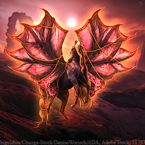
be honest -.- how are we feelin'? |
|
|
| |
|
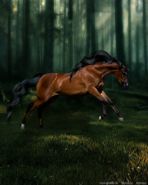
Could use a little more development with the hair, but other than that it looks amazing!! |
|  |
|
 Steady Rain all Day