| |
|
hair doesn't like me XD at least it has volume 😂 |
|  |
|
| |
 |
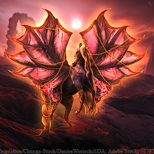
Would love some critques on my lates pieces Hooves are probably the weakest point in the piece below, was a full colour change |
|
|
| |

|
honestly, the shadow was the first thing i noticed. body prep is gorgeous, but the horse doesn't really fit in with the background assuming the hooves are drawn, they all look great besides the front right :D i really like it ! |
|  |
|
| |
 |
Hermes Warmbloods said:
honestly, the shadow was the first thing i noticed. body prep is gorgeous, but the horse doesn't really fit in with the background assuming the hooves are drawn, they all look great besides the front right :D i really like it !
Thanks Hermes! |
|
|
| |

|
anytime! you're getting so much better it's awesome :D |
|  |
|
| |

|
Kirralee said:
Would love some critques on my lates pieces Hooves are probably the weakest point in the piece below, was a full colour change
I actually quite like the horse on that background. As the background is not super vibrant, the coat of the horse would not reflect the colour very strongly, which is what you have done. It fits fine. Your grounding is fine here. What a gorgeous colour change. <3 . The shadow appears to be in the correct place. The thing that can be improved about it is some blurring. Basically, since the light in the background seems to be muted and not directly on the horse, the shadow from the horse would not have a bold and specific outline. It'd be more a dark puddle on the floor. :) |
|  |
|
| |

|
Versailles said:
Kirralee said:
Would love some critques on my lates pieces Hooves are probably the weakest point in the piece below, was a full colour change
I actually quite like the horse on that background. As the background is not super vibrant, the coat of the horse would not reflect the colour very strongly, which is what you have done. It fits fine. Your grounding is fine here. What a gorgeous colour change. <3 . The shadow appears to be in the correct place. The thing that can be improved about it is some blurring. Basically, since the light in the background seems to be muted and not directly on the horse, the shadow from the horse would not have a bold and specific outline. It'd be more a dark puddle on the floor. :)
thats pretty similar to what i was thinking, however its pretty easy to accidentally over-blur something so i dont blame you :) been there done that millions of times |
|  |
|
| |
 |
is this better? Lighter or darker? |
|
|
| |

|
Kirralee said:
is this better?
Perfect! Beautiful work <3 Shadows can't really be over-blurred, especially in very misty pieces with indirect light, so you don't have to be too shy with it. :) |
|  |
|
| |
 |
|
