| |

|
Hermes Warmbloods said:
Versailles said:
I actually quite like the horse on that background. As the background is not super vibrant, the coat of the horse would not reflect the colour very strongly, which is what you have done. It fits fine. Your grounding is fine here. What a gorgeous colour change. <3
. The shadow appears to be in the correct place. The thing that can be improved about it is some blurring. Basically, since the light in the background seems to be muted and not directly on the horse, the shadow from the horse would not have a bold and specific outline. It'd be more a dark puddle on the floor. :)
thats pretty similar to what i was thinking, however its pretty easy to accidentally over-blur something so i dont blame you :) been there done that millions of times
If I may make a gentle suggestion, Hermes- when it comes to critique, I really encourage to try and directly name ways that the person can improve. :) Say what you think, the only limitation is to not be rude. <3
. When I went through art courses in college, it was huge to name something they've done well, and then walk them through something to improve- that's the constructive piece. Instead of naming what they've done poorly or incorrectly and nothing else. By saying what they've done wrong but not saying exactly what to change about that, it ultimately leaves them in a similar spot. They might need that guidance if they do not understand exactly what is wrong. |
|  |
|
| |

|
edit: nevermind, i finished the piece ^^ |
|
|
| |
|
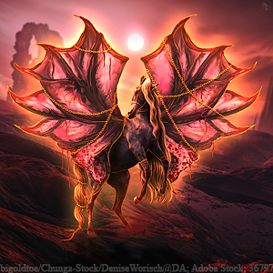
ooooh I love the background/coat color combo :D |
|  |
|
| |

|
speaking of critique while I'm here, I might as well get a few opinions XD I'm trying to steer away from blurriness so I've moved more towards higher clarity images, and the only issues I'm having with this particular piece ( WIP :) besides the funky shadow is the highlight difference between the mane & tail |
|  |
|
| |
 |
Hermes Warmbloods said:
speaking of critique while I'm here, I might as well get a few opinions XD I'm trying to steer away from blurriness so I've moved more towards higher clarity images, and the only issues I'm having with this particular piece ( WIP :) besides the funky shadow is the highlight difference between the mane & tail
I really like this pieces. I would almost add a bit more movement/flyaways to the tail. |
|
|
| |

|
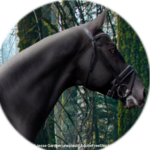
- any critique on the finished product? |
|
|
| |
|
Lumix Estates said:
- any critique on the finished product?
Overall, the piece itself looks very good! I like how you did the hooves. However, there is one thing I'd like to point out: the hair. Cremellos don't typically (if they even) have dark hair. Their hair is always lighter in color, and their coat practically white. I would highly suggest going back and making the hair a lighter color, otherwise it may look off. Another thing, the coat. While the coat color itself is amazing, I think the shade should be just slightly lighter. It looks a little more yellow than white right now, but I love how smooth it looks! |
|
|
| |

|
Rivendell Steeds said:
Lumix Estates said:
- any critique on the finished product?
Overall, the piece itself looks very good! I like how you did the hooves. However, there is one thing I'd like to point out: the hair. Cremellos don't typically (if they even) have dark hair. Their hair is always lighter in color, and their coat practically white. I would highly suggest going back and making the hair a lighter color, otherwise it may look off. Another thing, the coat. While the coat color itself is amazing, I think the shade should be just slightly lighter. It looks a little more yellow than white right now, but I love how smooth it looks!
|
|
|
| |
|
Yeet and spageet, I did a hippocampus looking ass fish boi and want some feedback. I did far more painting than normal and even did some repainting and hate life so really, what I'm chasing, is some pointers for the next time I decide to try a fish stick |
|  |
|
| |
 |
|
