| |
|
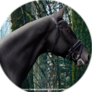
Overall I think the piece looks great, however I do notice that the tail looks a little more pixelated then you were going for. I would also suggest blending the roan in the coat a little more, but that's about all I notice. Great job on the eye and the white markings!! |
|
|
| |

|
|
| |

|
I think that piece looks amazing! No critique from me :) |
|
|
| |

|
Rivendell Steeds said:
I think that piece looks amazing! No critique from me :)
Ok, thanks! |
|  |
|
| |
|
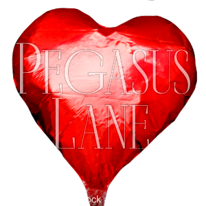
Any critique? (: The background blurring job is trash so.. just kindly ignore that |
|  |
|
| |
Rumble Team |
The tail is gorgeous. I can see some discoloration on the horse (stains) which kinda draws you attention away. Pretty good grounding, the body prep looks nice. |
|  |
|
| |

|
I would also add a strong light source somewhere |
|  |
|
| |

|
But very beautiful!! Very nice job! <3 |
|  |
|
| |

|
I would recommend hand drawing the tiny parts of mane near the neck; the edges look rough and unnatural due to being cut. And yes, following what Tranquillity said, I'd add a light source. Maybe coming in from the right? Another thing: the eyes. While you could just leave them as is, it may benefit your piece to have those eyes stand out; draw them on maybe. I'd keep the blue, but making them larger would probably look better. Not much larger, but large enough that you can see the pupils and color clearly. |
|
|
| |

|
Thank you, everyone! I appreciate it greatly <3 Any critique on this? The grounding has been giving me a buttload of trouble XD |
|  |
|
