| |

|
KPH Equestrian said:
Rising Stars~ It loogs great! The body prep is nice, though I'd like to touch on the lighting. The horse is a little too red-toned for such a blue background. However, it looks like you've repainted the horse's highlights with a matching blue color, which definitely helps tie the horse into its background! The last thing I'd like to add is the wings should be blending into to shoulder a bit more. Take a look at the shoulder blade, and smudge the base of the wing to follow that, to help it merge into the muscle and bone. All in all, I think it's a great piece! Well done<3
Actually I didn't repaint it I used color balance and mono color filters |
|  |
|
| |

|
Edited at March 13, 2024 04:35 PM by Dash and Duchess
|
|  |
|
| |
|
Opinions on this piece? I'm a tier 4 artist :) Not sure if I want to keep the wings or not. |
|
|
| |

|
 I'm mainly worried about the credentials honestly. Are they visible enough or should I darken them? I'm mainly worried about the credentials honestly. Are they visible enough or should I darken them? |
|
|
| |

|
Whimsical Winds said:
Opinions on this piece? I'm a tier 4 artist :) Not sure if I want to keep the wings or not. I love the wings and believe you should keep them. I love this piece by the way.
|
|
|
| |
|
Southern Heights said:
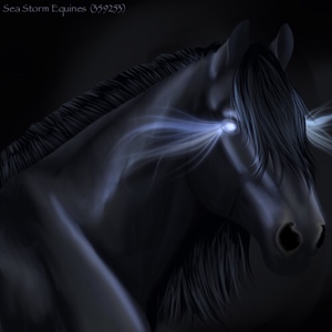
 I'm mainly worried about the credentials honestly. Are they visible enough or should I darken them? I'm mainly worried about the credentials honestly. Are they visible enough or should I darken them?
I think the credits are good. I can see them and tell what they are |
|
|
| |
|
KPH Equestrian said:
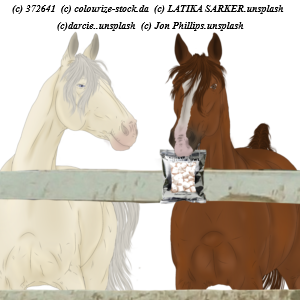
What do y'all think of the mane? the Body prep/grounding and all that is a WIP, I just want critique on the mane style<3 This is also my first tack removal - the horse has a bridle on :D Edit: my latest piece(currently up for auction) what could be improved here?
they look good! i would personaly add a few strands of a lighter color to the mane and tail on both of them other then that there stunning! |
|
|
| |

|
~solar stables~ said:
KPH Equestrian said:
What do y'all think of the mane? the Body prep/grounding and all that is a WIP, I just want critique on the mane style<3 This is also my first tack removal - the horse has a bridle on :D Edit: my latest piece(currently up for auction) what could be improved here?
they look good! i would personaly add a few strands of a lighter color to the mane and tail on both of them other then that there stunning!
thank you!<3 Those are so old lol. I've changed styles and figured out more about lighting since then, thankfully xD |
|  |
|
| |
 |
Hello, first time asking here, any opinions on this piece? Anything I missed? I'm a digital artist, I did the horse with my bare hands, background is a photo taken by me and the wooden floor is a sticker-thing from IbisPaint (do I credit that too?) Not sure about the lighting on the tail or on the horse at all for that matter. Also pricing help would be appreciated :) Thanks! (Watermark could be removed if it's in the way of critiques) |
|
|
| |

|
Aeronautica said:
Hello, first time asking here, any opinions on this piece? Anything I missed? I'm a digital artist, I did the horse with my bare hands, background is a photo taken by me and the wooden floor is a sticker-thing from IbisPaint (do I credit that too?) Not sure about the lighting on the tail or on the horse at all for that matter. Also pricing help would be appreciated :) Thanks! (Watermark could be removed if it's in the way of critiques)
Looks amazing, but the horse's legs are too tall, they look ike they would be streched, I think, and also I think the original floor could have been prettier? |
|  |
|
