| |
|
Thoughts? Im very proud of this lol, New breakthroughs feel awesome. Edited at December 20, 2019 12:00 AM by Cassa Belle |
|
|
| |
|
Need critique and pricing help |
|
|
| |

|
Snowmass Horses said:
Looking for a critique This is a very elegant piece, I like the composition and choice of stock. :) To further perfect this piece I would suggest focusing on matching the lighting on the horse to the lightning on the background. One way you can do this is by creating an overlay layer of the background and placing it over the horse with an opacity or around 10. To further create a concise lightning you can auto tone and auto contrast the horse. This will both match the horse to the background and build definition in the horse itself. Another way to make the horse pop instead of fading into the background would be to add a shadow below the horse that follows the direction of the sunlight. You can also create a slight glow around the horse itself to subtly make it stand out. I hope these suggestions help. If you have any questions feel free to PM me. :)
|
|  |
|
| |

|
Vellum Elites said:
Snowmass Horses said:
Looking for a critique This is a very elegant piece, I like the composition and choice of stock. :) To further perfect this piece I would suggest focusing on matching the lighting on the horse to the lightning on the background. One way you can do this is by creating an overlay layer of the background and placing it over the horse with an opacity or around 10. To further create a concise lightning you can auto tone and auto contrast the horse. This will both match the horse to the background and build definition in the horse itself. Another way to make the horse pop instead of fading into the background would be to add a shadow below the horse that follows the direction of the sunlight. You can also create a slight glow around the horse itself to subtly make it stand out. I hope these suggestions help. If you have any questions feel free to PM me. :)
This definitely helps! Thanks, Vell! :3 |
|  |
|
| |
|
This kinda took me ages xD not sure what to think of it. I would like some critique and pricing help (SB and AB prices) I appreciate my cutting out was a bit dodgy in places Edited at December 23, 2019 05:38 PM by Oak valley |
|
|
| |
|
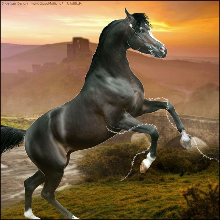
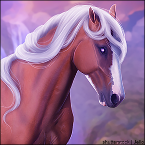
Cassa Belle said:
Thoughts? Im very proud of this lol, New breakthroughs feel awesome.
I love the dramatic lighting and color contrast you chose for this piece. It creates a beautiful serene effect. A few things that could really bring this piece to the next level would be to auto-color the horse to match the background. This is basically an option in photoshop that changes the color of the horse slighlty to compliment the background. This will help to give your piece a more realistic feel. It builds the idea that your horse is actually in the scene you are depicting. You can also play around with color balance to add in a few key colors from the background in hues in the horse's coat. Other than that I might do one final sharpen on the horse just to make it pop a little and add a few highlights to the mane to give it definition. Awesome work here. :) |
| |
|
| |
|
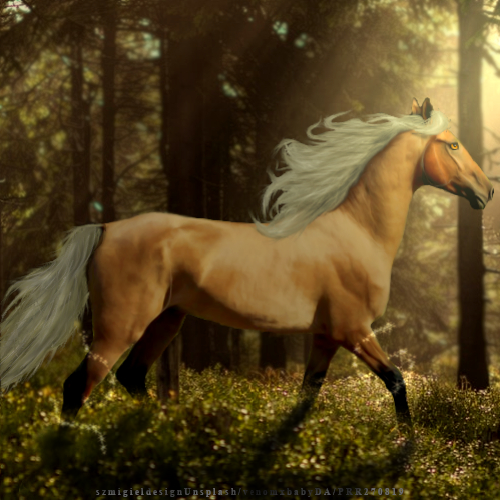
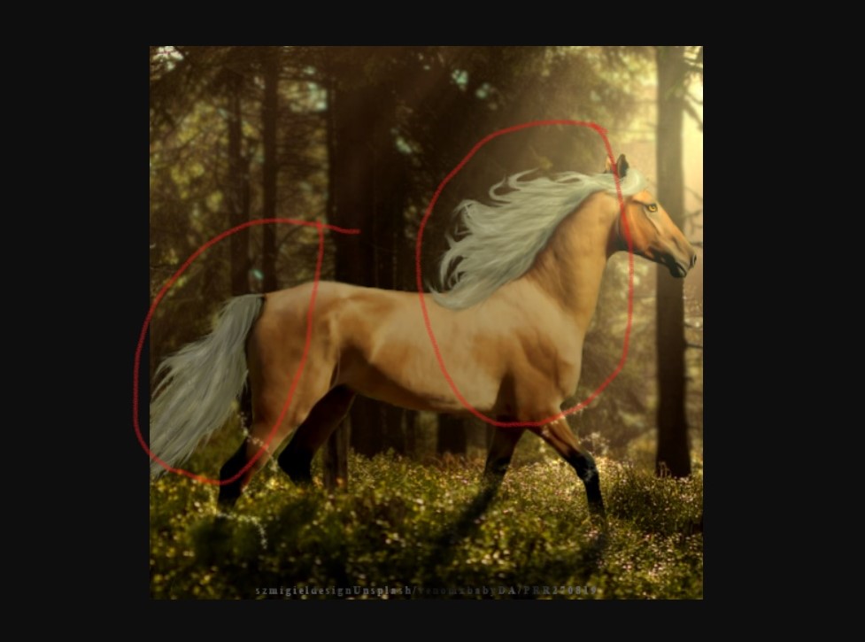
Phoenix Rising Ranch said:
Need critique and pricing help
Allow me to preface by saying this piece is quite beautiful. I love the autumn vibes that emanate from it. :) You did a good job with the sun light playing with the shadow. Your BG blurring job is also quite good. A few tips to make this piece POP would be: In the places I circled here the lighting does not quite match the background. I would say you should darken the tail a bit more, but add some brighter highlights in. With the mane and neck area it appears to be a bit washed out. I would suggest bumping up the contrast here and drawing in some lighter highlights in the mane. I would also try to add some highlights to the neck area that follow the sun's rays. This would blend the lighting on the horse with the BG nicely. Other than this you could add a few more highlights to the face are and do one final sharpen on the horse itself. Lovely job here Pheonix. :D Pricing wise I would start with an SB of 25k to allow for bidding. Make the AB somewhere around 150k to encourage people. When auctioning an image always keep in mind that people are looking to spend more on custom images and less on premade images therefore you have to carefully price in order to secure some ebs. Starting with a low SB and ending with an AB that you would like, yet is reasonable is safe way to go. Keep in mind though that you should always set your SB at the lowest you are willing to sell the piece for. |
| |
|
| |
|
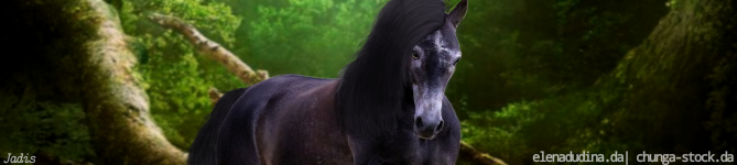
Oak valley said:
This kinda took me ages xD not sure what to think of it. I would like some critique and pricing help (SB and AB prices) I appreciate my cutting out was a bit dodgy in places
Looking good, Oaky! I think the eye pops a little too much, so darkening the color or lowering its opacity would make it fit the horse more. The only part of the cutting that throws me off is the bottom of the head by the lip. Just draws too much attention. I think the horse should be darkened in the areas opposite of the light source, aka the bits "closer" to the screen. The stiff curve of the forelock also throws me a little. Maybe some loose hairs there would make it more natural. |
|
|
| |
|
Oak valley said:
This kinda took me ages xD not sure what to think of it. I would like some critique and pricing help (SB and AB prices) I appreciate my cutting out was a bit dodgy in places
Nice job Oak! You did a very good job of matching the horse's lighting and coloring to the lighting and coloring of the background. My only suggestions in this area would be to darken the legs a bit and reduce the outer-glow some. You have made a good start with your eye. It is on the right track. To enhance it further here are a few suggestions. Stick to semi-natural colors. These will help to make your eye more realistic. Make sure to add some highlights in to the eye after. If you are interested, this is the eye process I follow when drawing eyes. I found this very helpful and it was made by the lovely Lib. :D Other than these suggestions you may try blurring the background a bit with a lens blur and sharpening the foreground. Nice work here, you have made great progress Oak! |
| |
|
| |
|
Edited at December 24, 2019 05:40 PM by Diamanté
|
|
|
 Steady Rain all Day