| |

|
Cassa Belle said:
Thoughts?
I really like this!
I would suggest lightly outlining them in a shade a bit lighter than the background since it seems like that is where the light source is coming from. I'd also maybe add some soft highlights on them both to tie it in more with the background and make it seem like they're being lit up from the back :) |
|
|
| |
|
Had fun with this! Could use some tips. Also, my first color change. 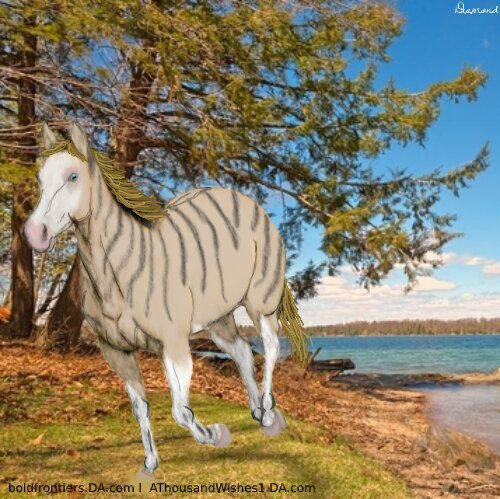
|
|
|
| |
|
Phoenix Rising Ranch said:
Critique?
Still looking for critiques |
|
|
| |
|
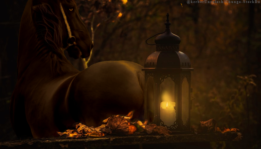
Star Catcher Estate said:
I'mma lay this down right here; I'm super pleased with this. This was a new experiment with doing hair. Also my first color change <3
I really like this. I love the way you've done the mane and tail. The body of the horse looks a bit grainy, but to me it looks quite nice in this picture. I think that maybe you should have a bit more red on the edge of the horse for the lighting else it'll look like there's not much fire |
|
|
| |
|
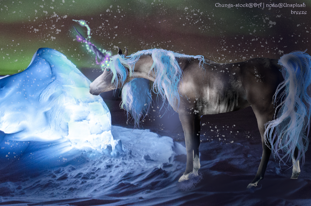
Breezie Rose said:
looking for opinions. First (full body) mania using gimp and my new tablet so I'd love some pointers!
Wow! This is really impressive! First thing I noticed is the hair, the edges don't look as smooth, they kind of look a bit jagged and it doesn't flow naturally, maybe if you experiment with the brushes then you could see which ones work and which don't . The second thing I think you should add is a reflection. To me it looks as itlf the horse is just stood in the water. I don't use gimp but the way I do the reflection on ibis is I make a new layer, copy the horse, paste it on the new layer and flip it. Then I move it so the hooves are touching. I then lower the opacity and blue it a little. Hope this helps |
|
|
| |
|
Ethereal Eventers said:
Looking for critiques and pricing opinions! Thank you
I really like this. Its simple but pretty. I think maybe next time you could as a few more highlights and blur the body a little to make it fit in with the mane |
|
|
| |
|
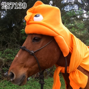
Phoenix Rising Ranch said:
Critique?
I love this! To me the lighting is pretty good. Maybe next time you could make the eye fit in a bit more, to me it looks just orange. I usually have a darker orange, do the eye with that. Put it on a lighter orange, go over the middle of the darker stuff to make it stand out. Then I get a bluey whitish colour, go over the middle part with that to make it blend in and then I out a small dot in the corner of the eye fir the white part. |
|
|
| |
|
Diamond C Ranch said:
Had fun with this! Could use some tips. Also, my first color change.
This looks good Diamond! First thing I notice is the mane, it's a bit stringy. I usually get a base colour, make the shape with that. Get a smaller brush and slowly add highlights on top, but I gradually get it lighter so it looks detailed. Next time, don't forget a shadow! They're very important |
|
|
| |
|
Looking for critique on this, I'm extremely proud of it but I know that I can improve in some areas :) |
|
|
| |
|
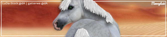
Moonglade Manor said:
Looking for critique on this, I'm extremely proud of it but I know that I can improve in some areas :)
Very nice :) Two things that I notice immediately: the horse doesn't look like it matches the background enough and the eye stands out too much. To make the horse match the background better, take a common color from the background and, on a new layer, color over the whole horse. Clip that layer to the horse, then lower the opacity all of the way down. You can then work on raising the opacity a little until the horse matches well. A different way you could do this is going into filters on the horse's layer and toying with the color balance. As for the eye, it should be matched to the background as well, and then lower the eye's layer's opacity a little until it looks nice. The only other thing I'd say is add another layer and draw the outline/large muscles in an off white color. Then lower the layer's opacity so that the lines don't draw in lots of attention but they define the horse more. |
|
|
 Steady Rain all Day