| |

|
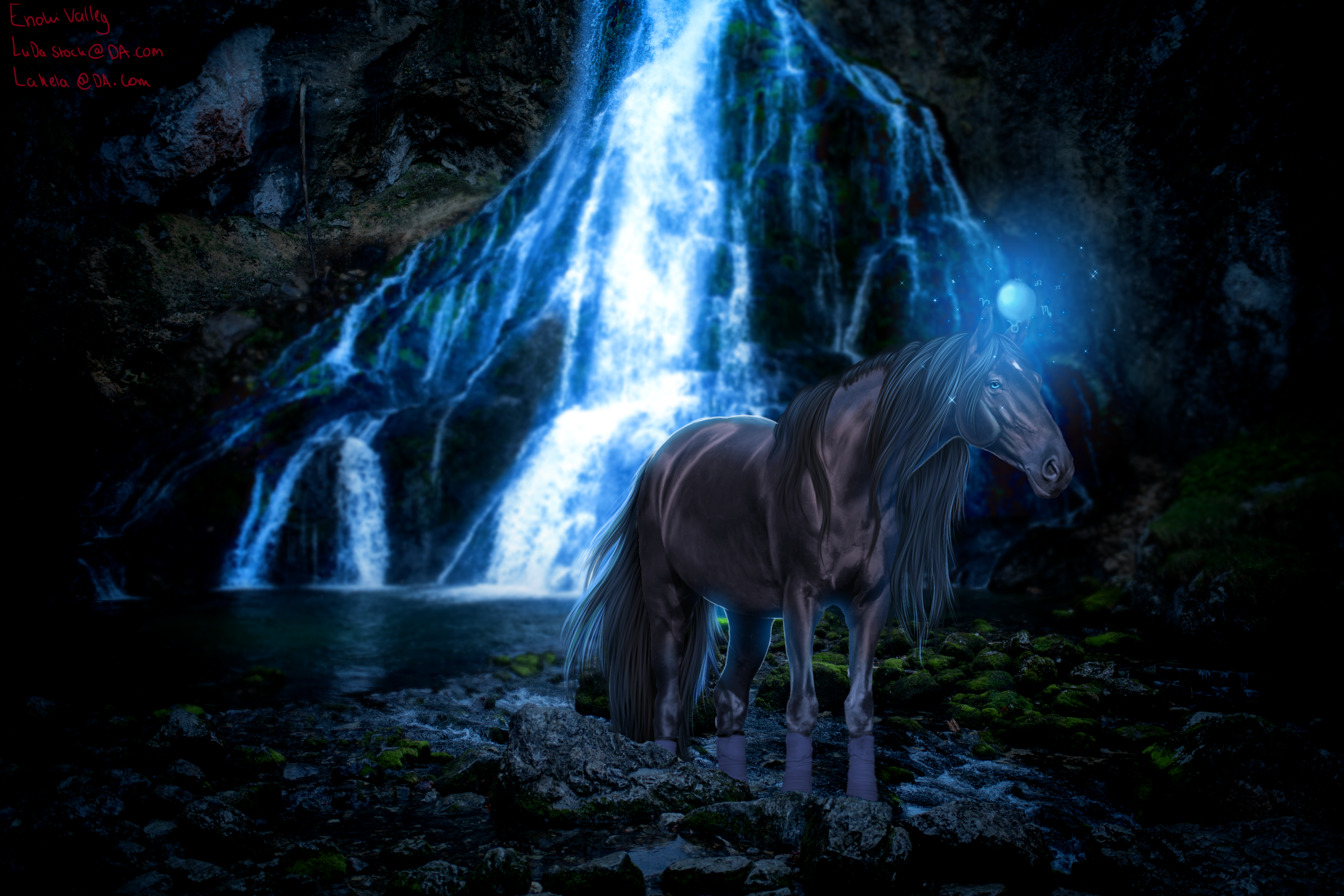
Looks incredible! I love the muscle definition. In my opinion, . You need different shades of brown. Grey muzzle, maybe lighter orange/yellow around the points, like chest, armpit, flank, muzzle, etc. darker brown on the bony parts and over the back, on the withers, forehead, etc. Example. Hair, you need more shading. It's really nice and detailed, but it's a bit strong. You can make the lighting a bit more dramatic over the whole horse, which will make it seem like it fits in better. Purple parts can be darkened (I would use a near black colour on soft light or overlay, and then smudge and blur it to get the desired effect). And then the yellow are the bright highlights, which I would make a similar colour to your backlight, so a bright red/purple. Make sure to do the shadow and highlights on seperate layers from the hair, using a clipping mask Hair idea. Personally, I would also darken your current strands of hair a smidge, and redo some highlight strands with the shade you're currently using! I would also add some shadowy strands. (Not really sure how to describe this, sorry! . Lighting, darken up the front of the horse because that's away from the light (but not too much because you need to still see the horse, I showed kind of where I would darken it using purple), and yellow is where I would add the lighting. Example of lighting I would do lighting similar to how I did my My firework piece I do lighting with add, overlay, or soflight and use an almost white colour on a seperate layer. Darkness I use almost black and either soft light or overlay. Blue is kinda where I'd position a shadow, and I choose a colour that's almost black and lower the opacity. I would add some more light where I added the white dot, to make it more dramatic. Personally, I'd also make the eye a little bit bigger, as that's a central focus of the horses face. . I love the vibe of this piece, the stock and the background work really well together and the horse really seems to be there! The patterns also turned out really nice, especially in the darker lighting! I can't wait to see how much more you improve in the future! . Edit: forgot to mention, I would also blur the background a bit and add some vignette! And usually tobiano comes with a face marking, so that might help bring the piece together. Heres a very messy example of all the changes I've suggested implemented on the actual piece! https://i.ibb.co/9b1h0Ts/IMG-8191.png |
|  |
|
| |

|
Sagebrush said:
Looks incredible! I love the muscle definition. In my opinion, . You need different shades of brown. Grey muzzle, maybe lighter orange/yellow around the points, like chest, armpit, flank, muzzle, etc. darker brown on the bony parts and over the back, on the withers, forehead, etc. Example. Hair, you need more shading. It's really nice and detailed, but it's a bit strong. You can make the lighting a bit more dramatic over the whole horse, which will make it seem like it fits in better. Purple parts can be darkened (I would use a near black colour on soft light or overlay, and then smudge and blur it to get the desired effect). And then the yellow are the bright highlights, which I would make a similar colour to your backlight, so a bright red/purple. Make sure to do the shadow and highlights on seperate layers from the hair, using a clipping mask Hair idea. Personally, I would also darken your current strands of hair a smidge, and redo some highlight strands with the shade you're currently using! I would also add some shadowy strands. (Not really sure how to describe this, sorry! . Lighting, darken up the front of the horse because that's away from the light (but not too much because you need to still see the horse, I showed kind of where I would darken it using purple), and yellow is where I would add the lighting. Example of lighting I would do lighting similar to how I did my My firework piece I do lighting with add, overlay, or soflight and use an almost white colour on a seperate layer. Darkness I use almost black and either soft light or overlay. Blue is kinda where I'd position a shadow, and I choose a colour that's almost black and lower the opacity. I would add some more light where I added the white dot, to make it more dramatic. Personally, I'd also make the eye a little bit bigger, as that's a central focus of the horses face. . I love the vibe of this piece, the stock and the background work really well together and the horse really seems to be there! The patterns also turned out really nice, especially in the darker lighting! I can't wait to see how much more you improve in the future! . Edit: forgot to mention, I would also blur the background a bit and add some vignette! And usually tobiano comes with a face marking, so that might help bring the piece together. Heres a very messy example of all the changes I've suggested implemented on the actual piece! https://i.ibb.co/9b1h0Ts/IMG-8191.png
Wow. I'm a huge fan of your pieces and I love the improvements you have made - totally agree! I struggle with lighting so I will be doing a massive focus on it. Thanks for all the critique, I know I takes time. Will be taking this onboard! |
|  |
|
| |
|
 Just popping this up hoping for a bit more criticism. I am hoping I have taken on board some things lol. I think it's a solid improvement. If you have any input, thanks a bunch! |
| |
|
| |
|
I love it!!! The soft flow of the hair, the lighting, everything is really well done. . Problems I see is that I don't like the boots on the horse. I would've tried to cover this up with rocks or shadows or replaced the legs with different stock/done a tack removal. . Second, there's something missing to this piece. Unfortunately I can't put my finger on it, but it's making it feel a little incomplete, hopefully some other artist can help me figure out what it is! . Overall extremely well done,, I can't find much else to critique! |
| |
|
 Morning Showers then Cooling

