| |
|
BreezieM30w RIDs said:
I feel like I keep pushing a lot, but I'm in an art mood! Thoughts on this one?
https://i.postimg.cc/PxRvpzr1/Untitled94.jpg
It looks great! I really like the overall composition and placement. What I noticed that looked a little odd to me were the lower hind limbs and the back hooves. They look fragile and tiny, I am not sure why it could be the cutting or the glowing outline. The other thing that looks a little distracting from the horse is the wide light outline that is around the cave and the horse itself. Personally I like outlining with a thinner harder brush to subtly add contrast and bring attention to the horse.
|
|
|
| |
|
Golden Hall Stables said:
BreezieM30w RIDs said:
I feel like I keep pushing a lot, but I'm in an art mood! Thoughts on this one?
https://i.postimg.cc/PxRvpzr1/Untitled94.jpg
It looks great! I really like the overall composition and placement. What I noticed that looked a little odd to me were the lower hind limbs and the back hooves. They look fragile and tiny, I am not sure why it could be the cutting or the glowing outline. The other thing that looks a little distracting from the horse is the wide light outline that is around the cave and the horse itself. Personally I like outlining with a thinner harder brush to subtly add contrast and bring attention to the horse.
Awesome! Thanks for the feedback! Is this a little better?
https://i.postimg.cc/Z5kH5QHP/Untitled94-1.jpg |
|
|
| |
 |
Golden Hall Stables said:
This is my most recent piecehttps://i.postimg.cc/sg5KmK57/Moving-In-Stereo.jpg
I am feeling stuck currently so yeah... critique as hard as you feel like!
Overall this is a very availing peice,the mane/tail looks very nice,the eye is good ,and he body prep is nice too!it just seems too dark for the back ground , create a new layer (one above the mane and tail too) ,eyedrop the sky color ,maybe make it either brighter or more yellow ,then draw a fully opaque line over where you when the light streak.make the layer anything under the subtitle lighten (or which ever one you feel is right) and lower the opacity. This way the partially darkness will make alot of sense |
|
|
| |
|
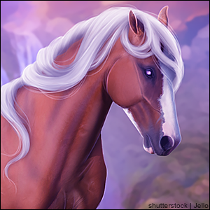
I made this set for a contest, and it didn’t win. So firstly, critique? I know the hair isn’t the best, but other than that... And secondly, what SB would do you guys recommend?
https://i.postimg.cc/13x4rCWm/Jelly-avi.png
https://i.postimg.cc/7Yrfgttx/jellyfish-ret.png |
|  |
|
| |
 |
I love this altogether,it's a very nice set,the thing I notice most is the eye (mainly on the avi) it is a bad idea to use a dot as I highlight Create a clipping layer and use an air brush,because of the surrounding light,use a light grey ish blue (nearly white but with some colour) and airbrush the highlight from where ever the light source is |
|
|
| |
|
https://i.postimg.cc/FFxGyqtq/IMG-20191024-105233-894.jpg https://i.postimg.cc/CLPNtqxs/Untitled317-1.jpg
Some critique on thie contest entry is appreciated :) |
|
|
| |
 |
<a href="https://horseeden.com/horse.php?id=20675140"> https://horseeden.com/horse.php?id=20675140</a>
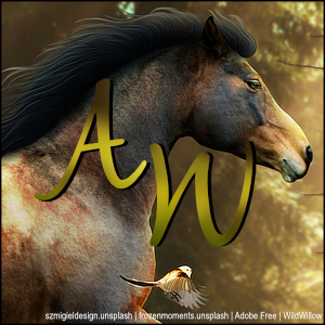
I just did this for my girl, I think it's one of my best so far and it's been a hot minute since I last did art. What do y'all think?? :) |
|
|
| |
|
Callisteia Equine - Overall thatÂ’s a super nice piece. Great concept, horse fits nicely into the background and lighting is all spot on. The mane and tail are gorgeous and are amazingly done, I really cant fault it. The only things that seem to be a little bit off are the shadow and the smudging on the horse. The shadow is placed weÂ’ll however it just seems super sharp. Gaussian blurring the shadows layer can help make it look a lot softer. As for the horse, it seems a little over smudged to me. Especially where the light shines over itÂ’s back. Overall very nicely done! |
|
|
| |
 |
Thank you Aussie! I do agree that I went a little too rough on my smudging :/ but once I did it, I was kicked out of my program and I had no way of undoing it lol. I also was thinking of softening the shadow but I dont know what Gaussian blurring is... I use Autodesk Sketchbook and GIMP, is that available on either of those?? |
|
|
| |
|
https://i.postimg.cc/h4zK9xrx/Spoopy.png
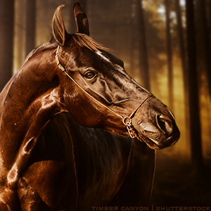
I know, I know, this is really boring. But I just can't quite find that idea to give it spark. Also, thoughts? |
|
|
