| |
|
https://i.postimg.cc/LsYR50qT/Untitled34-20191013181515.png
https://i.postimg.cc/pLbXJ51Q/Untitled25-20191009210207.png What can I do better here? |
|
|
| |
|
Raven, I would say anywhere from 30-50k for the set. Full avatar could be like 70kish :) I can be bad at pricing though, so if anyone else has any ideas, help Raven out!
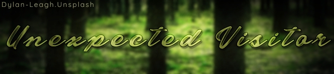
Anime, -Banner:
So for the banner the first thing that I notice is that the image is a bit grainy, is that fixable? Next thing is that the hair needs some more detailing and highlighting. Same goes for the horse as it all looks a bit flat. Also the eye does look a bit unrealistic. Maybe reference the link down below and search for the eye part of the video. I believe it is towards the end.
(I'm copy and pasting the highlighting advice I gave to Raven on the first page.)
I would use a pastel yellow color or a pastel blue for the back (Depends if your lighting is warm or cool. In this case I would us a yellow.) Very small brush size. 1-2 px on a pressure sensitive hard brush. After those each have their own layer, set the whole layer to overlay and mess with the opacity. Do this highlighting process for the horse and hair. It will make the image crisper and less flat.
I reference Manduh's youtube a bunch for my art, this time stamp might help you with highlighting. It helped me tremendously.
https://www.youtube.com/watch?v=9xltza9Ojtw&t=551s Time stamp: 32:36
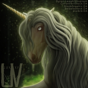
-Avatar:
This image could use some of the same highlights mentioned above. Apply these everywhere. The eye on this one also is a little unrealistic. Next thing is that the hair looks blurry and kind of matted looking (not like "dreadlock" matting that you would see on regular hair. What I'm trying to say is that it looks kind of clumped together. There aren't really any flyaways or strands if you get what I mean.) and the forelock is a bit too thick. The position on the hair looks good, but if you decide to re-do he hair you would add some fly-aways. For the hair I recommend a soft pressure-sensitive brush set to 1-2 px.
Reference this for hair! https://www.youtube.com/watch?v=AtNt3bT6fGo Time stamp: 12:11
Hope this helped everyone (and made sense lol)! :) Edited at October 14, 2019 04:23 PM by Trillium Acres |
|
|
| |
|
|
| |
|
https://i.postimg.cc/MKc37f35/Untitled283-1.jpg I would love some critique on this premade please :) |
|
|
| |
 |
The reflection on the eye is white,which should be a grayish blue in a normal light but because the reflection is from a fire ,eye drop the colour from the film and lighten it a little,then use that as the reflective color |
|
|
| |
|
I'm way too tired and didn't understand any of that :') (not trying to be rude but I'm exhausted lol, I have school tommorow and I'm up mate again) |
|
|
| |
|
Looking for Critique and a good price https://i.postimg.cc/DfSMpbHx/My-Drawing-5.jpg https://i.postimg.cc/J4XmvhGW/My-Drawing-6.jpg |
|
|
| |
|
Recent artwork. Critique? *click for quality*
https://i.postimg.cc/28VCwyTD/Untitled375.jpg |
|  |
|
| |
|
I'm awful at pricing so can't help with that sorry
Peice #1
Honestly this peice messes with my eyes, the horse has no contrast and the white outline is way too out there, is there any way to fix that? Try adjusting shadows and highlights I'm assuming the horse is meant to be ghost like? Try lowering the opacity of the horse so lighting is better and the ghost effect is more real
Peice #2
Very nice, however the image looks really stretched and unnatural, when moving images always have the ratio proportions locked so nothing is stretched, make sure you add shadows
Again try playing around with shadows highlights and even a bit of smudging
Also try blurring a little bit of the bg to add focus to the horse
White Forest Farms said:
Looking for Critique and a good pricehttps://i.postimg.cc/DfSMpbHx/My-Drawing-5.jpg https://i.postimg.cc/J4XmvhGW/My-Drawing-6.jpg
|
|
|
| |
|
Ughh luxxy this peice is genuinely to die for 🤤😍
The horses eye is glowing green, however the highlights and glow don't quite match, try adding some small strands of green on the hair and some 1px highlights on another layer on low opacity
Other than that it looks amazing!
Crystal Heart Estate said:
Recent artwork. Critique?*click for quality*
https://i.postimg.cc/28VCwyTD/Untitled375.jpg
|
|
|
 Sunny
Sunny

