| |
|
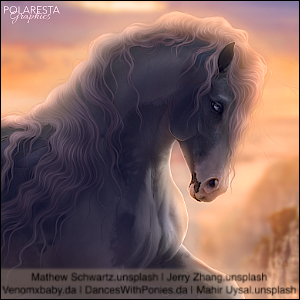
I would love some critique for this piece! Please give honest opinions don't be afraid to tell me exactly what you think.
http://oi63.tinypic.com/21j26h3.jpg
|
|  |
|
| |
|
Looks nice. But you have smudged the horse to much, making it look fake. I'd suggest using a different rate or opacity. Other than that it looks good! |
|  |
|
| |

|
Moonlight stud said:
Looks nice. But you have smudged the horse to much, making it look fake. I'd suggest using a different rate or opacity. Other than that it looks good!
Thanks, I will try a lower opacity next time. |
|  |
|
| |
|
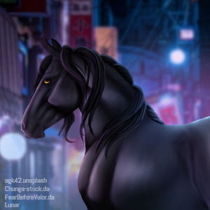
Yeah, it's blended a bit too much and the horse is too bright for the backround. I suggest looking for horse stock that matches the brightness. |
|
|
| |
 |
Maybe add an shadow. It can help the image look more like a photo than a manip. |
|
|