| |

|
Introduction After having promised joinme to many people but failing due to me being senile or time zones not matching, I thought I'd whip up a step by step guide with screenshots instead. I'll try to make it as easy to understand as I can, but feel free to ask questions through PM or here in comments if you're unsure about what I did in certain steps. This workflow is the result of many years spent with Photoshop, as I've been drawing digitally before arriving to HEE. This guide also includes the Photoshop tools I'm using. The tools used will all be explained when they appear so you can find the tool in your program that does the same / similar thing. Unfortunately I don't know any other art programs (besides MS Paint lol) so I can't help you with finding the tool you're looking for. *** Contents Chapter I - Choosing Stock
The start of a journey
Searching for the one
Stock for beginners Chapter II - Composition
This guide's example
Where should the horse be?
Oh, those shadows! Chapter III - Preparing for work
Your file is your home!
A tip before the go Chapter VI - Background works Part 1
Stabilizing the chaos - Brightness
Stabilizing the chaos - Focus Chapter V - Background works Part 2
Stabilizing the chaos - Contrast
Stabilizing the chaos - Colors
Stabilizing the chaos - Frame Chapter VI - Horse Prep Part 1
*snip snip*
Off with the tack! Chapter VII - Horse Prep Part 2
I want you bay!
Body color Chapter VIII - Horse Prep Part 3
Black as night Chapter IX - Horse Prep Part 4
Let's get you looking real handsome! Chapter X - Horse Prep Part 5
Details, details!!
Slightly bigger picture Chapter XI - Horse Prep Part 6
Fit into the frame
Larger, softer
Shine on me
Hello darkness...
Dropped something? Chapter XII - Mane and tail
Setting it up
Make me fabulous!
Tailing Chapter XIII - Finishing touches and crediting
Finish line!
Crediting Chapter XIV - Background merges 1
Composition
Chapter XV - Background merges 2 - The Sky Part 1
Disclaimer
Mountains in the distance
That beautiful sunset Chapter XVI - Background merges 3 - The Sky Part 2
Eclipse Chapter XVII - Background merges 4 - Coming Together
Colors
Lights
With the introduction out of the way, let's get started, shall we? :D |
|  |
|
| |
|
Chapter I
Choosing Stock The start of a journey When it comes to art, the most important part is the idea you have in your mind. Ideally you should have a clear image you'd like to achieve that includes: - General feel: Is it going to be a bright, colorful and happy piece? Or will it be dark? If dark, then sad? Spooky? Mysterious?
- Background type: What place will your horse be? On a vast open meadow? On a cliff ledge? Between breathtaking mountains?
- Color scheme: Will you use mostly warm or cold colors? Red, orange, yellow or blue, purple, green?
- Horse pose: What will your horse be doing? Will it rear up to the sky? Buck into the air? Just stand prettily in a beautiful scenery?
- Horse color: Solid or patterned? Any of the base colors or a mix? A bright color or a darker one?
- Your Message: What do you want to say with this piece? What should the person who looks at your image feel? Obviously, having all those clearly in your mind is rare. I've noticed that I make the best pieces when I have all of those above perfectly pictured in my mind, because I have what to work towards. Even if you need to take a detour or change little things about your imaginary artwork, it is best to have these in front of you when you close your eyes. Naturally, you don't need to have all of these set in stone before you start to make art. You can go with only a few of those too, but the more you have the better - and the easier job you will have while working. Once you have your mind set on what you want to create, you can start searching for stock. Sometimes just looking at a background or horse stock image will be enough to generate the rest of the above points into itself: you can get inspired by seeing an exact image. *** Searching for the one Now, since art is so diverse and everyone looks at things differently, I can't tell you what stock is good for you. But I can give a couple of general tips. What to avoid and what to look for when you set out to find the background - horse matchup. If I were to get into merging backgrounds, we would sit here all day. So for now I'll just explain the basic 1 image for background and 1 image for horse type of art making. In the future I may make a new chapter for horse/background merging, if there will be a need for that. For the background, you will want an image which can "host" your horse. Based on what pose you want to use you will need the background to have a larger or smaller open space where you can place the horse. For example, let's say we want a background for this horse stock. In this case, it is not advised to go for a background like this one. The horse will look unnatural because the composition of the background image calls for a frontal pose or where the horse is with its back towards us. The same applies for this image. Technically there is enough space for the horse to fit, but the direction of the path on the ground will make the pose feel out of place as the motion of the horse doesn't follow the path. This image would work as a background, because there is enough open space with a horizontal direction for the motion of the horse to make sense. Even when you got the composition right, you can still go south by choosing bad quality images. Here's a list of what to avoid: - Low resolution or blurry images: For certain pieces you might need the blur (for example if you want to enhance motion blur) but it definitely shouldn't come from your stock. The blur on the stock image is something you can't control. The blur you make is always reversable. Example of blurry, low resolution horse stock.
- Overbright or too dark spots: Watch our for extreme shine or darkness! If you're an experienced artist you will be able to deal with them, but if you're a beginner, you will have a very hard time getting your piece together because those overly bright or dark spots will always tilt your image in a set way - a way you may not want it to go. Not to mention that these spots block the muscles and details of the horse, so it'll be much harder to add those onto your piece. You'd have to paint them yourself. Example of overbright horse stock.
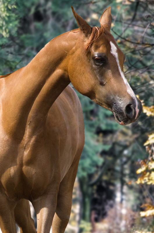
- Patterned horses: Unless the horse has the exact pattern you're looking to make, you don't want to use patterned horses as stock. It's much easier to add pattern to a solid horse than to make an already patterned horse solid. It isn't impossible, it's just much harder. Finally, remember to always check the stock provider's comments if they allow their stock to be used off site or on sim sites. Not all horse stock providers allow their photos to be used this way, and trust me it's not fun to completely restart a piece just because you missed one of their rules. *** Stock for beginners For beginner artists it is best to choose horse stock that has as many details as possible. You will be able to learn where each muscle is and how the light hits them, which will help you later on when working with less detailed images. The lights and shadows on such a stock should be neutral, with no strong light reaching the horse from any side. A very good example for such a stock is this one. |
| |
|
| |
|
Chapter II
Composition This guide's example From this moment on I will explain things by adding screenshots of an artwork I made. I'll still keep the general tips, but I will be able to show exactly what those tips mean. *** Where should the horse be? If you're familiar with art, this will be something you've heard thousands of times. You should always try to base yourself on the holy Rule Of Thirds. The rule of thirds helps create an image that is pleasing to look at. To follow this rule, you will need to split your image up into a 3x3 grid of cubes or rectangles. The main idea is that you should place important things on the lines, or to where they cross each other. You will soon see how this works, but if you'd like to read more about the rule of thirds, this article is great and simple. In Photoshop you're able to place guides into your file, which are especially helpful for the composition part of arting. You can find the guides in the "View" menu. I suggest making a guide layout instead of putting the guides one by one. When you don't need the guides anymore you can simply click "Clear Guides" in this menu to make them disappear. 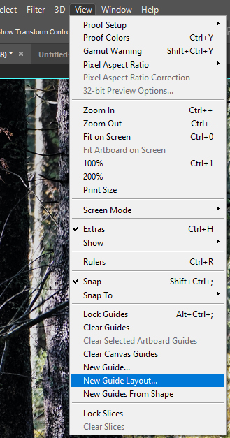
Guide layout option location
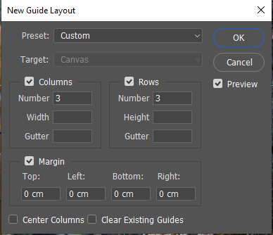
Guide layout settings for the rule of thirds
 Result of the above guide layout settings Result of the above guide layout settings
As you can see in the above, the back of the horse touches the top line, and the knees are just below the bottom line. The horse is within the middle 3 rectangles, and the two trees in the background align with the two vertical lines. You shouldn't feel restricted by these guides or by this rule. Feel free to use it to your liking to improve your composition. Take the below image for example: 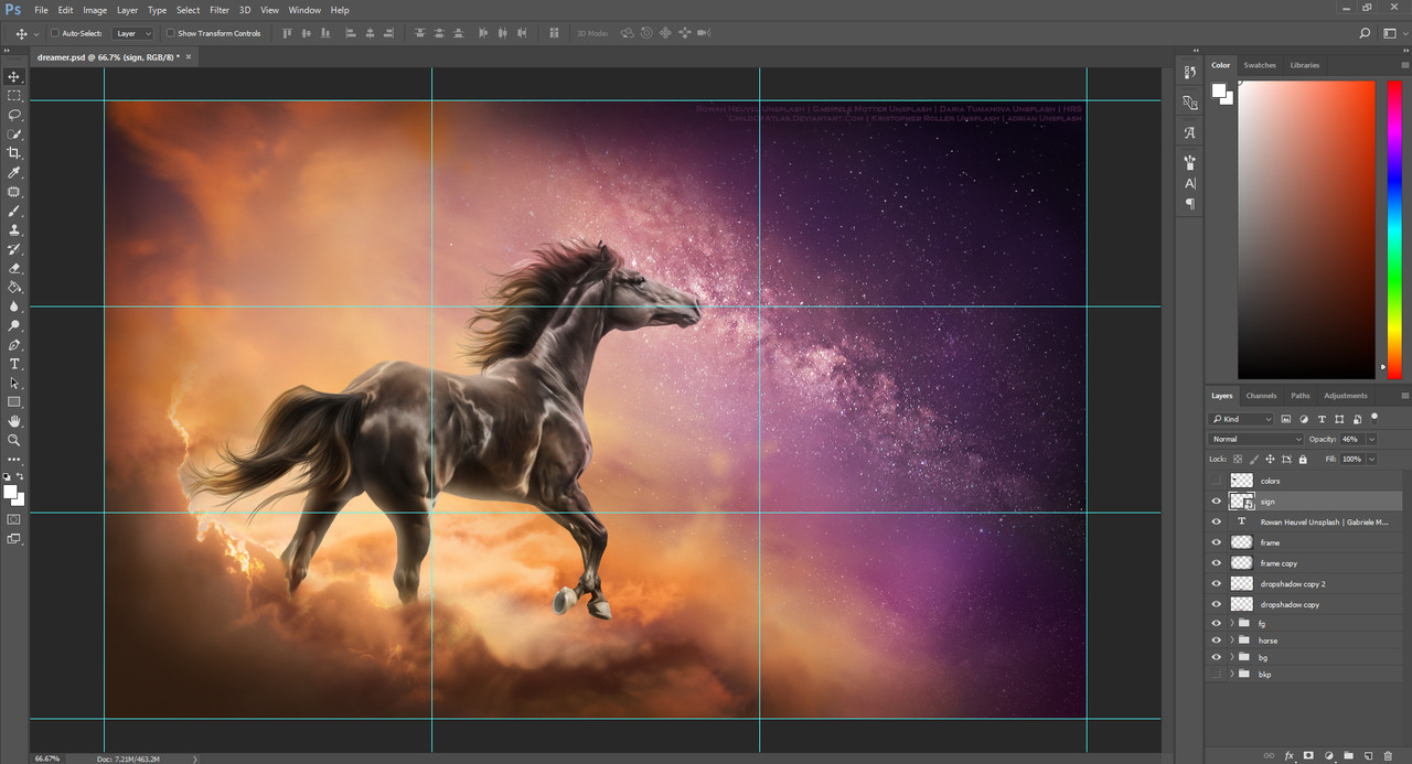 Rule of thirds in my previous work Rule of thirds in my previous work
You can see that the head of the horse is aligned with the top line, the rump and right hind leg aligns with the left line, and the galaxy touches the crossing of the top and right lines. What you should priorize is that the horse fits into the background you chose. The horse should have enough space for it to look natural, to make it believable that the horse is actually there. In the meantime, the horse needs to have a realistic size compared to the rest of the image, unless you want to make a giant or tiny horse. In case of a giant or tiny horse, the size has to make sense, you shouldn't just place the horse however you can and then call it a giant or tiny horse because that's how it could fit. These things always need to be visibly intended, otherwise your piece will not look natural. 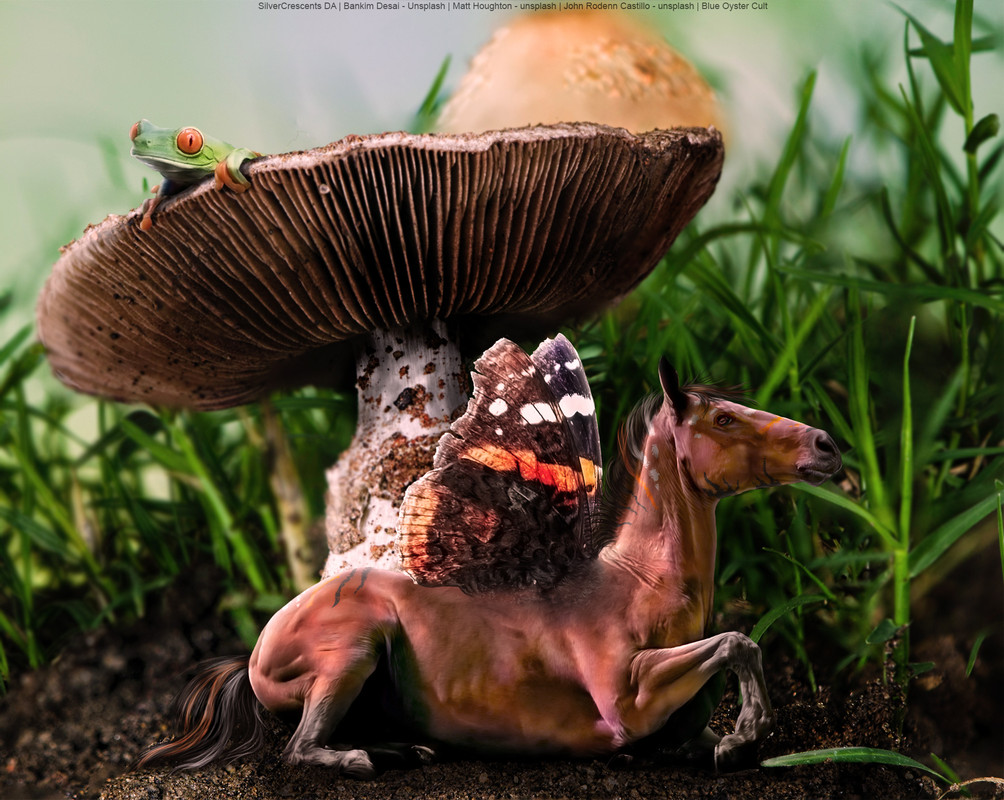 An example of a tiny horse from me, from the previous artist rumble An example of a tiny horse from me, from the previous artist rumble
As you can see the horse is pretty small compared to the mushroom or the frog, but it still comes together, because the size is expected in this environment. 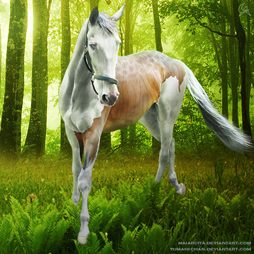 A bad example from me where I didn't quite get the sizes right A bad example from me where I didn't quite get the sizes right
If you look at the trees in the background, you can see that the horse is much too small compared to them. It feels a little off right? *** Oh those shadows! Another thing to consider when placing your horse is where the light is coming from and what you want to highlight in the image. If you want one side of the horse illuminated, it is best to turn and flip the horse around until the light of the background comes from where you want it to come from. If the horse has stronger shadows on its body and you don't want to bother taking them off, that is another point to consider. Mismatching shadow directions can mess up any image instantly, even if everything else is perfectly done.  Left frontal light on the horse casts shadows on the right hind sides Left frontal light on the horse casts shadows on the right hind sides
Not only the direction of light can mess with your overall feel, but also the mismatch of shadow and light intensity. If you put a very bright horse into a dark background, it will not look natural. More about this later. Now that we have our composition ready, it's time to jump right into "real" work! |
| |
|
| |
|
Chapter III
Preparing for work Your file is your home! The file you're working with should be neat and organized. You should be able to tell what you did with what, where you put certain parts of the image and how to get to each setting you used. This is important, because, since art is unpredictable by its nature, you never know when you'll have to change something. And when you have to spend valuable minutes - or worse, hours! - just by trying to find where is that one dot of blackness on the side of the horse that you can't get rid of, it can be quite damaging for your artsy feels. Having an organized file also helps in case you're selling a premade and offer changes. It's much easier to navigate around something you're familiar with than if you had to find stuff in a randomly thrown together bundle of layers. 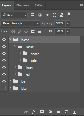
Example of my folder structure
As shown by the above image, I like to organize my working layers into folders. Folders can be put inside folders, so I can have a "horse" folder where I can separate the body, mane and tail, and their colors and shades each. I like creating this basic structure from the very start, and add more folders if I need as I go on. Sometimes there is a need for a foreground folder, but sometimes it'd be just wasted effort to make it in the beginning. What I always have are background and horse, so it's nice to have at least these folders set up by default. In the mane and tail folders I have a color and shade folder too, and in the color folder of those I have 5 empty layers named 1, 2, 3, 4, 5. Those are for the color shades I use to paint the mane and the tail. I always use 5 colors for both, so again, it's nice to have it done already by the time I get to painting them. You don't have to follow my example, you can create your own order among your layers. If you're okay with just having the layers named and sit around in a bundle, you do you. Just make sure that whatever you have in your layers section makes perfect sense for you. *** A tip before the go Since you most likely have to resize right away, when placing the horse and background into your file, I thought I'd mention this tip in this section. To resize an image without losing quality is not possible. What we can do is minimize the quality loss. I found that shrinking images in Photoshop is best when I convert the image to a smart object first. It doesn't lose nearly as much quality as it does when the image is just a simple image. 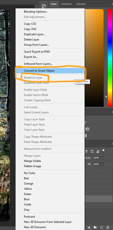
Convert to smart object and rasterize locations
Smart objects are great for resizing, however, they are not directly editable. If you try to draw with a pencil on a smart object, Photoshop will warn you with a pop up that the layer you're trying to edit is not suitable for it, and you must rasterize it first. If you're new to Photoshop this might sound scary. Rasterize it? What on Earth does that mean?! Well, it's a setting right below the "convert to smart object" option when you right click on a layer. Once you're done resizing, you should convert the object back to a rasterized layer so you don't get pop ups when you later try to edit it again. And yes, this is the method I'm using for making the cuts from large images as well. Convert the whole thing to smart object, resize, save. Easy peasy! |
| |
|
| |
|
Chapter IV
Background works Part 1 Stabilizing the chaos - Brightness It's pretty rare for a stock image to be usable "out of the box" as a background. Usually even premade backgrounds need some adjustments before they would be ready to accept our horse hero. In case of more complex images with multiple objects or textures we always have more work to do than if the chosen background was a plain field of grass in front of plain blue sky. We're going to work with this image for this guide. It was that "I saw it and I had to do something with it" kind of inspiration for me. Feel free to download the image and follow along the steps if you'd like. You can find the horse stock here. All images in this guide are clickable for full size. First things first, I placed the horse as seen in the previous "Composition" chapter. The next step was dealing with the overly bright spots of the image. There were two parts specifically which were too bright for comfort, two patches of bushes in the hinder parts of the picture. To clean those up, we will want to reduce the shine using the "Curves" tool. 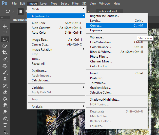
Where to find the "Curves" tool
The Curves tool allows you to adjust the gamma level of your image based on brightness. You have a line in the middle of the tool which you can add dots to. You can then drag the dots up and down to adjust the levels. The left side has the darker shades and the right side has the brighter ones. You will soon see how it works in action. First we need to grab the "Lasso Selection" tool which lets you select an area you freely draw with your cursor. We make a rough selection of the overly brigh bushes as seen below: 
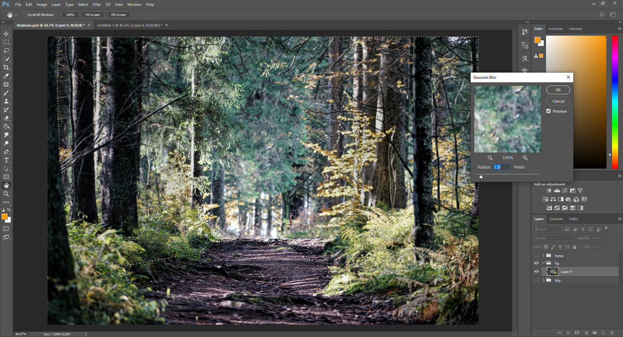
If we modify anything as it is now our image will have a sharp edge around the area we selected. To avoid this, we need to add feather to the selection. Feathering the selection means that it adds a "border" to your selection that fades into transparency, so when you change something within the selection the change will slowly fade into the unchanged parts instead of the sharp edge we draw. You can find the feathering tool here: 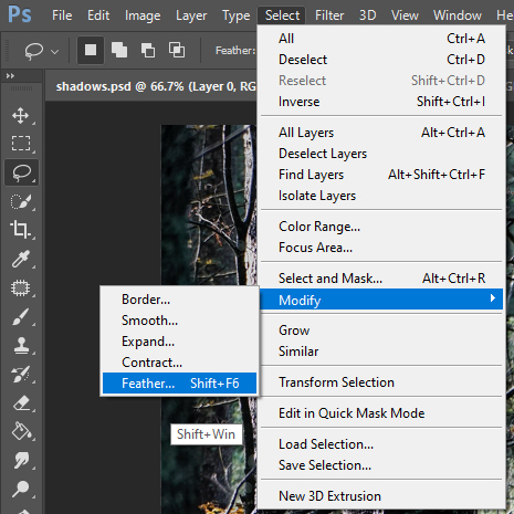
Now, the pixels you need will depend on many things. How accurately you need the changes applied to the area you selected, and how large is your image. We're now working with an approx. 2000 x 1600 sized image, and I don't need the selection to follow what I drew very closely. I'd rather want it to fade out more slowly to make the change less noticable. I chose a 20 pixel feather here. You can always experiment with the pixels, just undo the change and make the feathering again with a different amount and see what works best. Now that we have our selection, head to the Curves tool mentioned above, and play with the dots until the image looks good. Below are the settings I used for this patch of bushes: 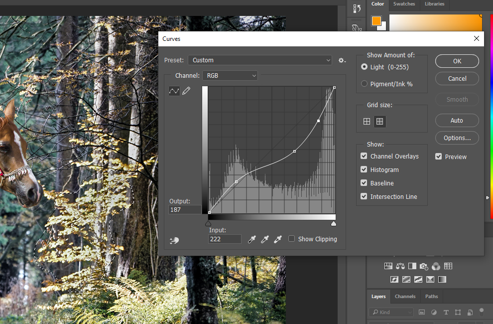
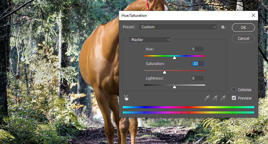
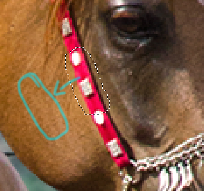
When this patch looks right, select the other patch of bushes the same way as we selected this one and repeat the Curves adjustment. Don't be afraid to play around, experiment how the Curves works. Drag those dots to the bottom to see the drastic changes and adjust them until they are okay. Here's the selection I made for the other set of bushes: 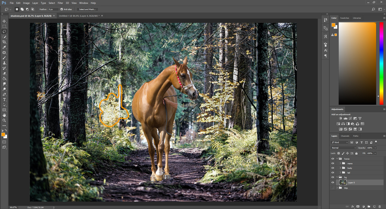
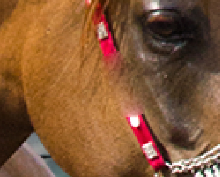
Another thing we must do before we move on is fix the saturation of these bushes we just darkened. Sometimes, adjusting the Curves can make the parts we touched look a bit off, but this is easily fixable with the saturation adjustment. Make the selections around the patches again, select the area that looks differently saturated than the rest of the image. Make the feathering, then head to the saturation tool and play with the slide until the bush matches the image once more. Below are the settings that I used for these exact bushes: 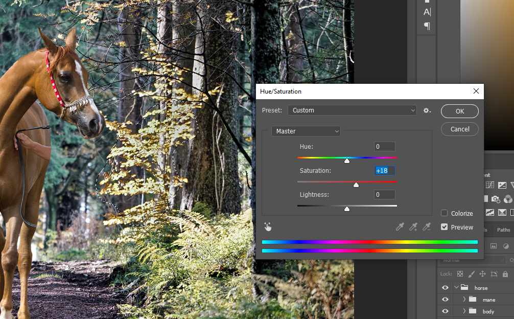
*** Stabilizing the chaos - Focus An easy way to place the focus somewhere on an image is to blur out its surroundings. Since we want to have the focus on our horse instead of all the sticks and leaves behind it, we need to blur the background. We have to do this carefully, not to blur too much or too little, and not to fade into the blur too late or too soon. This is all about experimenting again, each image has its own properties to consider. 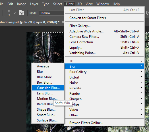
Where to find the Gaussian Blur setting
First, we select the part we'll blur less. It's in the middle section of the background, just behind the horse. Make a selection, feather is (I'm still using 20 px of feather here) and head to the "Gaussian Blur" setting to make your change. Play a bit around with the strength of the blur to see what looks best. Below are my selection and the blur settings: 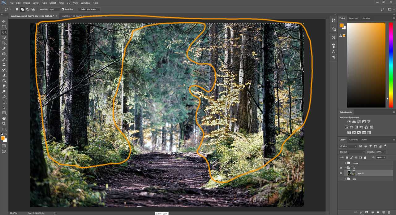
Selection for the blur
Gaussian blur settings for the selection
Next, select whatever was left out from the previous selection but needs around the same amount of blur. The branches on the top and side. Set the feather lower, I used 10 px for these and I was trying to be more accurate when selecting them. 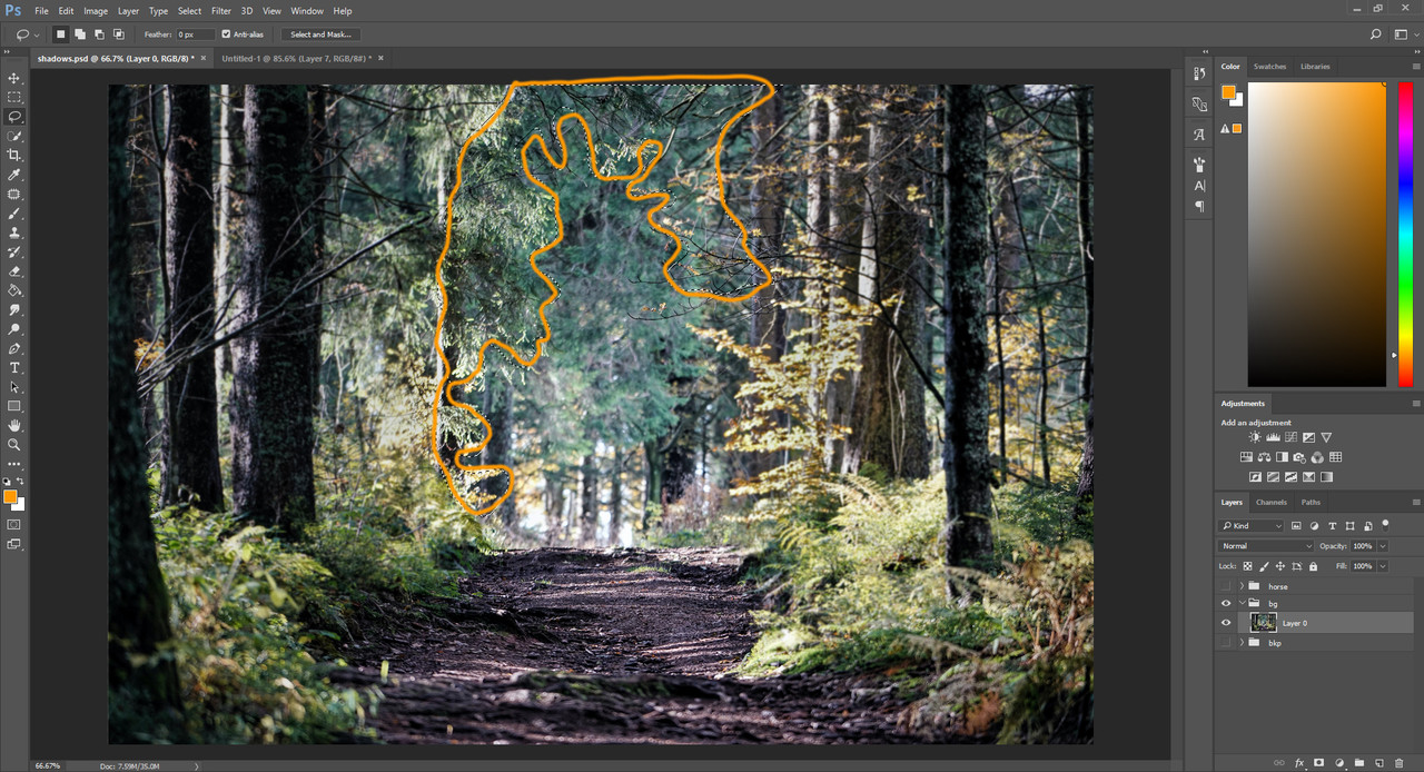
Selection for the blur
Next we need to blur out the furthermost part of the background. I used 20 px feather again. This part will receive a stronger blur, play with the strength until it looks good. 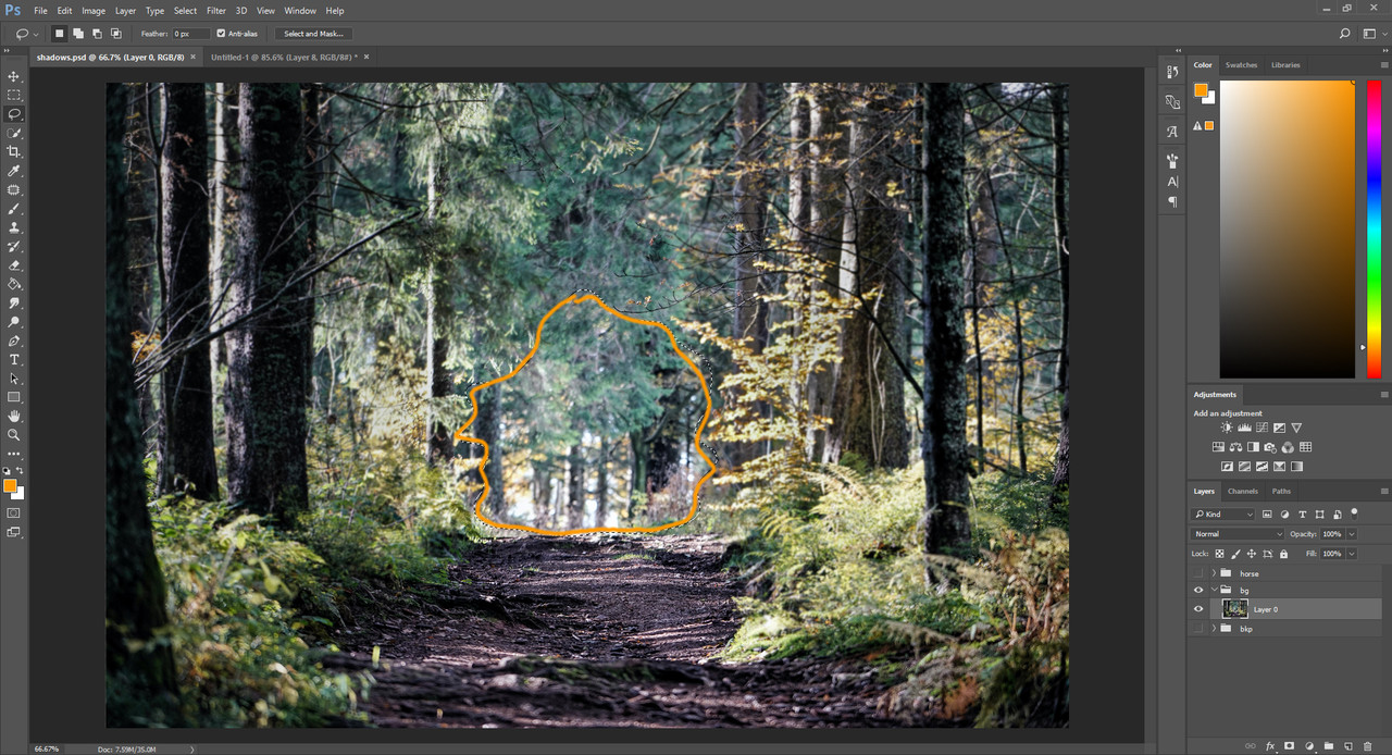
Selection for the blur
I left out a small place that I just realized by this time, so I make the selection and blur the same way as the previous step. 
Selection for the blur
Now we move on to blur the ground. I did this in two steps, the first step was a stronger blur for the further part and a slighter blur for the closer part. Below are the two selections: 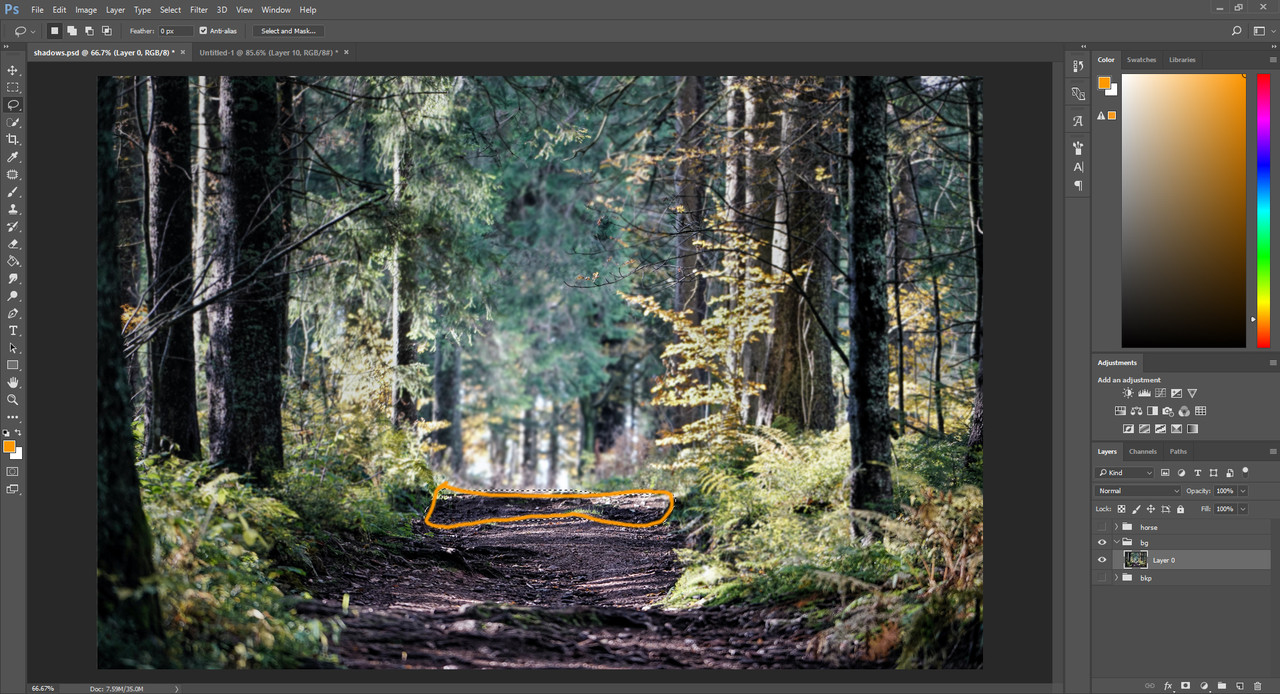

Even if we made the feathered selections and tried to be accurate, we will remain with spots that aren't blurred out at all, or are blurred too little. For these spots we can use the "BLur" tool from the toolbar, which is like a pen but instead of drawing it blurs the area we go over. Set the setting to about 50% and grab a size that works for the areas that were left out, and get blurring! 
Blur tool
|
| |
|
| |
|
Chapter V
Background works Part 2 Stablilizing the chaos - Contrast We now have an image focused on the middle section with no overly bright spots, but this still doesn't quite look like a decent background for an art piece. To make it more artistic we have a few more tricks to check out. One of these tricks is adjusting the overall contrast, giving the image a more dramatic or smooth feel, depending on which way we push out the contrast level. This time I'm looking to increase contrast, so we're going for the dramatic approach. You can find the contrast slide in the Image -> Adjustments menu as seen below. This tool does exactly what it says. Adjusts the overall brightness and contrast of your image. 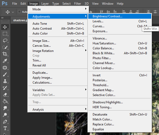
Where to find the contrast tool
Feel free to experiment and play with the two slides in the pop up window and see how they act. I can't repeat this enough times. Always try out the tools you use. Yank those slides to the side and see what happens. You can always go back, or just cancel the tool and no changes will be made. So be brave and check those tools you work with thoroughly. You need to get comfortable with them in order to make them your servants later. 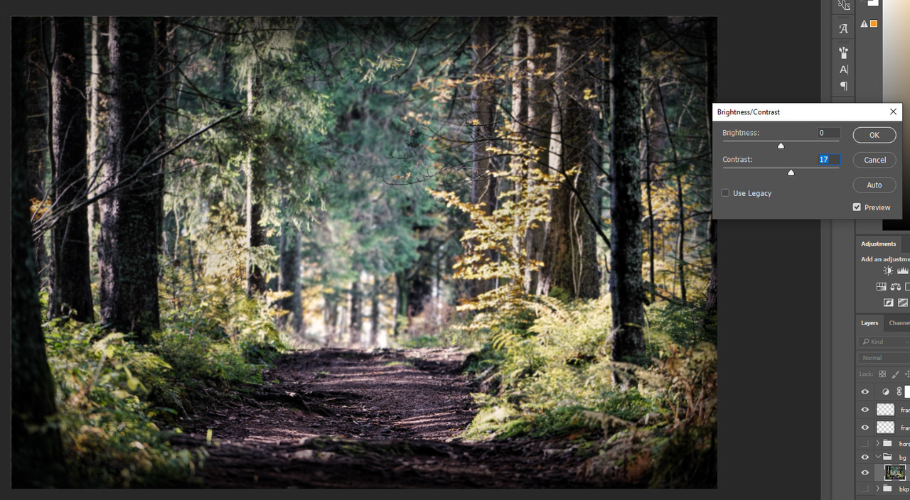
My settings for this image
*** Stablilizing the chaos - Colors We're getting there, but still not quite ready for the horse. When I find myself in a situation where the background doesn't have a clear profile, I like using the "Photo Filter" option to give it one. By clear profile I mean that there isn't any color - other than black or white - that dominates my image. I like working on at least one lead color or warmth group to make the piece come together as a whole. Many times this one dominant color is missing from photos because the photographer wants to show us the reality of a sight, which is completely fine and gives us, artists, a lot of freedom to work with their pictures. 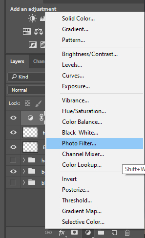
Where to find the Photo Filter
Notice that I use this Photo Filter above all existing layers so it can affect everything. If you use the Photo Filter from the layers tab it will act like a mask and affect all layers beneath it. If you use it from the Image -> Adjustments path, it will only affect the selected layer and will not appear as a separate layer. I like using it from the layers tab because I can turn it off easily when I need to pick any colors. If I pick colors when the Photo Filter is on, all colors picked will be off a bit towards the color that the filter has. Therefore I do not recommend picking colors while the Photo Filter layer is visible. 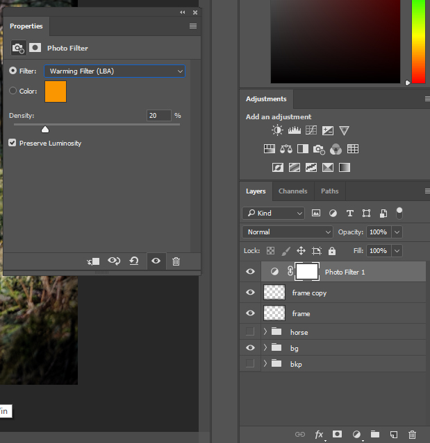
My chosen filter and its strength for this image
*** Stablilizing the chaos - Frame What I like adding to my pieces is a dark frame around the picture. It helps with placing the focus on the middle section and hide the details on the edges that would otherwise draw attention. This step is completely skippable and even I don't add it to every one of my pieces. But since this example piece needed it, I might as well explain. To make the frame I use a very large soft brush with the opacity set to pressure sensitivity and the color black. I paint the frame around the image on a layer with the type set to "multiply" first. 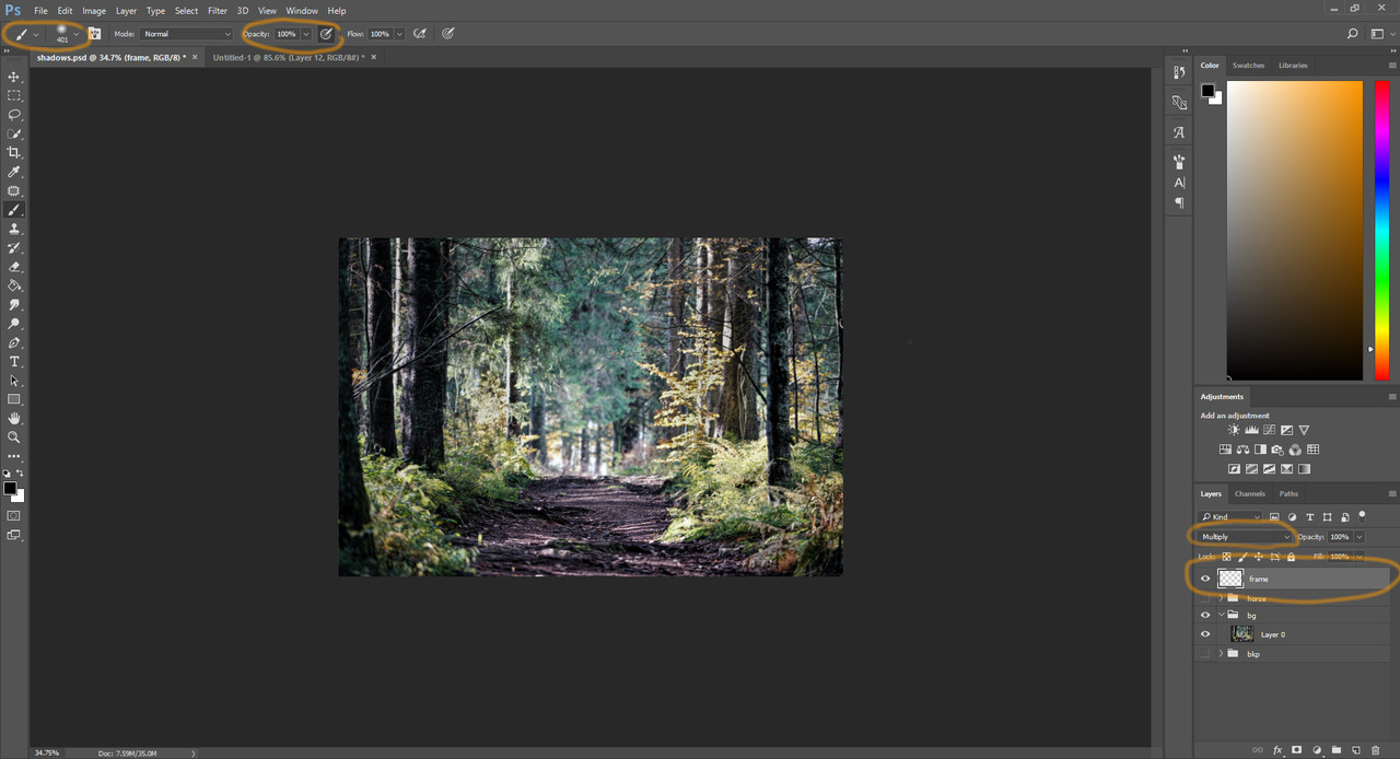
My brush and layer settings for the frame
Once painted, I grab an eraser, same size or larger than the brush, also with pressure sensitive opacity and soft round form. I erase back from the frame until I'm happy with the result. 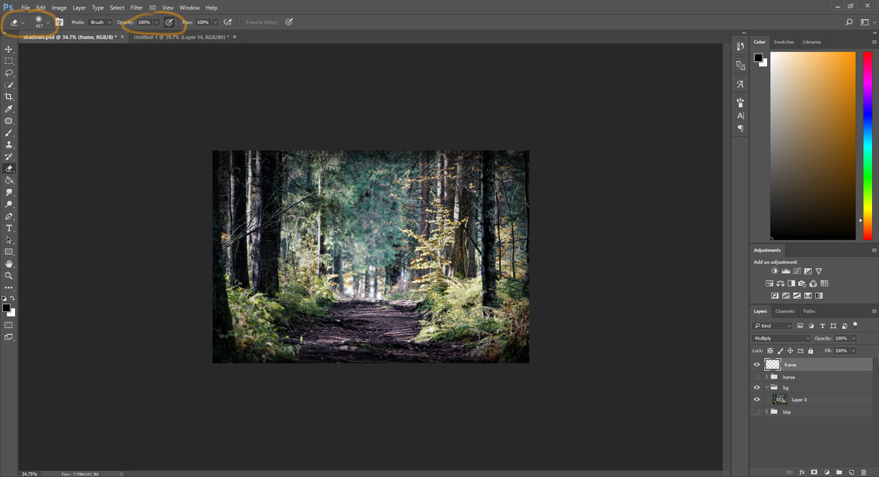
Eraser settings for the frame
At this point the frame is usually much too black. To solve the issue I duplicate the frame layer and set the duplicate to "soft light" layer type. I play with the opacity of the "multiply" and "soft light" frames until the frame looks just right. 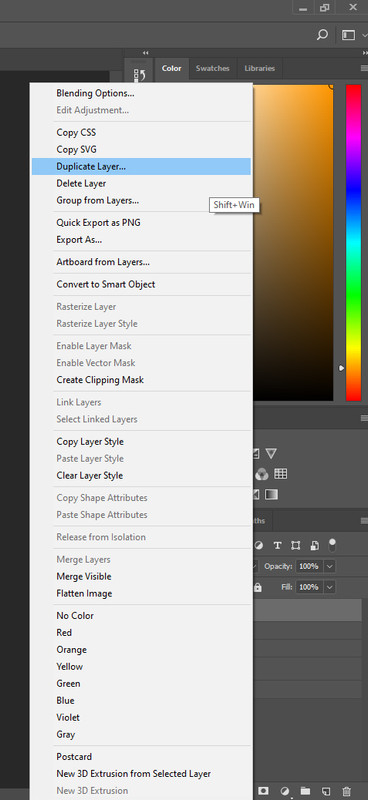
Duplicate the layer by right clicking on it and selecting the "Duplicate Layer" option
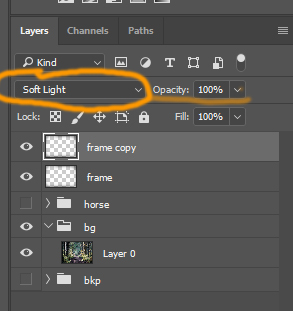
Change the duplicate layer to "soft light" type
Now the layers section got too messy for me, so I grouped the frame layers and the photo filter into a foreground folder. You can easily group multiple layers if you select them and press the little folder button in the menu under the layers. 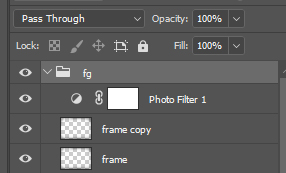
Group the extra layers into the foreground folder
The background is finished, we're off to the main dish: the horse! |
| |
|
| |
|
Chapter VI
Horse Prep Part 1 *snip snip* The first step to every horse prep is the cutout. It's very important that you cut the horse out as precisely as possible, otherwise you will have to run after black or white spots later on, erase on every shadow and light layer, every color layer, until you finally make it disappear. To cut the horse out use a hard round eraser, with the size of max. 12 px and min 2 px. Never use the size of 1 px for anything. It will leave your image pixelated and that isn't nice to look at. If you need a smaller size than 2 px you can set the brush size to pressure sensitive and press very lightly to get the thinnest cravices. 
Eraser settings for cutout
*** Off with the tack! The terrifying detacking has arrived! Don't worry if detacking is new or sounds too hard for you, all it takes is practice. And thankfully Photoshop gives us a very useful tool to make our lives easier too. 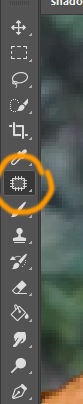
The "Patch" tool
First things first, about the tool we'll be using: the "Patch" tool. This tool works in wondorous ways. You select an area, then you click and drag that selection. Inside your initial selection you will see the same part of the image that you dragged the selection to. If you let go of the drag, the tool will replace the part you selected with whatever you saw inside the selection right before dropping the drag. 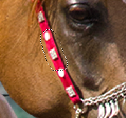
Make the selection with the "Patch" tool
Drag the selection somewhere else
And the tool will fill in your selection automatically
Now this tool doesn't always fully replace the parts like a copy paste, it has some kind of smart processing behind it. It mostly changes the texture but doesn't change the color fully. It's a great tool by itself for certain detacking operations, but for more colorful or complex tack, we will still need to repaint a bit. When working with the Patch tool, you should aim to drag the selection to an area which is similar to what your selection should have beneath the tack you're trying to remove. The closer the area is the better it works. After you're done with removing the halter with the Patch tool, you should get something like this as a result: 
The halter is gone, but this is sub par, at best. You can still see the colors at some places and if you look at the horse it's still very visible that there was something on there. This is where we start repainting. For repainting, we will need a relatively small, soft round brush with pressure sensitive opacity. Then we need to pick a color from the horse - don't forget to turn off the photo filter from the earlier step! - from a place closeby to the part we want to paint over. It is very important to make a new layer and paint there. Do not ever paint over the original horse layer! 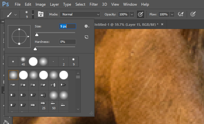
Brush to use for repainting
Where to pick colors from
Paint just a little with each color, then go back and pick a slightly different color to paint again. Don't be afraid if it's smudgy and doesn't look great, all we need now is to get the colors right in the areas we're painting on. When you're done repainting the parts necessary, you should get something close to this as result: 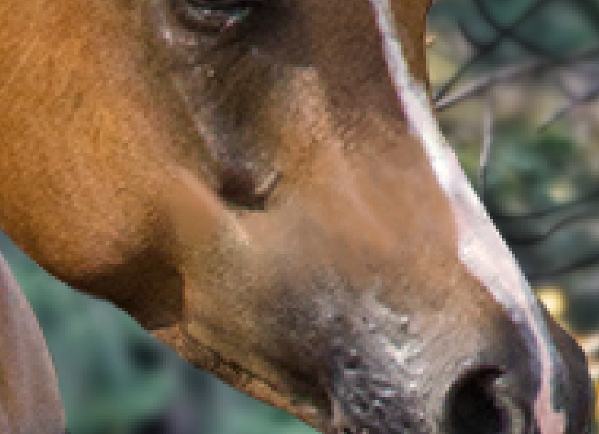
Once we have this, duplicate the original horse layer and merge it with the new layer you made for the repainting. 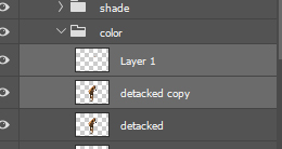
Now grab the Patch tool again and add the hairs back into the repainted places the same way you removed the halter. Select the smooth area, drag the selection over an area with hair, let go of the selection, and ta-daa! You should have a neatly detacked orse head as a result: 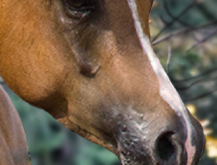
This horse stock not only has a halter but also half an arm and a lunge too. The process is the same. Patch tool, new layer, repaint, duplicate, merge, Patch tool. 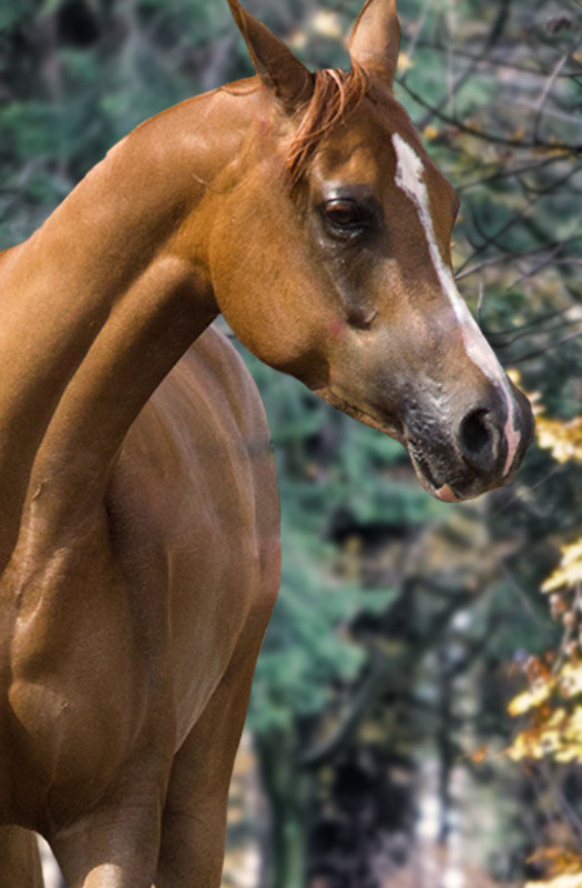
Result of detacking using Patch tool only
Result of detacking after repainting
It is important that after this step you follow along the horse cutout one more time and clean up your cut. The Patch tool is quite messy, and also the reainting might have left a few parts sticking out where they shouldn't be sticking out. Ensuring a clean cut at this step is essential. |
| |
|
| |
|
Chapter VII
Horse Prep Part 2 I want you bay! Now that we have a nicely detacked chestnut horse, let's make it bay. Because we can. I also owe everyone an apology as I just realized that I forgot to save the progression images. So if someone is following these steps, please feel free to post your progression images after each chapter! First things first, what is a bay horse? Bay horses have a darker, redder tune than chestnut horses, and they also have black legs and mouth called "black points". The next steps are interchangable, and I honestly forgot in which order did I do them. I'll post them in an order I would do them now, but this order might change from horse to horse or from day to day... Anyway, here we go! *** Body color First of all, duplicate your detacked horse layer and name it anything that will let you know that this is the base body color. I named it, very creatively, "baybase". 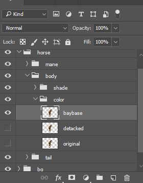
Make a rough selection around where the black points should be. Don't forget to feather your selection! I think I used 15 px here, but I wouldn't put my hand in fire over this statement. Just use whatever size looks best. 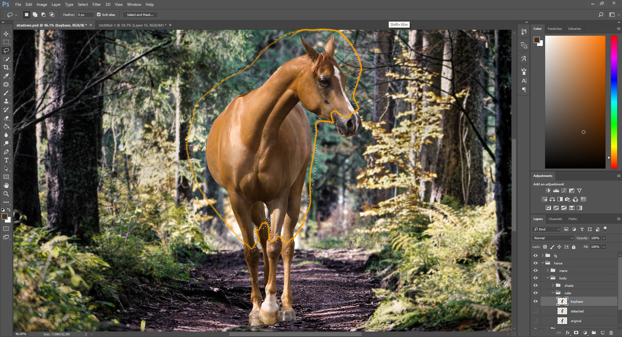
Invert your selection. You can do this from Select -> Inverse. 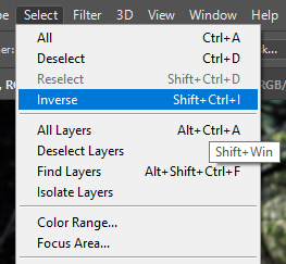
And simply press delete on your keyboard. Now you should have a horse that doesn't look very healthy, she's missing her face and legs! But don't worry, we will give these back to her soon. 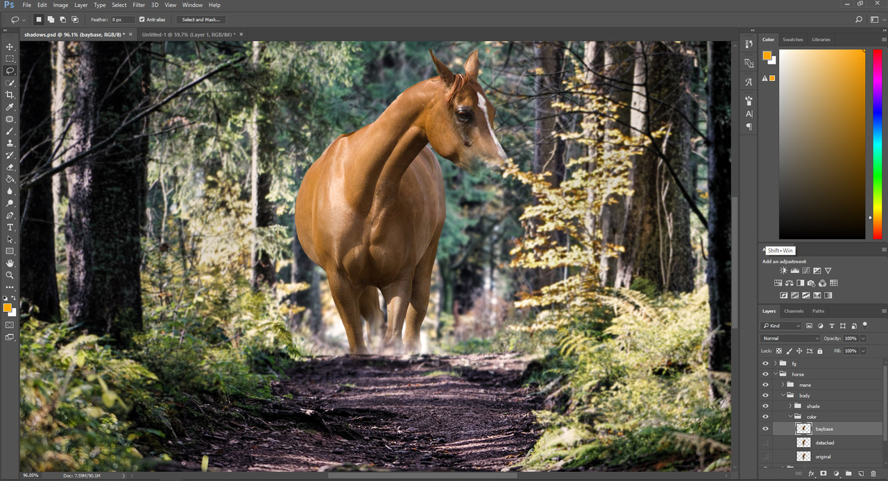
We now have the part that has to look bay separate from the black points. I'm sure that there are endless ways of turning a chestnut horse into bay, and I use a different method almost every time I make art, but this method brought surprisingly nice results so it might as well be included in this guide. A little bit of personal opinion: I think chestnut is the easiest color to work with when I need to change the color of the horse to anything, so I prefer using chestnut stock horses for every art I make. Our first step towards the bay color will be adjusting the color levels of this "baybase" layer. You can make a duplicate and save that layer into the backup folder if you made one, before moving on with this step. 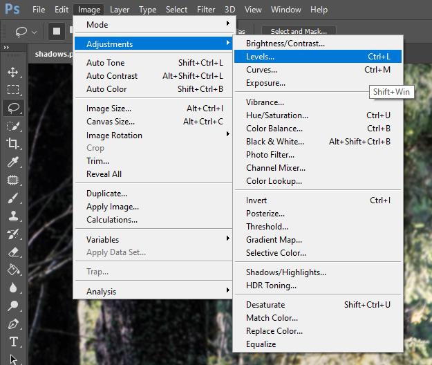
Where to find the "Levels" setting
The "Levels" setting is another playground that has no fix recipe. It adjusts the intensity of a color based on the gamma of the image. You have 3 slides, one for the bright gamma, one for the midtones and one for dark gamma. If you slide the red color's bright slide towards the left, then the red will intensify in the bright colors. If you slide the dark slide towards the right, the red will vanish from the dark colors. If you slide the middle slide towards the right side, the red will slightly intensify in the midtones, but if you slide it towards the left, it will lower the red in the midtones. I encourage you yet again to play around, be brave to make those slides move and see how they affect the color of your horse. I say "increased" when I move the left or middle slide towards the right and I say "lowered" when I move the right or middle slide towards the left side. For this horse I had to lower the red, slightly increase green and increase blue in multiple steps. First I adjusted the red level, then the green, then blue, then red again, green and blue. You can repeat the adjustments as many times as needed. You will not get a perfect bay color out of this, so just get something that doesn't look like a bright yellow chestnut anymore. Here is what I went for: 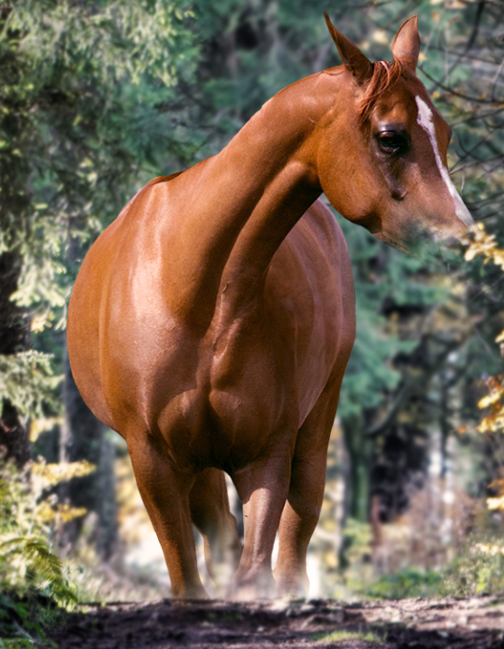
This is nowhere near bay yet, so we have to see what colors are "missing" from this horse compared to a bay. Open up the browser and take a good look at a neat blood bay horse. What do you see? Definitely more red, maybe more blue? Let's add those two colors in! The ways of adding colors is infinite, this was my first time trying this exact method. See, I'm also experimenting. You can always go back and use a method you used before if you don't like what you get. Duplicate your "baybase" layer and go to the "Hue/Saturation" setting we used in Chapter IV. Yank the hue slide to one side until your horse turns completely blue. Blue like this: 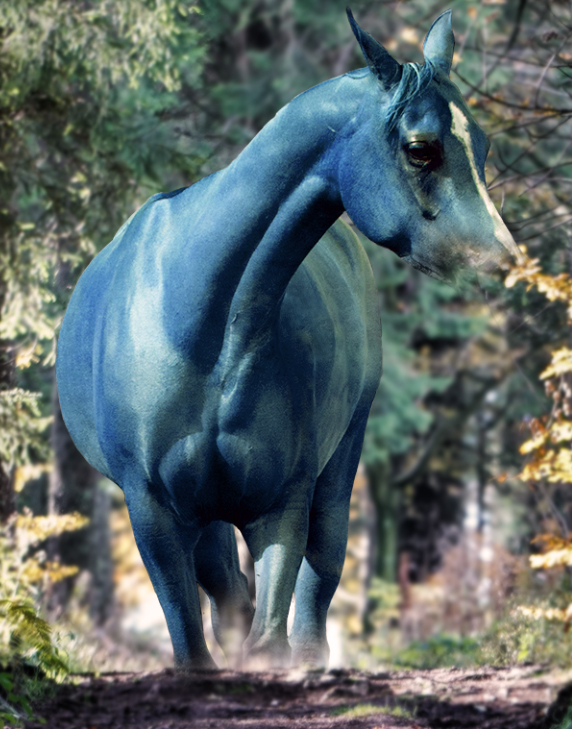
Now we have a totally blue horse layer. Let's try different layer types to see how it mixes with the level adjusted chestnut layer beneath it! Set it to soft light, overlay, multiply, try as many as you want. Which one looked the best? I chose the "overlay" type and lowered the opacity for the blue color. This is my result: 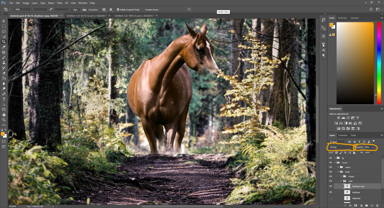
We said that the horse wasn't only missing blue, but also red. So duplicate the original "bayase" layer and adjust the hue until your horse turns fiery red: 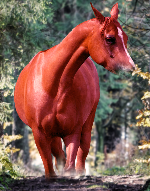
It is time to play with layer types yet again. For the red color I chose the "hue" type and lowered opacity. Here's my result: 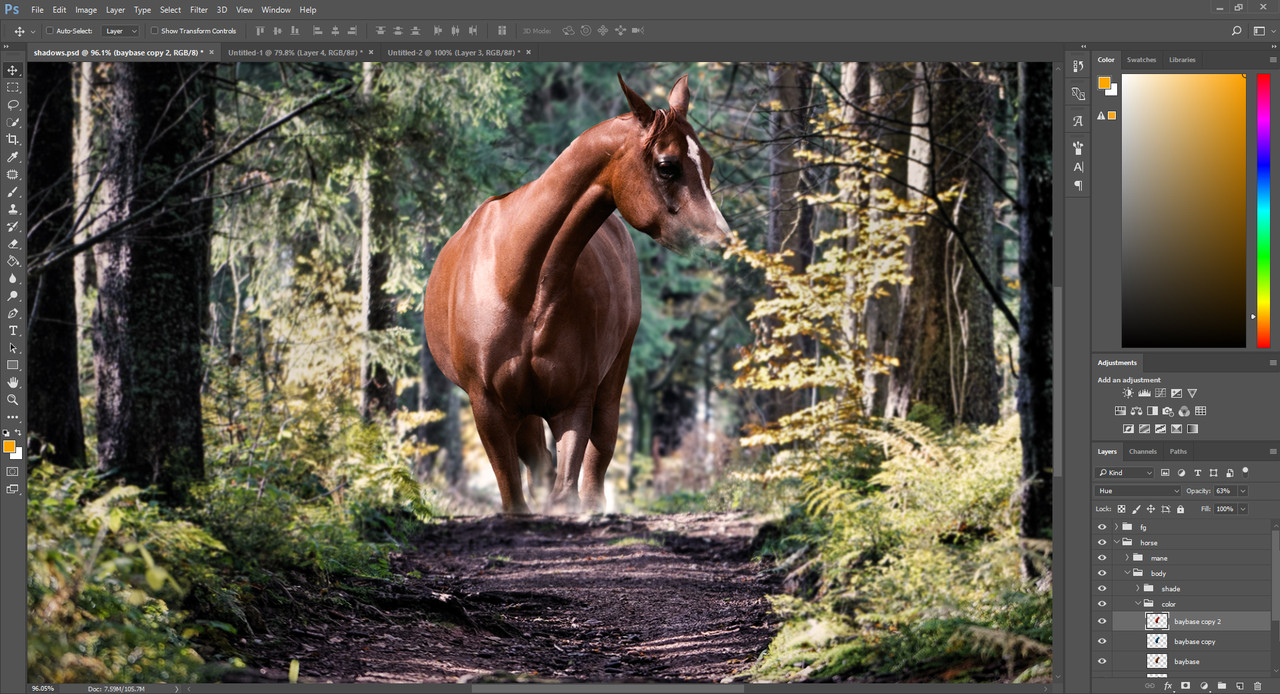
Now this one can be sold for a bay already. The only problem is that now we can barely see the eyes and the area surrounding it. To fix this, simply merge the blue, red and baybase layers into your one final "baybase" layer, then grab a soft round eraser with pressure sensitive opacity and carefully erase from the baybase layer until the eye can be seen well again. You should get something like this: 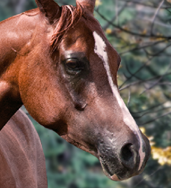
|
| |
|
| |
|
Chapter VIII
Horse Prep Part 3 Black as night After getting the base body color, it's time to turn our attention to the black points. Grab the original chestnut horse layer and duplicate it. Name your new layer "black points". Make sure that this layer is under the "baybase" layer we created in the previous chapter then make a very rough selection around the legs. This time you don't need to feather your selection because the edges should be under the baybase layer, therefore not visible. 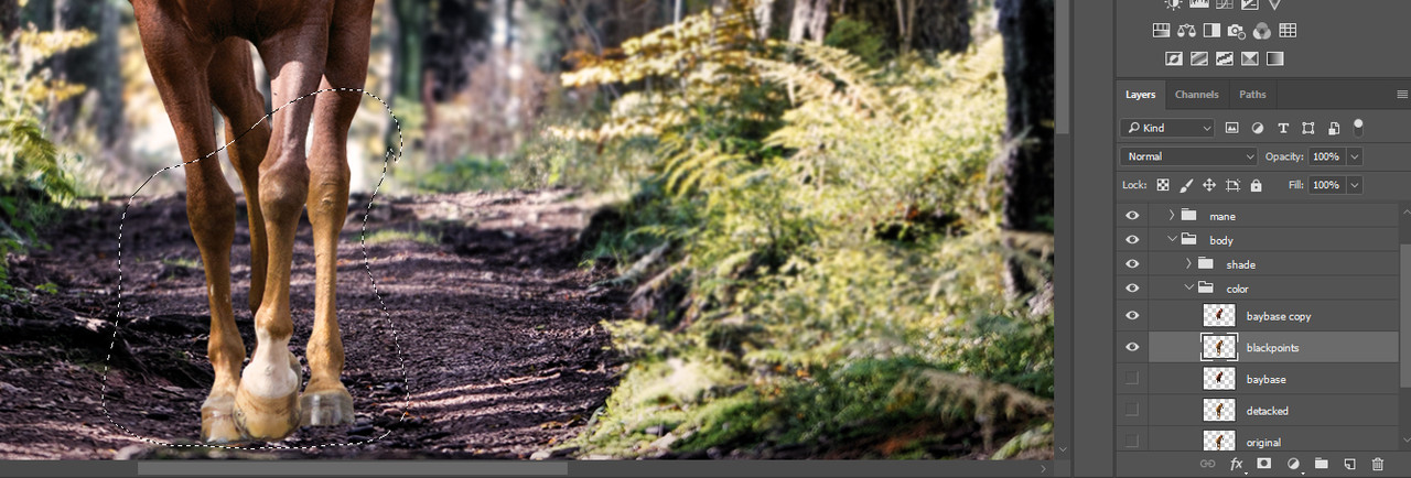
Grab the previously used "Hue/Saturation" tool and lower the saturation on the selection. Do not ever lower the saturation to zero if you're working with horses. Not even when adding white patterns. Complete black and complete white is extremely unnatural when it comes to horse coats. The next time you see a horse with markings just go up to it and take a good look at those white spots. You will not see the kind of pure white hairs that a completely desaturated digital image produces. 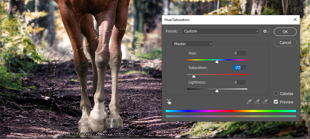
Set the saturation to low, but not zero
Now get the "Curves" tool from Chapter IV and get the legs look black. You should darken the brighter and darker colors as well as the midtones, until the legs look black enough for a bay horse. 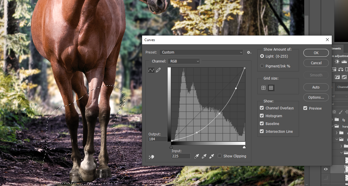
They don't look quite right, they are way too dark. To solve the problem, we will need to open the "Shadows/Highlights" setting from the Image -> Adjustments menu. 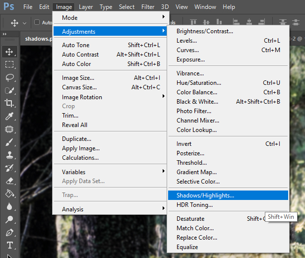
Where to find the "Shadows/Highlights" setting
This setting adjusts the brightness of the shadows and highlights based on the gamma. If you increase the amount of shadows you increase the size of area that the setting affects. If you increase the tone it will make the affected area brighter. If you do the same with highlights, it will make the bright parts darker. Increasing these settings too much can make the picture look very unnatural and pixelated, so be mindful when increasing them. 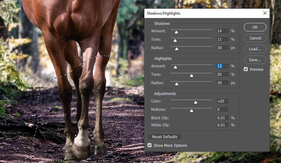
My results and settings with the legs after adjusting shadows/highlights
The legs should be fine now for a bay horse. It is advised to make an adjustment with this tool on the body of the horse as well to remove the too dark or too bright spots that were generated during color change. 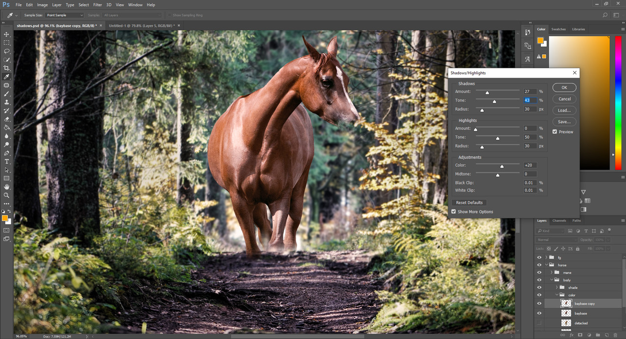
A step I forgot to take screenshots of was giving the yellow front hoof back to the horse. To do this I duplicated the original chestnut layer, placed in beneath the blackpoints layer and named it "yellowhoof". Then I erased back from the blackpoints until the yellow hoof was showing. I also deleted everything from the yellowhoof layer but the hooves so I didn't have to deal with messed up edges later. |
| |
|
| |
|
Chapter IX
Horse Prep Part 4 Let's get you looking real handsome! We move on to one of the most patience testing parts of horse prep. In this chapter we will make our horse look artsy. 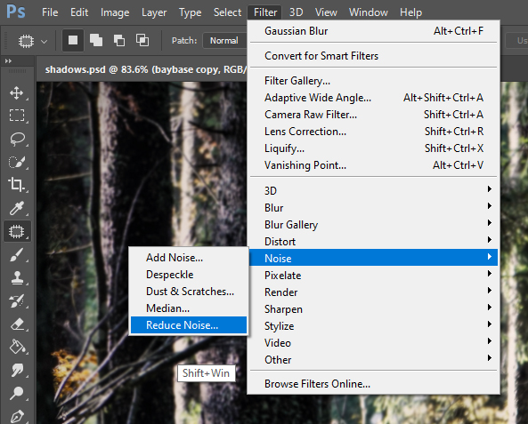
Where to find the noise reduction setting
As you probably noticed, our horse is very coarse. To make it smooth we first need to reduce the noise to remove extra pixels from those granulated areas. You can either merge your horse color layer into one or repeat the steps on both the baybase and blackpoints layers. I chose to repeat the steps, but merging the layers is also fine. Keeping them separate gives you a freer hand at making changes after the art is complete. The noise reduction setting is something you need to discover for your own style. Some people like their horses smudgier, some like them sharper. You can freely play with the slides to get the kind of detailing you want. 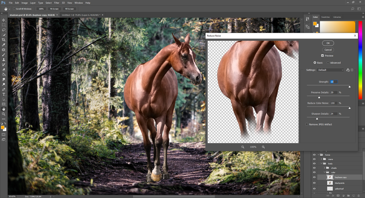
My settings for noise reduction and the result
Once the noise reduction is done, we use the "Smudge" tool to give the horse the artistic look. The result will be much more like a piece of art rather than two photos mashed together how it is right now. 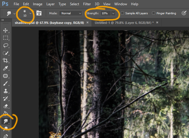
Where to find the "Smudge" tool and my settings
The strength of the smudge is absolutely up to you. How smudgy you like your horses is your style. I use 10% on both body and hair, but I'm very careful with it. I recomment 10 px or smaller brush size for the face, legs and details, and a maximum of 25 px size for the body. The bigger the size the more parts are smudged into one, so it's very easy to mess up details with larger sizes. There is a huge difference between smudging and blurring the horse. If you blur the horse all the granulated parts will still remain there, it will just look like you can't see them well. If you smudge those grains will be mashed together to form a new color with minimal texture kept underneath. I do not advise blurring your horse as part of the body prep unless you especially want a blurred out horse. 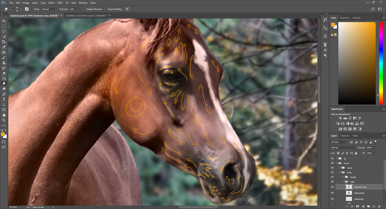
Smudge directions on the face
The most important thing with smudging is the direction in which you smudge. You should aim to follow the horse's muscling or hair. I personally use the muscles to base myself off of. The correct smudging directions are easy to identify but hard to master. When you smudge the wrong way, your horse will also look wrong. A trained eye can notice when this happens. This is a technique you need to practice and practice until you learn where to smudge in what directions to get the best outcomes. You can smudge by just one stroke or by moving back and forth, they will have different effects. Try them and see how they work. 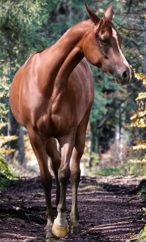
Result of smudging
|
| |
|
 Morning Showers then Cooling


