| |

Rumble Team |
Chapter X
Horse Prep Part 5 Details, details!! 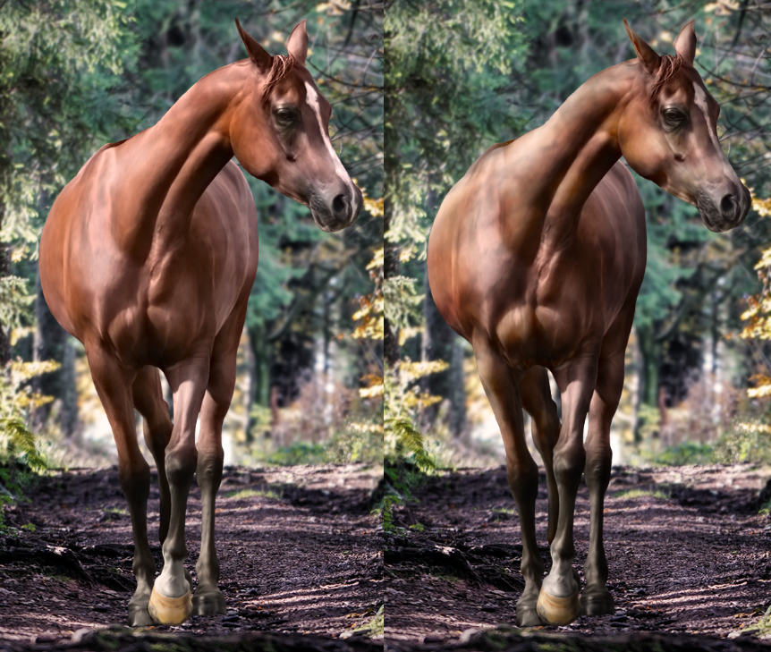
Can you tell what's next? :D
That's right, we've arrived to the lighting section. The other most patience testing part of horse prep. We're going to turn that sad, outstanding horse from the left side into a real part of the background image, the one on the right. The next steps are once again interchangable, I personally like going from details to big modifications, but I believe this should work the other way around too. 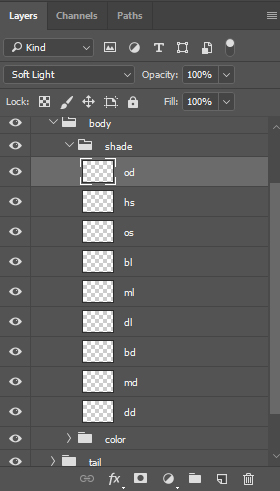
Layer structure
First of all, we need layers. A lot of layers. The above layers represent "dark", "light" and "shine" layers. I shortened their names to these because I've got fed up with typing "detaileddark" and "detailedlight" every single time. So "d" in front menas "detailed", "d" on second place means "dark", "l" means "light", "s" means "shine", "m" means medium, "b" means "big", "o" means "out", "h" means "hard". "OS" = "OutShine". I know I know, what a weird naming system. You will see them later in more detail. 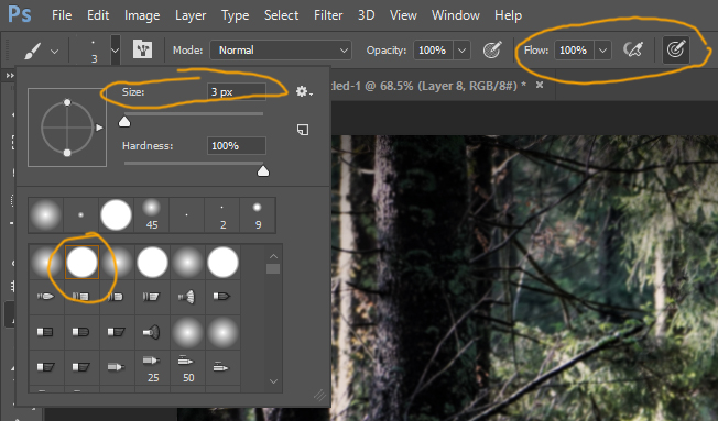
Brush for details
As stated above I like starting with details. I use pressure sensitive size so I can get all my beloved details out there without making ugly pixels. The brush has to be pure black and the layer needs to be on "soft light" type. Then you start painting in the details. The main point of this step is to enhance the details of the horse that were smudged or that aren't as visible as desired. You should always follow the original horse stock when painting in details, and never "abuse" the stock. What I mean by "abusing" the stock: 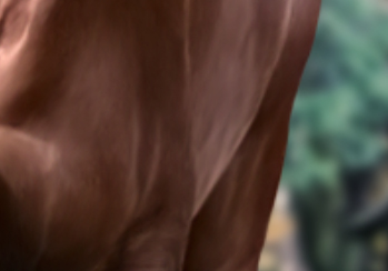
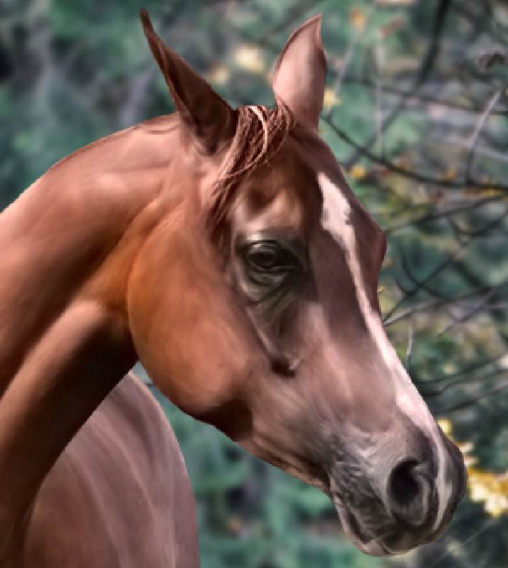
Do you see those two white lines above the leg muscle? Do they look natural? Absolutely not. There were white lines there by default, and I enhanced them and made them longer. Bad girl. That is something you should not do. You should see what the stock is asking for, not what you imagine for it. If you put lights where there aren't supposed to be lights it will ruin all your hard work because those lights will stick out of your horse like a lightning rod from a rooftop. Be patient and add your details softly. Here is how the detailed shadows look like on the head right after painting them: 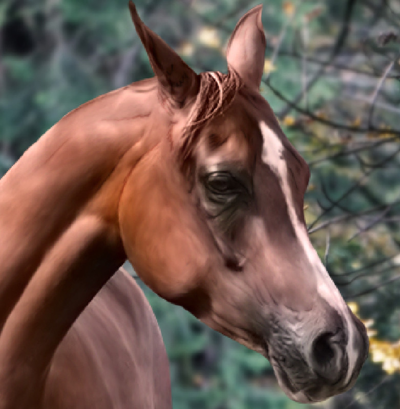
When you're done painting on the detailed lights or shadows you should go over your horse to smudge them into the body. The above image has very outstanding shadows, but after the smudging step, they blend in very nicely to the rest of the body - given that they were placed correctly: 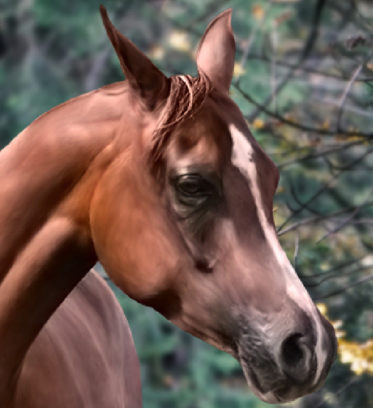
I can't press how important it is to follow the stock horse with these steps. Put shadow or light to enhance certain areas. It takes practice to see what areas need shadow for enhancement and what areas need light. Certain parts need both. Adding only shadow generates depth, adding only light generates height, adding both creates folds. 
The full horse after the detailed shadows were painted and smudged in
I usually go with the detailed lights after the detailed shadows. The method is exactly the same, but you must be very careful with lights as they are a more powerful eye-attracter than shadows are. Badly placed shadows can be shoved under the carpet but badly placed lights will always be seen. 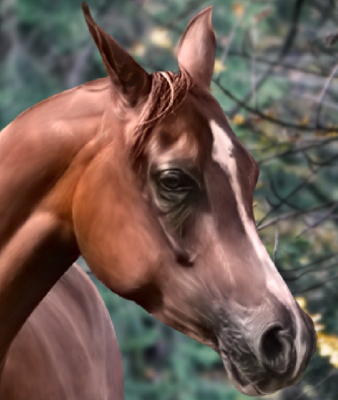
Detailed lights on the head before...
...and after smudging
I found that detailed lights rarely need to be placed anywhere else besides the head and the skin folds at the base of the legs. 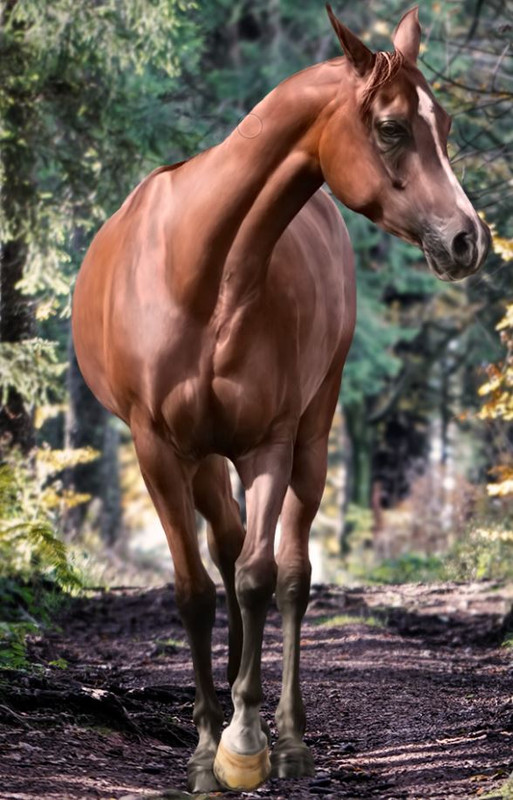
Smudged in detailed lights
*** Slightly bigger picture For the following steps we will need to create a complete horse layer where we merge the baybase and blackpoints layers. You can duplicate these two layers and merge their duplicates. Once you have this horse layer, grab the "Quick Selection Tool" and wildly select everything on the merged horse layer. 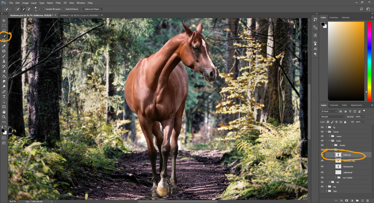
The "Quick Selection Tool"
The tool should automatically jump to select only the horse on the merged horse layer. This tool is a sort of smart selection, which selects areas based on content and it learns as you continue selecting and deselecting on a certain image. After a while it will be pretty good at what you want to select. This learning mechanism resets with every instance of Photoshop, so the tool only learns as long as you work on the given image in the given time. Now, since the horse is on a transparent background, the tool should select the horse in full and nothing else. 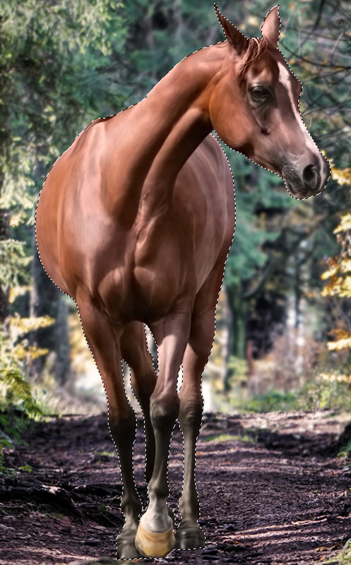
The selection made by "Quick Selection"
When you have your selection you can disable the merged horse layer. This trick was needed because we're going to paint with larger brush sizes that will go outside the outlines of the horse. In order to save us the trouble of erasing everything that goes outside the lines, we can instead, have this selection and paint only within it. Try it out, select the medium shadows layer and try painting outside the selection. Nothing will happen. 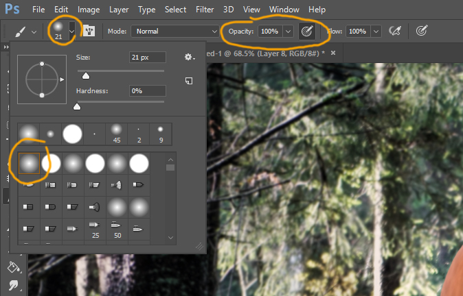
Brush for medium sized shadows and lights
Painting the medium lights and shadows is solely for the purpose of enhancing the anatomy of the horse. For now we don't try to make the background's lights and shadows reflect on the horse yet. For the medium and large sized shadows and lights I don't smudge, I use the pressure sensitive opacity to create the fading I need. Occasionally I use a soft round eraser with pressure sensitive opacity to take back from parts that feel too much. 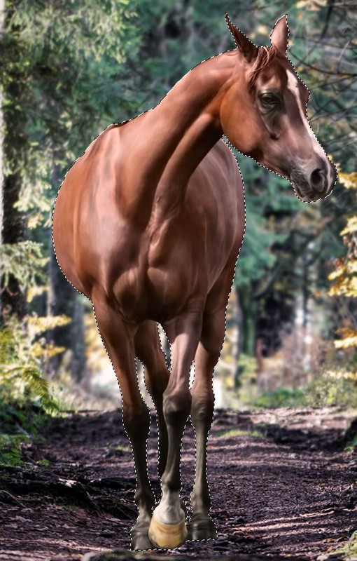
Result of medium sized shadows
Result of medium sized lights
|
|  |
|
| |
Rumble Team |
Chapter XI
Horse Prep Part 6 Fit into the frame With these steps we're going to place our horse into its surroundings. Unlike the previous shadows and lights, with these next ones we must consider where the light is coming from in the background and apply them to the horse accordingly. It's advised to take a look at similar pictures with various objects or horses on them to see how the light hits in such an environment. In this case, just google "horse in forest" or search on Deviantart and try to find images where the horse is between trees and the trees cast a shadow on the horse's body. We must break these shadows and lights down into "digestable" bits, because if we were to add all of these on a single layer, we would have to consider too many things at once and it might get too confusing. *** Larger, softer First I placed the large shadows, where the horse's body has darker areas by default. I avoided painting any of these large shadows to places where the horse will be hit by light. For this we still need to keep our horse selected, because the brush size we use for the large spots would surely leave a mess outside the lines of the horse otherwise. I usually use a size between 80-160 px with the soft round brush on pressure sensitive opacity. The size varies with the size of the image itself and the horse. 
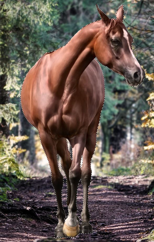
Result of painting large shadows
After the large shadows come the large lights. Be mindful that these should not go to the same areas where you painted the big shadows, because the horse's body will never shine where it casts a shadow on itself. 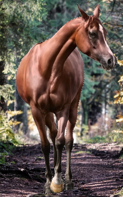
Result of painting large lights
Now we have the lights and shadows that come from our horse being a horse. At this point you're done with enhancing the anatomy of the body and your horse should look pretty neat, like a piece of art in itself. However, it should still feel quite out of place when it comes to the whole picture. What the horse is missing are background related shadows and lights. Those are what we will add next. *** Shine on me When it comes to background related lighting I usually go from bright to dark, so reversed compared to the anatomy enhancement. It's much easier to grasp where the light comes from, paint that in, and then see how the shadow falls on the horse with a given light direction. Once you understood where your light is hitting your horse you'll be able to place the shadows on the opposite side accordingly. So once we have our understanding it's easier to just put those lights up right away, isn't it? 
Color example for soft lights
Now my weird naming system comes in here. Until now it was quite obvious, detailed, medium and big dark and light. But for the background specific lights and shadows I use "OutShine", "HardShine" and "OutDark". I use these names because these lights and shadows usually go to the edges of the horse, on the "out"side of it. Calling them "out" stuff was the shortest I could think of while I still understood what they meant. This is purely personal preference and my own way of optimizing my workflow speed, so name these layers whatever works best for you. You will need at least 3 layers, but you may need more than one shadow layer. The OutShine layer is the first one in the line, the softer and larger lights. To get these right you will need to pick a color from somewhere in the background where the color of this light is seen. In this case I picked a warm orange color from one of those bright bush parts. Whatever color you pick, you should tone the saturation downer to almost white. Your goal is to have a mostly white color with a slight tint of the color of the light. A note: light in natural settings is almost always warm - except for winter or underwater themes - so you will want to have a yellow, red, orange or crimson color as the tint. 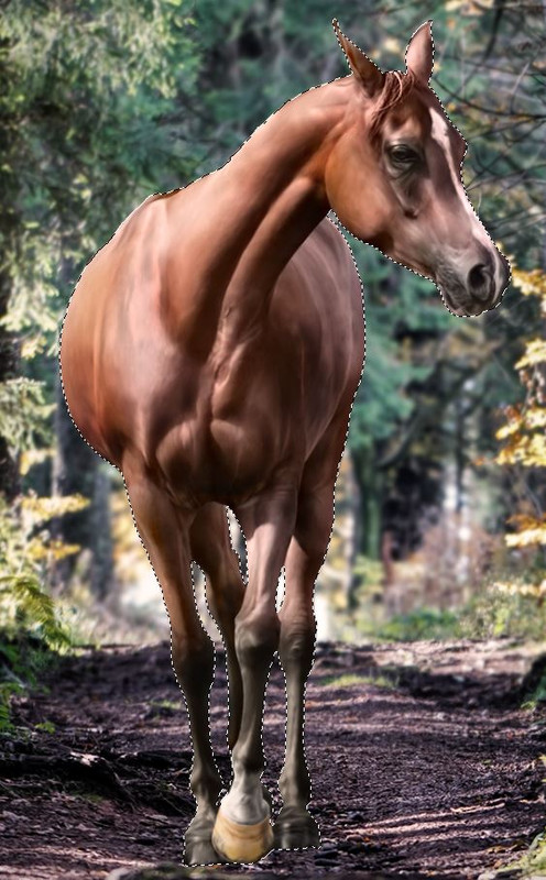
Result of the "OutShine" layer
For the OutShine you will want to use a very large soft round brush with pressure sensitive opacity and paint very carefully. The layer should have the "soft light" type. You should not cover any anatomy on the horse! If your horse lost details painted before due to the OutShine layer, your shine is way too strong. The next step are the hard lights that hit the horse directly and sharply. Not all backgrounds will require hard lights, in those cases it is enough to softly enhance the OutShine layer with another soft light layer. In this case there were very few spots to paint in, it is barely noticable when compared against the OutShine-only image. For these lights use an even less saturated, whiter color, and set the layer type to "hard light". I call this layer "HardShine" usually and use a smaller bit still large brush size - about 30-60 px depending on the image. 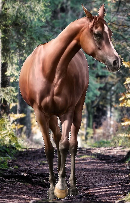
Result of the "HardShine" layer
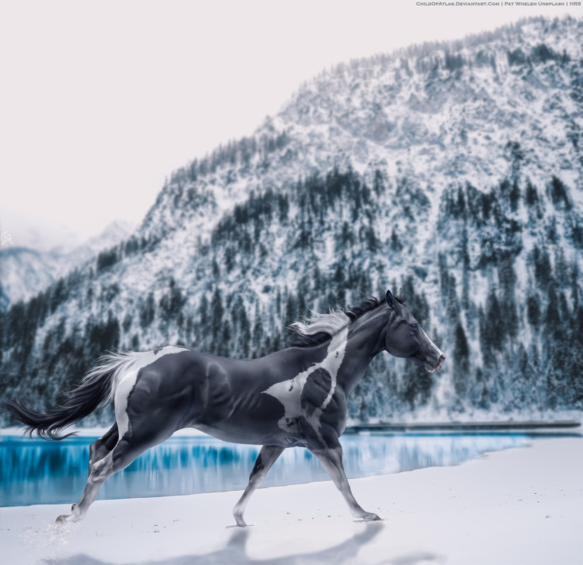
An example of stronger "HardShine" in a previous work of mine. Notice the heavy white lights on the belly and legs - those are reflections from the snow.
A tip for the lights: Don't get scared if you mess up the lights. You can always grab a large soft round eraser with pressure sensitive opacity and go back to correct them when necessary. For example if you put too strong lights at a point but their placement is good, you can just erase from the overbright parts util they are soft enough. *** Hello darkness... For this image I used two layers of "OutDark". These shadows are either generated on the opposite side of the hard lights or are cast on the horse by the elements in the background. Here we have both of these: we have the leaves of the trees casting their shadow on the horse and we have the basic contrast between the bright and dark side of the body. My first "OutDark" layer was for the contrasting shadows. I placed these shadows on the opposite sides of the lights, following the shape of the horse's body and muscles. I painted with a large soft round brush with pressure sensitive opacity on a "multiply" type layer. 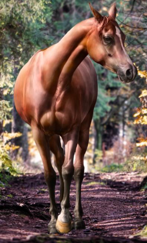
Result of the first "OutDark" layer
Apologies, forgot to save a snip during the process, so I went back and disabled the other layers to show you the result. Here I already added the finishing touches to the horse and background which we will talk about in a later chaoter so it looks slightly different. After these base shadows are placed we are on to see if anything casts a shadow on the horse. In our case we had the trees and the leaves. For this I spent a good half an hour looking at reference images where I could see exactly how it looks like when a horse has shadows cast by leaves on its body. This was technically the purpose of this piece of art, I even named the file "shadows-study". When I saw the background I decided it will be to my advantage if I tried to place a horse into this complex shadow pattern. 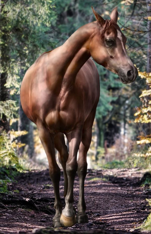
Result of the second "OutDark" layer
After many attemps, drawings and erasings, I ended up with the above. I painted over the whole horse and made it homogenic gray, then went with a smaller - 20-30 px - soft round eraser with pressure sensitive opacity and erased back to create this sort of leaf pattern on the body of the horse. At certain places I left more shadows intact, to mimic the branches. The layer style in this case is "normal" and the opacity is reduced to a level that looks good. *** Dropped something? Now the horse looks quite good in our background, but something still feels off. The thing we're missing is the shadow cast by the horse onto the background. The interaction between the background and the horse is a two-way thing. Not only does the background cast shadows on the horse, the horse also casts its own shadow on the background. This is a very important step and if this is missed the horse will not look like it's part of the image. Simply because this two-way interaction becomes a one-way effect, which goes against the nature of how lights and shadows work. You can't have an object sit somewhere with a directed light and cast no shadow. I usually call this shadow layer "dropshadow" and have it set to either "soft light" or "multiply" type, whichever looks better. The brush is either a soft or hard round brush, the size and softness varies depending on what kind of background and lights I have. For this image, you can see that there are already shadows dropped by trees on the ground next to the horse. We will have to create a shadow that matches those already existing ones, and cover up the bright spaces between the shadows of the trees. As the horse is walking between the trees and the light hitting it creates its shadows very similarly to that of the trees. 
Result of the "dropshadow" layer
So here I used a small - max 10 px - hard round brush with pressure sensitive opacity and the color of full black. I painted inbetween the shadows of the trees until the bright places were covered up, then added the shadow of the hooves and legs. The only difference between this shadow layer and the other we added is that it is highly advised to put this layer beneath the rest of the horse. As the horse will never have this kind of drop shadow on its body it is better if the body covers it up completely. That way we don't need to be careful not to paint over the horse, and we can comfortably work our way around the background however we need it. 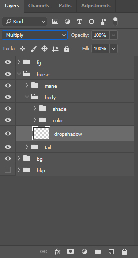
Place the "dropshadow" layer beneath the rest of the horse
And we're officially finished with the body prep! We can now move onto the next step. |
| |
|
| |
Rumble Team |
Chapter XII
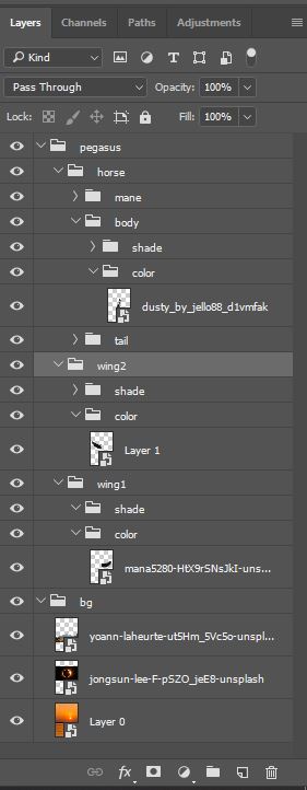
Mane and tail Setting it up Before jumping into the mane and tail there are a few things to set up to make our lives easier. As mentioned in Chapter 3, I usually create the layer groups in the beginning of work. If you haven't done it then, now is the time to do it. It's much easier to just keep painting after switching layers with one click rather than having to create a new layer, name it, then go back to painting. 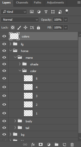
Layer structure for colors
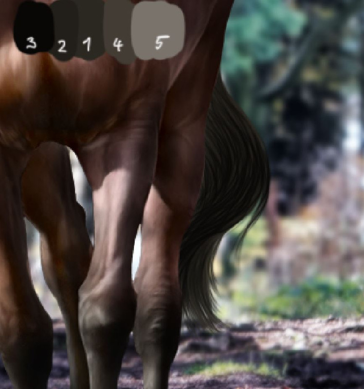
Now this is a personal preference but I like using 5 colors for all manes and tails. I pick these colors usually from the horse iself if I can, to keep it natural. When I can't - for example silver horses where the body of the horse doesn't have the color of the mane - I look for a horse with the desired mane color and use that image to pick the colors from. I find this method creates much more realistic colors than mixing up my own colors. In this case I picked the colors for mane and tail from the legs of the horse. After picking, I paint a small line on a new layer that I place on top of everything for ease of access. You should have the opacity on 100% and not on pressure sensitivity to keep the fullness of the color. 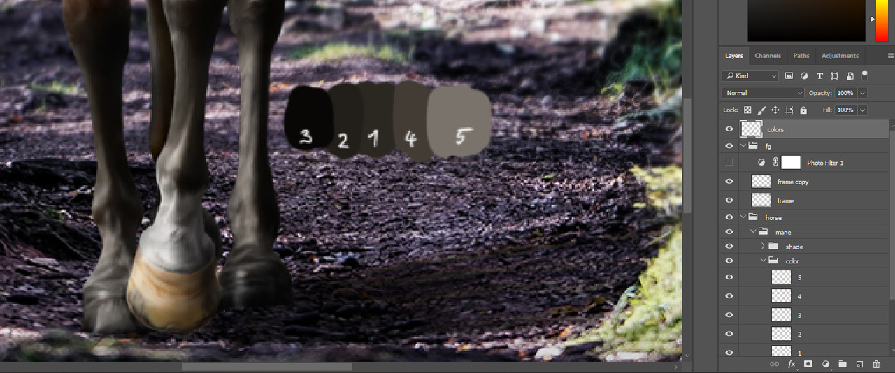
5 colors for a black mane and tail. Notice that the Photo Filter is turned off for color picking!
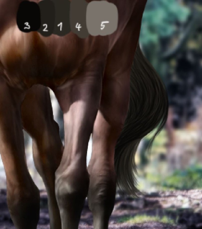
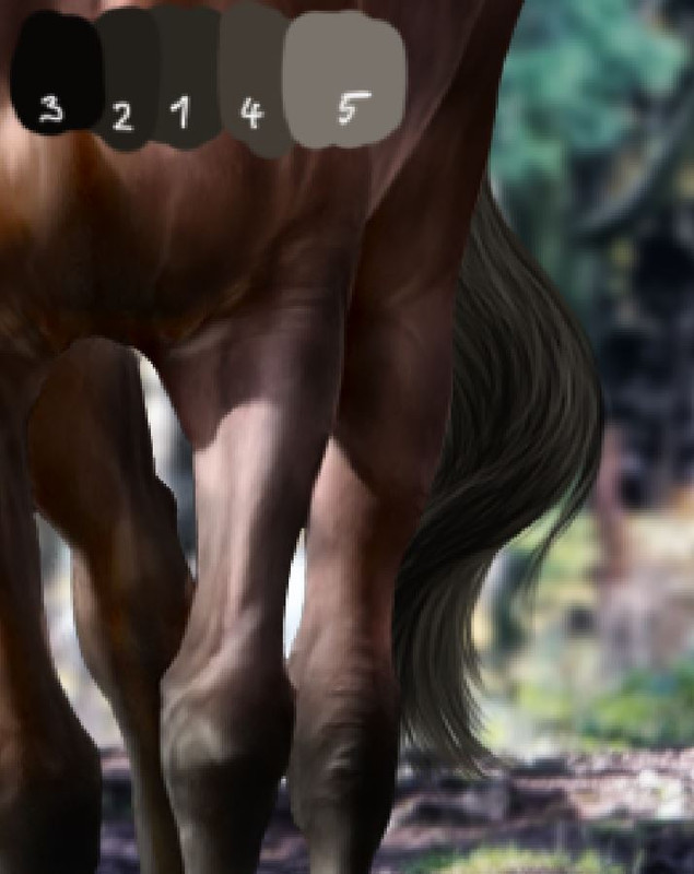
The 5 colors for me are: - 1: This is the midtone of the mane and tail. This is the color I use to make the shape. All the other colors go on top of this one.
- 2: A slightly darker color to paint in the hair strands. Each strand has to follow the flow of the full hair.
- 3: The darkest color, mostly used to enhance where the shadows are going to be or to separate certain strands of hair from others. It can also be used to enhance the details.
- 4: Slightly lighter than the midtone. Usually this color doesn't have a big role, but I still feel more comfortable putting the base of the lights with this one first.
- 5: The brightest color, used to enhance the stranding and the lighter areas of the mane. Take note that these are colors, not lights or shadows. I paint the hair with two steps, color and shadows, so these colors do not create the final look of the mane and tail. 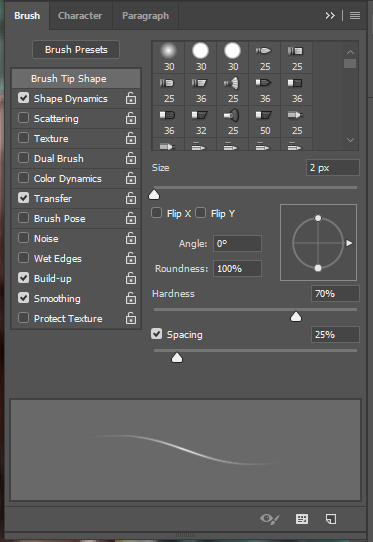
My hair brush
I got my hair brush from another HEE artist, these settings are awesome and I highly recommend them to anyone. The "never use 1 px for anything" rule applies also here. *** Make me fabulous! I like starting with the mane, but this comes down to personal preference. If you want to start with the tail, it's completely up to you. The first step is to create the basic shape of the mane, for this I usually use a larger brush size, around 4-6 px. Here you should decide how you want your hair to flow. Be mindful that hair is almost never straight, so avoid completely straight lines when painting it. You should also try to follow the body and movement of the horse as much as possible. If you put the mane in a resting position on the neck of a cantering horse, it will be very hard to believe that the mane actually belongs to that horse. If I were to make a fuzzy, flying hair for this horse, it would not look natural at all because there isn't enough movement to create such a motion. 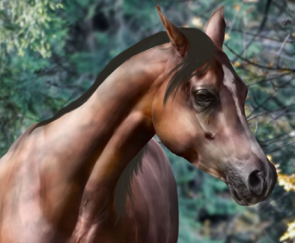
Basic mane shape
When you have your general idea painted on, grab the small - 2 px - size of the hair brush and start painting in the strands. I hightly recommend adding a few strands of hair that stay in an "incorrect" position, flying somewhere outside the base shape to add some realistic detail into the mane. Do not overdo this! Just one or two strands per mane are fine, just how a naturally well groomed hair would still have those few stubborn strands that just don't want to stay the way you want it - no matter what you do with them. 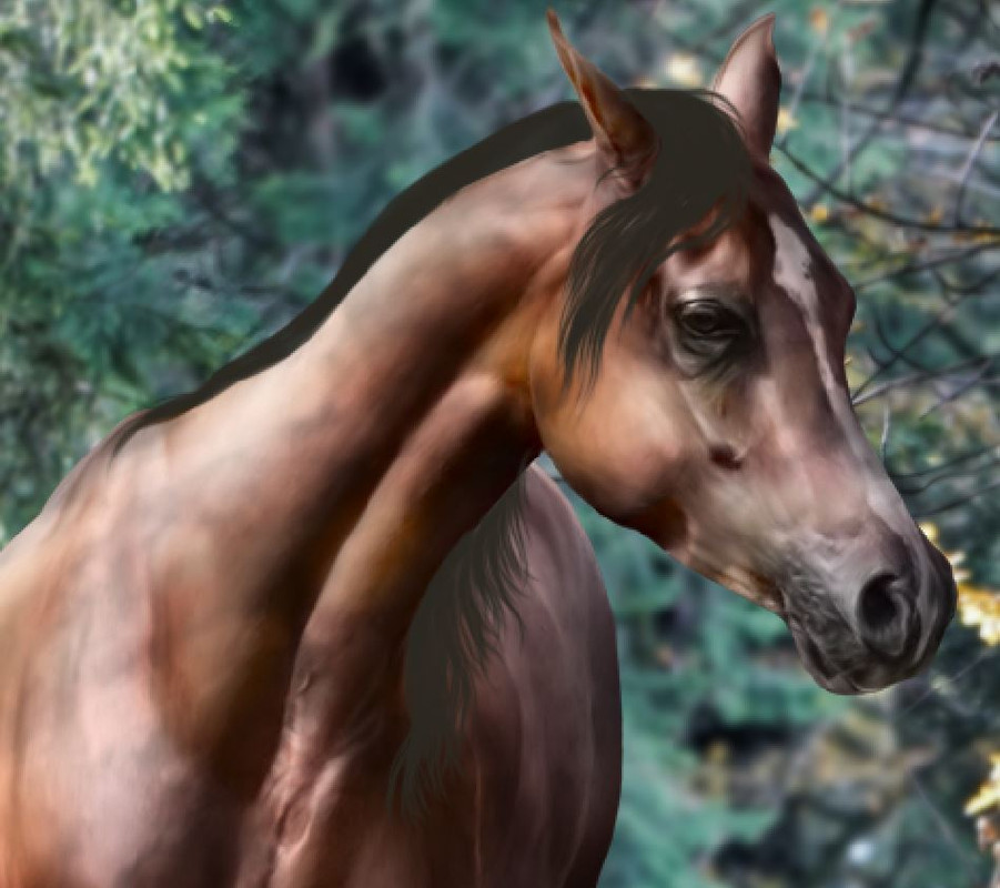
Detailed mane shape
Notice that small strand of hair on top of the head at the ears? that is the kind of mess I'm talking about. When you have the shape, you can grab the second color and add in the strands. Be aware and follow the shape you created, don't just paint lines wherever. The more you follow the flow the more natural it will look. Also keep in mind that mane and tail strands very very rarely go from bottom to top in one line visible to us. They mix up with the others, create clumps and clusters, sometimes disappear and reappear. There is really no way of teaching how this works, you have to see and practice. Check how other artists paint their hair, check how real horses' manes look like. It is advised for beginners to follow the mane of the stock horse as much as possible. If you leave the mane on the horse and paint over it, you can practice how the mane should flow. 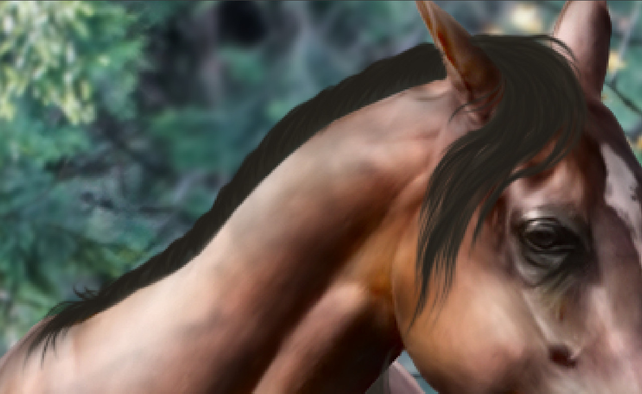
Result of adding the second color
Moving on to the third color, do not fall into the trap of adding too many dark spots. You can enhance all the strands if you want, but it's much more powerful and natural if you leave spaces with only the first and second colors visible. 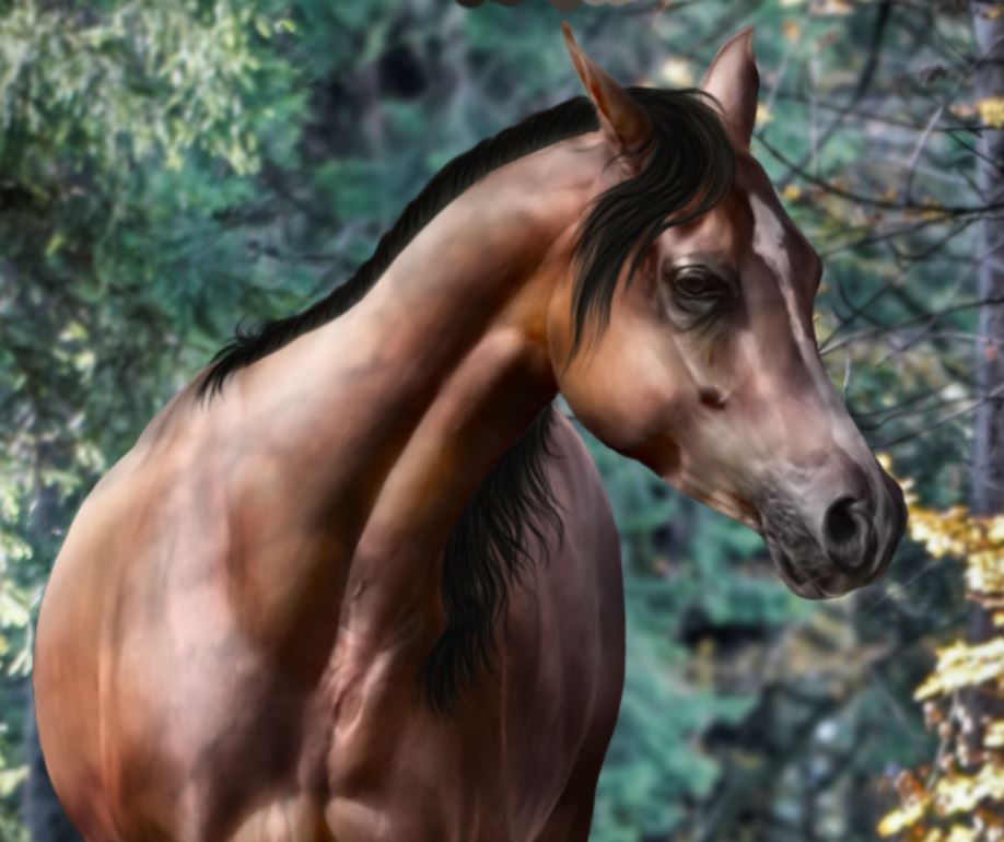
Result of adding the third color
When adding the fourth color be careful not to paint over the areas you want to leave completely dark. Here you have to consider how the lights will fall on your mane and paint these brighter spots accordingly. If you have an area that will be covered by a shadow, it's best not to paint any lighter colors there and leave only the first 3 colors. 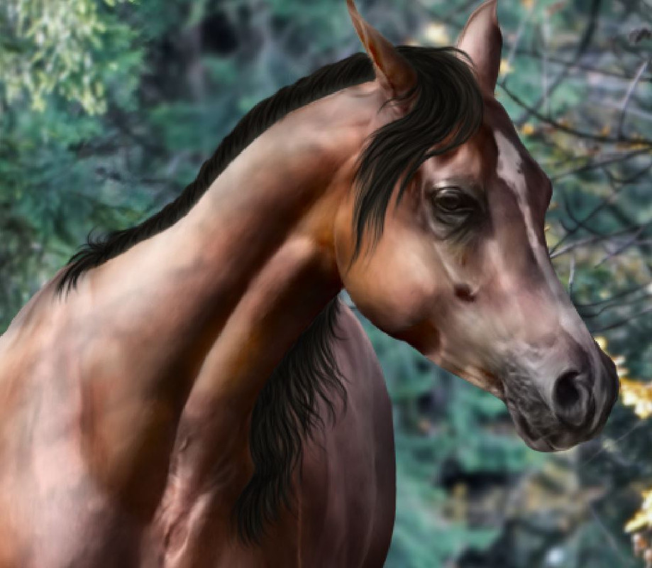
Result of adding the fourth color
The fifth color is for bright places and strand enhancment. Be careful with this as this color acts as a very powerful light in the overall image of the mane. If you paint it to the wrong places it will mess up your final product. 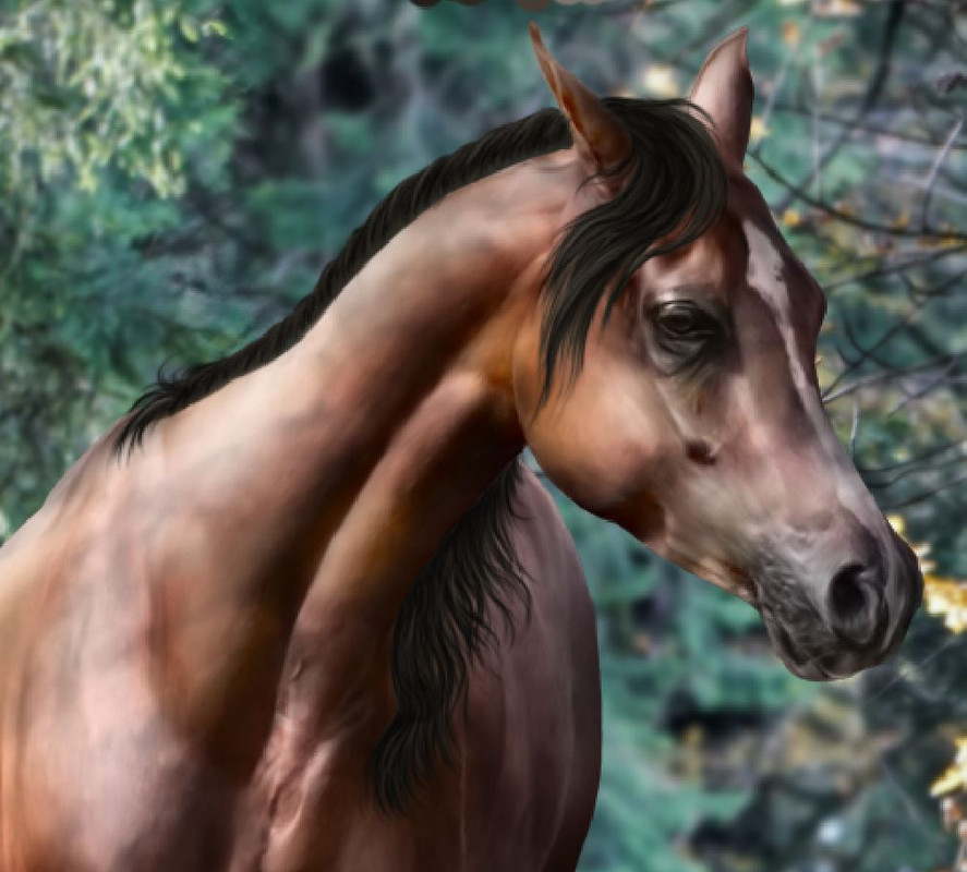
Result of adding the fifth color
Now that we have the colors, we can move on to the shadows and lights. Remember the trick we did with the selection at the body prep? Go ahead and duplicate the "color" folder of your mane, then merge the duplicate. I usually convert the folder to smart object then rasterize it for these merges, I found that it has a better looking result than simply merging the folder. You can disable the original color folder and make the Quick Selection on your new, merged color layer. You aim to select all of the mane and only the mane. The shading works very similarly to that of the horse. Large, soft round brush with pressure sensitive opacity. For shadows use a pure black color, for the soft lights use the warm color picked from the background and for harder lights use a whiter color. For manes and tails I found that setting the softer lights layer to "overlay" and the harder, whiter light layer to "soft light" gives the best results. 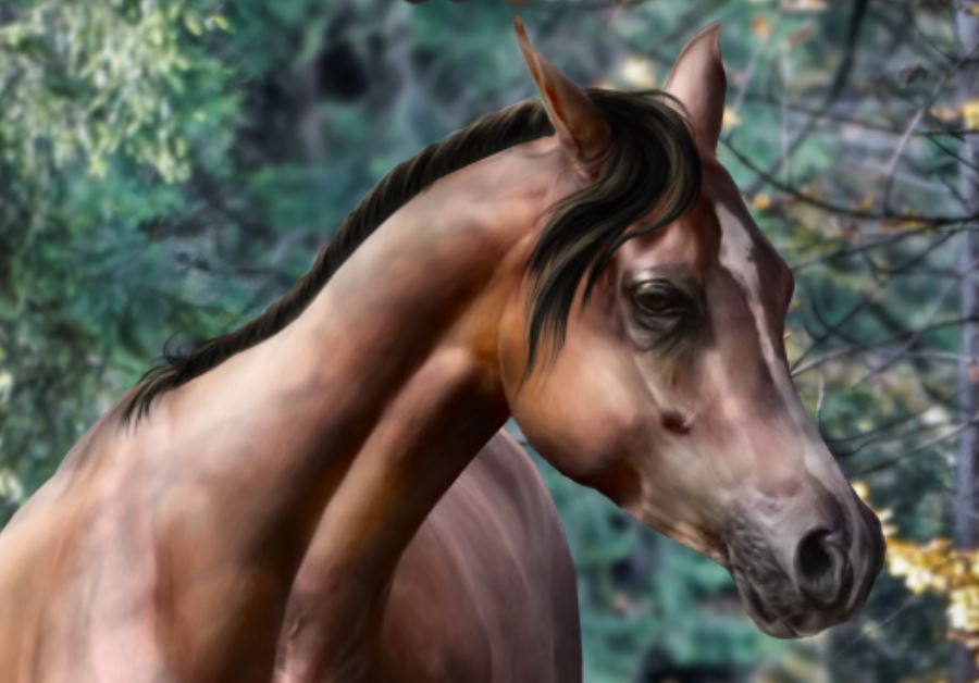
Result of adding shadows and lights to the mane
Notice that I decided to remove the part of the mane from the neck. I just didn't like how it looked so I took it off. This should serve as a reminder that you are free. You're an artist. Your primary goal is that you like your art, not what others think of it. Nobody can tell you what to do exactly, you can do whatever looks best to you. So take that freedom and keep it in mind! *** Tailing The steps to create the tail are the same as for the mane. You first need to make the shape, then detail it, then add the colors and finally the lights. It is highly advised to follow the stock horse unless you placed your horse into a windy environment where you would need to follow the blow of the wind. 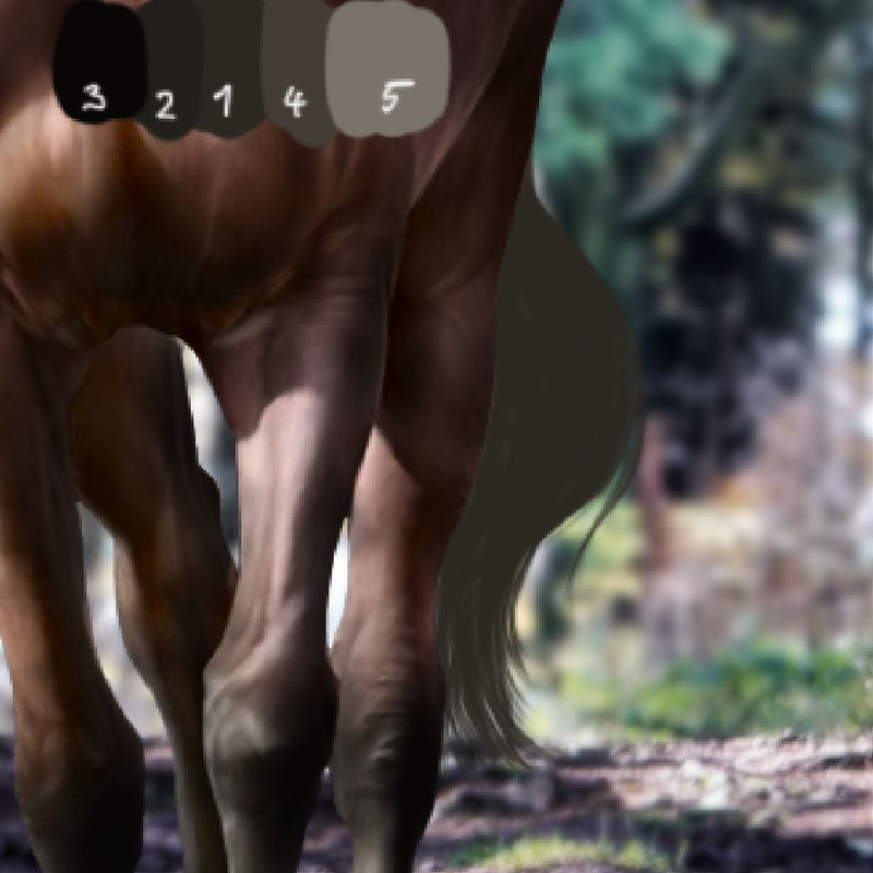
Shape of the tail
Result of adding the second color
Result of adding the third color
Result of adding the fourth color
Result of adding the fifth color
Result of adding shadows and lights
|
| |
|
| |
Rumble Team |
Chapter XIII
Finishing touches and crediting Finish line! We're almost at the finish line! Now is the time to save your work as an image and take a step back to take a good look at it. 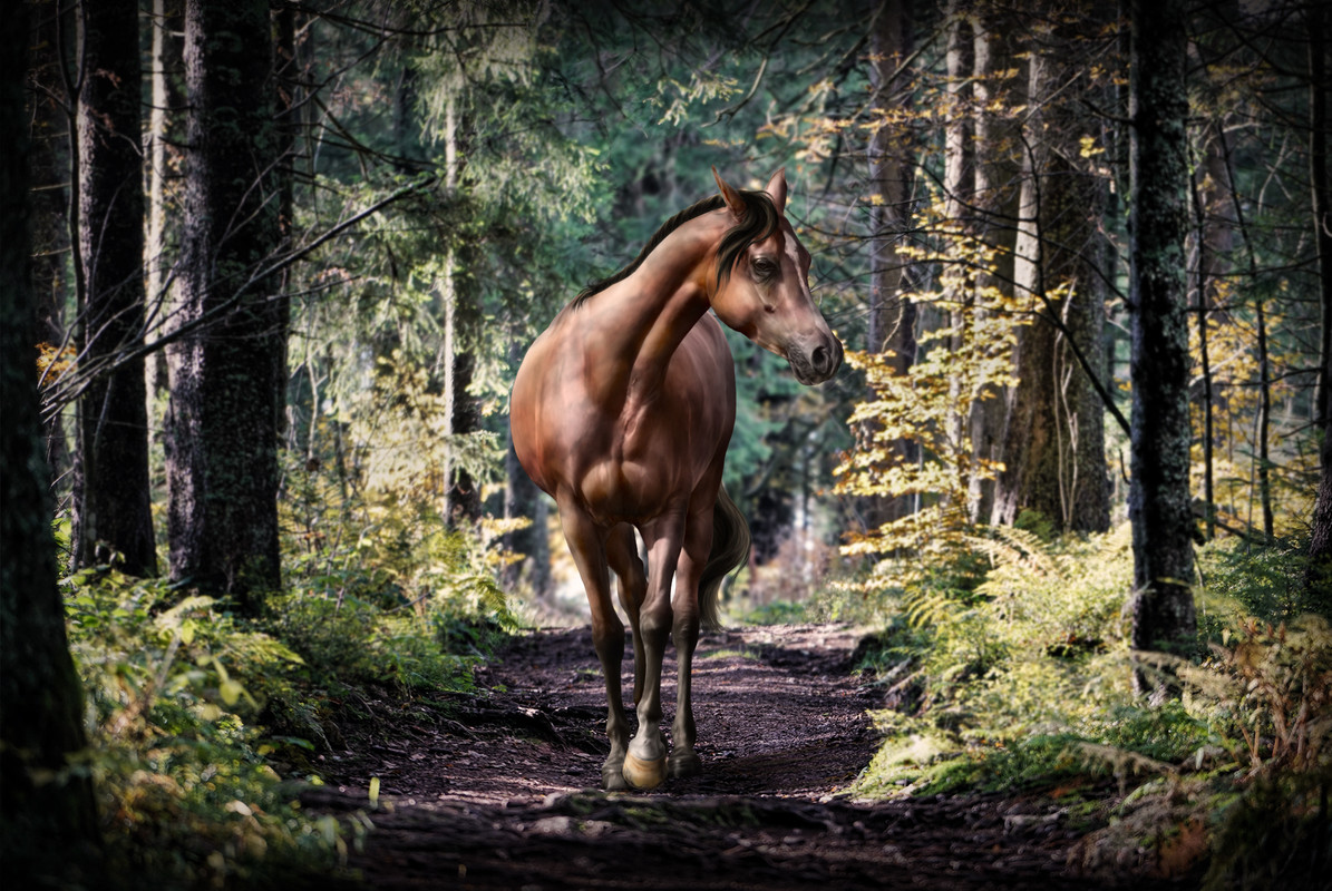
If you see anything that is messed up, anything that needs changing, go ahead and make the necessary changes. Here I enhanced the saturation and played a bit more with the contrast settings of the overall image. 
As the last step, we paint the eye if necessary. In this case I felt it was needed to give a boost to the eye of the horse, so I zoomed in, picked colors from the original eye color and gave a little definition to the eyeball. I did this in the horse -> body -> color folder, on a new layer. 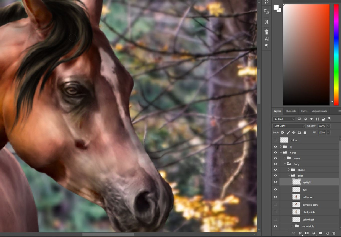
*** Crediting After you're satisfied with your work, last but not least, you need to add your credits. Crediting is as important as any other step in making art, and should never be left out. Respect the stock providers and thank them for their work by adding the correct credits to your image. If using Deviantart, in most cases you can write the username of the person with a "DA" afterwards, but some users ask for specific credits. You should always check the description of the stock photo you use and if you don't find anything there, check the journal posts of the user. They must have a "stock rules" post somewhere, and you are obligated to search for this post and check it. This is not optional, it is an obligation. After finding exactly what text has to be on your image, you can just put it on a text layer on top of everything else with whatever color and roughly place it where you will want your credits to be. 
"Raw" credits
To fine tune the credits is to make it not too outstanding to disturb your art piece, but also to keep it readable and visible. It is best to place the credits on a homogenic part of the backround where the same or similar colors are covering a large enough space for the credits to fit. If you cannot find such a place, you can always add a 1-2 px sized stroke to your text from the Layer -> Layer Style -> Stroke menu. You can use a bright text color with dark stroke or the other way around, whatever works best for your image. Sometimes adding a drop shadow to the text can also help. Play with the colors and opacities until the credits are readable but not disturbing. 
Final credits
For these credits I picked a color from the ground where light was hittng, and slightly lowered opacity. I also used a central vertical guide to help position my credits to the center. And we're done! You can now upload your piece to Deviantart, add the credits to the image description as well and link back to the stocks you used. You're ready to use your work of art on HEE :) 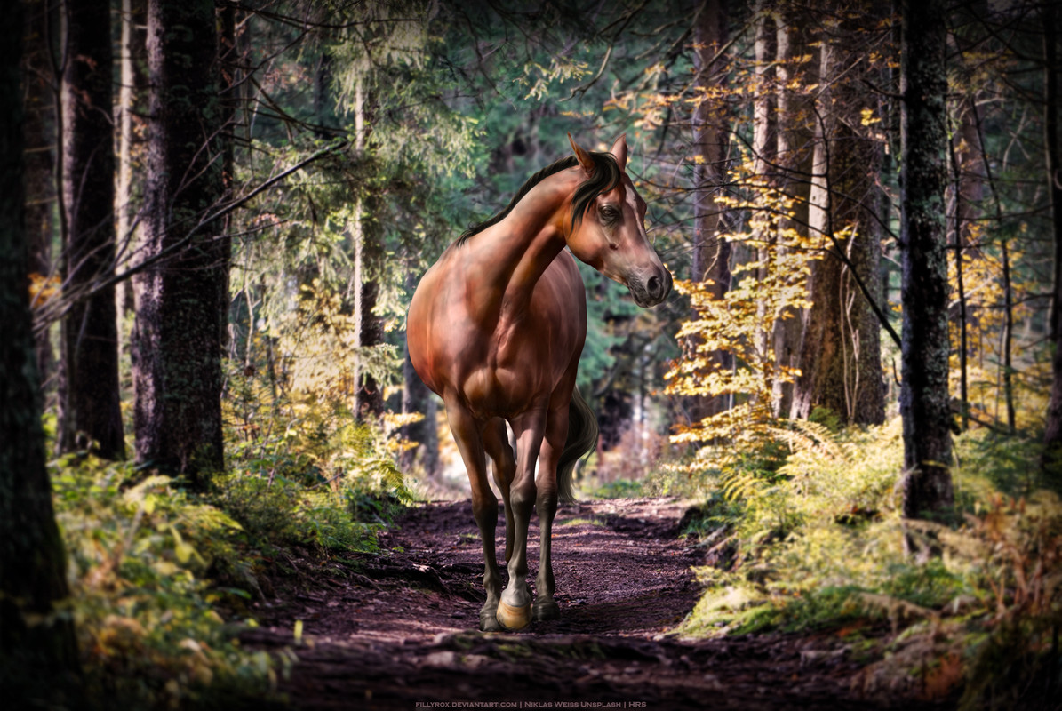
|
| |
|
| |
Rumble Team |
Chapter XIV
Background Merges 1 Composition When you're merging images for the background, it's especially important to first create a rough composition. Cut the pieces you want to use roughly then place them together to see if they fit. How do you know that they will fit? It is crucial that the perspective matches. For example if you have an image like this one and you want to replace the sky behind the buildings, you should use a sky picture that was taken from the same angle. A sunset may be beautiful, but if you use a sky like this one, it will look out of place. To make sure that the perspective matches, you will have to follow the vertical and horizontal lines you see inside the picture frame and trace them until they meet. At the point of their meeting, you get an angle. 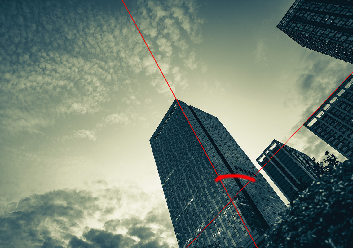
Angle on the buildings
This is the angle that all vertical lines must be close to in your other images when they meet the horizon line. Obviously, you don't need to make lines and angles all the time, but it's good to train your eye to see perspective. Once you have the view necessary, you will be able to tell if two images should match or not. 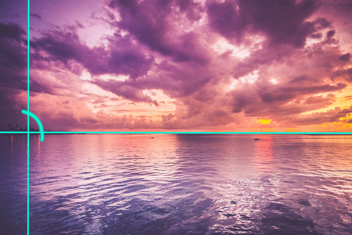
Angle on the example sky
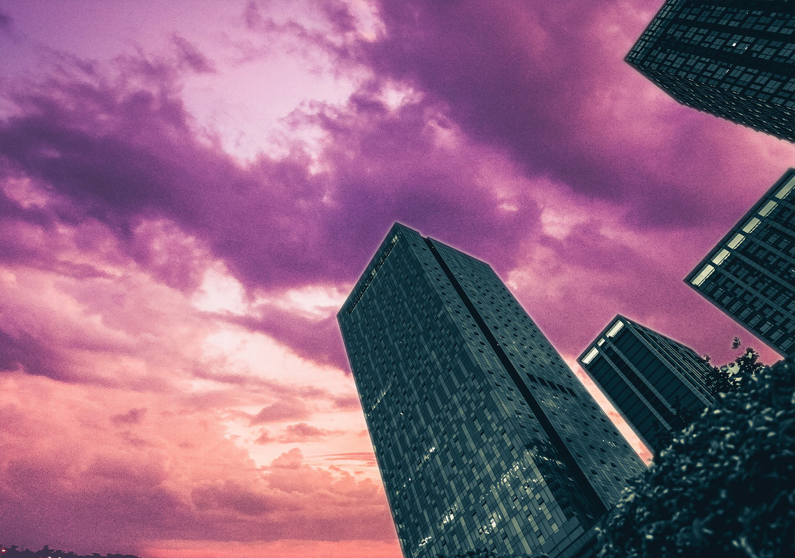
Quick merge of the two images
Doesn't quite look okay, right? Let's try a different image for the sky, for example this one. You can see that this image was taken directly from below, because what we see on the picture are the bottom of the clouds. 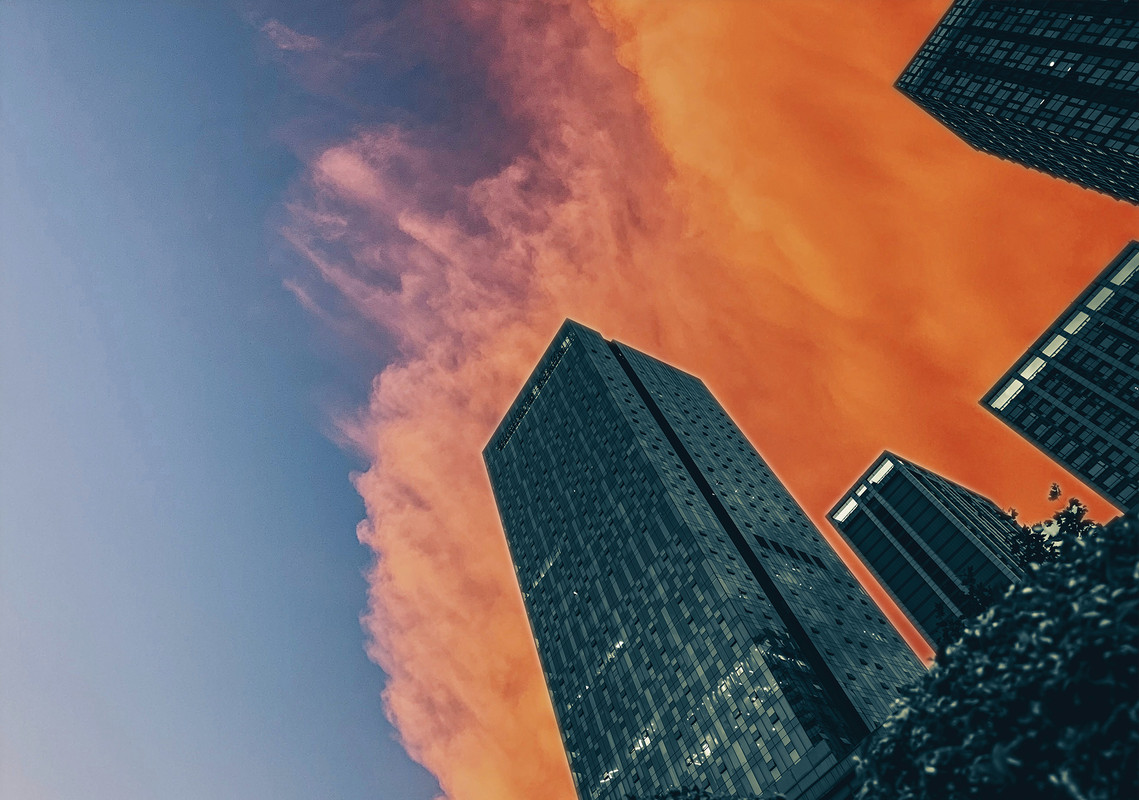
Quick merge of the two images
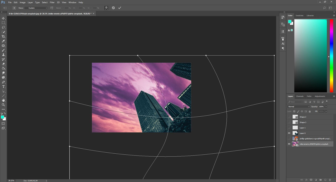
Okay, but what if you really, really like that first image we used? Can you not merge those two at all? Well, you obviously can. Just with a few extra steps. Photoshop has the ability to alter the perspective of an image. You can find this tool on the top part when you have the free transform tool selected. 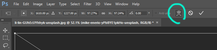
Where to find the tool
What this tool does is that it lets you drag each of those rectangles individually, altering the shape of your image. 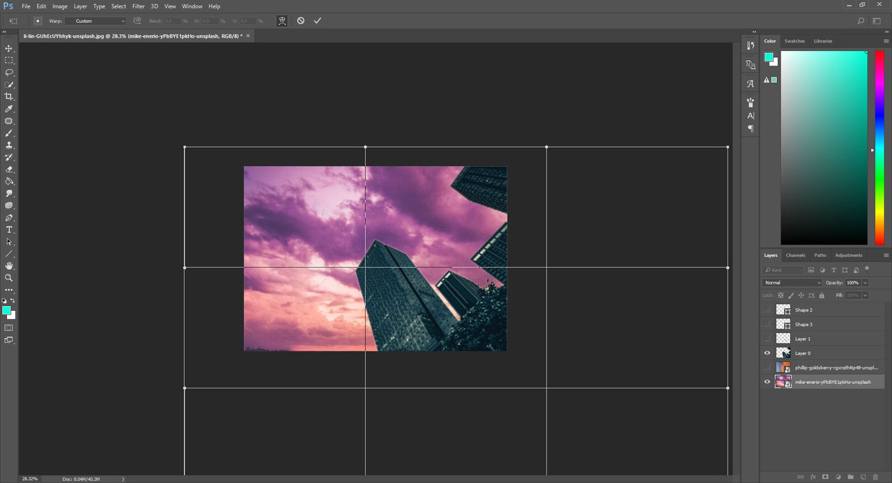
How it looks like
Result of altering the perspective
Now this will still look pretty out of place, because the horizon is not in the same angle as the one with the buildings. Just grab the transform tool and turn the sky layer until the two horizon lines line up, and you have your desired sky behind your buildings! 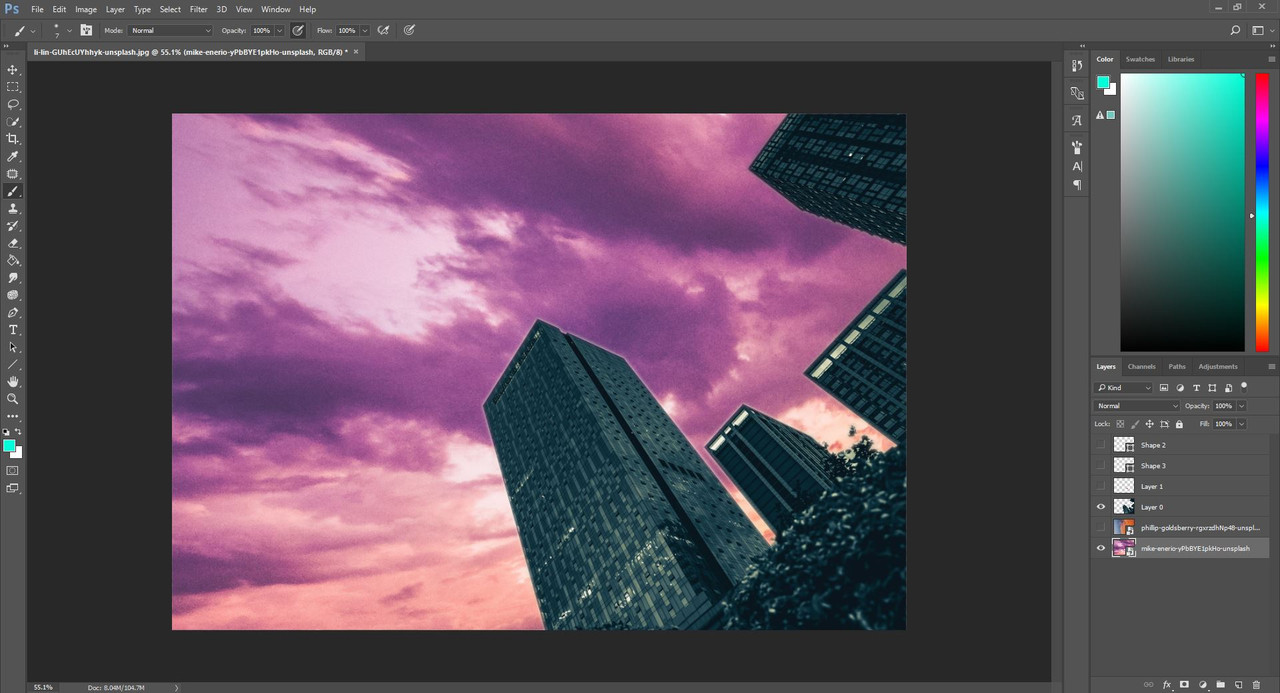
Result of aligning the horizons
Getting the perspective right is the first and most important part of merging backgrounds, but it isn't the only thing to think about. You also must adjust the contrast, saturation and colors so the images blend together well. It's actually very similar to how we make the horse fit into the background, but I will show you these steps in our actual example in the next chapters. |
| |
|
| |
Rumble Team |
Chapter XV
Background merges 2 - The Sky Part 1
Disclaimer In the next two chapters I will thoroughly explain how I merged the background for my latest piece that required a merge. These steps will most likely not be what you exactly need because every art is different and each background merge requires unique things, but you may find techniques that will help you with your future projects. 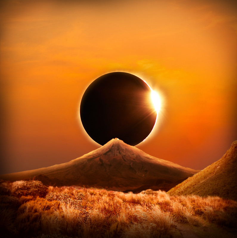 The background we're looking to get is this one The background we're looking to get is this one
 My compositonal image of what I want to create My compositonal image of what I want to create
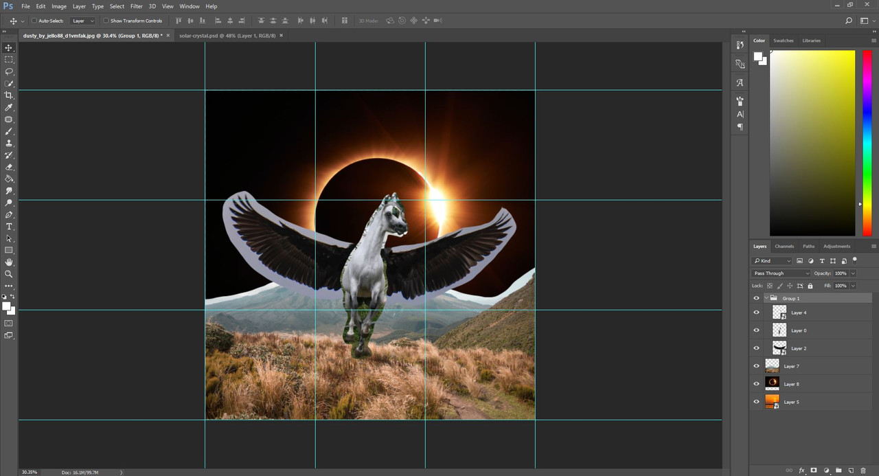
And finally, my layers
Notice that the layers are all organized into folders, and they are all converted into smart objects as of now. I only rasterized layers after their placement and size was final, and I needed to get to work on their other assets. Before jumping into the real work, we must decide what has to be done with each individual image in order to get the background we want. In this case, the following are needed: 1) Cut out the sky from behind the mountains
2) Remove the sun from the sunset
3) Cut out the eclipse from the black background
4) Adjust color, contrast and lighting on each image to blend them together Once we have our to-do list, our work becomes much easier and more organized. If you'd like to follow along with this background merge, here are the stock images I used: Mountains
Sunset
Eclipse Let's jump right in! ***
Mountains in the distance The first thing to do is to make a clean cut of the mountains as we're about to replace the sky behind them. When cutting out mountains from their sky, there are a couple of things to note. First of all, you don't need to make a clear cut of all the bushes and leaves that might be visible on the mountainside. The background will be blurred, so these details would get lost anyway in the later step. You should rather focus on getting the shape of the rocks right, while also being careful about the smaller shadows. It's very easy to think that a rock is part of the sky when looking at them too zoomed in, so it's advised to stop from time to time and check how you're doing. Just zoom out, and if the cut is looking okay, you can continue. 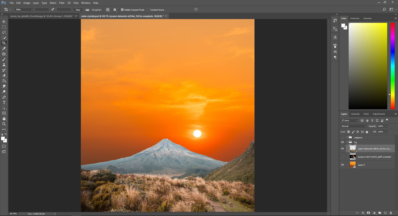 My result of cutting the mountains My result of cutting the mountains
Whenever I replace the sky in a background merge, I always put the new sky image I want to use on the bottom layer. This way I can immediately see how the sky will look like behind my objects. It's also a great way to get a vague idea about the color adjustments that I will need to do later. For this image, I will need to change the color scheme of the mountain behind from this grey-blue hue to a dark black-orange one. I will also need to add orange to the grassy parts in the foreground. Even though these adjustments will come in a later step, I can already start picturing how I will want it to look. *** That beautiful sunset As beautiful as this sunset is, if we want to put the eclipse in the middle, it means that the sun has to go. Removing the sun itself from an image is a piece of cake: all you need to do is grab the patch tool used earlier in the tack removal step, select the sun, drag your selection to another part of the sky, and voila! 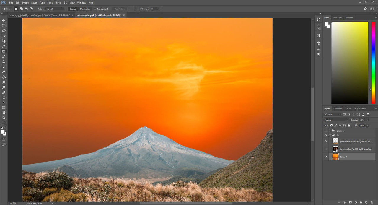 Result of the patch tool Result of the patch tool
If only it was this easy, right? Well, in a way, it is multiple easy steps one after another, until the sky looks neat even without its sun. In the above image, you can clearly see the brighter circle around where the sun was, so if you look at the image now, it feels like it's missing something. That is what we must fix with a few more steps. First, just select a part of the sky that has the colors similar to what's supposed to be in the place of that bright circle. Copy and paste onto a new layer, then drag it to cover the bright spot. 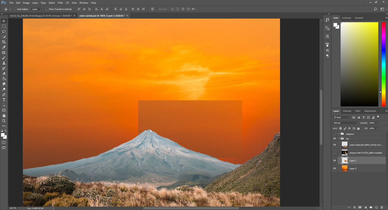 Covering the bright spot Covering the bright spot
Now grab a large, soft, round eraser with pressure sensitive opacity, and take off the hard edges of the rectangle. The pasted part should blend in a little better now, but it's still far from perfect. 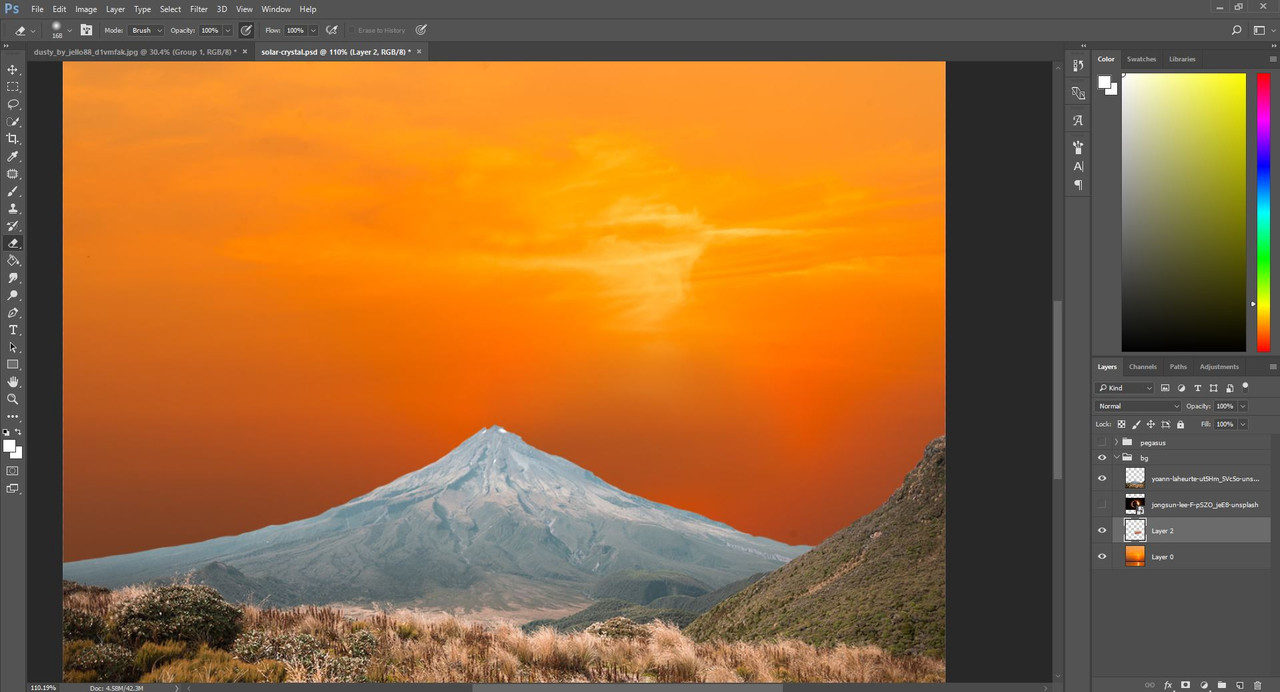 The spot with sharp edges erased The spot with sharp edges erased
Next, adjust the saturation of the dark spot. Below is the amount I decided looked best, but feel free to experiment and see how changing the saturation alters the image. 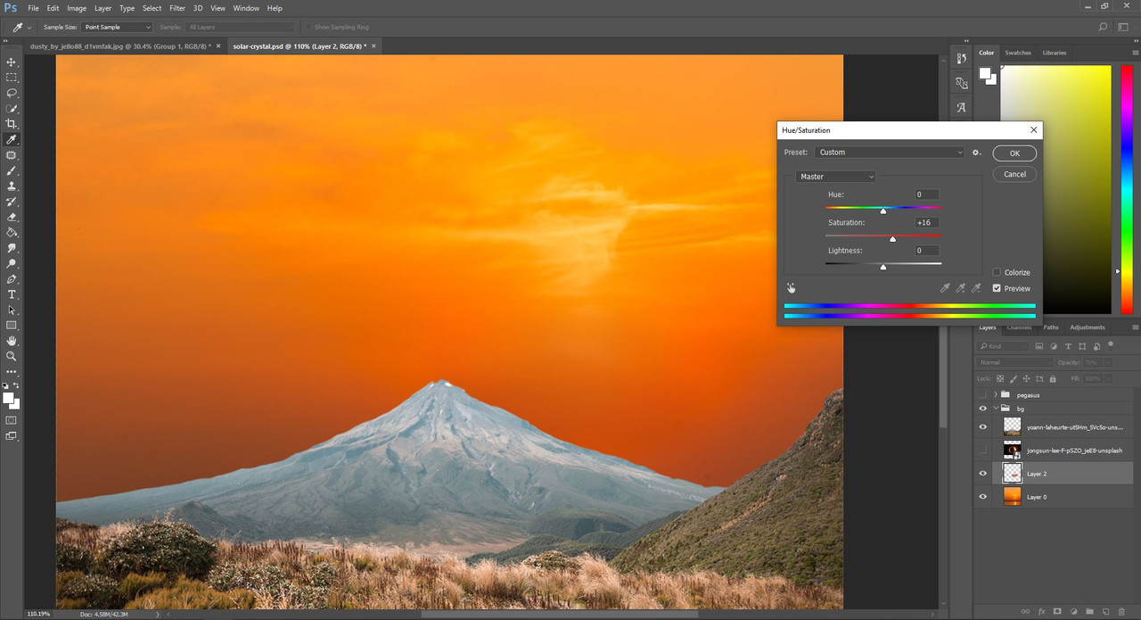 Saturation change Saturation change And now, if I were to show someone this image, they probably wouldn't point out that there was a sun shining in that spot anymore. This is all we need for now, obviously some color adjustments or a bit of play with the layer types could make that patch blend in even more, but I settled with this much because we're about to covr most of that place up anyway. Before moving on, merge the patch into the original sky image, so your sky is only on one layer. |
| |
|
| |
Rumble Team |
Chapter XVI
Background merges 3 - The Sky Part 2 Eclipse As you can see I placed the eclipse above the sky layer but below the mountains. Now that the eclipse iself is visible on the image, it is clearly seen that there is too much empty space on the top of the picture. Just simply crop down the top using the Crop tool until you're left with something that looks good. 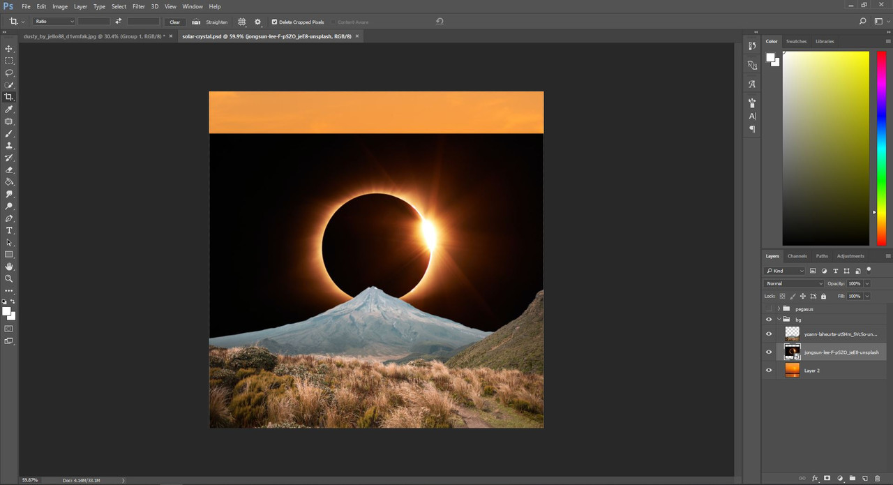
Result of cropping the top
Now, to remove the eclipse itself from the black background is a little bit tricky. Thankfully, Photoshop has a convenient tool for us that makes our job easier. This tool is the "Color Range Selection". You will want to use it while only the eclipse layer is visible. 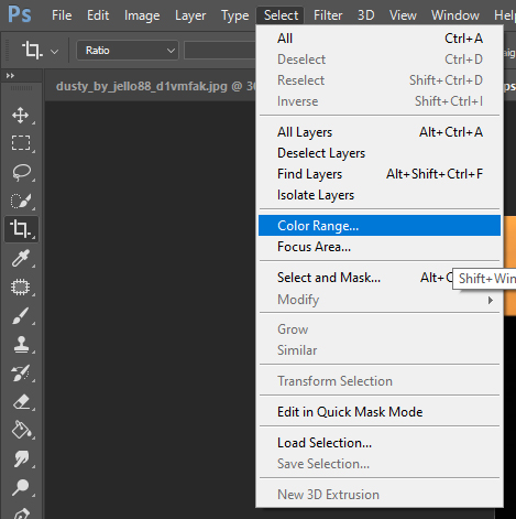
Where to find the Color Range Selection
This kind of selection allows you to pick a color from your image, and it will select everything on the picture which has that same color. In our case, black. The fuzziness slide adjusts how exact the selection should be. You will see the preview of the selection in black and white, where the white parts are the ones to be selected. Play with the fuzziness slide until the black parts on the preview look close to what you want to be left with. 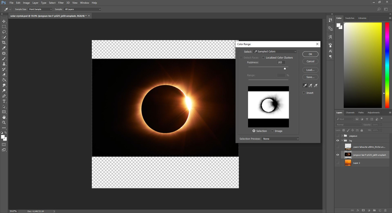
Color Range Selection in action
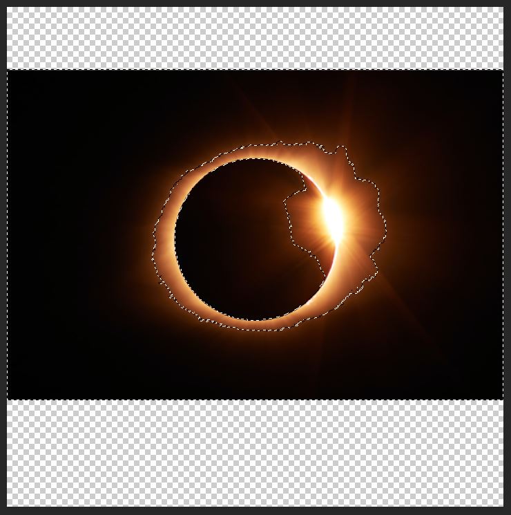
The selection produced from the above settings
Once you have your selection, simply press "delete". This way, you've cut out all the black parts from the eclipse. 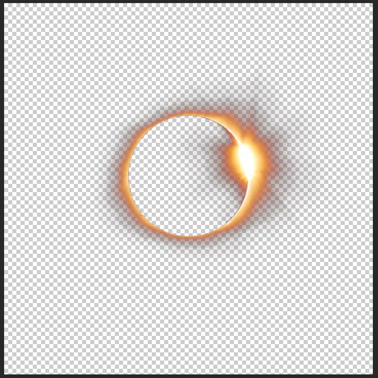
Result of the selection and deletion
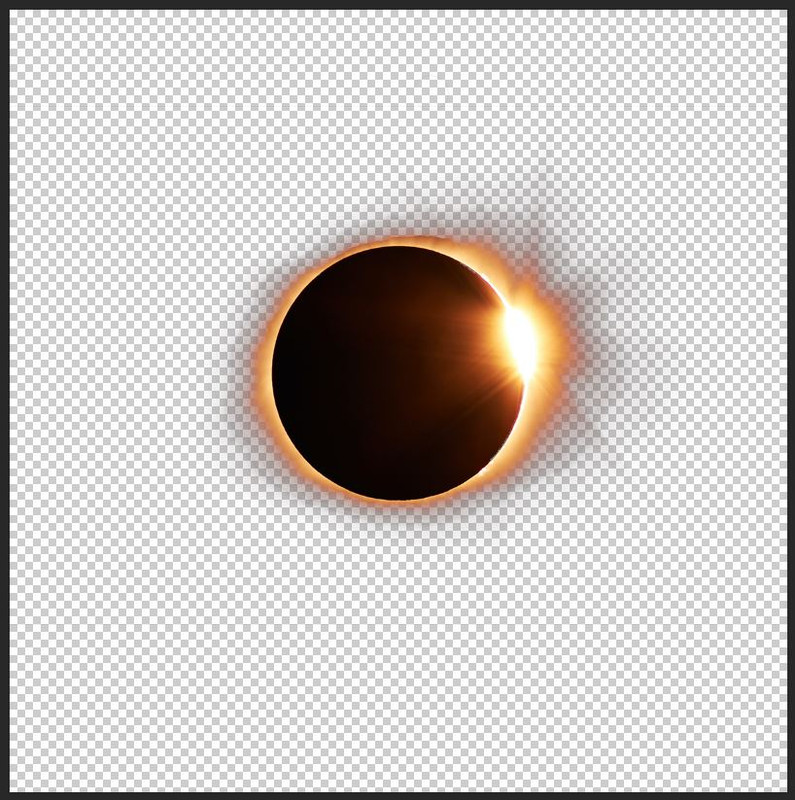
Now if we enable the sky layer we will see how the cut out eclipse looks against its new background. Here I realized that having the sky show through the middle of the eclipse looks pretty unnatural and simply bad, so I went back to leave the black center of the eclipse untouched. 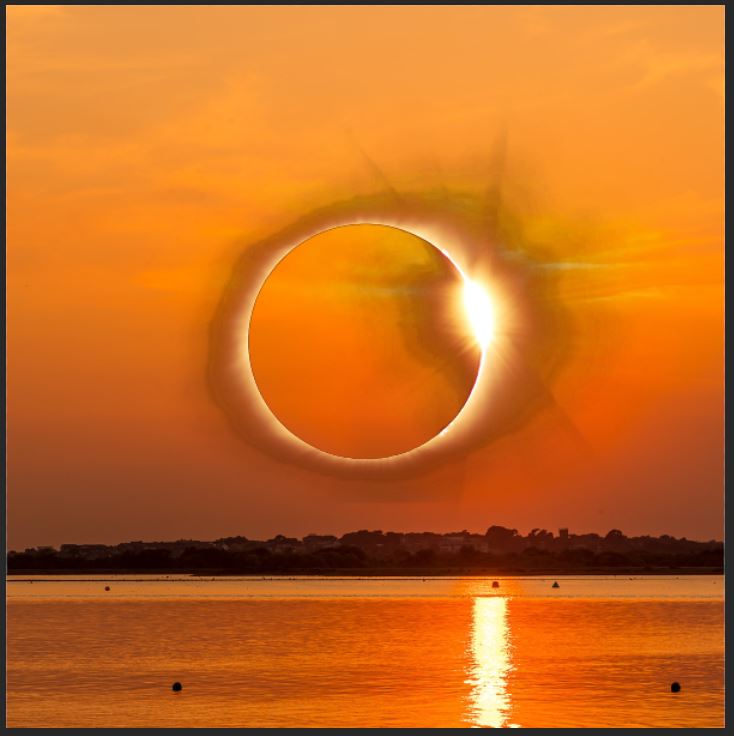
The cut out eclipse on the sky
To do this, I re-made the color range selection, then grabbed the Quick Selection Tool - the one we used to select the whole horse in the medium-big lights and shadows step. I set the tool to exclude parts and I took the center out of the full selection. 
Quick selection tool with the exclude option
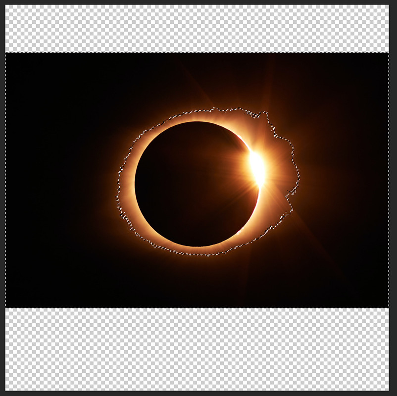
Selection after removing the center from it
Result of the deletion with the above selection
Now we have our eclipse with its black center cut out neatly. When enabling the sky layer again, however, it becomes visible that this cutout is anything, but neat. The top part still has the line where the image ended, and we are left with shadowy parts around the eclipse itself. This is something we can fix with a soft round erases on pressure sensitive opacity, and erasing back from the leftover dark parts until we're happy with the result. 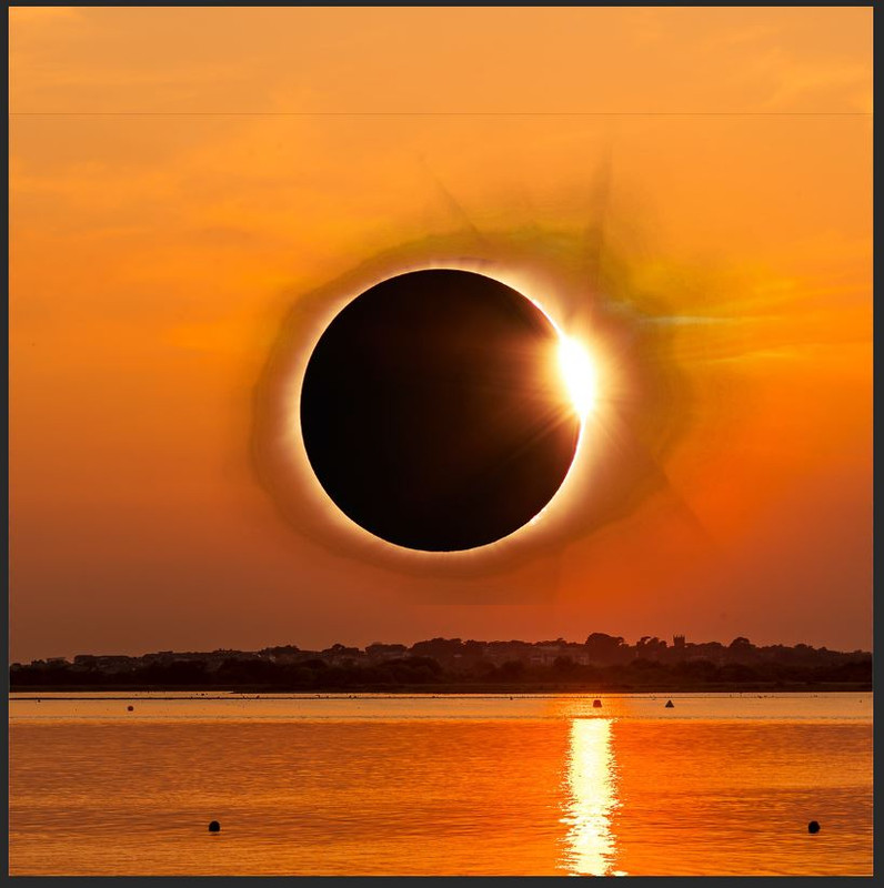
The cutout on the sky layer
Result of erasing the shadowy parts
Notice that I didn't mind the bottom party too much. This is because our mountains will cover it up once we enable them again, so there is absolutely no need to work on those parts. However, the picture still doesn't look right. Somehow those clouds on the sky layer are disturbing the focus on the eclipse itself, and having them behind the sun is also not very natural. We have no choice but to remove them. Just go back to the sky layer and repeat the steps we used to remove the sun. Copying a part of the background to cover up the place of the clouds wasn't necessary this time, the patch tool did a good enough job by itself. 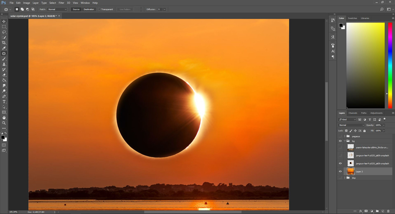
Result of removing the clouds
This is the time where we enable the mountain layer again, and admire the fruits of our work. I find it very refreshing to sometimes take a minute to stop and see what I've created so far, in whole. I suggest we take that minute now before we move on to the color corrections. |
| |
|
| |
Rumble Team |
Chapter XVII
Background merges 4 - Coming Together Colors What we have left now are the colors and contrast. We will start with the colors, because depending on the color of the area you work with you might need stronger or weaker lights and shadows. First we have to separate the two hues of the mountain layer. The one mountain in the background is much less contrasty. much greyer and bluer than the foreground, so obviously we will need to do different things to it. Simply grab the Quick Selection tool and using the exclude and include modes, select the grey mountain in the back. You don't have to be deadly exact here, but try to be as close as possible. When you have your selection, just copy the mountain and paste it onto a new layer, above the mountains layer. 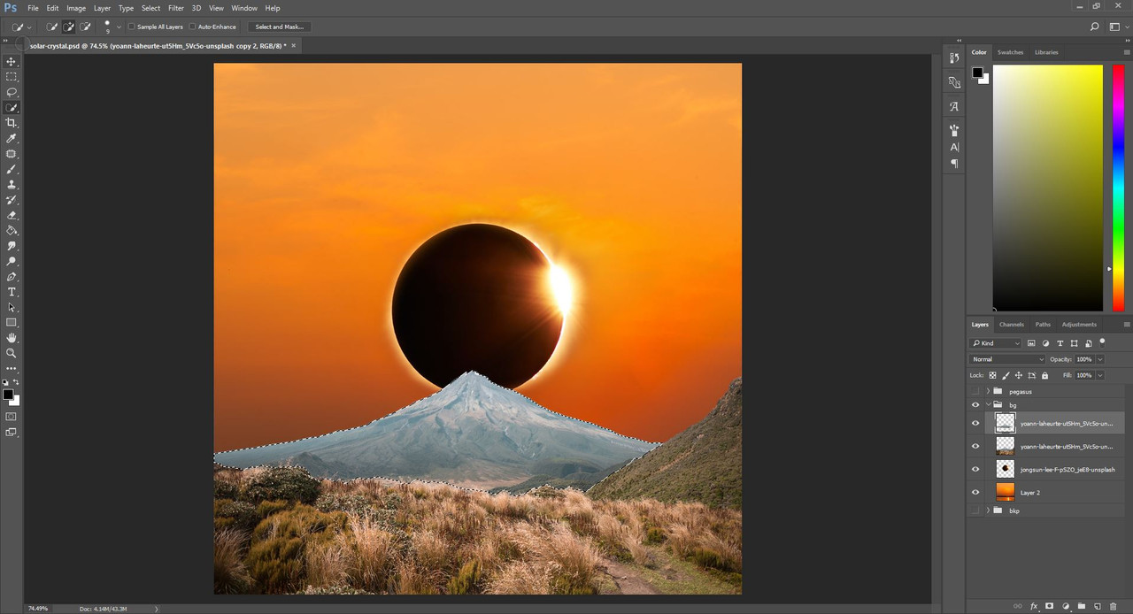
Selection of the mountain
The next step is adjusting the colors of the mountains to match the sky. Here you will have to play with the hue/saturation, color balance and levels tools, very similar to how we made the color change on the horse in Chapter 7. We have to add reds and oranges to both the mountain behind and the grassy foreground. The mountain behind needs stronger adjustments - this is why we have it on a separate layer. Experiment with these tools until you're happy with the results. 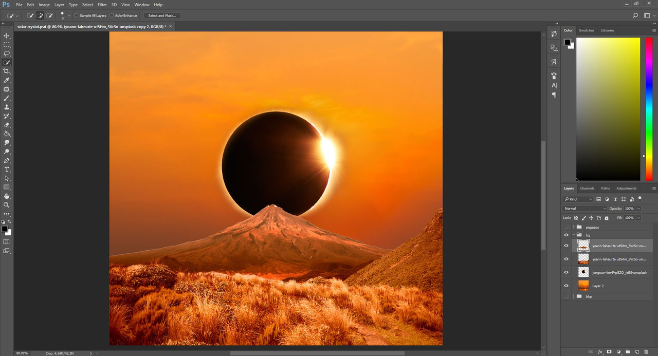
Result of adjusting colors
*** Lights Another reason why we placed the mountain on a separate layer is that it has much more contrast than the foreground. The light of the sky, the eclipse is directly hitting it from behind, generating a very dark shadow on the body of the mountain and very bright light on the edges of it. To put these on you will need to create a layer for each light and shadow that you paint in, set them to either multiply for shadows, overlay for lights or soft light for either. Here I used overlay for the lights and a mix of soft light and multiply for the shadows. Use pure black color for shadows and a bright yellow, less saturated color for lights. 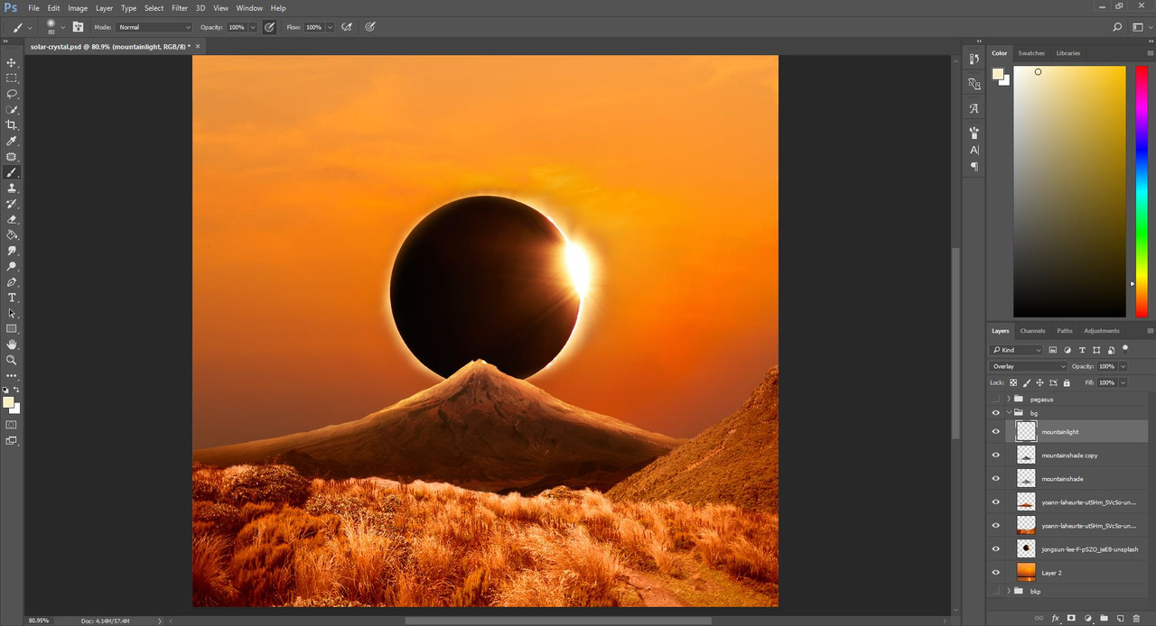
Result of lights and shadows on the mountain
At this point the background folder got too messy for me to handle, so I created folders for the sky, mountain and grassy foreground where I could put all the light and shadow layers separately in order. This is not a necessary step, just a personal preference. 
New layer groups
Next, repeat the shadows and lights on the grassy foreground and the mountainside on the right side of the image. Keep in mind that the shadows and lights on these parts aren't as harsh as they were on the mountain behind, because these parts are further from the light source. 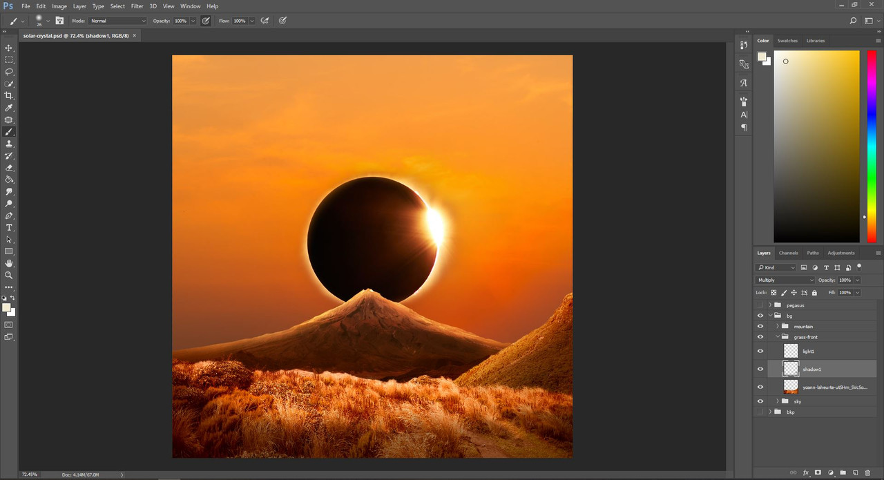
Result of lights and shadows on the foreground
Notice that even after adding lights and shadows, the connection between the mountain behind and the grassy foreground is a little unreal. The grass is way too bright there and the imperfect cutout we made for the selection of the mountain is showing its teeth now. It's pretty easy to fix this, with a soft round eraser with pressure sensitive opacity, erasing back from that connecting part. We will also need to remove the hard lights from there to make the grass blend in more with the mountain. 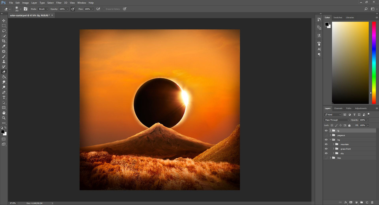
Result of grass correction and frame
After correcting the grass, I could treat this background as any other. I added my beloved dark frame around the picture, I blurred the distant parts, and there I had the background I wanted. 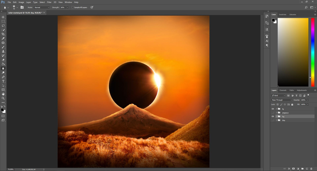
Result of blur
Now that the background is ready, you can move onto the horse prep. Congratulations on the background merge! :D |
| |
|
| |

|
This guide is absolutely fantastic! :D Organized, clicky pictures. I need to find the time to sit down and try this. Thank you so much, beautiful job! |
|  |
|
| |

|
This is amazing! Thanks for making this! I used the smudging guide on my most recent piece! Thanks <3 |
|  |
|
 Light Rain then Clearing Overnight


