| Teir? | July 14, 2023 04:35 PM |
|
|
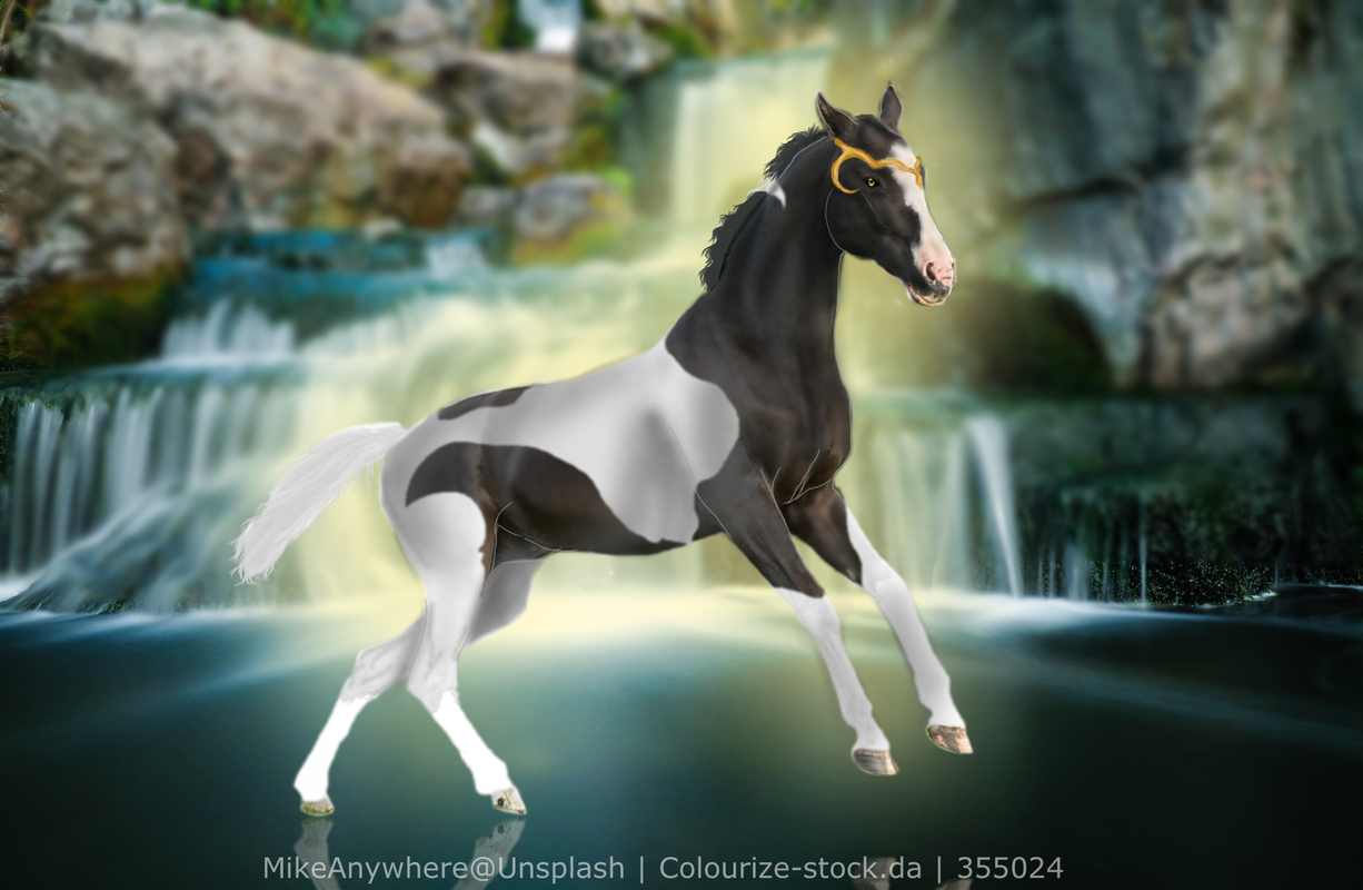
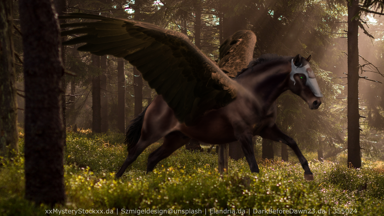
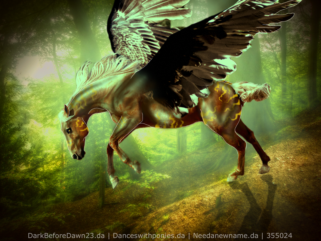
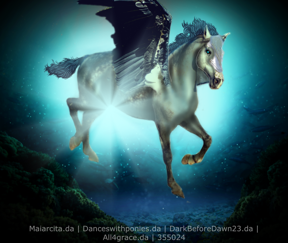
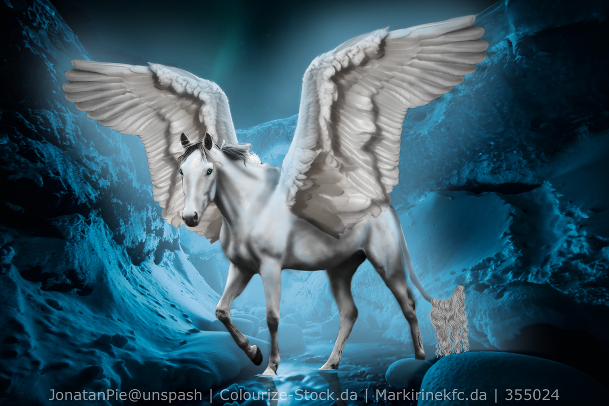
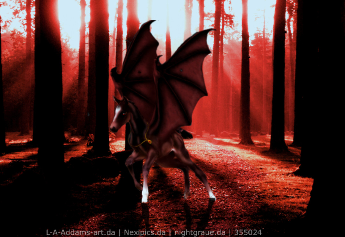
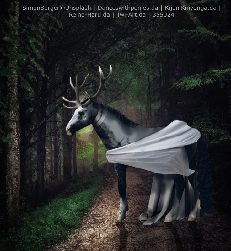
I am back recent art pieces: |
|  |
|
| Teir? | July 14, 2023 07:17 PM |
|

|
Damn! Your work with wings is impressive! I think one of the things I see is a slight inconsistency in body prep, sometimes it's blurrier or sharper than other times (I was totally guilty of that too) I'd say the white outlines around the horse are too squiggly, but honestly I think your art looks great without it! Your color changes and markings are impressive as well! Low T2! |
|  |
|
| Teir? | July 14, 2023 07:55 PM |
|
|
Thank you! I will work on those things, I don't actually blur my horses body anymore, it's the shadowing and lighting that I do that makes it look like that 🤣 I might start doing that stuff lighter now due to the blur look, as for the lines, I have real shaky hands, and I have to agree with you there, the arts look better without them 😀 |
| |
|
| Teir? | July 17, 2023 03:11 PM |
|

|
I'd say mid to high T3. I think the issue is really just consistency. The strawberry horse looks very different from the style you used with last few pieces, so people won't really know what to expect when ordering.. does that make sense? I'd love to say T2 as you have some pieces that look like they'd fit there, but the competition from other artists in that price range that are more consistent may make it harder to get orders. |
|  |
|
| Teir? | July 17, 2023 03:15 PM |
|
|
I'd say low tier two, high tier 3. As Floresta stated the issue seems to be consistency as well. If your pieces looked similar to number 3 I would say a very high tier 2. But for others a tier 3 or a low tier 2. |
|
|
| Teir? | July 17, 2023 03:22 PM |
|

|
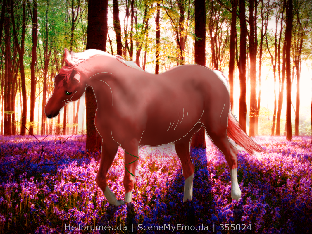
As both people said above me I would say consistency is an issue. All your pieces are lovely don't get me wrong but there seems to be a huge gap in quality from the second + third one you posted and the strawberry horse. Most of those ( ESPECIALLY the second and third would be mid to high tier 2, but then you hit the strawberry on and it's super blurred out and the lines are a bit wonky) I think you could test waters in tier 2 and if it doesn't work out move to high tier 3. I don't mean to put you down in any way whatsoever lovely, your art is beautiful as well and your wing work is amazing, I'm just not quite sure what happened lol <3 |
|  |
|
| Teir? | July 17, 2023 04:11 PM |
|
|
Thank you! I will stay in high their 3 for now until I fix the consistency issue! I don't think I am going to try my luck with the lines 🤣 I got to wonky of hands to be doing it |
| |
|
| Teir? | August 4, 2023 12:38 PM |
|
|
Others have already commented on body prep and consistency, so I will leave that alone and instead offer critique on hair and lighting. As previously stated each piece has a variation regarding technique, which is fine as you're still finding your style. I can see you've used both the smudge method and painting the hair on a new layer. Personally I paint my hair, so I'm not too familiar with the smudge method and won't offer any advice regarding. For painting, I'm not sure what program you use but you'll probably want to use a round brush with a softer edge, I typically color match it to the base of the existing hair in the original image. Then I take into account the pose of the horse and the scenery. Is it raining? windy? If the horse is moving, how would the hair flow? From there you can start your base, remember that hair tapers towards the end, and is almost never linear. Personally I like to add small wispy strands, but it most definitely is not required. Once you are happy with your base, you can start adding highlight and shadows. It is very important to take the lighting of the background into account when doing so. For me I generally add wider highlights that blend into the body of my hair, but you can highlight individual strands, etc etc. The same goes for shadows. Secondly, the lighting in your pieces needs a little bit of work, which is fine! Lighting is hard. I've noticed that on a lot of your pieces where the horses have white markings they are blindingly white. It doesn't fit the background, and if you look at horses in real life their markings are almost never pure white. The undertones need to fit into the background. For example, on the red piece with the foal the ends of the legs (fetlocks leading to coronets leading to hooves) would probably be darker as the piece is very shadowy. The markings would also have a slight red undertone to fit with the lighting. It's a small step but it really helps tie the horse into the background well. If you need any clarification, don't be afraid to ask :) |
|
|

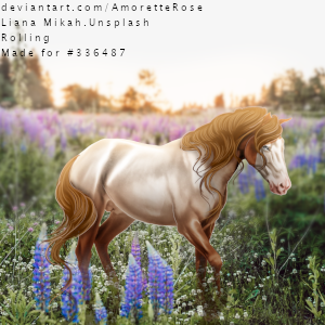
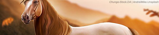
 Morning Frost and Afternoon Sunshine