| |

|
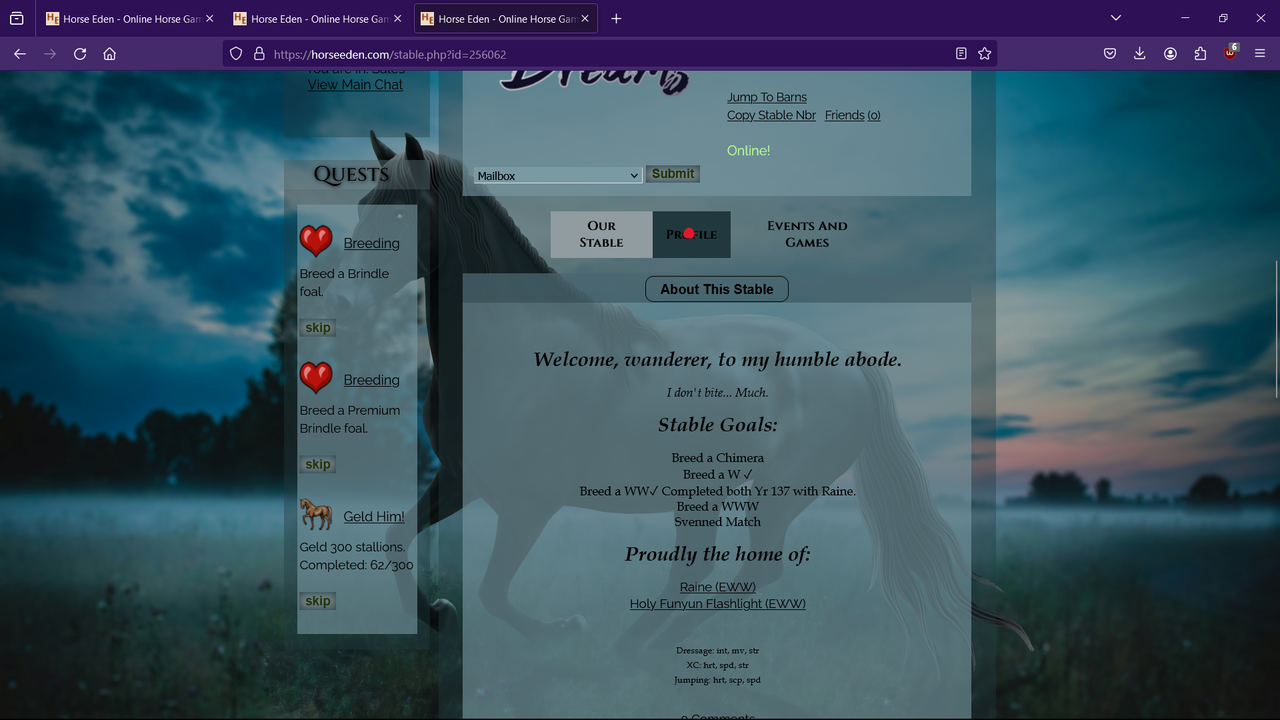
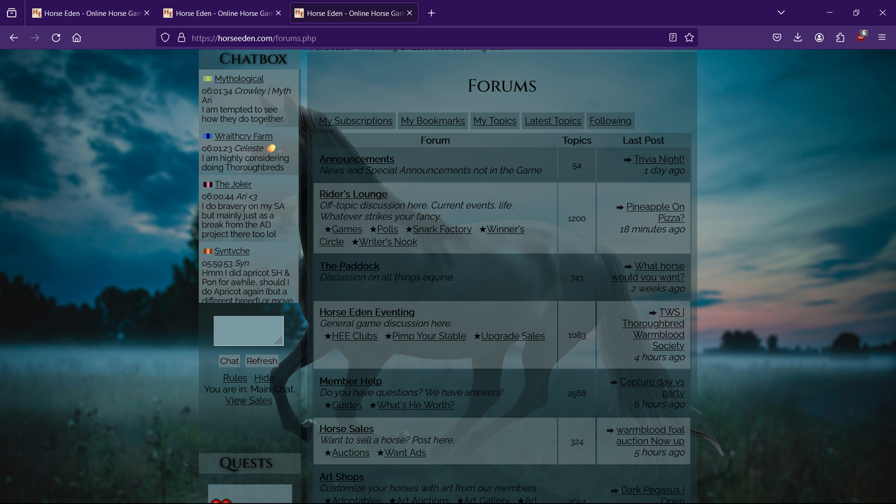
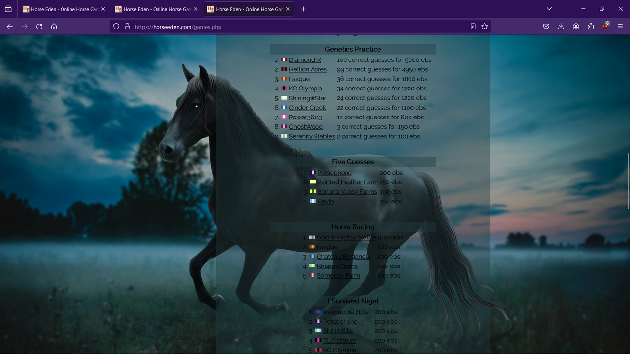
Art credit to the amazing Amethyst, palette by me. This is a personal piece, made by myself, for myself using art I've paid for. Not a collab, not a sales piece. Hello! As the title says, I'm looking for some constructive criticism on my palette. This is a piece I've made for myself and where I personally think it's beautiful, I would like another set of eyes to see what I don't. It can be viewed on my page, and the screenshots below highlight things like the forums and games page. Note: My screenshots hide my cursor, so the red dots indicate where my cursor is resting, to highlight the hover effects:) I'd like to hear anything you have to say, but please remain kind and constructive. Thank you! 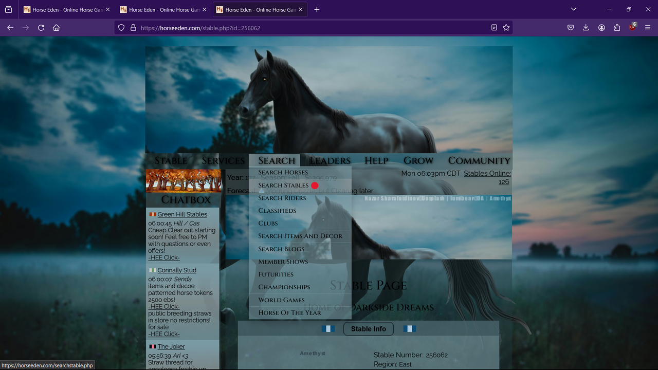
|
|  |
|
| |

|
For me personally, I'd want a lighter text color so I could read the text easier lol. But, I also have terrible eyesight. But I love this palette!! <3 |
|  |
|
| |
|
Tranquility said:
For me personally, I'd want a lighter text color so I could read the text easier lol. But, I also have terrible eyesight. But I love this palette!! <3
Thank you! I thought the same, but I thought white text might be worse than the black. I also have awful eyesight and this palette doesn't make me want to yeet my eyeballs lol |
| |
|
| |

|
what about a light gray instead of black or white? :3 |
|
|
| |

|
I design palettes and have a shop ~ (these are just my opinions <3)
What I draw to straight away is the page background being to transparent. I would also make the font colour lighter, including the nav bar etc. In the nav bar drop down, see how the box "Search Horses" overlaps the "Search" word? I would personally put a small space between the two. Same with the chat boxes, I would put a small space to seperate them. It just gives a neater look, I personally think. I personally don't like the overall font (nav bar is good) only because it makes the numbers all wonky, it's always been my pet peeve haha.
margin-bottom: 8px;
the above code ^ helps put a space between Again, these are my personal opinions
Your palette looks brilliant and you should be proud with the outcome! ♡♡ |
|  |
|

 Hurricane ! Follow Evacuation Routes.


