| |
|
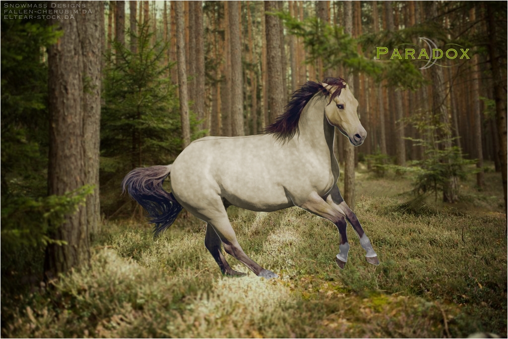
*judgey face* 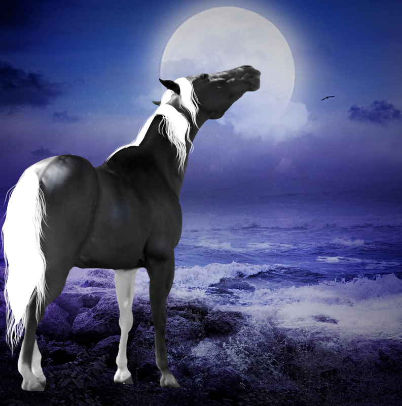 Definitely still a wip. How's it look so far? |
|
|
| |
|
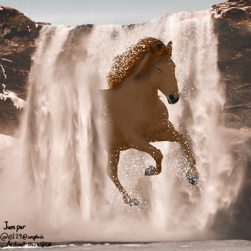 Thorghts? :D |
|
|
| |
|
Jumper the horse is a little too smudged out. You want to add definition to the muscles |
|
|
| |
|
ok will do :D thx
Cain Manor said:
Jumper the horse is a little too smudged out. You want to add definition to the muscles
|
|
|
| |
|
Your manes are looking much better though |
|
|
| |
|
thanks, I have been practising alot but this is the first one I'm liking the manes is this better? |
|
|
| |
|
Cain (some critique on your piece <3) First thing I can say is I love the mane and tail overall "shape", but you need some lowlights. Some darker gray strands that will really bring out and emphasize it as well as the lighter parts and make it look more realistic.
-
Second, your lighting. In the background, the moon is the light source, coming from the other side of the horse (and slightly above) Therefore, the rump/shoulder/side shouldn't have the "highlights" where it looks like a light source is hitting it. Once you get those figured out, give a small little "glow" of light around the parts of the horse the moonlight would hit the horse with the most light. -
And lastly, your hooves. If you can't find a way to get your hooves to look good against the backround, put some little little dark airbrush strokes over it, almost like a "mist" that could be covering the hooves.
:3 PM me if you have any other questions <3 - EDIT-just saw that it's still a WIP. Now I can see that the tail isn't finished. I feel like it did too much critique to early lmao |
|
|
| |
|
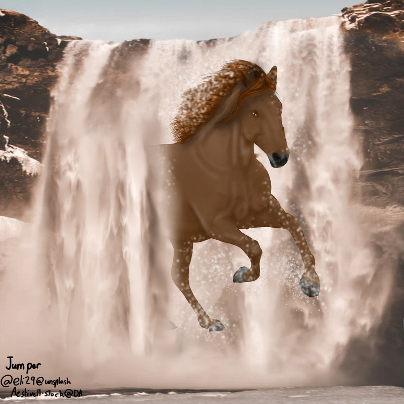 :D updated even more thoughts now? |
|
|
| |
|
Have at it, had a major art block and would like to know what needs improving. :) Edit: Wrong accout, meant for Snowmass Horses, haha. |
|
|
| |

Art Team
|
@Cain I think that mane is going to turn out really cool! Only things I can say at this stage is to paint over the but highlight as it does quite match the background, lol. Also, give the horse more a blue tint to make it look more natural <3 . @Snowmass A few suggestions on this one. First, I'm not too sure about the mane, The part the lays over the horse's shoulder almost looks smudged... I know you can draw manes extremely well <3 Tail too. Lighting, the horse's highlights and shadows seem rather extreme/too strong just looking at its environment. Only other thing is grounding the back feet. Some of the horse's feet are still made of grass! Either draw the feet, or cover them with more individual strands of grass. Beautiful muscling/body prep <3 |
|  |
|
 Morning Showers then Cooling