| |
|
@Jumper Definitely newer to manip art/design so all I can offer is a more outside view or opinion and please take everything I say with a grain of salt as I am certainly no expert😅 I think the glow is a really cool effect in this piece! The legs are getting a little lost to glow and background though. And I would also suggest maybe smudging the tail a bit more since the individual strands are really standing out right now. [A pickier suggestion]I like the spikey flame like mane style as well I would just maybe smude some of the ends or add (just a few) more strands to fill them out a little more since the base is smudged/fuller. Hopefully some of that makes sense and helps! -Also forgot to add really like the muscle detailing in the neck :) |
|  |
|
| |
 |
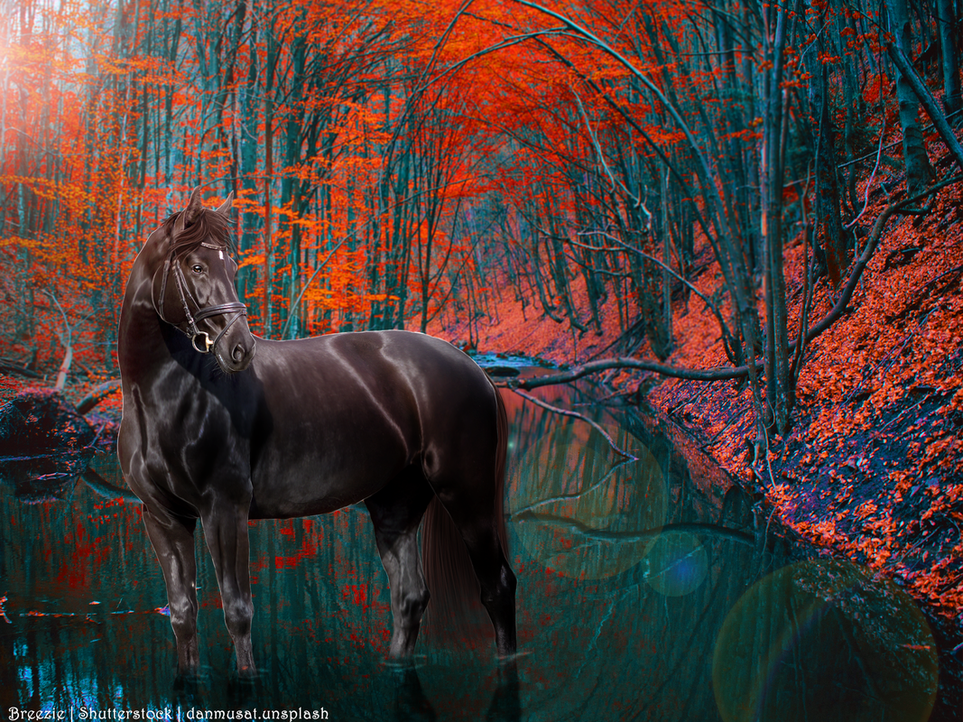
Breezie Rose said:
Hey there! Finished a quick premade this morning :) Thoughts? Edits? Additions? Anything?
Stunning, Love the detail its faboo <3 It just looks a little off to me, and I think its because the space opposite your light source is too light. There isn't enough contrast, therefore, the darker side of your horse looks too dark. So your horse is correct for the light source but your background isn't. Does that make sense? |
|
|
| |
|
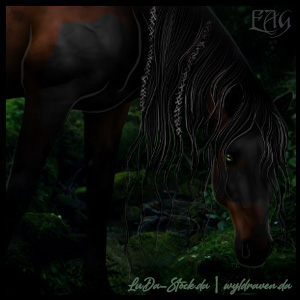
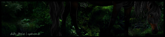
Hey this is my first art piece ever, so I have TONS of room for improvement. What are your suggestions!? Both the background and horse stock are from the same person as credited and I included my stable number in for editing credit. (LMK if I need to change anything about credits before I start making art for my horses) |
|  |
|
| |

|
I would say some prep! If you want examples PM me please! ^^ |
|
|
| |
|
Hideaway I would make the lettering white so it stands out more <3 |
|
|
| |
|
Cain Manor said:
Hideaway I would make the lettering white so it stands out more <3
I did at first but it got washed out with the sunlight, I definetly should have messed around with it, maybe flip the horse and put the writing in the upper right? |
| |
|
| |
|
Sure!
Hideaway HorseCenter said:
Cain Manor said:
Hideaway I would make the lettering white so it stands out more <3
I did at first but it got washed out with the sunlight, I definetly should have messed around with it, maybe flip the horse and put the writing in the upper right?
|
|
|
| |
|
Ladybird Estate said:
This is very nice of you trillium! https://i.postimg.cc/k59dn6tW/Untitled159-3.jpg Any way I can make this better?it's for a high stakes contest
|
|
|
| |
|
thx so much
Verity Stables said:
@Jumper Definitely newer to manip art/design so all I can offer is a more outside view or opinion and please take everything I say with a grain of salt as I am certainly no expert😅 I think the glow is a really cool effect in this piece! The legs are getting a little lost to glow and background though. And I would also suggest maybe smudging the tail a bit more since the individual strands are really standing out right now. [A pickier suggestion]I like the spikey flame like mane style as well I would just maybe smude some of the ends or add (just a few) more strands to fill them out a little more since the base is smudged/fuller. Hopefully some of that makes sense and helps! -Also forgot to add really like the muscle detailing in the neck :)
|
|
|
| |

|
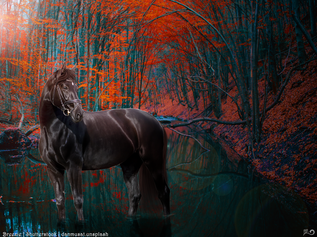
Nueve de Cassa said:
Breezie Rose said:
Hey there! Finished a quick premade this morning :) Thoughts? Edits? Additions? Anything?
Stunning, Love the detail its faboo <3 It just looks a little off to me, and I think its because the space opposite your light source is too light. There isn't enough contrast, therefore, the darker side of your horse looks too dark. So your horse is correct for the light source but your background isn't. Does that make sense?
It does! Thank you, Cassa! EDIT: Is this better? |
|  |
|
 Warming, with Sleet and Heavy Icing