| |
|
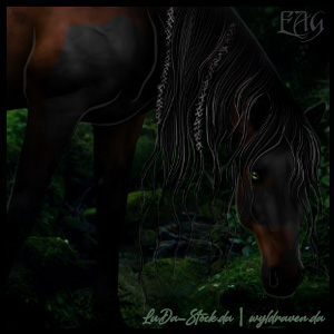
@Garner That makes much for sense 😉 You're genuinely amazing. My only 'issue' with this is the low resolution. If you were to link the image would it be higher resolution? Also could have a little more contrast in the mane <3 |
|
|
| |
 |
|
| |
|
I would love to get some critiques and opinions on this one. I havent made a piece in quite some to and this is my first one back. Thanks in advance! https://www.deviantart.com/apexartistry/art/1-Grey-pony-cantering-in-field-856030329 Edited at September 23, 2020 05:34 PM by Apex Equestrian |
|
|
| |
|
@Apex I think that's a really great start! Highlights are looking very nice. I would reccomend extending the shadow of the horse to be more under the front of the horse. Throw in a darker shade or two in the mane and tail at about 1.1 px. Also, give drawing the eye a shot just to add some personality. Only other suggestion is to make the bottom of the tail darker or more in shadow than the top. |
|
|
| |
|
Gem said:
@Apex I think that's a really great start! Highlights are looking very nice. I would reccomend extending the shadow of the horse to be more under the front of the horse. Throw in a darker shade or two in the mane and tail at about 1.1 px. Also, give drawing the eye a shot just to add some personality. Only other suggestion is to make the bottom of the tail darker or more in shadow than the top.
Thank you so much! I will definitely take all those things in mind for my future pieces. :D |
|
|
| |
|
Can I have some criticism and what's it worth? |
|
|
| |
|
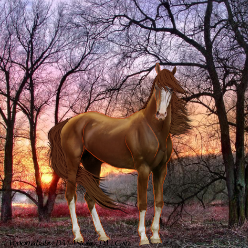
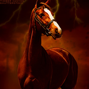
@Cain Not loving the orange lines you used to outline th muscles. That seems rather unnatural to me. Same with the dark brown lines on the white side of the face. If anything, the dark brown lines Gould be used in place of the orange and grey lines on the white side of the face. Main thing to look at I would say is lighting. The light source is obviously behind the horse so the highlights should be on the edges of the horse's body. The middle of the horse should be significantly darker to be realistic. There is like two black lines going underneath the right eye. What are they there for? If they're meant to be the shadow of the forelock, Gaussian Blur those suckers 😜 |
|
|
| |
|
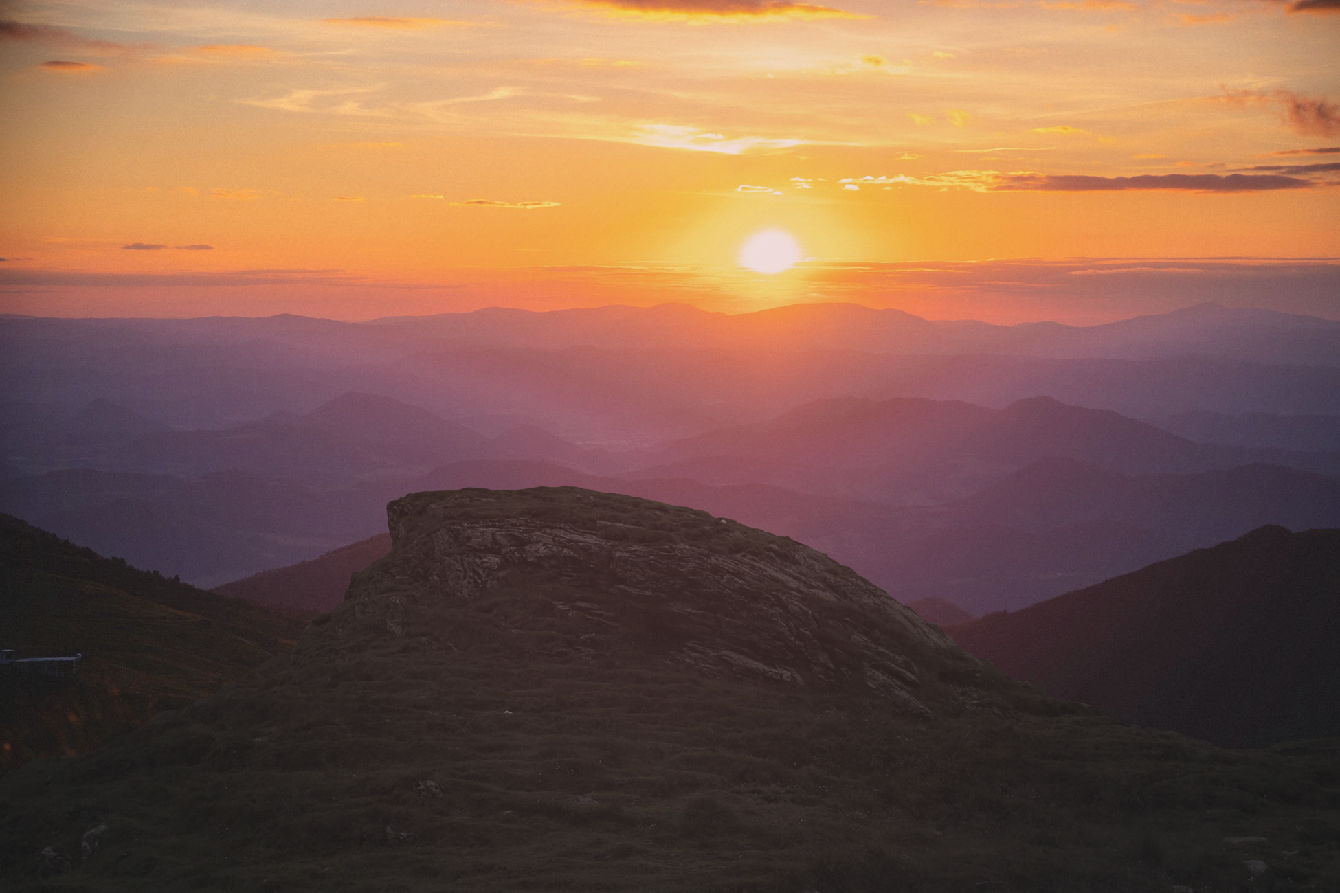
uhhh... trying to do a background merge and ... it looks... dodgy. Looking for tips to make it look more realistic. Thank you :) Edited at September 28, 2020 01:52 PM by Madsie Manor |
|  |
|
| |
|
@Madsie Hey!!!! I think that's looking great so far!! The images fit well together, shadows, cutting, and tinting are perfect. What would add realism is to add some significant highlights on the edges of the rock/cliff where the sun's light would be hitting it. This can be done by adding a layer on overlay, then using a white airbrush. Blend and play with opacity as needed <3 |
|
|
| |
|
@Madsie I agree with Gem, they merge really well, I could only tell the merge line because of the shading (highlights). The tint and hues go amazing together and I'm sure your final piece will be strikingly beautiful. |
|  |
|

 Warming, with Sleet and Heavy Icing