Aussie Stables
04:45:23 Aussie - Golden
that's no good Myth. how does 2 hours of sleep and waking up thinking you can't breath sound?
hollyhock joy
04:45:01 
hmm id contact your local DNR
FirstLightFarms
04:44:36 puck
thats a mood serenity

snow, is it shedding? also maybe contact a local wildlife rescue
Montana
04:43:56 Tana, Kae 2.0
This is really what I'm salty over...
-HEE Click-
I haven't had a good color stud prospect in a while because all of my (many) colts flop with the ratings (WEE combos)
Mythological
04:43:55 Crowley | Myth
Headache
hollyhock joy
04:43:54 
lol
Snow Stable
04:43:45 Snow❆Gem
Anyone here know much about deer fawns?! Like a wildlife rebilator kind of knowlegde?

I just found a very young fawn, with flappy ears like a Beagle. All I've found online is curly back can be from dehyration (wrong direction), or something genetic.
Serenity Stables
04:42:40 Serenity / Rain
Can I lay down in the forest and let the moss reclaim my body please
Aussie Stables
04:40:48 Aussie - Golden
Myth i am slowly dying.
from coughing.
Mythological
04:40:29 Crowley | Myth
Nope.
TopGun Elites
04:40:10 mav/maverick
myth

FELT.
Sunset River Arabian
04:40:09 Athena
Tana
Her training threw me for a loop this morning
-HEE Click-
Lucky
04:40:08 Marty McMucha
Myth
Pretty fair honestly. Anything exiting for RO?
Lucky
04:39:42 Marty McMucha
Tana
Oof yeah. Had a WWE that was only up 4 on week 5 once
Mythological
04:39:38 Crowley | Myth
I feel like I am slowly dying.
Montana
04:37:56 Tana, Kae 2.0
What hurts is if they aren't all-up on Week 5
-HEE Click-
FirstLightFarms
04:37:39 puck
tag yourself im the second option
Sunset River Arabian
04:37:18 Athena
Miso
This hurts. This was my big match
-HEE Click-

Tana
Oh I know. I'm not looking at training. I just don't know how good he'd be as a stud since he doesn't have markings and he's WWE
Starleaf Stables
04:37:07 Flare <3
These two gals have very different approches to Week 4's, on says Fuck it let do it:
-HEE Click-
The other says why do it?
-HEE Click-
Lucky
04:36:30 Marty McMucha
Myth
What about you?
You must be a registered member for more
than 1 day before you can use our chatbox.

Rules   Hide
You are in: Main Chat
View Sales


 Year: 178   Season: Summer   $: 0 Mon 04:46pm CDT  
 Forecast: Fog Early followed by Afternoon Showers


Forums

→ Horse Eden is a fun game! Sign Up Now!

My Subscriptions
My Bookmarks
My Topics
Latest Topics
Following
Forums > Art Shops > Art Help
  1

Looking for heavy critique! February 22, 2021 11:12 AM

Cherry River Elites
 
Posts: 1000
#855977
Give Award
I need some hard critique on this. Two different wing colors as well, completely insignificant, ignore that. Be as harsh as you need to, I feel like I could improve a lot. This is actually my best art yet, but you're probably super bored with all my rambling on by now, so I'll shut up and let the masters work their critique magic.
IMG-0274.png
IMG-0275.png
Looking for heavy critique! February 22, 2021 11:19 AM
Former Stable
 
Posts: 0
#855982
Give Award
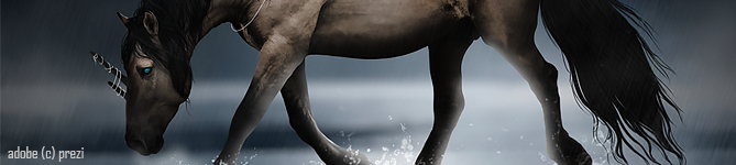
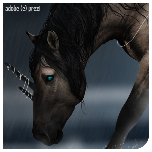
Honestly the biggest thing for me is just how pixelated it looks, I would try using smaller brush sizes so it doesn't look as blocky. I think you were trying to do a braided mane and tail but the tail is very thin. The pink nose is also darker than it needs to be.
The definition on the chest is great though but I would try and carry that through the rest of the horse more, especially on the dark sections on the legs.
Looking for heavy critique! February 22, 2021 12:53 PM

Florestä
 
Posts: 3050
#856035
Give Award
I think it looks really good. Would definitely buy.
Looking for heavy critique! February 22, 2021 01:02 PM

Thistleberry Farm
 
Posts: 4433
#856040
Give Award
i think the definition on the chest is good. but with the legs you need to finish them way more smoothly, makin sure to rub out any bits coming off the legs, and maybe smudge the dark layers on the legs so they blend with the buckskin color of the horse, because at the moment they look very abrupt and not right.
with the hair you attemted to do braids, and honestly you shouldnt have. it looks odd and pixelated, a bit like dreadlocks. i would have done the hair either long, flowy and dark, or short but smooth. the pink snip on the nose is too pink, try softening that.
now with the wings. honestly, they arent that great. along the tops of them need to be more swooshy and curved, more angelic. the tip bits of them look to pixelated an round, like you have just done them with a mouse. try smudging them (use a low strenght smudge) to create a better effect.
Looking for heavy critique! February 22, 2021 01:10 PM

Cherry River Elites
 
Posts: 1000
#856046
Give Award
White Hills- Thanks. I was actually using the smallest brushes possible, because I suck at resizing, so I was using a 500x500 canvas. But I'll definitely work on more definition on the legs.
Sage Brush Stables- I love you <3
Olive Tree Equine- Dang :'). What do you mean by 'bits coming off the legs'? The braids were actually supposed to look like that, but if I were trying to do nicer braids, I'd use a better brush. I also thought the pink looked off- just wasn't sure why. I meant to make the wings look slightly twisted. But I'll definitely use those tips for other wings I make.
Thanks everyone!
Looking for heavy critique! February 22, 2021 01:18 PM

Thistleberry Farm
 
Posts: 4433
#856048
Give Award
sorry to be so harsh XD i meant for example the front left leg, there are bis where you have repainted it darker where you havent rubbed it all out so there are small pixels coming off the leg in places.
Looking for heavy critique! February 22, 2021 01:22 PM

Cherry River Elites
 
Posts: 1000
#856052
Give Award
Ah, I see that now. Thank you!
Looking for heavy critique! February 22, 2021 01:27 PM

TenaciTea
 
Posts: 1929
#856058
Give Award
My main thing with this is the wings.
If you look at bird wings, they aren't completely straight.
When I draw wings (that aren't super anatomically correct) I do two gentle curves basically going on the opposite directions.
Ignore that this is a completely different art style than what you're working with xD
amberchampagnefewspot.jpg
If you look at the wings on this, you see that they're not straight, and it makes the horse look more like it's in motion. If you wanted the wings to look more level to the ground, you could decrease the angle/curve of the wings.
Looking for heavy critique! February 23, 2021 01:03 AM

Azrail Elites
 
Posts: 725
#856374
Give Award
What program do you use?
Looking for heavy critique! February 23, 2021 07:55 AM

Cherry River Elites
 
Posts: 1000
#856463
Give Award
Procreate

Forums > Art Shops > Art Help
  1

Refresh


Copyright ©2009-2024 Go Go Gatsby Designs, LLC    All Rights Reserved

Terms Of Use  |   Privacy Policy   DMCA   |   Contact Us
Help Me (2)  |   Game Rules   |  Reset Palette